StreamImports
Member
Hello,
I heard how because colors on monitors may differ, there were cases where clients received their material not in color they wanted.
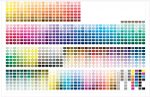
I asked people who done it successfully and they told me that firsthand I should opt for pantone colors and not CMYK. I later heard
about pantone color reference books available to buy which I should use to base my color preference on because they have standard
of codes that printers refer to. These books are best way to ensure that I and printer on the same page about color I want.
Other people said that they use online websites for color reference but I wodner how they do it successfully if there can be color
discrepancy between monitors.
Do you use pantone colors book or other source of colors reference? What would you recommend? Should I get the book and if so, which model/standard/type? Some have older year of publication (is this disadvantage?), some are available in glossy and matte coating and also are offered in uncoated.
Thanks
I heard how because colors on monitors may differ, there were cases where clients received their material not in color they wanted.
I asked people who done it successfully and they told me that firsthand I should opt for pantone colors and not CMYK. I later heard
about pantone color reference books available to buy which I should use to base my color preference on because they have standard
of codes that printers refer to. These books are best way to ensure that I and printer on the same page about color I want.
Other people said that they use online websites for color reference but I wodner how they do it successfully if there can be color
discrepancy between monitors.
Do you use pantone colors book or other source of colors reference? What would you recommend? Should I get the book and if so, which model/standard/type? Some have older year of publication (is this disadvantage?), some are available in glossy and matte coating and also are offered in uncoated.
Thanks
Last edited: