Gray balance green overcast problem (GCR ink saving project, OneVision Asura)

mrjukk

Member
Hi everyone, i hope im asking this question in the right place and if not i would be thankful if the mods place my thread in a correct category.

Im doing a project on ink saving which involves determining the high point of ink saving a company should use without risking loss of quality (there are alaso other goals and plans, but i dont wanna be too long). As this is a personal project so my finances are limited and im working with printing facilities who offer me their work in exchange for my results.

This is how i planned to do my research.

- I prepared a test printing form with test images (skin tones, grays, saturated tones, low key and high key images and so on.) and wedges which includes a OneVision software GCR wedge with 70cmy/70k fields and a 50/50 + a 30/30 field. I also used fogras ECI/bvdm gray control strip in the L variant.

- I made the pdf's and optimized them in OneVision Asura software with a workflow used by a local printing facility. I wrote down all the options they include in their workflow and i only changed the level of GCR or ink saving optimization. I used 4 levels, from lowest to highest.

- I then made the plates, no problems there.

- The printing process.

This is where the PROBLEMS BEGIN, on files with NO or little optimization the printer told me he could not avoid the GREEN overcast on gray balance fields, without comprimising the color quality of the test pictures below. He told me he tried fixing the gray balance but if he cought the right balance with little to no overcast on CMY test fields the test images would look horrible, so he kept the way images look and left a green overcast on gray balance fields.

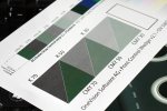
Below is a picture where the problem is at its worst, you can see the green overcast on the CMY fields. This is the print from the plates with LOWEST amount of GCR. In the prints with higher amount of GCR there is less of a green overcast, somewhere even none.
EDLu4qw.jpg
(click on image to enlarge)

So with my knowledge i have come to this conclusions:

- I wasnt in the print shop while the printing was in process, so lack of effort and a simple quality print would solve this problem. (printing was pro-bono, if that makes any difference)
- A problem in pre-press, although everything went according to standard, nothing i would notice went wrong.
- Logical explanation is, the amount of C and Y ink is excessive so a green overcast is formed, again i checked the plates and files from the RIP and everything is in order, so not a pre-press issue.

I would be very happy of every reply, i can provide more pictures of the prints or even microscopic pictures of the plates and prints i made, trying to solve the problem. Doing the whole printing process again would be my first step in fixing this issue, what do you think?

p.s.: Prints comply with the standardized ISO coated paper LAB and density values. Quality still isnt satisfactory.
 
Last edited:
Questions:

1 - What were the actual measured densities that the press ran at when the green showed up? ("Prints comply with the standardized ISO coated paper LAB and density values." is too vague.

2 - What was the press sheet layout? I.e. can you provide an image of the whole press sheet to see its imposition?

3 - What do the separations look like? Can you provide even lo-resolution images of the cmyk channels from no optimization to full?

4 - You say "on files with NO or little optimization the printer told me he could not avoid the GREEN overcast on gray balance fields, without comprimising the color quality of the test pictures below." Is that type of separation their standard? If so, was he having the green issue on live jobs before the test?

5 - Are the SIDs the test ran at the same as the SIDs the press operator normally runs at? If not, what SIDs does the press normally run at? Does the press operator normally run to specified SIDs or to whatever density results in a visual match?

Hi gordo, thanks for a quick reply.

I can answer some questions right away, some when i get back to my work computer tomorrow.
1. Actual SIDs for the upper image with little optimization (2/10 level in asura) are as followed:

C 1,54
M 1,39
Y 1,13
K 1,72

Which is pretty solid. I dont have the LAB solid values at hand right now.

2. Sheet layout (missing the printers marks, that are on plates)

i2VWmoL.jpg

4. I found some old print test sheets that this printer did and i can confirm that the green issue was also seen there, i dug up some old prints that came from the same machine. What does this mean, if anything? Otherwise they are a well respected print shop, so i didnt have any doubt going to them.

5. The SIDs they run are these, for coated paper:

C 1.45 +- 0.10
M 1.45 +- 0.10
Y 1.0 +- 0.07
K 1.7 + 0.2 - 0.05

They said the printing is only controled measuring density at 70% halftone (dont know which values they use) and the solids at the values i provided.
 
Last edited:
Hi gordo, thanks for a quick reply.

I can answer some questions right away, some when i get back to my work computer tomorrow.

2. Sheet layout (missing the printers marks, that are on plates)

View attachment 4893

4. I found some old print test sheets that this printer did and i can confirm that the green issue was also seen there, i dug up some old prints that came from the same machine. What does this mean, if anything? Otherwise they are a well respected print shop, so i didnt have any doubt going to them.
5. The SIDs they run are these, for coated paper:

C 1.45 +- 0.10
M 1.45 +- 0.10
Y 1.0 +- 0.07
K 1.7 + 0.2 - 0.05

They said the printing is only controled measuring density at 70% halftone (dont know which values they use) and the solids at the values i provided.

RE: 2 A vertical sheet? Or did you rotate it 90°, or ? Was this graphic the only image on the press sheet?

RE: 4 It doesn't matter if they are well respected or not. This is a technical exercise not a popularity contest. If the green cast is typical then what it might mean is that their press has not been set up properly.

RE: 5. Those sound like SIDs copied from a spec sheet. What were the actual measured SIDs as printed on your test form? And can we assume a KCMY ink sequence?
 
I edited the actual sids later, so you might missed them as they are not in your quote, here they are again:
Actual SIDs for the upper print with little optimization (2/10 level in asura) are as followed:

C 1,54
M 1,39
Y 1,13
K 1,72

the SIDs below with + and - marks are what they aim for when printing sheet fed coated, so yes they are gracol coated paper spec SIDS.

The image was rotated 90° yes and this was the only graphic in B1 format. Im not sure i understand you correctly.

Thanks alot for replying.

Missed those numbers.

Your densities for C and Y are high relative to M - that may be your problem right there. Are you measuring Status T or E? (GRACoL would be status T) GRACoL densities are actually:
K 1.70
C 1.40
M 1.50
Y 1.05
You can see how much higher the actual M should be relative to C and Y.

Not the:
K 1.7
C 1.45
M 1.45
Y 1.0

Targets you quoted.

And not the:
K 1,72
C 1,54
M 1,39
Y 1,13
You actually ran at.

And see how low your actual M is relative to the GRACoL target?

In your test form, assuming its orientation on press was actually:
Test_zpsd9ugilqq.jpg


There are some issues from a testing point of view.

1- Your measurable targets cross ink zones and are inline with imagery that has variable ink take off. You should never set up a test form like that. The amount of ink that a press lays down is affected by inline ink usage. That affects SIDs and dot gain. To minimize this issue, test elements should always by imposed inline with ink zones - i.e. inline with the direction of the press sheet through the press. There should not be any subjective imagery inline with objective test elements.

2 - You have not included any objective measurable test targets of the effect of different levels of GCR. It's all subjective.

3 - Are the grayscale images B&W, CMYK, or CMY?

4 - It's also very hard for the press operator when the vast majority of the file's contents is subjective imagery. It's confusing. He needs to run to SIDs not pretty pictures. So I would completely redesign the form. Put all your subjective elements on the right side and all the objective measurables on the left side. Then have solid bars for each process colors running along the top and bottom across the full width of the sheet. The press operator should be instructed to run those solid bars at specific SIDs across the width of the sheet lead to tail and completely ignore what the images look like.
 
Last edited:
Cant thank you enough gordo, great information.

I can completely see the problem behind the variable ink take off, i have a picture of a girl inlined with the low-key picture of snow, which has very little ink take off. The eiffel tower is in grayscale, the shoe laces picture is a vector format CMYK file.

I have to point out some things about subjectivness. The firm that let me use the Asura software has ran some tests before and therefore im more interested in the subjective point of view and the differences that may occur with different levels of GCR. (they determined a level of GCR they use in their daily production by runing their own test, which i didnt see) Thats why i have planned a survey under standardized D50 lighting with around 200 people, which will be analysing the 4 different prints with the same pictures (just different level of GCR). We talked about what kind of scenes they would like to include, they said wood, skin and snow tones or scenes are a must.

The way i went about creating this printing form was as i now know very wrong. I wanted to emulate an everyday kind of document a client would usually bring into the shop and then try and print the document with different levels of GCR. Clients rarely impose their forms with having ink take off in mind and such.

But i totally agree with you, for a test, a redesign of the form would be the only way to go.


"2 - You have not included any objective measurable test targets of the effect of different levels of GCR. It's all subjective."

I thought the cmy30-70 an k30-50 fields would serve me enough as in showing the effect of black substitution on a wedge that software creator provides.
 
Last edited:
You should also stick with established visual standards used in Europe for quite a long time for testing purposes –*I mean the ISO images or the Roman 16 images. They're really useful since it's easy to get hold of good printed samples of them.

If you want to do your own color separation versions (without using the Asura system) you can do that (up to a point) by obtaining the free profiles of VIGC: VIGC Max TAC ICC-profiles

I considered using only ISO images and i could for skin tones, but not for all the tones i needed, thanks for the vigc profiles, i will look it up.
 
All in all, as @gordo said, the densities for C and Y are high relative to M which in the end causes a green overcast on the gray wedge. The more black added at higher levels of GCR the easier is it to control gray balance as their is less harm if the C,Y densities are higher because theres much less C,Y ink on the grays.

I see this as the most logical explanation, doing projects like these teach and challenge me the most (im still a student and a part time worker in a printing facility).
 
Last edited:
[SNIP]
I have to point out some things about subjectivness. The firm that let me use the Asura software has ran some tests before and therefore im more interested in the subjective point of view and the differences that may occur with different levels of GCR. (they determined a level of GCR they use in their daily production by runing their own test, which i didnt see) Thats why i have planned a survey under standardized D50 lighting with around 200 people, which will be analysing the 4 different prints with the same pictures (just different level of GCR). We talked about what kind of scenes they would like to include, they said wood, skin and snow tones or scenes are a must.

The way i went about creating this printing form was as i now know very wrong. I wanted to emulate an everyday kind of document a client would usually bring into the shop and then try and print the document with different levels of GCR. Clients rarely impose their forms with having ink take off in mind and such.

But i totally agree with you, for a test, a redesign of the form would be the only way to go.

"2 - You have not included any objective measurable test targets of the effect of different levels of GCR. It's all subjective."

I thought the cmy30-70 an k30-50 fields would serve me enough as in showing the effect of black substitution on a wedge that software creator provides.


Since it is a test, emulating an everyday kind of document a client would usually bring into the shop might not be the best choice because it might not reveal what you're testing to find out. Think of an airplane test pilot testing a new aircraft design. If they flew the airplane the way a normal pilot would they aren't really going to learn very much about the new designs capabilities or faults. The same thing is true for a press test. It is better to choose images that specifically exaggerate potential benefits and issues. Then you can also get objective data which will help you to better understand the subjective evaluations.

So, thinking about what GCR does in a separation...

You're replacing a certain percentage of chromatic colors (C,M,Y) with an achromatic color (K) in order to reduce the volume of chromatic colors while maintaining the same visual appearance. That should reduce costs and it should also increase on-press color stability as SIDs change because the influence of the chromatic colors is reduced.

Thinking about that raises some questions (in my mind anyway) that your test might want to answer by using images that specifically highlight these issues:
1- How much does the appearance shift (if at all) as the SIDs of one of the chromatic colors are shifted? E.g. if M only is reduced and/or increased by 20 points? This will be helpful information for the press operator to show them whether fiddling with SIDs achieves anything more than a placebo effect.
2- Does the increase in the level of GCR result in any artifacts like color drop off, or shade stepping, or hue shifts in long vignettes?
3- By reducing the chromatic colors the rosettes will shift in their position in the tone scale. Does this result in smoother screen tint builds for certain colors? Does it cause any issues for the press operator in achieving registration (many press operators use rosettes as an indicator of image registration).
4- Does putting K as a greater component of the process image cause an increase in the possibility for K subject moiré? (This happened to a client of mine who printed a lot of electronics images - increasing the GCR resulted in an increase in the number of times that moiré appeared in stereo speaker grills.)
5- Does putting K as a greater component of a process flat screen tint build result in grainy appearing color?
6- Does the software doing the GCR conversion keep single color and two color screen tints pure?
7- Does the software doing the GCR conversion keep color bars unaffected?
8- Does the software doing the GCR conversion result in vector and raster images having the same screen tint builds?

I'm sure you can think of even more things to test.
 
Thanks again for the input gordo, some of these questions i can surely answer in my project, especially the ones about software and what the GCR algorythm does to certain elements.

I will definitely have all the things i learned in this thread in my mind if a redesign of the form will be my next step, which seems to me like the best solution. (although its not all in my hands, i have to talk it over with my supervisor, and see what he has to say)

If i may ask, does anyone have some research papers or scientific articles on the matter of ink saving? I can find a few on google but i would like to read more if there are.
 
On any press test you do not want the pressman adjusting colour visually. It ruins the test. My advice is to never give the press crew a proof for a test. They will, by nature, try to match the proof, which is the opposite of what they should do on a test form.

As per Gordo, the press should print to standard ink density or, preferably, colourmetric values (Lab), for the printing conditions and paper you are testing for. If Gracol, use Gracol standards, if G7, print G7 standards. Anyting else is useless.

Gordo, good comments on the test forms.

Regarding the ratio of CMY, I disagree a wee bit with Gordo. I've found that relative relationship between ink densities is unique to the print conditions at the time of test ie, the mechanical condition of the press, the inks, paper, blanket, and chemistry. I prefer to establish SID based on colormetric data, rather than focus strictly on SID.

To put it another way, If a 1.50 Magenta SID has L*a*b* values well off what's required for a specific substrate, then what's the point of printing to that SID? Color is dependent on the substrate and quality/condition of ink, not the SID per se.

I've found on the four presses we have here that the cyan SID is always slightly higher than magenta for all substrates we run (SWN 24# to #3 Coated) in order to produce good NPDC and hit the standardized colourmetric values. All presses uses the same inks, blankets and print with same brands of substrates so I'm not surprised by that.

Finally, a press test is a means to establish good press curves for that press and substrate. To use a sports analogy, and who doesn't like a good sports analogy, a good press curve gets you to in the ball park but not to home plate. For that you need stellar process control and training in prepress and press room.
 
Regarding the ratio of CMY, I disagree a wee bit with Gordo. I've found that relative relationship between ink densities is unique to the print conditions at the time of test ie, the mechanical condition of the press, the inks, paper, blanket, and chemistry. I prefer to establish SID based on colormetric data, rather than focus strictly on SID.

To put it another way, If a 1.50 Magenta SID has L*a*b* values well off what's required for a specific substrate, then what's the point of printing to that SID? Color is dependent on the substrate and quality/condition of ink, not the SID per se.

Thanks for a quality reply pcourterelle, the print shop that did the printing for free told me, they only use 70% halftone (sometimes SIDs too) densitometry as a quality control during the printing process, which i now see is completely unsatisfactory if i wanna achieve the right gray balance on all 4 forms, not only the ones with higher GCR where producing good gray balance is easier due to high portion of K ink that has been added to the CMY fields.

Im not blaming them, it was my fault thinking the right results can be reached with such quality control, i know i wouldnt be satisified if i saw the green overcast on the CMY fields in the press room, thats for sure. I will do the LAB measurements on solids, monday when i get back to work, and i will post them then.
 
Last edited:
Regarding the ratio of CMY, I disagree a wee bit with Gordo. I've found that relative relationship between ink densities is unique to the print conditions at the time of test ie, the mechanical condition of the press, the inks, paper, blanket, and chemistry. I prefer to establish SID based on colormetric data, rather than focus strictly on SID.

To put it another way, If a 1.50 Magenta SID has L*a*b* values well off what's required for a specific substrate, then what's the point of printing to that SID? Color is dependent on the substrate and quality/condition of ink, not the SID per se.

Just for the record and because it goes against the published expert thinking :)

A press is designed to lay down a film of ink - not to make color (although color is the result if chromatic/achromatic inks are used).

Offset lithography, because it's planographic, depends on the ink film being within a certain thickness range or the process will fail. That ink film thickness ranges between about 0.80 and 1.20 microns.

Densitometry is an indirect and convenient measure of that ink film thickness.

So, IMHO, the press needs to be set up to the specified ink film thickness and be hopefully at the center point of the ink film thickness range. This allows the process to operate in a stable fashion when normal variation in ink film thickness occurs through the run.

At that density/ink film thickness, if the inks are the correct hue and formulation, and the paper meets the ISO specification, and the lighting instrument/ambient, etc are correct then the measured colorimetric values of the process hues should be within the tolerance values of the standard/specification that the presswork is aiming for. If not, and minor tweaking of ink film thickness via SID moves measured (but only within the range the process required) do not align the colorimetric values to the target then something is wrong in the process.
 

PressWise

A 30-day Fix for Managed Chaos

As any print professional knows, printing can be managed chaos. Software that solves multiple problems and provides measurable and monetizable value has a direct impact on the bottom-line.

“We reduced order entry costs by about 40%.” Significant savings in a shop that turns about 500 jobs a month.


Learn how…….

   
Back
Top