PANTONE vs CMYK gamut checker

Dario

Well-known member
Hello there,
I need to strip some spot color from a multi inks job, so I'd like to find the ones with the smaller DeltaE compared to its cmyk equivalent.

is there a quick way to check the deltaE between a spot color and its nearest cmyk (e.g. Fogra39) equivalent?
Given a spot color, I'd like to find a way to find its 'less worst' cmyk quasi-equivalent.

Am I dreaming?

Regards
 
Last edited:
If I understand you, you're looking to find the closest Pantone solid to the closest CMYK build to a particular Pantone solid. So for instance, Orange 021 C would become 166 C.

I'd use Photoshop. Make sure you have the desired CMYK profile set as your working space, and that the Pantone swatch libraries are up to date (you can get them using Pantone Color Manager).

1) Click on Foreground Color Picker in the toolbar, then Color Libraries, then select the appropriate Pantone library.

2) Find and select the colour, and click the Picker button.

3) Nudge one of the CMYK value up a percentage then down again (this is necessary to make the picker selection stick) and click OK.

4) Repeat step 1, and you'll get the closest Pantone.
 
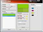
ColorPicker from the old Greytag ProfileMaker suite can do exactly what you're looking for. I think that you can still download it from the x-rite website, and ColorPicker may run without a license, but don't quote me on that.

You load the icc profile that you want to test against (i.e. a custom press profile, or FOGRA in your case), load the Pantone Library as a .txt file (or manually input L*a*b* values), and the software will display the dE and the resulting CMYK when converted through the LUT (Look up table). You can also control the number of channels for the conversion, in case you want to limit it to a 2 or 3 color build. The minimize dE function will usually achieve a slightly lower dE as it bypasses the error of LUT interpolation.

Most higher end color management software can do this is as well. As Gord mentioned, ColorThink, ColorLogic (Basiccolor), Esko ColorPilot. However, none of them do it in as user friendly a manner as ColorPicker. Being an old software, it won't use the latest CMM for conversions, but should be fine for your purposes.

Screen Shot 2019-02-28 at 8.25.08 AM.png
 

Attachments

  • Screen Shot 2019-02-28 at 8.25.08 AM.png
    Screen Shot 2019-02-28 at 8.25.08 AM.png
    227.5 KB · Views: 312
  • Screen Shot 2019-02-28 at 8.25.08 AM.png
    Screen Shot 2019-02-28 at 8.25.08 AM.png
    227.5 KB · Views: 277
  • Screen Shot 2019-02-28 at 8.25.08 AM.png
    Screen Shot 2019-02-28 at 8.25.08 AM.png
    227.5 KB · Views: 271
Pantone Color Bridge is the guide set intended for this. Available from your local Pantone dealer.
 
Pantone Color Bridge is the guide set intended for this. Available from your local Pantone dealer.

Well, besides Pantone® is not the only spot inks vendor, we could discuss on this ... just tell me which print standard it is based on.
 
Well, besides Pantone® is not the only spot inks vendor, we could discuss on this ... just tell me which print standard it is based on.

According to what I have been told by Pantone a couple of months ago, the Pantone CMYK guides are printed according to the old ISO 12647-2-2004 / AMD 2007 standard, so I assume the Color Bridge guides are printed to the same standard. So Fogra 39 for coated paper and Fogra 47 for uncoated paper.
 
Pantone Color Bridge is the guide set intended for this. Available from your local Pantone dealer.

I don't have the bridge in my office and I'm not gonna jump up and get our copy, but I'll tell you right now that I've referred to it and some of the "equivalents" are completely off the wall: really bad hue match, etc. The bridge's matches are like "color guessing by a drunk"... a rich and influential drunk who is egotistic and ignorant and demands respect.

I trust a good prepress eye or pressman, or even my lousy intuition, far more than I'd ever trust the bridge all by itself.

Why beat around the bush? Just say what you mean. LOL

I believe that the Pantone Color Bridge swatchbook is printed on a waterless press. Anyone have its print production info to verify how it was printed? Ink sequence, screening, etc?
 
I don't have the bridge in my office and I'm not gonna jump up and get our copy, but I'll tell you right now that I've referred to it and some of the "equivalents" are completely off the wall: really bad hue match, etc. The bridge's matches are like "color guessing by a drunk"... a rich and influential drunk who is egotistic and ignorant and demands respect.

I trust a good prepress eye or pressman, or even my lousy intuition, far more than I'd ever trust the bridge all by itself.

A lot of the CMYK variations of Pantone colors are not very close to the original, simply because the original is far away from the borders of the CMYK gamut.

I am sure they are as close as you can get in colorimetric terms if you print CMYK according to ISO 12647-2-2004 / AMD 2007, - in regards of density and TVI.

The correct way to approach this reality is to show your customer the Color Bridge with the original Pantone and it's best CMYK variant side by side and then let the customer decide if they accept this - or if they need you to add a spot color to keep the original Pantone color.

That again would mean that you have to be able to print to standards - in your case probably GraCol 2006, to hit the CMYK combinations of Pantone.

I am a standards guy, so in principal I am completely opposed to color corrections and last minute tweaking on press. The job of the printer should be to print in correct density with the correct dotgain, in register and with good water/ink balance.

That is why god invented the ISO 12647 standard.

Best regards

Ingi
 
Not true. You yourself should know that in many cases, custom builds can get you much closer than the bridge book builds. It's simply a matter of finding someone who knows how to do it.

Be that as it may. Printers - including prepress professionals shouldn't have to waste their time trying to do magic. This is exactly why it is a good idea to invest in the Pantone Color Bridge - both for the designer, - and for the printer - to avoid wasting time and to avoid (to at least some extent) difference in color between printers.

Professional designers should by the way know the difference between Pantone spot colors and CMYK.

If they are not ready to pay for spot colors they should just stick to CMYK and use the Spot Matching System or the Pantone CMYK guides.
 

PressWise

A 30-day Fix for Managed Chaos

As any print professional knows, printing can be managed chaos. Software that solves multiple problems and provides measurable and monetizable value has a direct impact on the bottom-line.

“We reduced order entry costs by about 40%.” Significant savings in a shop that turns about 500 jobs a month.


Learn how…….

   
Back
Top