Concerns with Proof File vs Designed Artwork

mattf

Well-known member
I am working with a new print company to develop carton designs. We have received the proofs back with some very minor concerns.

We tentatively have approved them, however I wanted to get some feedback to understand how an Illustrator/EPS file could be placed into a RIP/Prepress software and outputted this way. In short is this specific to our files we have supplied or is this an error with pre-press software/prepress team.

I have the following examples:

1) Color Overlap blends together

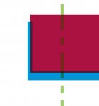
We have a color bar for the main brand and a shadow color band underneath. The PDF shows the top color and overlaps the shadow color, no transparency added in. However within their print proof the overlap between the colors blend together.

2) Outline on shapes

We have oval shapes as single color, however when they returned a proof there was a border around the oval.

3) "Text" Images outlined

One of our brand elements that contains text should be 100% black. On one deliverable it is correct, but on another it showcase black outlined image with a lighter % of black within outline (muddy brown comes to mind).

Any feedback on why this could be occurring would be helpful.
 
Could you post some photos/screenshots of the illy file and of the proof - specificallly the problem areas. It could be with a rip not processing transparency correctly, trap settings, you might also turn on the overprint preview in illy to see what you sent them . . . you would not believe how many times I have seen white set to overprint . . . which make it just dissapear.
 
Could you post some photos/screenshots of the illy file and of the proof - specificallly the problem areas. It could be with a rip not processing transparency correctly, trap settings, you might also turn on the overprint preview in illy to see what you sent them . . . you would not believe how many times I have seen white set to overprint . . . which make it just dissapear.

All 3 examples below.

CE Mark in yellow was correct, green was not.

Oval symbol in design file on top showing how it should display, version below it on how they placed it on the proof.

And finally the color overlapping and blending together.
 

Attachments

  • photo7084.jpg
    photo7084.jpg
    37.2 KB · Views: 304
  • photo7085.jpg
    photo7085.jpg
    8.2 KB · Views: 301
  • photo7086.jpg
    photo7086.jpg
    18.6 KB · Views: 308
Looks like what you are seeing is trapping (a good thing!) Best to voice your concerns to the vendor and they can investigate and tell you for sure.

I'm curious about one thing - you said the proofs are "tentatively approved," yet then go on to describe what you believe are errors. If you think there are errors, then you should not aprove the job in any way until all your concerns are alleviated.

We approved based on the risk of delivering on time + the scale of the issue. In our mind these elements were low risk and we could accept them short term. Don't always have time to correct these types of errors. However it will be great to understand the gap in more detail and see what can be done to mitigate these issues. Thank you for the input!
 
Ditto for what DCurry said, I don't know how much enlargement the images were at but trapping is usually done in thousandths of an inch increments our default "trap" is .002-.003. But we have been know to go in a change it for a specific job. But if your trapping, for instance a yellow and a blue patch together you will get a thin green line between them . . . without this you would frequently see a think white line between them cuz were just not perfect out here.
 
I agree with dabob and DCurry. It looks like you definitely have valid concerns here that you can only sort out by talking with your supplier. No way would I approve as is.
 
If this is digital printing, this looks 100% like prepress issues. Added strokes, and such. Maybe ask your vendor for their actual proof file, and investigate in Illustrator. One issue I see off the bat is use of .eps files placed in illustrator. Why wouldn't you just place native .ai files if multiple or controlled assets are to be used? EPS files are not as smart as .ai or .pdf files when it comes to transparency.
 
This is called trap, it is needed for registration on press. You can ask if they can reduce it a bit but it's most likely still going to be noticeable.
 
For the first image - the black CE, it should just be set to overprint, and you wouldn't see the lighter gray inside.

The other two look to be enlarged significantly for the posted images, and probably aren't trapping as thick as they appear - but I agree with the others, ask your provider to thin it down some.
 

PressWise

A 30-day Fix for Managed Chaos

As any print professional knows, printing can be managed chaos. Software that solves multiple problems and provides measurable and monetizable value has a direct impact on the bottom-line.

“We reduced order entry costs by about 40%.” Significant savings in a shop that turns about 500 jobs a month.


Learn how…….

   
Back
Top