


wonderings
Well-known member
I dont do a lot of large text formatting with indesign, and have with this yearly job have always hacked my way around to get what it the way I wanted. It was not pretty but it worked. This is a program for a Christmas festival concert, 24 pages, of which most is text that I have will be type setting (lyrics, composers, soloists, etc)
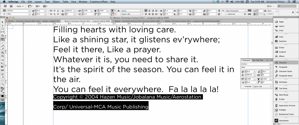
Because they put in the words for some of the songs they need to have the copyright info as well with the song. Normally I have have just made a new text box, sized it the way I wanted and positioned it where I wanted. This becomes a real nightmare when they have changes and the entire document reflows. Obviously I would have to go and manually reposition this copyright info. I was going to insert it right into the text box, in which everything is linked. The problem is this info is much smaller, and in some cases 2 or 3 lines. When I try to adjust the spacing (leading) it becomes a mess and I cannot seem to figure out how to tighten this up without effecting the rest of the text that does need to be adjusted this way. I have taken some screen shots of what I am talking about:
1) I have highlighted the info I need to adjust. For some reason the second line looks different when highlighted (black box bigger).
2) Adjusting the spacing with the text selected leads me to this:
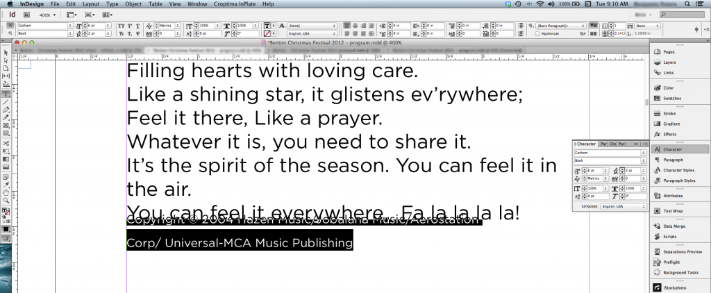
3) Adjust the spacing on just the bottom line gives me nothing at all to tighten up, but does go the opposite way to give me more space, but not less. You can see the change in Leading from 9 to 2, nothing changes at all.
I am sure there must be something small I am missing here, so what is it? How do I adjust this text, without messing up everything else to get it to look like this?

Because they put in the words for some of the songs they need to have the copyright info as well with the song. Normally I have have just made a new text box, sized it the way I wanted and positioned it where I wanted. This becomes a real nightmare when they have changes and the entire document reflows. Obviously I would have to go and manually reposition this copyright info. I was going to insert it right into the text box, in which everything is linked. The problem is this info is much smaller, and in some cases 2 or 3 lines. When I try to adjust the spacing (leading) it becomes a mess and I cannot seem to figure out how to tighten this up without effecting the rest of the text that does need to be adjusted this way. I have taken some screen shots of what I am talking about:
1) I have highlighted the info I need to adjust. For some reason the second line looks different when highlighted (black box bigger).
2) Adjusting the spacing with the text selected leads me to this:
3) Adjust the spacing on just the bottom line gives me nothing at all to tighten up, but does go the opposite way to give me more space, but not less. You can see the change in Leading from 9 to 2, nothing changes at all.
I am sure there must be something small I am missing here, so what is it? How do I adjust this text, without messing up everything else to get it to look like this?


