Introduction / Kodak Staccato Question

Hello PrintPlaneteers,

I work for Frontline Technologies in New Zealand. We are a supplier of pre-press solutions, proofing, colour management plates, setters etc. I have a background in colour management from 'both sides of the fence' having trained in CMYK repro and also spent several years in the 'RGB world' as Digital Production Manager with Getty Images inc in London.

I am a Fogra Certified partner for the implementation of PSO (process standard offset), and have been impressed at the uptake of ISO 12647-2 standards in the market - although I have found that most customers are happy to 'comply' to the standards without actually taking the Fogra/Bvdm PSO tests for certification.

My question is regarding The new ISO standard for NP screening, PSO_Coated_NPscreen_ISO12647_eci, based on the Fogra 43 dataset, and it's suitability (or not) as a target for a Kodak Staccato workflow.

I have achieved a great AM 150/175 lpi result, using Harmony to hit the ISO Coated V2 target gains. These are stated as Curves A (CMY TVI = 13% @ 40) and B (K TVI = 16% @ 40).

The ISO target for NP screening stipulates Curve F - CMYK TVI = 28% @ 40.

So - should I use ISOCoatedV2 TVI aim values or ISO NP Curve F values when printing with Staccato screening (on a magnus/sword ultra/ 20 or 25 micron)?

I would be interested to hear if any other stacatto users have attempted to match the new ISO NP target. The results I got with staccato are very heavy and flat when using (and hitting on press) a 28% tvi @ 40 as the aim value...

Upon measuring linear plates with an IC plate II advanced, AM 150/175# is producing a pretty perfect result - ie max deviation <1 (eg 40=39.5, 60=60.2 etc). A staccato version of the same produces slightly more deviation up to approx 2.5% difference between target/measured (eg 70=67.5, 85=87 etc)

Should I use a separate harmony plate curve to correct to linear before applying a press compensation curve, or will a second curve just cause smoothness problems?

My customers objective is to produce a 'visual match with the improved detail and gamut' (ie not really a match!) that they expect from staccato.

Any thoughts readers have on this subject would be greatly appreciated.....

I look forward to being an active member of this group!


Best regards,

Elton McAleer
 
The ISO target for NP screening stipulates Curve F - CMYK TVI = 28% @ 40.

So - should I use ISOCoatedV2 TVI aim values or ISO NP Curve F values when printing with Staccato screening (on a magnus/sword ultra/ 20 or 25 micron)?

I would be interested to hear if any other stacatto users have attempted to match the new ISO NP target. The results I got with staccato are very heavy and flat when using (and hitting on press) a 28% tvi @ 40 as the aim value...

My understanding is that the TVI aimpoints (Curve F at 28% TVI) for non-periodical screening are such as to not require large plate compensation (over 10%) in efforts to reduce banding and artifacts, but that in order to visually match the tonality of standard screening/TVI aims, its recommended to convert everything printing with such curves to the NP profile, therefore prepping all work for the higher TVI and maintaining visual consistency with standard screening.

From my experience, I'm not convinced that a plate compensation of over 10% results in significant banding or artifacting, so I'm not sure that curve F was the best choice, as it will no doubt cuase confusion. Using Curve F with the associated characterization data and profiles should work perfectly well, but would require all incoming files (new conversion and existing CMYK) utilize the new profiles. If not, things will look too heavy.
 
I have achieved a great AM 150/175 lpi result, using Harmony to hit the ISO Coated V2 target gains. These are stated as Curves A (CMY TVI = 13% @ 40) and B (K TVI = 16% @ 40).
[and]
Should I use a separate harmony plate curve to correct to linear before applying a press compensation curve, or will a second curve just cause smoothness problems?
[and]
My customers objective is to produce a 'visual match with the improved detail and gamut' (ie not really a match!) that they expect from staccato.

Based on your stated objectives, you would make your 150/175 lpi presswork your target and build tone compensation curves for your Staccato screening to tonally align Staccato to your 150/175 lpi target. You may (or may not) need to have a different plate curve for one of the chromatic colors to achieve gray balance. You should not linearize the Staccato plates first. Just run them "uncalibrated."
Once you've achieved a tonal match there is typically very little difference in the color of contone images. That is because the extra gamut is only manifested in one and two color screen tint builds - which are not so common in most CMYK images.

best, gordo

My photography here: Gordon Pritchard's Photography
My sketches here: Sketches by Gordon Pritchard
 
Last edited:
Thanks for your replies, guys.

I like the idea of using the NP screen eci profiles.. but unfortunately most of the data will be pre supplied PDF, and so re-separating the CMYK will be problematic without a decent 4d engine to retain black integrity. (i'd like them to use GMG colorserver and ink optimizer but budget is tight).
- So i'll advise that they continue to sep to IsoCoatedV2 and use the AM dot gains as a target....

I'll go ahead and make a 'target' harmony from the 175# work - can you advise on a 'good' set of nodes - i'm currently using 5, 25, 50, 75, 95...

Thanks again for your input...

Cheers

Elton
 
and so re-separating the CMYK will be problematic without a decent 4d engine to retain black integrity. (i'd like them to use GMG colorserver and ink optimizer but budget is tight).
I'll go ahead and make a 'target' harmony from the 175# work - can you advise on a 'good' set of nodes - i'm currently using 5, 25, 50, 75, 95...

The nodes you've chosen should be fine, although some would go from 5 to 95 in 10% increments. Don't curve lighter than 5% or darker than 95%.
Ink optimizing with an FM screen takes careful consideration as its use involves a variety of plate and press implications. BTW, just using Staccato, should result in an approximate 15% ink savings compared with a 150/175 lpi screen.


best, gordo

My photography here: Gordon Pritchard's Photography
My sketches here: Sketches by Gordon Pritchard
 
I'll go ahead and make a 'target' harmony from the 175# work - can you advise on a 'good' set of nodes - i'm currently using 5, 25, 50, 75, 95...

Elton, it really depends on the results of your testing. I personally don't play with anything below 10%. The fewer "nodes" or control points the better - ESPECIALLY with FM screening. I just did some stochastic testing yesterday, and the resulting curve has only 1-2 control points per channel, and they aren't the same points in each channel. There are those who will disagree with me, but they are, of course, WRONG }:-{>
 
Dear Elton,

Parallel to Gordo's suggestion, we are simulating 150lpi dot gain targets both on 200 lpi periodic and 20 micron non-periodic (Staccato) prints with very good visual match. The extra vividness of Staccato at quarter tones comes as a bonus.

CMYK color space is ISO Coated v2 (ECI) for all images and Harmony target curves handle the rest. We first printed to wet densities, that dries to target Lab values, using "linearized" plates for both perodic and non-periodic screens. Than using GMG's PrintControl Pro, we have generated plate compensation curves to achieve 150 lpi dot gain targets. These two plate compensation curves have than been fed into Harmony as Target curves.

To make good use of the bigger gamut of non-periodic screening, you should generate an ICC profile from the print made with the "linearized" plates (with above target densities) and use this profile as the CMYK color space. However, this requires a totally different color management policy and workflow. You will lose the flexibility of receiving ISO Coated v2 (ECI) images/files from all sources and printing them with whatever screening you or your customer prefers. Where color fidelity to RGB matters, we run the second path.

Regards,

Refik Telhan
OFSET YAPIMEVi
Ä°stanbul, Turkey
 
I agree that a 'wider gamut' custom icc for the press running staccato could give an improved gamut for RGB fidelity, but it has been a long battle to get all parties in our markets' typical sheet fed supply chain to adopt ISOCoatedV2_eci as a'standard' working CMYK space - so the introduction of reseparating/changing color management policies just for stochastic would complicate things too much for many customers at this time...

Rtelhan, I also use GMG print control pro to do my press standardisation work. For tjose who are interested, this is how I set up my standardization curves:

I print a sweep of densities with TVI patches below them on linear (ie 50%file tint = 50% plate dot) and measure the wet densities. It is imperative to use the denso that is tied to the press to record these wet density figures - however i usually also 'double check' live with my gretag denso and PCPro/eye1 to confirm colour is 'in the ball park'.

This allows me to get data at both ends of the LAB threshold (e.g. 1.25 cyan = too light = deltaE >5 through to 1.6 cyan = too dark = deltaE >5) whilst giving a good range of 'working' colour in the middle (e.g. 1.4 - 1.5 wet density cyan, dries to deltaE <3). I leave the sheets overnight to dry before measuring LAB values.

I take an average of TVI patches immediately above and below the optimum (ie lowest deltaE). I have found this to be important as most presses I have encountered here in NZ exhibit a degree of variance from front to back of the sheet due to starvation/roller pressure problems etc.

I have found that AM screening typically takes 2 iterations of the plate compensation curve to achieve primary, TVI and grey balance aim values. Iterations on stochastic seem to introduce banding and artefacts more readily - so, in agreement with Rich apollo above, I'm currently of the opinion that fewer nodes and therefore a smoother curve are preferable to 'chasing' an aim TVI that may produce banding.

My final test chart is an ever-evolving creation. Whilst I concentrate on solids, trap overprints, grey balance and TVI patches, for final customer sign off I always like to include some images. I use the altona suite and, more recently, have begun to use the BVDM 'Roman16" suite of images. I find the supporting info on these images is fantastic...

When I'm confident the curves are correct, I instruct the printer to run the job 'blind' (ie no proof, no visual adjustments) to his 'new' target densities. (Usually 'new' because he previously ran 'by eye' or with some arbitrary densities inherited from "the last guy" or "where I used to work".)

The thrill for me comes next - like some victorian magician, I then produce an ISO Coated V2 certified proof that I have secretly run on the customers' site (most of our customers run GMG ColorProof), and watch the printers' face as it dawns on him that the proof/print match is better than he's EVER had running by eye with the previous plate curves.....

Process control, process control, process control!!
 
Last edited:
Are there any issues or concerns with how the Roman16 images are laid out on the press form? Do they provide any suggested guidelines?

thx, gordo
 
Hey Gordo,

BVDM don't provide sheet layup guidelines, but they do supply a 54 page book with general tips, CIE LAB 'maps' and reference values and a breakdown of what to look for in each image. Images are supplied as 700dpi @A5 size in 16 bit ECI RGBv2, 8 bit and 16 bit ISOCoated V2, all tiff. more info at www.roman16.com

Cheers

Elton
 
The reason I asked was because the majority of the images have a very strong color bias:
Picture3.jpg

Which is unusual for this type of application where typically images have more variety of hues in order to help balance out ink usage on press.
Also, do the cmyk "neutral" color images make use of GCR or UCR, and if so, can you determine how strong the chromatic color replacement was?

thx, gordo

my pics: Gordon Pritchard's Photography
my sketches: Sketches by Gordon Pritchard
 
I agree the strong color bias of the images could cause balancing issues on press without carefeul planning of the test chart. I don't introduce any images to the standardisation procedure until my TVI/solid/overprint chart meets ISO tolerances. The image test chart is a useful tool though - I generally get the customer to plate and print the chart using their existing workflow and methodology (ie usually by eye to a proof) and then output the chart again using the newly created curves.

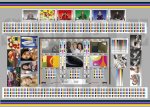
I have attached a lo res of the visual chart I used just this morning (with great success!)...

re UCR and GCR, the supplied CMYK from bvdm are separated as follows:

photoshop cs3
Adobe ACE CMM
perceptual to IsoCoatedV2_eci
(Fogra 39 and 39L dataset)
Paper type 1 and 2

TAC=330
max black=95
k length=9
k width=10

I do quite a bit of work with both RGB separation and CMYK re-separation through GMG colorserver, as well as the assesment of chromatic color replacement with Ink Optimizer. i find the 'neutral' images particularly useful in assessing the quality of separation/reseparation and undercolor removal. (i usually proof CMY and K progressives to check this before going near the press).

in the Roman16 book, BVDM explain (at quite some length!) their reasoning behind the images containing what they describe as a "reduced image language" in terms of content, subject and chromaticity. I won't go any further into their explanations here, but suffice to say they have put a lot of supporting data and information into the pack - which wasn't cheap, but has proven worth every penny..
 

Attachments

  • roman16 visual testform sample.jpg
    roman16 visual testform sample.jpg
    158.1 KB · Views: 372

PressWise

A 30-day Fix for Managed Chaos

As any print professional knows, printing can be managed chaos. Software that solves multiple problems and provides measurable and monetizable value has a direct impact on the bottom-line.

“We reduced order entry costs by about 40%.” Significant savings in a shop that turns about 500 jobs a month.


Learn how…….

   
Back
Top