Hi guys,
I've had this issue for quite a while now. This started back when I was printing on my Canon C710. What would happen is when I would print double sided 100lb text that was high in print colors or saturation, it would spit the sheets out with wrinkling or almost a burning of the sheet. Every time I would call canon out on this issue they would replace the upper and lower fuser units and it seemed like it would get better. The fuser would be changed at maybe 10-20% of its life expectancy. All paper profiles were set correctly according to the GSM of the paper.
Fast forward a bit, I got the Konica C7090 and I would see the same/similar type of issues with this machine as well. They blamed the paper but luckily I had 3 different brands of 100lb gloss text with me and it would do it on all of them. Then they blamed the artwork stating it's had too much saturation on the colors. What they suggested and set up for me was a paper profile for the 100# with much lower GSM(heat) setting to print those specific double sided high saturation jobs. Problem with that is it prints without the toner smearing but it would be a super dull and matte finish.
Now when I print in that low setting, it's starting to jam and spit out wrinkled sheets of paper.
Not sure what to make of this, seemed like this would be more of a known issue in the digital print community since it's happening on two different machines. One of the Konica specialists suggested I lower the density in the fiery to have it lay less toner on the sheets but still obtaining the same color which im not sure if that's possible.
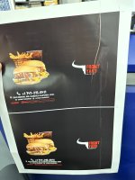
Anyone else have this issue or maybe a suggestion. Any input would be appreciated. I've attached a couple images for reference.
I've had this issue for quite a while now. This started back when I was printing on my Canon C710. What would happen is when I would print double sided 100lb text that was high in print colors or saturation, it would spit the sheets out with wrinkling or almost a burning of the sheet. Every time I would call canon out on this issue they would replace the upper and lower fuser units and it seemed like it would get better. The fuser would be changed at maybe 10-20% of its life expectancy. All paper profiles were set correctly according to the GSM of the paper.
Fast forward a bit, I got the Konica C7090 and I would see the same/similar type of issues with this machine as well. They blamed the paper but luckily I had 3 different brands of 100lb gloss text with me and it would do it on all of them. Then they blamed the artwork stating it's had too much saturation on the colors. What they suggested and set up for me was a paper profile for the 100# with much lower GSM(heat) setting to print those specific double sided high saturation jobs. Problem with that is it prints without the toner smearing but it would be a super dull and matte finish.
Now when I print in that low setting, it's starting to jam and spit out wrinkled sheets of paper.
Not sure what to make of this, seemed like this would be more of a known issue in the digital print community since it's happening on two different machines. One of the Konica specialists suggested I lower the density in the fiery to have it lay less toner on the sheets but still obtaining the same color which im not sure if that's possible.
Anyone else have this issue or maybe a suggestion. Any input would be appreciated. I've attached a couple images for reference.