Strange problem... only with lowercase "d"

wonderings

Well-known member
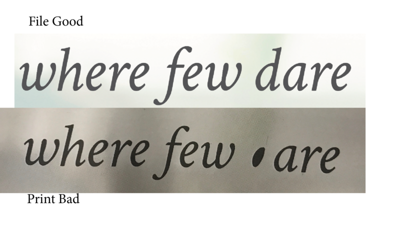
I got a job from a design house we use regularly. Normally problem free, and this is probably not their problem but I cannot figure it out. We have a 16 page job, proofs printed fine, PDF's look great, signed off and approved for press. I make the plates. Pressman is running the next day and pulls off the first sheet for approval. Anywhere the font crimson text italic is used the lowercase letter "d" is missing and substitute with a weird shape dot (looks like it fits in the circle of a lower case d). Cannot see anything wonky with the working file in Indesign. It is the same as the text surrounding it and it happens throughout the job, anywhere that font, and only that font is used. Crimson text bold italic no issue, just Crimson text italic. Anyone ever had anything like this? I have had font issues before, though rare, but never an issue with a single letter of a font where everything else looked fine. It is repeatable, made a new file used the font, just the letter "d" in 100% black and same thing. Is this a weird corruption of the font?

To fix it I converted the imposed PDF fonts to curves and we have the presses running again. Had to toss 12 plates because of the issue. Any thoughts?
 
It sounds like a known issue with, as Kodak put it, 'Non fatal PDF error handling'. In versions of Prinergy before 7.5 the Adobe APPE rip would ignore these errors and font issues won't show up until output. Either in VPS at 800 dpi or above or plate one-bit tiff files. In version 7.5 Kodak explains that 'the new APPE RIP being more strict with fonts and how to use "Non fatal PDF error handling" '. The default setting in the render section of output process template is to fail if it runs across these fonts. We have had a slew of nightmares since upgrading to Prinergy 7.5 as the normalized PDF's look fine but fail at output then you have to track it down to which surface it is and then which page it is. Or just change the setting in the render section to ignore the font data errors which is what we usually do and we haven't got burned yet. I can test this on my rip if you can send me an example file. I would be interested to see if it does this with our setting to ignore the font data errors. One thing we have found is that most of the time this issue arises from users using freeware fonts or web fonts which should be a no-no but you can't tell customers that. Do you know if that font is a freeware font?
 
I seem to remember a lot of issues like this with the free google web fonts. Once you know this of course you can flag them up in preflight or just automatlcally outline them when they exist.
 
I seem to remember a lot of issues like this with the free google web fonts. Once you know this of course you can flag them up in preflight or just automatlcally outline them when they exist.

There are way too many problem fonts in existence to do either one of those. Might as well just outline everything.
 
One thing we have found is that most of the time this issue arises from users using freeware fonts or web fonts which should be a no-no but you can't tell customers that. Do you know if that font is a freeware font?

you can find a freeware font crimson in the www

it looks like a more or less modulated version of a Garamond

i load the free font: an inventary Report about fonts in Acrobat´s Preflight do not detect any suspicuos thing compared with an original garamond.

a test through my ORIS workflow (EPS-based) and a Harlekin RIP show´s no problems, but maybe wonderings font is a copy of a copy-freefont...

It´s long ago that i had acces to fontographer: The fact, that only the small "d" is infected is an urgently hint for something could be done wrong by fontbuilding, what is maybe hidden by former original infos written in the font, so no Preflight will detect it.

I do remember things like path directions, "remove overlap" or / and stroke filling and i guess that´s are the points to start with investigation...

Ulrich
 
Last edited:
Crimson Text is a Google font. Designed for web use.

Designer

tMpJxPzsw2j6SrfBkHfDS41PN6AmTomlFInb9bV343m4tak4ofbfGqZbN8E=w40-h40-fbw=1
Sebastian Kosch

Principal design

About


Crimson Text is a font family for book production in the tradition of beautiful oldstyle typefaces.

There are a lot of great free fonts around, but one kind is missing: those Garamond-inspired types with all the little niceties like oldstyle figures, small caps, fleurons, math characters and the like. In fact, a lot of time is spend developing free knock-offs of ugly "standards" like Times and Helvetica.

Crimson Text is inspired by the fantastic work of people like Jan Tschichold, Robert Slimbach and Jonathan Hoefler. We hope that the free type community will one day be able to enjoy Crimson Text as a beautiful workhorse.

I downloaded it and used it in InDesign and made a PDF and ran it through Prinergy. No issues at all with it. Maybe try the attached font in place of the one you have and see if it still does it.

Crimson_Text.zip
 

Attachments

  • Crimson_Text.zip
    311.2 KB · Views: 205
Crimson Text is a Google font. Designed for web use.


I downloaded it and used it in InDesign and made a PDF and ran it through Prinergy. No issues at all with it. Maybe try the attached font in place of the one you have and see if it still does it.

Crimson_Text.zip


I did remove the font from the customer and use the one attached, same issue.

I did my own search and found the font family free on fontsquirrel.com

We have a very basic setup, no preflight it runs through, I generally just use the preflight in Indesign. This is an obvious case where the built in preflight is lacking. I am guessing it is just an issue with our RIP. Our RIP is a Momentum RIP from Presstek v7.0r2. It is Harlequin but rebadged I guess for Presstek.

Think I am just going to have to watch for these files and outline fonts for this specific brand.
 
Yeah the one on fontsquirrel is the same one as the Google font. Same developer anyway: Sebastian Kosch.
 

PressWise

A 30-day Fix for Managed Chaos

As any print professional knows, printing can be managed chaos. Software that solves multiple problems and provides measurable and monetizable value has a direct impact on the bottom-line.

“We reduced order entry costs by about 40%.” Significant savings in a shop that turns about 500 jobs a month.


Learn how…….

   
Back
Top