gordo
Well-known member
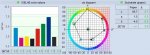
I did a plot of the TVI curves embedded in the official characterization data sets for FOGRA 39, GRACoL 2006, and GRACoL 2013:
FOGRA 39:

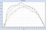
GRACoL 2006:

GRAcoL 2013:

We're told that there is very little difference between GRACoL 2006 and 2013 and that they look almost identical. So why are the TVI curves so different?
The 2013 curves looks like the CMY TVIs have been adjusted to make them identical despite the difference in SIDs of the CMY inks.
Any ideas?
FOGRA 39:
GRACoL 2006:
GRAcoL 2013:
We're told that there is very little difference between GRACoL 2006 and 2013 and that they look almost identical. So why are the TVI curves so different?
The 2013 curves looks like the CMY TVIs have been adjusted to make them identical despite the difference in SIDs of the CMY inks.
Any ideas?


")