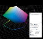
7-color gamut with Hybrid (Screen SPEKTA I, first generation)

Ulrich

Well-known member
Hi

i call this a "challenge": 7-color gamut with Hybrid (Screen SPEKTA I, first generation)

In advance: This is just a theoretical problem, just for "fun", no urgent need for a solution yet, but may be someone is interested in too?
For illustration is here a download with the "original" as an example for difficult blues and screenshots of the bitmapped preview - i hope, that dropbox works:
http://tinyurl.com/hwf6tow
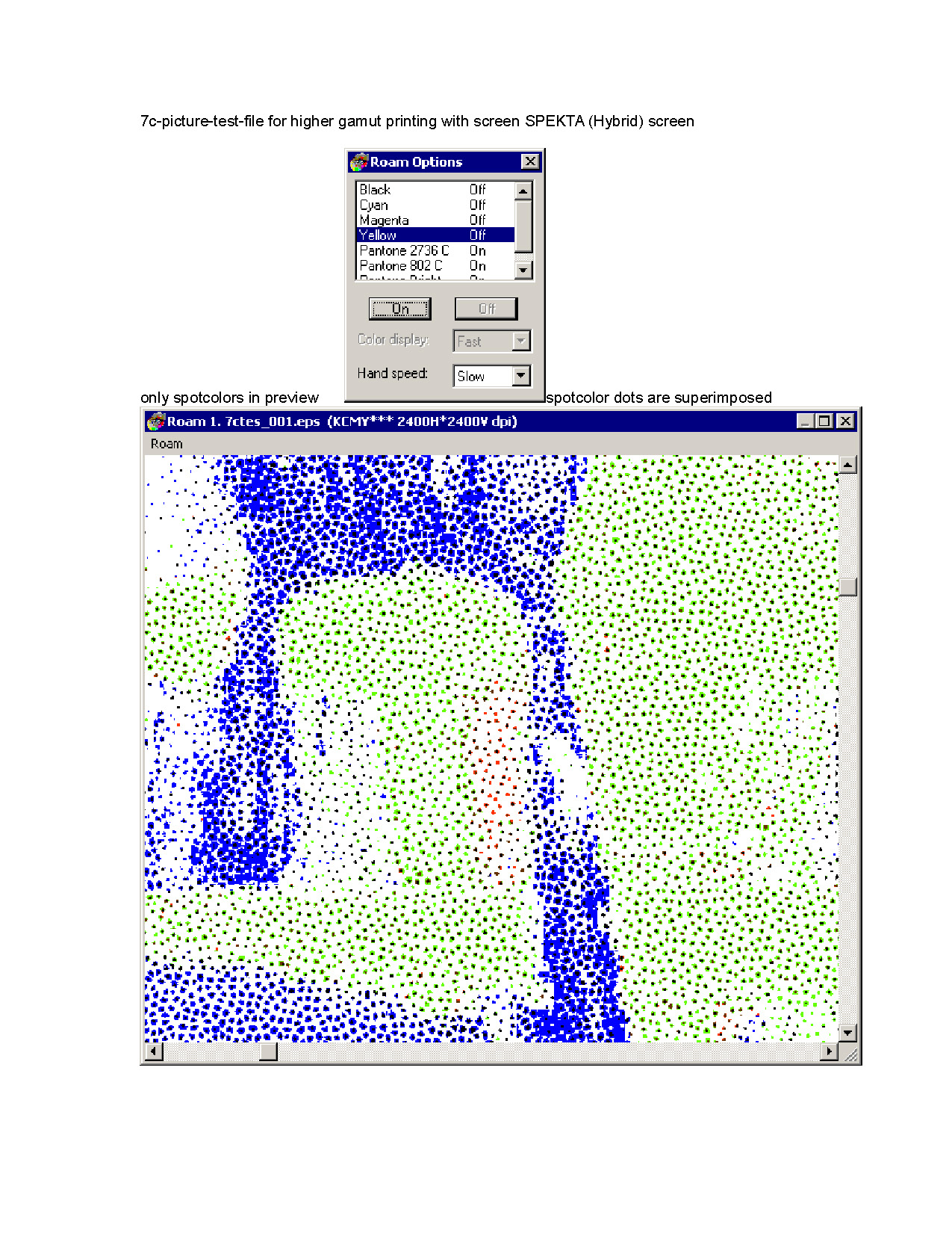
7c_Spot colors superimposed.jpg


By thinking to satisfy a customer with difficult blues in his RGB-Original for Offset on coated sheetfed, it is a short way to think about higher color gamut to get closer to the RGB original.

But with SPEKTA(I) there is a problem:

The separated Spotcolor channels are bitmapped with dots which lies exactly one above the other and that will cause no stable run, because the risk by a slightly different register is high...
(by the way: may be this is the reason for calling SPEKTA a hybrid, because the dot size is diferently as to see in the screenshots and not only the frequenzy as by trueFM/NP(non periodical)?)


I think: Channel mapping the spotcolors to a complementary color could be an idea, but that would not be very smart to handle (spot Green to magenta, spot Blue to yellow and spot red to cyan).


Any ideas or knowledge how to face this very special challenge are welcome, also recommendations for an other color space and profile for more satisfying the RGB-blue?

(I´m sorry: Me is not allowed to share the profile, but you can ask Christian Piskulla, the editor of http://www.cleverprinting.de/experimente/ to get the profile: Cleverprinting_Exp_7c_09_05_2013.icc)

Is this still a problom in SPEKTA II (second Generation)?

And: Would be this a problem for other FMscreens? I guess not, if really the frequenzy of different spotcolor-channels is different..?

And: Any idea how to get a helpfull softproof-preview in photoshop with a 6 or 7 color-profile?


Ulrich
 
Last edited:
Dropbox didn't work for me: "Error (403) It seems you don't belong here! You should probably sign in. Check out ourHelp Center and forums for help, or head back to home."

1. AFAIK Spekta only has screen patterns for 4 colors. I've never seen anything from Screen that suggests otherwise. You'd have to contact them directly to find out why. Other vendor FM screens have patterns for more than 4 colors.

2. What is your concern about channel mapping the spot colors to a complementary color? You said it wouldn't be smart. Why not?

3. RE: "may be this is the reason for calling SPEKTA a hybrid, because the dot size is diferently as to see in the screenshots and not only the frequenzy as by trueFM/NP(non periodical)" In a First order FM screen individual pixels are added pseudo-randomly within the halftone cell simulate different tones. Spekta, like the vast majority on FM screens in use, is a second order FM screen. To simulate different tones, a second order FM screen like Spekta pixels are clustered within the halftone cell to form larger structures. This growing of the dot is what makes 2nd order FM screens hybrids.

4. I wouldn't use a profile to do the separations in your case. I'd just create the extra channel for a Blue printer where needed in PhotoShop.

5. Doing the extra channel(s) in PShop will give you a fairly good representation on screen for how the image will print. The RIP driving your ink jet proofer may know how to handle the 5/C separation (The most recent I did was a Canon proofer driven by an EFI RIP - it did an excellent job showing the difference between a 4 and 5/C separation.)
 
Dear Gordo

thanks for response, i failed to post jpegs here but was sending you a mail with the screenshots now...

1.
interesting, i didn´t notice that there a only screen patterns for 4 colors only till yet!
Mostly Duotones came with Black and one spotcolor, but we are not producing duotones very often... I will have a look to it tomorrow.
In past - maybe 15 years ago - we have driven one job against the wall with duotones in two different spotcolors with no Black, there we discover the "problem".

2.
may be it´s "clever", but not "smart" in the meaning of a comfortably way to handle. I guess in that case i had to send every 7-colored job two times to the RIP: 1. for CMYK and 2. the spotcolors, otherwise i´m mapping the spotchannel in the complementary CMYK-channel, if there is content, or not? There is no - or i just don´t know a - control in SPEKTA to lead a color to a chosen and determined pattern, for example "pattern #1" of 4 different patterns.

3.
sorry, i need some time for a precice translation into german, that i get it in a way to answer whithout stealing your time. I will try it tomorrow. For now just this: I think i´m not working with SPEKTA as a FM second order, i mean there are two versions of SPEKTA and i´m sure to work with the elder one...

4.
very smart idea! ;-)
I´m always making things complicate first without a need for...

5.
... otherwise I think it´s not possible to mesuare Lab-values of a spotcolor in an extra channel in photoshop, so how could i believe what i´m seeing in the softproof-preview, if i couldn´t control it without a real dataset from a build and tested (not tested by myself..) profile?
But i´m absolutly not clear in my understanding of this point, what is one of the reasons for posting here.


Thank you very much!

Ulrich
 
Dear Gordo

thanks for response, i failed to post jpegs here but was sending you a mail with the screenshots now...


2.
may be it´s "clever", but not "smart" in the meaning of a comfortably way to handle. I guess in that case i had to send every 7-colored job two times to the RIP: 1. for CMYK and 2. the spotcolors, otherwise i´m mapping the spotchannel in the complementary CMYK-channel, if there is content, or not? There is no - or i just don´t know a - control in SPEKTA to lead a color to a chosen and determined pattern, for example "pattern #1" of 4 different patterns.

I don't know about your RIP but typically there is a screening cycle. So the RIP starts with KCMY then cycles through KCMY for the spot colors. So: KCMY Spot 1=K, Spot 2=C, Spot 3=M, Spot 4=Y, Spot 6=K, Spot 7=C and so on. Some systems have specific screen patterns for the spot colors - a much better solution. That was the case with Staccato the screening I worked on. You need to find out from your RIP vendor how it handles this problem or you will need to use a workaround. I.e. RIP the spot color separately as a color that you want the screen to be. E.g. Take the grayscale of the 5th color, colorize it as Yellow then RIP it. The RIP should apply the Yellow screen pattern. Then bring than bitmap into your work flow.

3.
sorry, i need some time for a precice translation into german, that i get it in a way to answer whithout stealing your time. I will try it tomorrow. For now just this: I think i´m not working with SPEKTA as a FM second order, i mean there are two versions of SPEKTA and i´m sure to work with the elder one...

For your purposes both Spekta 1 and 2 are the same.

5.
... otherwise I think it´s not possible to mesuare Lab-values of a spotcolor in an extra channel in photoshop, so how could i believe what i´m seeing in the softproof-preview, if i couldn´t control it without a real dataset from a build and tested (not tested by myself..) profile?
But i´m absolutly not clear in my understanding of this point, what is one of the reasons for posting here.


This is speculation:
Pantone colors in PShop have Lab values built in. The buildt in Lab colors determine how the spot color will be displayed by PShop. What PShop will have a problem with is showing how the spot color appears when it is overprinting another color. However, since you are overprinting C+M (blue) with a spot Blue, the overprinting color display in PShop is not really a problem. At least that has been my experience.
You do not need a profile for this application.
 
Last edited:
Thank you again Gordon,

espaccially for your hint, that there are only 4 different patterns in SPEKTA.

Some systems have specific screen patterns for the spot colors - a much better solution.
Yes, indeed it is! ;-)

I´m working with a very old Version of a Harlekin RIP (v. 5.3.1) in which is the SPEKTA I modul is licenced.

Unfortunately there is no "cicle" according the sequence of cmyk and spotcolors and the "funny" thing is, that all spotcolors are bitmapped with the pattern of magenta. It does not take any effect, if i try transparency or opaque instead of normal in the Harlekin-RIP-dialog or if i change the sequence of the cmyk-channels from KCMY into KCYM.

3. RE: "may be this is the reason for calling SPEKTA a hybrid, because the dot size is diferently as to see in the screenshots and not only the frequenzy as by trueFM/NP(non periodical)" In a First order FM screen individual pixels are added pseudo-randomly within the halftone cell simulate different tones. Spekta, like the vast majority on FM screens in use, is a second order FM screen.
So I´m with you calling SPEKTA a FM (and not a hybrid, as "offical" scientists (Basner/Dolezalek/Gemeinhardt/Vierkorn) from the FOGRA did in a Publication edited 2006 i read),
in any case my brain is to limited:
I could not find that characteristic, that i had learned as "classical" hybrid-screens are working with a minimum dotsize tonevalues from 0-10% and 90-100% with a stochastic distributed pattern and between 10-90% with a fine amplitude modulation like an 250lpi or higher, for Example like AGFA´s Sublima.

For your purposes both Spekta 1 and 2 are the same.
Because the intention to use it for colored halftone pictures and not for tecnical (vectorbased) grafics with only one tone-value or a gradient, right? (I understand the elder, first order FM were not so suitable for such tecnical objects? Yes, sometimes - belonging to the colors and dotshapes or whatever - there are examples, that an AM with only 150lpi is more suitable for such sujets as a higher 200lpi AM, because it is smoother. The clustering like a wurm-structure in the second generation FM minimize disturbances compared with the FM of the first generation.)

To simulate different tones, a second order FM screen like Spekta pixels are clustered within the halftone cell to form larger structures. This growing of the dot is what makes 2nd order FM screens hybrids.
?
Please see above, but probably i did not understand you correctly.
Please be for sure, that i am not interested in contradicting your knowledge, which is definetly more expierenced and wider spreaded than mine (just working for 20 years in the same company and now 15 years with the same essential RIP as an essential tool...).


In this context - facing the challenge to difference content and keep drawing in difficult colors out of the "normal" 4c-gamut - FM comes in my mind, because the slightly bigger gamut compared with an AM-production. Don´t understand me wrong: I strongly suspect someone to be a masochistic charlatan who dreams of being tarred and feathered who prefers FM only for this reason of a slightly bigger gamut, but in theorie it is an obvious thought to collect all possible opportunities first.

To work with a profile for a 6 or 7 colored gamut is also obvious, when more pictures are to optimize than only one, or not? But of course you are absolutly right, that also the softproof preview with a 7 colored profile happens with the deposited Lab-values in photoshop.

So without testing hardcpoy-proofs and real prints there will be no solution in sight only by thinking, but first there is no budget for and second is left the question does the result justifies such a hazzle if you compare this picture with left rgb, middle 7c and on the right ISOcoatedv2... ;-)

RGB 7c ISOcoated.jpg - Click image for larger version  Name:	RGB 7c ISOcoated.jpg Views:	1 Size:	1.04 MB ID:	259057

Thanks for reading! (and don´t respect the graybalance...)

Ulrich
 
Last edited:
Just for the record...
[SNIP]facing the challenge to difference content and keep drawing in difficult colors out of the "normal" 4c-gamut - FM comes in my mind, because the slightly bigger gamut compared with an AM-production. Don´t understand me wrong: I strongly suspect someone to be a masochistic charlatan who dreams of being tarred and feathered who prefers FM only for this reason of a slightly bigger gamut, but in theorie it is an obvious thought to collect all possible opportunities first.

FM screening doesn't have a bigger gamut than AM because of the dot shapes or how they're arranged. FM has a bigger gamut because the dot sizes are smaller. If you run an AM screen at about 350 lpi then its gamut will be similar to a 20 micron FM screen.

The extra gamut only applies with one and two color screen tint builds. As soon as you add a third color to a screen build it reduces the chroma. One and two color screen builds rarely happen in images. Because human vision is adaptive, it's unlikely you'll see the difference in gamut where it happens.

To work with a profile for a 6 or 7 colored gamut is also obvious, when more pictures are to optimize than only one, or not? But of course you are absolutly right, that also the softproof preview with a 7 colored profile happens with the deposited Lab-values in photoshop.

If you have a good 6 or 7 color profile (e.g. one that preserves neutrals and single colors, etc.) and you're doing a lot of that kind of work and the ink colors you use are always the same then a profile might be a good idea.
However, you do not need a profile to do 5, 6, or 7 color separations. Doing separations without a profile gives you much greater flexibility in choosing the extended gamut inks you use and where in the image they will be applied. I know of one commercial 5, 6, or 7 color separation that does not use a profile and that does a very good job at automating this kind of work. But for once in a while use I prefer to do it manually in PhotoShop.
 
Last edited:
Dear Gordo,

now quite ashamed (in only two conversations with you learning more than the last years...)

The extra gamut only applies with one and two color screen tint builds. As soon as you add a third color to a screen build it reduces the chroma.

?

I´m still chewing this, clear is only that the solids in AM and NP are the same and differences in gamuts happens in the lighter midtones


owing you a donation on your web-site (as many others here , too, i think...)

Ulrich
 

Attachments

  • image_5951.jpg
    image_5951.jpg
    16.3 KB · Views: 427
Last edited:
The difference in gamut between AM and FM happens around 15% and 85% and is largest around the 40-60%.

In a 4/C separation the third chromatic color always greys (reduces chroma) of the other two chromatic colors. So, if you add Yellow to an M and C screen tint - the Y reduces the chroma of the M and C patch. That's the idea behind doing GCR - instead of using a chromatic color like Yellow to grey the M+C color, use Black instead.

On a related note. Just to be technically correct. FM screens (or very high lpi AM screens) do not increase gamut. What they actually do is reduce the gamut less than coarser screens. That is because the color you see is the result of light being filtered by the ink. With coarser screens there are more and larger spaces between the halftone dots. The light that hits those spaces of unprinted paper are not filtered by the ink. So that light acts to grey, or lessen, the potential gamut.
 
On a related note. Just to be technically correct. FM screens (or very high lpi AM screens) do not increase gamut. What they actually do is reduce the gamut less than coarser screens. That is because the color you see is the result of light being filtered by the ink. With coarser screens there are more and larger spaces between the halftone dots. The light that hits those spaces of unprinted paper are not filtered by the ink. So that light acts to grey, or lessen, the potential gamut.

Gordon, I know you have stated similar comments before. I think there is some kind of problem with the logic but it might only be semantics.

On one issue, I would say that coarser screens would have fewer not more spaces between the dots but those spaces would be bigger.

In my view, Gamut size would only be related to the size of the outer surface of the mapped Gamut volume. Any point within the Gamut is not a gamut increasing issue. So just because some combination of screens have a different colour in FM and AM or when applying GCR, it probably does not have anything to do with increasing gamut unless it is on the gamut surface.

My basic view, which could be wrong, is that the primary determination of Gamut size is the solids and the overprint of pairs of solids. Difference in screening might have some affect between these points. But if one talks about screening of more than 2 sets of screens, the the resulting colour is within the gamut space and should have no affect on gamut size.

On the issue of the light hitting the unprinted paper, I understand your point about it greying the colour but I would argue that it has nothing to do with the potential of the Gamut. Any potential gamut would be related to the resulting colour of the actual dot itself, which is closely related to the solid. Also if you have a solid and you want to lighten it, you need to have a screen which allows the reflection of white light. And yes, doing that does grey it in the technical sense but if that is the colour you want to get then that is what you have to do. If you want an increase in gamut of that screen, then one has to go and increase the gamut of the solid.

I might be wrong about a lot of this because it is a bit hard to think in terms of where on is in a gamut space for any combination of solids, screens etc. :)

If I understand you correctly, your thinking about the gamuts is similar to what GATF's was in 2003 when they did a study (by Gregory Radencic) of FM screening and presented their findings in a research and technology delivered at their annual tech conference. They stated that the gamut was determined by the solid ink densities. Therefore they didn't look at the gamut volume itself.

I, and some of my creo coworkers formally protested about the methodology used in evaluating the screening technologies. Also, their conclusions about gamut contradicted studies from other print technology organizations as well as what the various vendors of FM screening were saying.

So GATF redid their evaluation (this time by John Lind) and presented their conclusions at the tech conference the following year. In that report John now found that the FM screening had an 11% greater gamut than the AM screen. John did not really speculate as to why that would be so (the gamut question was not the main focus of the study).

The mechanism for why FM exhibits a greater gamut is still a matter for speculation. The research that we did at creo pointed to the difference in the amount of light reflecting off the uninked paper being the primary cause. I believe that a TAGA paper suggested that it was the difference in ink film thickness homogeneity across the surface of the halftone dots that is the cause. I don't know.

What I do know is that if the SIDs are the same and the tone (density) values are the same then, for example, the color of a 50% 175 lpi AM screen will not match the color of a 20 micron FM screen. You can make the FM patch match the AM patch by greying it with black or C+Y but there's nothing you can do with the AM screen that will allow it to match the FM (except increase the AM lpi of course). I.e. the 50% FM patch is out of the AM screen's gamut. And if you profile the two screens you can see that the FM gamut volume is larger.

Gordon

I am probably thinking in line with the earlier view of gamut but I also am aware of the potential different affects of different screens would have on colour. Even in my 1997 TAGA paper, I referred to the difference in how light is reflected by screens of a smaller dot which would tend to have a thinner ink film. Later, I had analyzed why there would be a colour shift when the dot ink film thickness is not the same as a solid. And from measurements, it is known that the hue of screens is not consistent through the total range from 0% to 100% for the same ink and screen set. It curves on a Lab plat and from my analysis, ink film thickness tends to support that result. In Dry Offset, which is similar to flexo, a thick ink bead can be printed as a result of ink squeezing out from under the flexo style plate, and that thicker ink can cause a hue shift in a different direction.

So I have not said that the screens can not change the gamut but that the solids and overprints were the main drivers. I accept that FM can increase the gamut in a specific location on the gamut space surface. In that situation, I agree that no combination of AM screen would be able to reproduce it there.

What I don't know is if the results you talk about, shows that FM causes the gamut to increase in all areas of the surface of the gamut. Is it possible that FM can decrease the gamut in other areas and therefore there would be no combination of FM screens that could match the AM result in that area of the gamut surface?

Also, is any increase in Gamut, via FM, actually enough to make a difference to a printing business?

As always, these are interesting issues but ones that probably have little practical value to most people. :)
 
[snip]And from measurements, it is known that the hue of screens is not consistent through the total range from 0% to 100% for the same ink and screen set. It curves on a Lab plat and from my analysis, ink film thickness tends to support that result.

Correct. If you do a "spider" diagram the hue of an ink color is not a straight line from 0% to 100%. It curves and hooks depending on the screening.


So I have not said that the screens can not change the gamut but that the solids and overprints were the main drivers.

Correct. A shift in SIDs or overprint trapping will have a greater impact on gamut that screening will. However, the screening still has an impact.

I accept that FM can increase the gamut in a specific location on the gamut space surface. In that situation, I agree that no combination of AM screen would be able to reproduce it there.

Good.

Is it possible that FM can decrease the gamut in other areas and therefore there would be no combination of FM screens that could match the AM result in that area of the gamut surface?

I have not seen that.


Also, is any increase in Gamut, via FM, actually enough to make a difference to a printing business?

If it permits a printer to simulate a greater range of PMS color and/or get a better result on a poor substrate then, yes, I think it makes a positive difference.

As always, these are interesting issues but ones that probably have little practical value to most people. :)

Well, the gamut question is just one of many benefits for using FM screening - including its use in a flexo environment.
 
very interesting discussion, gentleman


so, this is quit more correct:

To simulate different tones, a second order FM screen like Spekta pixels are clustered within the halftone cell to form larger structures. This growing of the dot is what makes 2nd order FM screens hybrids.

but this was not totally wrong:

may be this is the reason for calling SPEKTA a hybrid, because the dot size is differently ... and not only the frequency as by true FM?


-------------------------
-------------------------


The extra gamut only applies with one and two color screen tint builds. As soon as you add a third color to a screen build it reduces the chroma.

+

In a 4/C separation the third chromatic color always greys (reduces chroma) of the other two chromatic colors. So, if you add Yellow to an M and C screen tint - the Y reduces the chroma of the M and C patch. That's the idea behind doing GCR - instead of using a chromatic color like Yellow to grey the M+C color, use Black instead.

so, this is not a specific FM issue, it concerns also AM, and with this added input from Erik:

...FM can increase the gamut in a specific location on the gamut space surface. In that situation, I agree that no combination of AM screen would be able to reproduce it there.

+

Is it possible that FM can decrease the gamut in other areas and therefore there would be no combination of FM screens that could match the AM result in that area of the gamut surface?
I have not seen that.

as question is still left (for me):

are there no gamut differences in that mayor part of the gamut that is build by three chromatic colors between FM an AM? If so, why?


Well, the gamut question is just one of many benefits for using FM screening

without a doubt others are:

- no - or depending to the picture - much less issues with Moiree

- no frayed edges by halftoned fonts

- no "brakes" by thin and curvy lines


but why FM is even in CTP-times still an exot? I mean if there are only benefits and no cons...

The calibration? Immobility/ignorance/"fear" of most of the printers? The Equipement of the printers?


-------------------------
-------------------------


...Gordo, (or Erik maybe?)

i have already a guilty conscience by overstraping you, but in the other post you said, you have been beta-Tester for AGFA and developed a plugin for Photoshop, so i would never get a better chance to place this question:


By what tecnical aspects (and not physiological) is caused which picture-resolution (ppi in a Photoshop halftone-file...) for FM?

I know already to difference between human eye-aspects of the viewing distance (which causes about 300ppi for books and flyers) and tecnical reasons to get 256 tones pending to the resulotion of the device and the AM screen-frequency, at least the idea of the Nyquist-Shannon-Theorem in which is said that there is a need for a doubbled recorded signal frequency to get no information lost for an output on another device.
So that makes this sense for scanning: 300 ppi for150 lpi and 2540 dpi.

But in FM there is no "frequency" as the lines in AM

There are a lot of fairytales around in the buisines, i think:
Some says you need 450ppi, some "take the best for the best" (600ppi) and others said 254ppi for a 20 micron dot and 169ppi for a 30 micron dot, a one-pixel-size have to have the fifth of the minimum dotsize, but couldn´t explain me why...

I believe to "know" 300ppi are enough, but for physiological reasons, the tecnical aspect don´t need them...

Enlightenment is urgently need!!! (I´m sure: not only for me...)


Thanks a lot,

Ulrich
 
Last edited:
but why FM is even in CTP-times still an exot? I mean if there are only benefits and no cons...

The calibration? Immobility/ignorance/"fear" of most of the printers? The Equipement of the printers?

You have to consider also this:

FM-production happens in most cases still with CMYK-files with a separation in a lower gamut profile like a NP-profile...

Okay, an ISOcoatedv2 or GraCol2016 Gamut will be increased in the moment of printing, but it is not the same, as a NP-profile separated file builded up directly from a RGB-source. (Quite similar to some higher gamut printing restrictions with already cmyk-separated files...)


Ulrich
 
as question is still left (for me):

are there no gamut differences in that mayor part of the gamut that is build by three chromatic colors between FM an AM? If so, why?

I don't understand your question. In 4/C printing you have 3 chromatic colors (C,M,Y) and one achromatic ink (K). When the 3 chromatic colors are used to create a color - one of them greys the color. I don't think that there would be any practical difference between AM and FM in that regard.


but why FM is even in CTP-times still an exot? I mean if there are only benefits and no cons...

The calibration? Immobility/ignorance/"fear" of most of the printers? The Equipement of the printers?

There are possible cons but but they are far out weighed by the benefits. IMHO some of the biggest reasons why more print shops don't use FM is ignorance, unwillingness to change, non-interest in responding to their customer needs, inability to understand marketing, the list goes on.


By what tecnical aspects (and not physiological) is caused which picture-resolution (ppi in a Photoshop halftone-file...) for FM?

If the pixels of the original image can be seen in the printing then the resolution of the image is too low for the screening (or the resolution of the screening is too high for the image - same thing) - AM or FM.
This is explained on my blog: http://the-print-guide.blogspot.ca/2009/04/image-resolution-for-printing-lpi-vs.html

I know already to difference between human eye-aspects of the viewing distance (which causes about 300ppi for books and flyers) and tecnical reasons to get 256 tones pending to the resulotion of the device and the AM screen-frequency, at least the idea of the Nyquist-Shannon-Theorem in which is said that there is a need for a doubbled recorded signal frequency to get no information lost for an output on another device.
So that makes this sense for scanning: 300 ppi for150 lpi and 2540 dpi.

The lpi/dpi 256 gray levels restriction is correct for a single halftone dot but not for a tone area for modern screens (since about 1984) http://the-print-guide.blogspot.ca/search/label/Grey Levels

But in FM there is no "frequency" as the lines in AM

Actually there is. Most FM screen patterns are built within halftone cells just like AM screens. The halftone cells repeat, therefore they have a frequency. Because they have a frequency they have a virtual lpi. On a 2400 dpi device a 20 micron FM screen has an equivalent ruling (lip) of 385 lpi.

There are a lot of fairytales around in the buisines, i think:
Some says you need 450ppi, some "take the best for the best" (600ppi) and others said 254ppi for a 20 micron dot and 169ppi for a 30 micron dot, a one-pixel-size have to have the fifth of the minimum dotsize, but couldn´t explain me why...

As I wrote before: if the pixels of the original image can be seen in the printing then the resolution of the image is too low for the screening (or the resolution of the screening is too high for the image - same thing) - AM or FM.

For a 20 micron screen I would normally use 400 dpi @ 100% reproduction size. 300 dpi would also work. Many RIPs are preset to resample incoming images to 300 dpi and most printers are not aware that the resampling is happening and aren't complaining.
 
Gordo,

as question is still left (for me):

are there no gamut differences in that mayor part of the gamut that is build by three chromatic colors between FM an AM? If so, why?
I don't understand your question. In 4/C printing you have 3 chromatic colors (C,M,Y) and one achromatic ink (K). When the 3 chromatic colors are used to create a color - one of them greys the color. I don't think that there would be any practical difference between AM and FM in that regard.

Better would have been i had awsked: Is it with FM possible to reach a color value out of the AM gamut with three colors or two colors and black?


I had posted a (worse) colorthink-3d-gamut visualized picture with the profiles ISOcoatedv2 and PSO_Coated_NPscreen_ISO12647_eci before. The first is AM-gamut the second FM-gamut on the same papertype, both Separations with a TAC 330% in the deep black. The bigger gamut NP-(Non Periodical)-Profile is transparency, so that you can see the bigger gamut area compared with the AM-Profile

You wrote before:
The extra gamut only applies with one and two color screen tint builds.
so, that means, the visualized difference shows color values they are caused only by tonal values of primary and secondary colors (y+m, m+c, c+y)? On the first look it seems that all differences happens above the edges (pinks?) of the solids and secondarys, but below the Cyan and green edges (pinks?) is a very small, but an area. The areas below the edges but must have either a third color or black and i think it doesn´t matter if you gray a secondary color with a third or with black in this context. But as you said already, it is not remarkable.

(By the way: in numbers color think points out for the NP-profile a volume 425.358 and for the AM 402.279, so the NP is 5.7% bigger than the AM, and that is, but not very much bigger.)

_______
_______

The lpi/dpi 256 gray levels restriction is correct for a single halftone dot but not for a tone area for modern screens (since about 1984) http://the-print-guide.blogspot.ca/s.../Grey Levels
I was unable to imagine that the principle of the supercell-method (not a light meal at all) works in the same way for FM although i noticed that something must be had "optimized" using FM for 300 ppi and below files... ;-)

For a 20 micron screen I would normally use 400 dpi @ 100% reproduction size....
So, you do it for keeping details and sharpness in photography, but because the supercell-methods a gradient as TIFF or JPEG don´t need 300ppi for an exposure with 2400 dpi, is that correct?


Thanks for your patience, Gordo

Ulrich
 
Last edited:
Better would have been i had awsked: Is it with FM possible to reach a color value out of the AM gamut with three colors or two colors and black?

I don't think so. At least in practice vs theory.

(By the way: in numbers color think points out for the NP-profile a volume 425.358 and for the AM 402.279, so the NP is 5.7% bigger than the AM, and that is, but not very much bigger.)

When GATF tested 133lpi vs 25 micron the calculated number of one delta E cubes for the FM color volume was 389,556 vs 350,395 for 133 lpi - an 11% increase in gamut volume. Your mileage may vary.

So, you do it for keeping details and sharpness in photography, but because the supercell-methods a gradient as TIFF or JPEG don´t need 300ppi for an exposure with 2400 dpi, is that correct?

I think you're confusing things. 300 dpi for an image is not related to grey levels on a 2400 dpi device. Supercells are a method for achieving correct AM screen angles and also uses dithering to get all the grey levels on a 2400 dpi device. FM screens typically deliver 256 levels of grey because they don't waste pixels in the halftone cell to build a large structure like a halftone dot.

[/QUOTE]
 
FM screens typically deliver 256 levels of grey because they don't waste pixels in the halftone cell to build a large structure like a halftone dot.

I don't believe AM "wastes" pixels and FM doesn't. For the same gray level (before linearization), a uniform area of AM and FM screening contains the same amount of pixels. e.g., in a block of 30% cyan, both AM and FM should contain 30% of "on" pixels. That's one of the basic requirements of a good halftone matrix.

The reason FM screening produces the full range of gray levels more easily than AM, is because its pixels are not constrained to small, repeating cells with a fixed size and growth shape. If you construct an FM matrix of 16x16 pixels and an AM one, both will produce 257 gray levels, but the AM screen can be coarse, depending on the resolution of the device. If you want higher LPI, you'd get a smaller halftone cell but also less gray levels. FM screening does not have this limitation - to reduce the visibility of the repeating FM halftone matrix, I can construct one with 256x256 pixels, for example, without sacrificing detail.

By the way, I wanted to ask you about this:
Actually there is. Most FM screen patterns are built within halftone cells just like AM screens. The halftone cells repeat, therefore they have a frequency. Because they have a frequency they have a virtual lpi. On a 2400 dpi device a 20 micron FM screen has an equivalent ruling (lip) of 385 lpi.

How do you measure the equivalent LPI of an FM screen?
 
How do you measure the equivalent LPI of an FM screen?

To decide on the equivalent lpi for the whole tone range, the method that I've seen most used is to count the number of transitions in a linear inch. (Draw a one inch line through a halftone area and count the number of pixel clusters in that distance.) If it's a 150 lpi screen there will be 150 transitions in that inch. If it's 20 micron FM there'll be 385 transitions - so, 385 lpi.
 

PressWise

A 30-day Fix for Managed Chaos

As any print professional knows, printing can be managed chaos. Software that solves multiple problems and provides measurable and monetizable value has a direct impact on the bottom-line.

“We reduced order entry costs by about 40%.” Significant savings in a shop that turns about 500 jobs a month.


Learn how…….

   
Back
Top