Color rendering with direct offset printing on brown kraft cardboard

lexignot

Member
Hello!

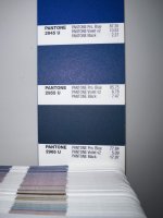
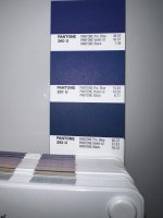
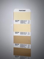
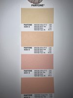
We did offset printing directly on a brown kraft paper board of 350G with a blue background in pantone 2767C and text on it in pantone 155C (flesh color). The rendering is darker than expected for both colors (see picture below the comparison between our sample and the reference). I know it’s doable to get a lighter color result as you can see on the picture below with an example from a competitor (left box on the picture). The color rendition of the Reference is obtained by digitally printing the artwork on regular white paper with Blue (#182D48) and Flesh (#F0D09F). We've tried digital printing with CMYK on the brown kraft paper and the result is even worse (very dark). Additional requirement, the client wishes to retain the brown color/authenticity of the kraft paper, that's why we print directly on it (and not on a white kraft paper).

Would you have any recommendations on how to get lighter colors (closer to reference) with offset printing directly onto brown kraft paperboard (i.e. add more layers of ink, use lighter pantones considering the existing brown color tone of the paper board, other recommendations, etc.)?

Thanks in advance for your help with this!


View attachment 292172
 

Attachments

  • Box colors rendering - 3 boxes - Isabel.JPG
    Box colors rendering - 3 boxes - Isabel.JPG
    74.8 KB · Views: 220
Last edited:
Three ideas:

1. Two hits of white ink dry trapped as a base where needed might help a little

2. (silk) screen opaque white as a base where needed

3. use white kraft and print the brown texture
 
Last edited:
Three ideas:

1. Two hits of white ink as a bse where needed might help a little

2. (silk) screen opaque white as a base where needed

3. use white kraft and print the brown texture
You left out one option.
Use a white ink base instead of the usual clear base to create a more 'opaque' color ink, ie add opaque white and remix accordingly.
This might be the one that was used on the sample.
 
Silver (Pantone 877) can sometimes be more effective that white as metallics have greater opacity
Both you & Sheetsqueezer are correct about underlay and dry traps.
But . . .
OP mentioned you could see the paper through the ink. I thought a mixed ink with a white base would achieve this with less effort.
YMMV.
 
Silver (Pantone 877) can sometimes be more effective that white as metallics have greater opacity
Or maybe even silver, then white? On a side note, you should maybe consider changing your name to Magnus800, because of the most obvious reasons. 😆
 
Or maybe even silver, then white? On a side note, you should maybe consider changing your name to Magnus800, because of the most obvious reasons. 😆
Well Magnus is my name for this group, because I run a Magnus (400Q) while 59 is the year I came into the world :)
 
You left out one option.
Use a white ink base instead of the usual clear base to create a more 'opaque' color ink, ie add opaque white and remix accordingly.
This might be the one that was used on the sample.
Adding opaque white to the mix has always worked out well for us. If the mix calls for white, substitute opaque white. If it doesn't, up to 5% in the mix can bring your color back. 5% being for darker material. Kraft 2%-3%.
 
Outsource to a trade/packing printer who has a press with an UV anilox coater in unit #1 to lay down opaque white first. Use a flexo relief plate.

If customer doesn't care about how the inside of the box looks, print on white litho wrap sheet to match kraft color, then emboss corrugate texture pattern.
 
Send the sample you want to match and the stock you are printing on to your ink supplier. They will create a custom match and will be able to teill you if opaque white is needed in color match or to be applied first.
 
Hello all and thanks for your answers, it's very helpful! I think adding 2-3% opaque white should do the job, I'll try. I scratched the Box Example and didn't see any white layer. Let's see, I keep you posted. Thanks!
 
Question, will I get a better result if I convert pantone 2767C (Blue) and pantone 155C (flesh) to their pantone equivalent the U-Series (uncoated), knowing I still want to print directly on a brown kraft paper board of 350G?
 
Adding opaque white to the mix has always worked out well for us. If the mix calls for white, substitute opaque white. If it doesn't, up to 5% in the mix can bring your color back. 5% being for darker material. Kraft 2%-3%.
Hello,

Thanks for your answer.

Below are photos of the Pantone colors (Pantone 282 U, Pantone 2965 U, Pantone 4029 U, Pantone 7507 U and Pantone 7506 U) I want to test on the kraft paper with their mix. If I understand correctly, for the Pantone colors 4029 U, 7507 U and 7506 U, I should replace the Pantone Trans Wt. by the Pantone Opaque White and for the Pantone 282 U and 2965 U, I should add 2-3% opaque white to the mix since there is no Trans White in their mix, correct?

Should I do this in addition to the white layers underneath the color Pantone (i.e. white layer dry trapped)?

Thanks in advance for your answers!

@gregbatch
 

Attachments

  • 31ac81bd18d8a92309558f192948eead.jpg
    31ac81bd18d8a92309558f192948eead.jpg
    767.8 KB · Views: 93
  • 20af63e4150658c89a643aa35450d727.jpg
    20af63e4150658c89a643aa35450d727.jpg
    723.2 KB · Views: 70
  • 102454b47247e5e359ae6d50820a1d7f.jpg
    102454b47247e5e359ae6d50820a1d7f.jpg
    736.6 KB · Views: 74
  • fa8ec923e8cc877ca208d8da7ab2b71f.jpg
    fa8ec923e8cc877ca208d8da7ab2b71f.jpg
    785.8 KB · Views: 68

PressWise

A 30-day Fix for Managed Chaos

As any print professional knows, printing can be managed chaos. Software that solves multiple problems and provides measurable and monetizable value has a direct impact on the bottom-line.

“We reduced order entry costs by about 40%.” Significant savings in a shop that turns about 500 jobs a month.


Learn how…….

   
Back
Top