Describing color shift tolerance in layman's terms

Gregg

Well-known member
Looking for advice on how to explain to designers that we (the customer) have to accept some variance in color which is within industry standard tolerance. What is the best way to do that.

If I was to show them this, it would do no good:
Coated Stock
C 1.45(+/-0.08)
M 1.40(+/-0.08)
Y 1.05(+/-0.08)
K 1.80(+/-0.08)

Is there a way of translating the Delta E to something the designer would better understand? For example, could you say the Magenta may move shift up to 3%. Something like that?

I realize there are so many variables, and don't want this thread to turn into super tech talk. Just wondering if anyone has a simple and easily understandable way of letting the customer know that they can expect some color shift throughout the run of their project.

Thanks in advance.
 
In my experience, that may be case by case with each designer you encounter. The ones employed by our customers I don’t have much faith in having any technical understanding of the print world. They only selectively understand basic layout principles for print it seems. If I described to them Delta E or a percentage, it likely wouldn’t click to them.

If things are color critical, they should sign off on a paper proof, and expect some variance, but a non-PDF proof is exceedingly rare among most of our customers.
 
C 1.45(+/-0.08)
M 1.40(+/-0.08)
Y 1.05(+/-0.08)
K 1.80(+/-0.08)

what?

those are your Delta-E?

from my understanding, only a person with really good eyes -and- understanding can perceive something under 2. In my last shop, we had only one employee who could do that. Anything under 3 is supposed to be fine for the vast majority of people.

I wouldn't go the tech route with a client, I'd compliment them on their exceptional eyes, remind them that color changes based on everyone's perception as well as the environment.

I'd ask them to ask their team/clients to look at the color under the light in the expected environment. We had a client who'd use our D-50 box, but then present to his client under fluorescent lights... which made no sense to me, but whatever.

Point is, I would avoid technical... or I sometimes will intentionally get too technical on purpose, apologize when their eyes glaze over and wrap up the conversation with, "hey, I think this looks great and think your demographics will like it too! ... 'anything' else?"
 
Descriptions of differences a very hard to communicate. What SWOP and later Idealliance did was to distribute printed Hi-Low ink density samples which showed the differences. Unfortunately they no longer do that.
Packaging printers still create their own Hi-Low references for spot and brand colors.
You can create your own reference samples by printing a live CMYK job at different densities.
 
Most of our customers either understands (10-15%) the standard tolerances from 12647-2 or do not care (vast majority) for color at all.
2-3% are the most annoying and do not understand standards, tolerances, difference in color perception due to illumination change etc.
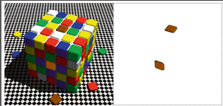
Those are the people to whom no matter how one've tried it is impossible to explain anything. Because they think they know how color should look like and simply didn't want for any explanation. For those i've find simple solution. I've printed color cube illusion and mask with cutout sides which actually looks same. First i give them original image and ask if the color is different. After i give them mask ))))
 

Attachments

  • изображение_2024-02-13_153550997.png
    изображение_2024-02-13_153550997.png
    267.3 KB · Views: 157
They think they know how color should look like and simply didn't want for any explanation.
I fired two customers in the last month over this (which is more than in the last 2 years).
We tell our customers upfront that there will be color shifts and color tolerances and two customers refused under any circumstances to accept an explanation. They were like... we printed it at home and it came out differently.
One customer literally sent two files with completely different colors in it and then was annoyed that they came out different... they're different!!!

Gave them their money back (they were small orders) and then sent them to my least favorite competition (petty I know).
 
Last edited:
I'm a pretty chill guy and can deal with most whatever, but that is *bleeping* stupid. I hope that was one of the two clients you fired
Yup. Only because no amount of reasoning/explaining was working. It was 50 copies that he wanted reprinted to match his home printer. I had already spent more time talking with him than I felt the job was worth, plus he was a first-time customer and I definitely did not want to build a long-term relationship with him. If you're happy with how they're printing on your home printer then print them there.
 
Yup. Only because no amount of reasoning/explaining was working. It was 50 copies that he wanted reprinted to match his home printer. I had already spent more time talking with him than I felt the job was worth, plus he was a first-time customer and I definitely did not want to build a long-term relationship with him. If you're happy with how they're printing on your home printer then print them there.
Same here. Rookie salesman brought in a new client.
Client provided files, we provided proofs.
Client said "No, no, no. You are just like all those other Commercial Printers. Doesn't look like my inkjet desktop printer OR my monitor."
So we worked to get the file to match his sample inkjet.
Worked with him to calibrate his monitor.
Never saw him again.
Sigh.
Education is expensive. Ignorance more so.
 
They’re SIDs, with some very wide tolerance margins posted afterward that are not necessarily industry standards. I think more shops are monitoring Delta E (difference numbers) these days with some shops even chasing them throughout a print run, but scanners and I think photo technology as well is still using Ink density patches to do that.

I’m not sure what OP was referencing but did mention not wanting this thread to get too technical…
I'll have to let Gregg clarify, but he did say Delta E and not SID and his numbers match my numbers on my best day. I think his Delta E numbers look great if he's using G7 calibration. The tolerance numbers look tight/good.

I feel like I'm not understanding what you're saying.

Maybe a third person can help me bridge the gap of your explanation so I know what you're explaining?
 
Trying to keep within layman’s terms; if your SID tolerances are set at .08+/-, all colors are then allowed to run over their target densities .08 and are also allowed to run under them .08. That gives you a total possibility of .16 points of color density variation, from color to color, throughout a given print run.

With target ink density tolerances set that wide, you can not only expect to see noticeable color shifting throughout a given print run, you can practically guarantee it.

(I don’t think OP listed any Delta E numbers, or at least none that I could see)

I understand the tolerances. But again, OP/Gregg said they were Delta E numbers, not SID.

I'm unsure why we're discussing SID? Isn't that obsolete and replaced by Delta E?
 
What I'm trying to achieve is a way to communicate to designers what the allowable color shift throughout a given print run may be, and I'm trying to do this in a way that they will understand.

If I bring up SID, LAB, or Delta E they are just going to immediately tune out.

If i was able to say, for example, an area with 50% magenta may fluctuate down to as low as 43% magenta or up to as high as 57% magenta. Something like that they could better understand. I know there are so many variables, but trying to figure out if there is a relatively generic range that I could describe to them.
 
Last edited:
What I'm trying to achieve is a way to communicate to designers what the allowable color shift throughout a given print run may be, and I'm trying to do this in a way that they will understand.

If i was able to say, for example, an area with 50% magenta may fluctuate down to as low as 43% magenta or up to as high as 57% magenta. Something like that they could better understand.
Genuinely curious how much you experience this kind of color fluctuation in print orders, what kind of printing are you buying, and from where (region)?
 
We use printers from all over the globe. The majority of our 4-color work is printed in Asia. Up until about a year ago, we went to a repro-house for wet-proofs (usually 2-3 rounds) before we approved color, and then files were released to the printer (from repro). However, this past year, we have run into more and more issues with the printer stating they cannot match the approved wet-proofs. So we have now started to go direct to the printer and receive digital proofs (either Epson, Indigo, or JetPress). That has been a mixed bag in regard to results. We have received press sheets from the printer that are way off from their own proofs. This has also happened stateside as well.
 
We use printers from all over the globe. The majority of our 4-color work is printed in Asia. Up until about a year ago, we went to a repro-house for wet-proofs (usually 2-3 rounds) before we approved color, and then files were released to the printer (from repro). However, this past year, we have run into more and more issues with the printer stating they cannot match the approved wet-proofs. So we have now started to go direct to the printer and receive digital proofs (either Epson, Indigo, or JetPress). That has been a mixed bag in regard to results. We have received press sheets from the printer that are way off from their own proofs. This has also happened stateside as well.
LOL.
Craftsmanship, Smashmanship.
It's only important that the beans add up!
 

PressWise

A 30-day Fix for Managed Chaos

As any print professional knows, printing can be managed chaos. Software that solves multiple problems and provides measurable and monetizable value has a direct impact on the bottom-line.

“We reduced order entry costs by about 40%.” Significant savings in a shop that turns about 500 jobs a month.


Learn how…….

   
Back
Top