You are using an out of date browser. It may not display this or other websites correctly.
You should upgrade or use an alternative browser.
You should upgrade or use an alternative browser.
Dot shape in offset lytho. Ctp-workflow
- Thread starter cementary
- Start date
A point of clarification.
Thank you gordo! This make things a little more clear.
I got a feeling that some people don't make difference between "real round dot" and "round-square" (euclidean).
BTW, maybe you can explain why the "real round dot era" started when ctp arrived? Was it possible to make "real round dot" in film based workflow?
gordo
Well-known member
Thank you gordo! This make things a little more clear.
I got a feeling that some people don't make difference between "real round dot" and "round-square" (euclidean).
BTW, maybe you can explain why the "real round dot era" started when ctp arrived? Was it possible to make "real round dot" in film based workflow?
I agree - most folks don't know very much about dots shapes and their impact on presswork.
The Euclidean dot (round/square/inverted round) is a digital recreation of traditional analog screens which were the result of passing an image to be reproduced through a black grid etched in glass (later replaced by a sheet of film).
The Round dot (small round dot in the highlights that just increase in size) has the advantage over Euclidean and Elliptical dots in that the "optical bump" that occurs when dots first touch happens at 75% - well into the shadows so it's not visible (as opposed to 50% with Euclidean and 40%/60% with Elliptical). However, it was problematic in a linear film workflow because the pincushion shapes resulting in the shadows would fill in and you would lose shadow detail. But that issue is eliminated in a CtP environment with the use of tone reproduction curves.
I know that I and the team I worked with at Creo heaviliy promoted the Round dot in CtP installations because the dot shape is the same for all screen angles and frequencies, the optical bump is hidden in the shadows at the 75% tone, the dot is non-directional so it is less affected by press problems, it reduces single channel moiré issues, and it's non directional, i.e. all screen angle dots react the same to directional press issues such as slur and doubling.
However, it was problematic in a linear film workflow because the pincushion shapes resulting in the shadows would fill in and you would lose shadow detail. But that issue is eliminated in a CtP environment with the use of tone reproduction curves.
Again, thank you for full and competent answer. For me things became absolutely clear now.
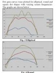
One thing that i need to do next is to convince my bosses so that became clear for them too. I found a simple article from International Journal of Advanced Engineering Technology with next plots

I didn't make such plots for myself yet. Maybe you did with your creo team back in that years?
Attachments
gordo
Well-known member
Again, thank you for full and competent answer. For me things became absolutely clear now.
One thing that i need to do next is to convince my bosses so that became clear for them too. I found a simple article from International Journal of Advanced Engineering Technology with next plots
I didn't make such plots for myself yet. Maybe you did with your creo team back in that years?
Thanks for sharing the info.
This is a good example of a poorly written technical paper and likely a poorly conducted test.
The first problem is that they do not clearly define the dot shapes they were using. Because different names may be used for the same screen pattern, they should have included an illustration. I'm assuming that when they say "Square Dot" they actually mean Euclidean (round/square/round). There actually is a Square dot shape which used to be used in letterpress printing especially for catalog work - but I doubt that's what they're referring to. They mention Heidelberg as a reference for screening. Heidelberg calls the Euclidean screen either "Euclidean" or "Round Square" - both are correct as is "Round Square Round" - but you should not drop the "Round" as these authors did.
Their description of the effect of halftone dot shape is so vague it's effectively meaningless. The rest of the paper has more vague statements.
They've also distorted the scaling of their dot gain curve charts to exaggerate the effect of the curves. Here is the first one "Fig. 3 Elliptical" graphed properly for comparison to theirs:

They conclude that: "The trend exhibited by graphs of theoretical dot area against measured dot gain has proved that dot gain goes on increasing with increase in screen frequency." which has nothing to do with the title of their paper.
Also, if you just change the lpi of the same screen (e.g. elliptical at 85 lpi, 120 lpi, 170 lpi) you should end up with TVI curves that are very similar in shape with just their peaks in different heights due to the increase in dot gain because of the increased lpi. You wouldn't get the significant distortions that they are showing.
Bogus technical paper.
This is a good example of a poorly written technical paper and likely a poorly conducted test.
Just like most of TP nowadays, i agree )))))
About differences between lpi – i think this is result of too small patches for measuring tint change.
But if we won't take into account all of methodology errors and assumptions the graphs for 175 lpi are right, don't they?
gordo
Well-known member
But if we won't take into account all of methodology errors and assumptions the graphs for 175 lpi are right, don't they?
Garbage in - garbage out.
The difference between Elliptical, Euclidean, and round are subtle so run your own test. It's a pretty easy thing to do. Most Euclidean halftones that are now available from vendors avoid the optical bump at 50% by not letting the screen form a perfect checkerboard at 50% (e.g. Agfa Balanced Screening which removes a corner pixel and adds it to the opposing corner or Heidelberg's which becomes Elliptical between about 45% and 55%).
So do your own tests - perhaps use available space in the off cut area of jobs if you can't run a dedicated test.
For now company allows to make any tests for quite any purposes (and i really appreciate that)))))So do your own tests - perhaps use available space in the off cut area of jobs if you can't run a dedicated test.
I followed your advice (actually last friday, just hadn't enough time to measure samples)
So, input values:
RIP - Kodak Prinergy
Dot shapes:
1. EllipticalP
2. Round
1. Plates – 175 lpi, 2400 dpi, positive, linear (to exclude possible effect of compensation curve)
2. Paper type 1-2, 130 g/m2, silk
3. Aims for solids – previously determined values with lowest dE according to iso 12647-2 (2007 amd). Tolerance – 0.08 Dencity
4. Press – sheet-fed manRoland 904
5. Samples taken – about 1600 patches (result is smoothed in kodak colorflow)
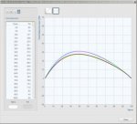
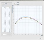
Result:
1. Elliptical

2. Round

Not so big difference in nominal values, but on a live image is much more interesting – round dot image looks much more "natural" than elliptical one. Elliptical is very "red" in the skintone of this particular image.
gordo
Well-known member
For now company allows to make any tests for quite any purposes (and i really appreciate that)))))
I followed your advice (actually last friday, just hadn't enough time to measure samples)
So, input values:
RIP - Kodak Prinergy
Dot shapes:
1. EllipticalP
2. Round
1. Plates – 175 lpi, 2400 dpi, positive, linear (to exclude possible effect of compensation curve)
2. Paper type 1-2, 130 g/m2, silk
3. Aims for solids – previously determined values with lowest dE according to iso 12647-2 (2007 amd). Tolerance – 0.08 Dencity
4. Press – sheet-fed manRoland 904
5. Samples taken – about 1600 patches (result is smoothed in kodak colorflow)
Result:
1. Elliptical
2. Round
Not so big difference in nominal values, but on a live image is much more interesting – round dot image looks much more "natural" than elliptical one. Elliptical is very "red" in the skintone of this particular image.
Bravo! Now, what do you think of the graphs published in the "technical" paper compared with your results?
Celebrate what you did with a nice glass of whatever beverage is appropriate!
I would really appreciate it if you could send me the data files - if it's a .txt file. My email is pritchardgordon @ gmail (dot) com
Now, what do you think of the graphs published in the "technical" paper compared with your results?
I think that they are quite mess, but that's bad for me, 'cause without so simple graph showing difference it would be hard to prove my opinion that we need to move from elliptic shape to "real round" shape. Or even impossible
Similar threads
- Replies
- 10
- Views
- 2030
- Replies
- 4
- Views
- 1678
- Replies
- 15
- Views
- 3597
PressWise
|
A 30-day Fix for Managed Chaos
As any print professional knows, printing can be managed chaos. Software that solves multiple problems and provides measurable and monetizable value has a direct impact on the bottom-line. “We reduced order entry costs by about 40%.” Significant savings in a shop that turns about 500 jobs a month. Learn how……. |


