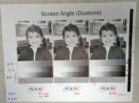
There are, IMHO, some critical issues with this exercise.
In the post, it's stated that the screen angle rotation is
20 degrees. 20° is the angle written on the plate and is the angle stated in the video.
But the PDF states: "Using a
30 degree screen angle rotation for the color ink will eliminate color flashing, and create a rosette pattern, but not a moire pattern.
So, is it 20° or 30°?
But that's not the big issue.
When two identical screens, as in this exercise, are overlaid and angled you will have moiré. What changes as the screen angles change is the frequency of the moiré. It's the frequency of the resulting moiré that determines its visibility. As the angle of the screens relative to one another increases the frequency of the moiré also increases but its visibility decreases. This is easy to demonstrate. Just print two identical screens onto a transparent substrate, overlay and rotate them at different angles. You can also do this virtually in PhotoShop. You can see that effect here at 5° and 10° offset:
And now 15° and 25°
Smaller moiré structures are simply smaller - and smaller things are simply harder to see.
The least visible (highest frequency) moiré pattern will be at 45 degrees. So I don't think it's correct to say that a 30 degree angle rotation creates: "a rosette pattern, but not a moire pattern".
The "flashing" is just the higher visibility of a low frequency moiré created when two screens are overlaid at the same angle but misregistered.
The color shift (color flash) that results is caused by an entirely different mechanism.
Going down the rabbit hole on rosettes...
A rosettes has a frequency 1/2 that of the screen frequency that created it. So, a 150 lpi screen would create rosettes with an equivalent 75 lpi frequency. That, and the fact that the rosette that's formed at that frequency is a fairly large structure means that certain color screen builds - especially the purples - can appear grainy/noisy in large, flat, color areas as the eye can easily see the rosettes.


