Hi again Erik,
Yes, for the purpose of this thread, the discussion should indeed include capability and consistency, in addition to a target to aim toward, and process control techniques.
Just to start with I would like to say that I understand that people are now trying to cope with exsting technology and have to do what works best for them. On the other hand, I am an engineer and I am trying to think of solutions to problems and therefore very specific understanding of the constaints is very important to know in order to come up with practical solutions. Nature is not forgiving and if one chooses to ignor what physically is happening, one will be punished with poor results.
Capability is very important and is something that can be measured. Statistical capability has to do with a process's variability and whether that variability is small enough to satisfy the performance goal of the process. The performance goal is determined by setting a tolerance on some measurable parameter.
There are two kinds of capablities that printing should be concerned about.
One is the capability to run a press consistently.
The other is the capability to obtain predicatble colour at any point in an image.
Basically from a statistical point of view, printing is not statistically capable with either consistency or predictability of obtaining point colour.
Statistical capability is basically defined as:
abs value of [the average measured value - the target value] + 3 standard deviations must be less than the tolerance.
As an example Let's say that the density tolerance is +/- 0.05pts.
If one has a target density of 1.30 but the average measured value is 1.32 the difference is 0.03.
Then for statistical capability the standard deviation would need to be (0.05 - 0.02)/3 = (0.03)/3 = 0.01
This is in terms of density and not even measured colour. The same kind of technique can be used to measure the capability of predictable colour at points in the image from job to job.
This is just an example to give you an idea that if someone from outside your industry came and measured your process, they would say that the process is not capable.
I have commented often about the ink feed problem that leads to the lack of capability in consistency of printed density, so let's not go there.
Let's talk about the consistency of predictable colour at any point in the image. If you had an ink jet printer that printed two images. One at the top of the page and one at the bottom of the page. Let's say that the image at the top of the page is always the same image but the image at the bottom of the page is different.
Because ink jet printers are reasonably capable of consistency and predictability of printing colour at any point of the sheet, one would expect that the image at the top would alway look the same and be independent of the image at the bottom. But if you had an ink jet printer that printed the image at the top differently each time you printed a different image at the bottom, you would have a big problem with predictability. How could you profile such a printer with any accuracy.
Well this is the situation with most offset presses. The image on the plate affects how the image on the plate is printed. In the extreme, one can have mechanical ghosting, where the image has taken ink from the form rollers in a way that it affects the inking of the plate in another location.
You also have presses that print a different density at the top of the sheet than at the bottom of the sheet. There is also starvation ghosting where the operator can not obtain a even density across the sheet due to the lack of ability of the roller train to provide an even ink film when certain images are printed.
When you have these kinds of weaknesses in the design of the press, how can one expect to have predictable characteristics that are required for accurate profiles etc. You can't.
A press does not print colour but is supposed to print with consistent ink film conditions on form rollers that result in consistent and predictable printing of solids and screens. The process of printing these ink films, even if they are consistent are not linear and are not independent. This reality means that trying to predict the colour outcome with curves applied to screen data is mathematically not valid.
If you had a press that did print consistently and predictably at all points in the image, then I would agree that an approach like ICC is right. My only concern here is in the number of points to characterise how the press prints. Some years ago I was looking at an inkjet printer and playing around with how many measured points were required to be able to map out the whole gamut in an accurate way. It took about 9000 points which were close enough to each other to make an interation between them that could come close to predicting a colour between the points. That's a lot of points. Automate that kind of method and the accuracy increases as the number of points are increased.
So in all of this discussion and even in Gordon's view that gray balance is needed at the beginning to set up the press, I just do not see it that way. I think in terms of capability of the process to do what one wants to do. I have no idea how one mathematically describes gray balance. I have not seen it described mathematically except in the targets of a few screen combinations. Trivial info.
The comments regarding the faults in the press may sound too grave but much can be done to improve both the capability of consistency and predictabiltiy. How does one change the mindset of an industry from coping with problems to solving problems?

")
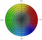
") I don’t see this as a confirmation at all. We agree that imagery can be resistant to deviation based on its make up, but not that there is no meaningful connection. We are talking about an image that has been presented with magenta bias, which is represented in both the image data and the 3/c gray. The “strength” of this bias is to a degree dependent on imagery (how much or little magenta is present in any particular pixel in relation to where the bias is introduced...midtone in this case), and the sensitivity of human perception, but the magenta bias shifts the image both numerically and visually in same direction as the 3/c gray for all colors with magenta values from 1-99%. In the case of the 0.52 de2000 sample, magenta is at the high 3/4 end of the tone scale and only undergoes a 1% change. Observe the gamut plot of your imagery in the attached example which shows the original image colors (shown in blue) and the magenta biased colors (red), which are without significant exception shifted toward the magenta side of the CIElab plot.
I don’t see this as a confirmation at all. We agree that imagery can be resistant to deviation based on its make up, but not that there is no meaningful connection. We are talking about an image that has been presented with magenta bias, which is represented in both the image data and the 3/c gray. The “strength” of this bias is to a degree dependent on imagery (how much or little magenta is present in any particular pixel in relation to where the bias is introduced...midtone in this case), and the sensitivity of human perception, but the magenta bias shifts the image both numerically and visually in same direction as the 3/c gray for all colors with magenta values from 1-99%. In the case of the 0.52 de2000 sample, magenta is at the high 3/4 end of the tone scale and only undergoes a 1% change. Observe the gamut plot of your imagery in the attached example which shows the original image colors (shown in blue) and the magenta biased colors (red), which are without significant exception shifted toward the magenta side of the CIElab plot.