Is color management really needed?

Agree with Gordo that Apple products are pretty good at displaying achievable color.

Problem I have seen repeatedly over the last 25 years is when a designer shows the customer output from their uncalibrated wide gamut desktop printer on stock nothing like the job is printing on. Customer loves the color which becomes the target for the proof/press. Got one just today........

I know what you mean. I had a customer that would supply a proof from their desktop inkjet printed on copy paper for jobs that would print on 100lb coated stock and want us to match it.
 
Or it could be Gordo that given your experience your approach to any project is to get the basics correct in the first place, understanding the end process and making allowances for this goes a long way to ensuring the end result meets expectation, colour management in some aspects has come about by trying to fill a void left by disestablishing manual production processes and its inherent verification along the way and replacing these with the infinite options available in digital production, i.e. the uninitiated can apply a profile without actually understanding what this does as in digital its a matter of checking/unchecking the correct radio button.
 
Last edited:
I've kept up with for years Gordo along with a few of the other guys on here like Rich, Matt, and Michael to name a few. Once upon a time in order for me to get accurate color and make the job easier for the press crew (over the years often that's been my job too pressman) color management was needed and I believe blew my boss's minds that we could do the things we were doing all thanks to color management. Lately the last couple years I've noticed it's not super critical anymore unlike calibration still is.

I believe Gordo what your experiencing is your eye's are trained well my friend. I trust my eye pretty much more than my XRite. I don't need exact measurements and truthfully I don't have time for it.

So throw all that technical mumble jumble everybody Gordo is a man that knows how to get the work out the door efficiently. That is the bottom line and what pays the bills. Too much techy and your spinning wheels and now days, at least for me, I don't have time to spin wheels I like this job.

OK let me have it. I've been a Gordo fan for years. :)
 
[SNIP]
IMO, Gordo's argument is more correctly stated as "custom profiling of my monitor isn't necessary for success in my particular workflow". Hard to argue with that. Though if you change a variable, say introducing a wide gamut monitor, the results could very quite a bit.

I guess so. My experience suggests that if one stays with Apple displays, custom profiling isn't necessary for success by anyone - at least for offset work.

gordo
 
I guess so. My experience suggests that if one stays with Apple displays, custom profiling isn't necessary for success by anyone - at least for offset work.

gordo

Gordon, curious about this.

Are you saying that this is basically true for all offset work that ranges from low to high print densities, over the whole gamut where there is a lot of over print and for uncoated and coated substrates? Or is this restricted to standardized printing conditions?

Is this also related to the level of expectations and what is acceptable?

Thanks for any comments.
 
Last edited by a moderator:
Gordon, curious about this.

Are you saying that this is basically true for all offset work that ranges from low to high print densities, over the whole gamut where there is a lot of over print and for uncoated and coated substrates? Or is this restricted to standardized printing conditions?

Is this also related to the level of expectations and what is acceptable?

Thanks for any comments.

For offset work that's run to typical/standard SIDs. I don't know of any printshops that proof differently for uncoated vs coated substrates. If they care then they'll have a plate curve and a different SID target to help normalize the presswork to their coated work. One hopes that the shop has standardized printing conditions, but the target print characteristic may or may not be an industry published target.
I don't quite understand "level of expectations and what is acceptable." I see their proof and it looks pretty much as I expected it would. The colors and tones look right. Comparing the screen to the proof is, IMHO, problematic.

gordo
 
I can say that my uncalibrated screen (using the generic profile) of my apple 30 inch display is pretty close. Close enough to where we can do color corrections. Is it dead on- I would say no way. But At some point you are splitting hairs with color.
 
Yeah, but it works. I'm happy, my clients were/are happy. I work with digital images so, since they are the originals, color fidelity can't be improved as there is nothing to compare them to.

gordo

I don't think that is correct, Gordo. If the image is in the sRGB colorspace, and you assign to it Adobe98 RGB, would the appearance change? You say there is nothing to compare the image to, but we can certainly make the image look incorrect. If we can make it look incorrect, that implies that there is a correct appearance.

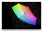
I compared a canned profile and a custom profile of my monitor, and there were some sizable discrepencies. Note that the blues differ not only in saturation, but in hue.
 

Attachments

  • display profile vs canned profile.jpg
    display profile vs canned profile.jpg
    639 KB · Views: 209
Last edited:
I don't think that is correct, Gordo. If the image is in the sRGB colorspace, and you assign to it Adobe98 RGB, would the appearance change? You say there is nothing to compare the image to, but we can certainly make the image look incorrect. If we can make it look incorrect, that implies that there is a correct appearance.

I compared a canned profile and a custom profile of my monitor, and there were some sizable discrepencies. Note that the blues differ not only in saturation, but in hue.

Yes the appearance may change if the image is sRGB colorspace, and you assign to it Adobe98 RGB. But so what? You edit the image based on what you see displayed rather than based on the possibility that some one further in the workflow will change it (if I understand your point correctly).
Yes, you can make the appearance incorrect - however, that's based on our perception of what's "right" or "correct" given the specific context of the image - and there's a wide range of tolerance where that's concerned. IMHO what you see on an uncalibrated Apple display using default settings, the color appearance is sufficiently accurate for you to make editing reliable and have a very good expectation of what the final result will look like on other Apple displays and in print. I haven't been burned or surprised yet and I've probably done thousands of images that way.

gordo
 
All depends the customer and job characteristic. When you have a customer with tight tolerances and colors with original products to compare, then default profile will fail. Even default profile is good for magazines, brochures etc... what is the reason to keep monitor with default profile for years ? Calibration devices are cheap enough and monitor profile validation takes only a few minutes. Calibrate, verify and be sure that you are in safe side.
 
All depends the customer and job characteristic. When you have a customer with tight tolerances and colors with original products to compare, then default profile will fail. Even default profile is good for magazines, brochures etc... what is the reason to keep monitor with default profile for years ? Calibration devices are cheap enough and monitor profile validation takes only a few minutes. Calibrate, verify and be sure that you are in safe side.


This seems to me to be at the heart of the problem in general.

A custom profile should be better than a generic or default profile. Calibrating devices should be better than not calibrating them.

I am guessing that Gordon's point is that it is not so critical if one is using the methods he has been using with Apple products. I have to believe that is true but I would also think that a custom profile of some kind would be better.

Since there are some differences in inks, papers and presses, having a method that can produce custom characteristic data easily and quickly should be the method for the future.

Trying to make every press printing condition match some industry average, I think makes for more work for the printer in the end in trying to make things work.

Maybe I am missing something in these posts.

No one (that I know of) uses a custom profile of a destination printing press when editing their PShop images. They all use a generic profile Fogra, GRACoL or whatever - generally whatever are PShop's defaults.

Back in the day, one of the marketing pieces that I created at Creo was a promotional piece, which included a number of images, that our customers could edit and use for their promotional efforts. When we received copies back at our offices it was amazing to see how similar the presswork was color-wise to each other. Where there was a difference was mostly in the contrast of the images - some a bit flatter appearing than others. But all looked good.

Ozkan Hangisi wrote:
All depends the customer and job characteristic. When you have a customer with tight tolerances and colors with original products to compare, then default profile will fail.

I don't believe that's true. They will look at the proof to decide the match as will the person doing the image editing. IMHO, looking at a monitor and then looking at an object away from the monitor and making a critical color evaluation is a myth (even though many people say they do it). That is because humans have no color memory and our eye/brain recalibrates on a continuous basis. That's our biology.

best, gordo
 
Gordon, a question about spot colours made with CMYK combinations.

Can one go to PShop and pick a spot colour (Lab) value and then determine a predictable combination of CMYK screens to print it?

It seems the question about printing spot colours is still a problem but if you are saying PShop is quite predictable, should it be able relative easy to do?

I find this confusing because I hear that things are predictable but then I hear generating spot colours with CMYK is a problem.

Can you clarify this for me? Thanks.
 
Put your engineer cap on straight Erik. Out in the press room a spot color ink comes from a single can and into the press ink fountain, then down the roller train to the plate, blanket, and substrate. A "predictable combination of CMYK screens to print it" is necessarily a simulation. I'll let you take it from there with your cap on straight.

In other words for some spot colors the simulation is better than for others. The less good ones are the problem ones.
Al
 
Last edited:
Put your engineer cap on straight Erik. Out in the press room a spot color ink comes from a single can and into the press ink fountain, then down the roller train to the plate, blanket, and substrate. A "predictable combination of CMYK screens to print it" is necessarily a simulation. I'll let you take it from there with your cap on straight.

In other words for some spot colors the simulation is better than for others. The less good ones are the problem ones.
Al

Al, you are right and I probably did not use the correct terms although I was asking about printing the colour with a combination of CMYK screens. To me that means simulation but it was not stated.

I will try to use the term simulation instead. Hope that is acceptable. Yes, the use of the right terms adds to clarity.

I do know about spot colours and have used them often and there has always been discussions of producing (simulating) them with CMYK screens. And of course, doing that also requires better control of the individual densities.

By the way, my engineering cap is round does not have a direction but does have a nice propeller. :)
 
Last edited by a moderator:
Thanks for taking it like a good sport. I was worrying that I may have insulted you.

One thing to note is that files using Spot colors are a real challenge to proof by off press methods and it is almost always best done by simulations on inkjet printers using 2 or more inks in addition to the base CMYK ones.

Al
 
Last edited:
Thanks for taking it like a good sport. I was worrying that I may have insulted you.

One thing to note is that files using Spot colors are a real challenge to proof by off press methods and it is almost always best done by simulations on inkjet printers using 2 or more inks in addition to the base CMYK ones.

Al

Al, I was not so interested in the proof but in how the press prints the simulation.

I can understand how out of gamut simulated colours are a problem but what about just simple in gamut simulations printed on press? Simulations that could be printed with a combination of CMYK.

Are these easy to determine with PShop or are they difficult?
 
IMHO, looking at a monitor and then looking at an object away from the monitor and making a critical color evaluation is a myth (even though many people say they do it). That is because humans have no color memory and our eye/brain recalibrates on a continuous basis. That's our biology.

Although there are challenges in comparing an emissive to a reflective copy, I wouldn't say that there is no value here for color evaluation, or that its a myth. In a tightly controlled environment with competent hardware, a very good match between monitor and hard copy proof can be achieved that can facilitate critical color adjustment. This usually isn't worth the effort, but I wouldn't say its not possible. I would also say that the softproof is usually subservient to the hard copy proof.

I also wouldn't go as far to say that humans have "no color memory". We do have very poor, and very short color memory, but we can make comparisons between soft-poof to hardcopy nearly as easily as hardcopy to hardcopy, though setting up the former is more difficult.
 
Erik,

Perhaps someone well versed in Pitstop will chime in. Your question is beyond my bare familiarity with Pitstop.

Al
 
Erik If I understood right you are asking Color Picker window of Photoshop
Open a new CMYK document, assign your process profile, open color picker window, pick the color from library then you will see Lab, CMYK and RGB values of the color. For more accurate numbers assign a fresh custom profile. Place the color in document. If your monitor good enough and well calibrated you can see a fair simulation too.
 

PressWise

A 30-day Fix for Managed Chaos

As any print professional knows, printing can be managed chaos. Software that solves multiple problems and provides measurable and monetizable value has a direct impact on the bottom-line.

“We reduced order entry costs by about 40%.” Significant savings in a shop that turns about 500 jobs a month.


Learn how…….

   
Back
Top