• Best Wishes to all for a Wonderful, Joyous & Beautiful Holiday Season, and a Joyful New Year!

Light indicator band issues.

beeeehhh

Member
Dear all,

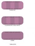
I experience some problems with different light indicators like :

PANTONE® LIGHTING INDICATOR Stickers
Pantone Lighting Indicator.jpg

PIA/GATF RHEM Light Indicator
PIA GATF RHEM Light Indicator.jpg

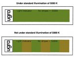
Ugra/Fogra light indicator
Ugra Fogra light indicator.jpg

Each one appears slightly different under the same light.
E.g. with a colorCommunicator and fluorescent tubes 5000 K.


Has anybody already seen this issue before?

Is it possible to obtain non uniform results?

Could I trust them to put them on the digital proof prints?


Many thanks beforehand for your explanations
sincerely,
 
You say that they all appear slightly different. Do some of them indicate that lighting is good while others show that the lighting is unacceptable?

D50 was redefined a few years back; are all of the stickers you have up to date?

Are the bulbs in your booth up to date?
 
Hello Rich,

indeed! Some are ok and the others not. And definitively, yes: the tubes on my several booth are all up to date.
 
Making a pair of metamers that behave close to perfectly is very difficult. It boils down to very slight formulation tweaks that are based on the color vision of the person creating the two colors (we have a metameric pair produced for us and it is quite common for 2 or more people to see the color match differently, thus come to different conclusions about how to tweak the formulation of the color). So short answer is - very minor color differences between the two colors under 2 or more different D50 simulators are not unusual.

Bob McCurdy
GTI
 
Dear Bob,

did you mean we are obliged to accept these tolerances by default? If I understand well, D50 equal 5000 K but 5000 K doesn't equal D50?

Axel
 
Yes. D50 is a CIE defined spectral power distribution - which is the key driver for how a color appears to the observer (besides reflectance and absorption characteristics of the color itself and the color response of the person doing the viewing).

Very small differences in the reflectance curve of the color can cause noticeable shifts in color, especially when you are comparing two colors which have significantly different reflectance curves (which is what you have with any metameric pair - they are different on purpose in order to appear the same under a specific light source).

So the key is that the Pantone metamers (or those from PIA or FOGRA) can be very helpful in warning a person that the viewing conditions are not suitable for critical color comparisons (the two colors do not match at all) but cannot be used to verify that a viewing environment IS meeting the ISO 3664 standard (even if the two colors do appear to match, there can be differences in color temperature, intensity, surround conditions, etc.).

Best use of these tools is to warn of a problem rather than to confirm that a standard is being met.

Bob
 

PressWise

A 30-day Fix for Managed Chaos

As any print professional knows, printing can be managed chaos. Software that solves multiple problems and provides measurable and monetizable value has a direct impact on the bottom-line.

“We reduced order entry costs by about 40%.” Significant savings in a shop that turns about 500 jobs a month.


Learn how…….

   
Back
Top