RIP question

Tech

Well-known member
I know this question probably belongs to Kodak section, but in general, when a printer informs you, their RIP (in our case Kodak Creo running on latest Adobe Print Engine 2.0) hangs/crashes on processing a single page that has spot-colored text with drop shadows on top of duotone image background...

Do you conclude:
a) they are not telling you the full truth of what the real problem is
b) they don't know what the solutions are
c) they want to milk you for mula
d) mistakes happen and they just want you feedback to help solve what they don't understand...like perhaps have designers change their layout to help solve their downstream output...even though layout files looks perfectly legit

Help me understand a few things please...
a) do RIP output live text into vector? I'm always under the impression that RIPs output in color separation based on resolution/LPI?... Regardless how complex or poorly design font family is, it should never be the problem that stops a RIP? Yeah, in our case, printer claims this postscript font we used has too many vector points for their RIP to process??? This is the first time I heard of such problem...

Thanks in advance to help educate me.
 
I know this question probably belongs to Kodak section, but in general, when a printer informs you, their RIP (in our case Kodak Creo running on latest Adobe Print Engine 2.0) hangs/crashes on processing a single page that has spot-colored text with drop shadows on top of duotone image background...

Sounds like an everyday job. Is it possible to get a look at the PDF in question? I can test it on our RIPs here (Harlequin-based and APPE 2.0 and CPSI-based) to check whether it crashes any of them.

Do you conclude:
a) they are not telling you the full truth of what the real problem is
b) they don't know what the solutions are
c) they want to milk you for mula
d) mistakes happen and they just want you feedback to help solve what they don't understand...like perhaps have designers change their layout to help solve their downstream output...even though layout files looks perfectly legit

I would not attribute to malice what can be explained by mistakes/lack of knowledge, so c) is a bit unlikely from my point of view ;)

If I stumbled upon such a problem I would certainly try d), but would ask if I can get hold of the original files (+fonts). They make experimenting so much easier than having to poke around in a PDF using various tools.
a)+b) usually go hand in hand, there is a lot to know about PDFs and possible pitfalls when you process them and not every printer has enough in-house knowledge for some problems.
If it is a bug in the APPE and they informed Kodak/Adobe about it, feedback and/or a solution can take a while.

Help me understand a few things please...
a) do RIP output live text into vector? I'm always under the impression that RIPs output in color separation based on resolution/LPI?... Regardless how complex or poorly design font family is, it should never be the problem that stops a RIP? Yeah, in our case, printer claims this postscript font we used has too many vector points for their RIP to process??? This is the first time I heard of such problem...

RIPs do output "flat" separation based images with the resolution for their imagesetter/platesetter.
There is no vector information in the output, only pixels/dots.

There are fonts that cause strange behavior at the RIP (e.g. problems with even-odd/odd-even filling), but none should crash an APPE if they display and print fine from Acrobat - which is a quick and easy test. Also try a PDF/A-preflight in Acrobat 8/9, PDF/A-preflights check font properties a lot more than PDF/X-preflights and report possible problems.

Complexity was a problem a long time ago, when RIPs had less resources and CPUs were slow (think 1990-1998). And even then, it just took a long time to RIP most files ;)

Trapping on the other hand ... trapping very complex jobs can take a lot of time, resources and has in some cases made the job error out on the RIP. But your printer should be able to tell the difference between a trapping problem and a "real" problem on the RIP.

I honestly felt dumbfounded when he tried to sell me the idea that live type/font are output as vector because that's how they were created...he even provided a screenshot of wireframe view. I thought perhaps this is how Kodak's system works? He sold me on the idea until I keep thinking about it. No idea why he would bother checking files in wireframe view either...I believe this rendering view is only for 3D objects in Acrobat. I suspect the complex wireframe screen rendered in Acrobat is just that...Acrobat's interpretation of type if you force it to render it in such view.

I'll give PDF/X-A preflight a try, although I doubt that'll be a problem. We have printed other products before with this odd font. The last possible problem I can think of is that their RIP can't handle the complexity of flattening the drop shadow transparency over the duotone which includes a spot color. Although this doesn't make much sense either because Adobe's Print Engine 2.0 is suppose to have full support to print live transparency over spot color.

Solution right now is to flatten the trouble pages in PDFv1.3 and that resolves their RIP problem. Of course, now I have to make sure their can rasterized transparency correctly over the spot bkg. It'll be a fun day explaining this because I can't output soft proofs correctly for our people to sign off even with overprint turn on. It shows all the classic signs of printing transparency over spot color with halo box around the items. Printing with overprint and converting spot to process usually solves this problem but a flatten PDFv1.3 from their RIP appears to prevent overprint from work properly on our printers.

I'll sent you a PDF test page to you if time allows. Appreciate the feedback and suggestion.
 
Last edited:
can you post a link to that file, i would like to try it, i have prinergy and harlequin rips, i guarantee it would work on harlequin, but be so slow you would want to throw the computer at the wall.
 
Tech,
It is absolutely possible for the situation you describe to happen - even with APPE implementation. Many of the "rougher" typefaces available today involve a huge number of points to define a character. Had a situation come up like this just recently.

Spot colors and transparency can still be kind of a crap-shoot.

I'd like to take a peek at the file, as well. Could give you much more pertinent feedback.
 
Last edited:
Regardless how complex or poorly design font family is, it should never be the problem that stops a RIP?
Pre-press specialists often say that fonts, and especially poor fonts, office fonts, cheap fonts, pirated fonts, free internet downloaded fonts (dafont.com is a pain in the ass for pre-press) are about 50% of the pre-press imaging issues...
(and pictures are the remaining 50%!)


Yeah, in our case, printer claims this postscript font we used has too many vector points for their RIP to process??? This is the first time I heard of such problem...
Sincerely it's a common problem... but it's not sure that it's the origin of the issue... reading this sentence "he tried to sell me the idea that live type/font are output as vector because that's how they were created" leaves me some doubts about the competence of your printer (or my ability to understand english???): he is perhaps only using your font as a good excuse to explain an issue that he doesn't understand...

... and (as rich apollo says), spot colors and transparency are still a problematic mix...

... and don't forget that even a new PrintEngine RIP is a piece of software... expensive software, yes it is, but only software, with bugs like in all other softwares!!!

I also would be interested with a link to the file!
 
Last edited:
can't you send the pdf trough in the version 1.3 with has flattend layers ?
there will be no problem with transparancy and spot colors.

because most rip's cant handle the new pdf files its best to flatten them.
 
can't you send the pdf trough in the version 1.3 with has flattend layers ?
That's the best way to work with old RIPs... but a PrintEngine 2.0 RIP is quite new RIP! It's compatible with transparencies, and able to "digest" without any problem a 1.4 or 1.5 PDF (and certainly more recent) exported from InDesign and containing transparencies!

With such a RIP, outputting a 1.3 PDF is only a workaround to carry on working while searching the real origination of the issue with the 1.4 or 1.5 file


@ Tech: what's the release of the PDF you gave to your printer? 1.4 or 1.5 or more?
I ask this question because I remember a friend of mine, who works with a Prinergy workflow, telling me that he has a lot of problems with PDF 1.4 exported from InDesign and containing transparencies... and all these problems disappear when using 1.5 PDF!!!
 
Duotone images were never a problem. These image files were saved as EPS as should be. As for the idea that text are vector and poorly constructed is a possibility and since I'm not in the business of typography nor have the right software to confirm that.

Files were originally release as live Indy files precisely because of spot and transparency issue, I wanted them to generate their own PDF either through their RIP or otherwise. They have reported a v1.4 workflow before and for a long time I only release v1.4 PDF files to them...unless we have special cases such as this, then live files are supplied. As stated previously, PDFv1.3 did resolve the problem for this printer when their analyst decided to give v1.3 a try.

It's how they handled and acted in this matter that makes me question their ability in even understanding their own RIP. I have wonder about this printer's competence for a while now, if I can have any say in such matters I would stop doing business with them...but I'm in no such position.

Of course, one problem resolved another arises...this time, because our designer ignore my earlier warning regarding the silver spot color they used in the file being too light and barely distinguishable on screen...it did reproduced too light on wet proof...a two color job, the spot is just as hard to distinguish on proof...sigh. Although an easy fix for the printer to switch color, it just feel like this is one of those jobs that just didn't want to get completed.

Thanks everyone for all the replies and suggestions. I have been too busy at work to post the the file for testing but I appreciate everyone's offer to help. Cheers!
 
Duotone images were never a problem. These image files were saved as EPS as should be.
EPS is an old file format that is completely out-of-age!
It is still a little bit useful with XPress for duotones and clipping path...
... but completely useless with InDesign : .AI, .TIFF and .PSD do the job much better than EPS... for a duotone picture in ID, prefer a PSD...
But that's not the subject of this topic.


As for the idea that text are vector and poorly constructed is a possibility and since I'm not in the business of typography nor have the right software to confirm that.
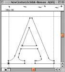
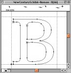
It's easy to see how a glyph is built: simply write a text with this font in Illustrator and vectorize it! all the vector points that appear in Illustrator after the vectorization are the real vector points of the font.

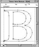
Just have a look at the 3 following drawings : "Sans titre 1" is "A" and "B" NewCenturySchoolBook vectorized in Illustrator, the 2 others are the same glyphs shown opened with Fontographer.
 

Attachments

  • ab_ill.jpg
    ab_ill.jpg
    46.4 KB · Views: 212
  • a_font.jpg
    a_font.jpg
    40.4 KB · Views: 210
  • b_font.jpg
    b_font.jpg
    42.7 KB · Views: 194
Hmm, I'm slowly advocating the use of Adobe native files as necessary, as long as we still run Quark, I don't see any chance on dropping EPS/postscript in our workflow anytime soon.

*****

See screenshot of the font that gave us trouble. It's complex alright...
 

Attachments

  • Picture 1.jpg
    Picture 1.jpg
    27.4 KB · Views: 198
Hmm, I'm slowly advocating the use of Adobe native files as necessary, as long as we still run Quark
I still go on using vector-based Illustrator EPS files for logos, even with InDesign, because I also still use XPress (7 only...)... and I also don't like the way that InDesign handles the .AI files... (when it works!!!)

But I'm fed up with EPS Photoshop bitmap pictures mainly because files are unusefully heavier and a damned JPEG compression can be included in!
Even with XPress 3.3 I prefered TIFF pictures, and I used EPS pictures only when I was really obliged: duotones and clipping-path.
Now, using mainly InDesign, I still work with TIFF or .PSD for "standard" pictures, and with .PSD for special cases, like duotones!


See screenshot of the font that gave us trouble. It's complex alright...
Ouch...!!! yes it is!!!
What's the name of this font? and did you find it free on internet???

(free TTF fonts downloaded from internet are often a problem for the RIPs... in most cases, we are obliged to vectorise them as a workaround... and sometimes it is absolutely necessary to rebuit or re-generate or repair them with Fontographer or FontLab...)


It's how they handled and acted in this matter that makes me question their ability in even understanding their own RIP.
I agree with you: PDF can sometimes be very difficult or impossible to image, because something is technically wrong in it, and it's impossible to fix the problem in the PDF
(mainly because the PDF has been badly done with improper settings or method, or because the native file is bad and need to be corrected before being usable)...

... but, normally, a competent pre-press operator can always image a native file!
 
Last edited:
It's easy to see how a glyph is built: simply write a text with this font in Illustrator and vectorize it! all the vector points that appear in Illustrator after the vectorization are the real vector points of the font.

With Postscript fonts, I expect this is correct, because they are defined the same way as Postscipt curves (cubic bezier). I think Truetype fonts - at least the original spec - are defined with a lower-order quadratic curve (one control point per segment instead of two), yielding more points with simpler segments. When these fonts are converted to paths, the application is probably using a path-fitting algorithm to convert into standard Postscript curves. I've usually seen a large number of points that are evenly spaced, even in the middle of straight lines, when these are converted to paths. The path-fitting problem (you can't make a perfect match) is probably why conversions from one type to another often look crappy. I believe Truetype has evolved into a container format that can now define fonts either way.

I suspect that the main reason Truetype used to be such a problem for RIP's is because of having to handle these curves with a different procedure than vector objects and Postscript fonts, possibly using an intermediate process to convert the curve type and yielding many extra points. This is pure guessing, though. Dov or Leonard might know more about the Truetype/RIP problem.
 
With Postscript fonts, I expect this is correct, because they are defined the same way as Postscipt curves (cubic bezier).
This is correct!


I think Truetype fonts - at least the original spec - are defined with a lower-order quadratic curve (one control point per segment instead of two), yielding more points with simpler segments. When these fonts are converted to paths, the application is probably using a path-fitting algorithm to convert into standard Postscript curves.
I must confess that I didn't care about TrueType fonts... as normally these "fonts" are not really made for DTP...

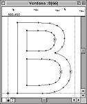
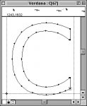
... but, I made the same test with Verdana and TimesNewRoman, both old TrueType fonts from MacOS 9.22, and you can look and compare by yourself: Illustrator reproduce exactly the vector-points of the original font opened in Fontographer.
 

Attachments

  • BCB.jpg
    BCB.jpg
    40.3 KB · Views: 212
  • B2F.jpg
    B2F.jpg
    32.6 KB · Views: 214
  • C2F.jpg
    C2F.jpg
    32.3 KB · Views: 208
  • B3F.jpg
    B3F.jpg
    34.8 KB · Views: 199
I suspect that the main reason Truetype used to be such a problem for RIP's is because of having to handle these curves with a different procedure than vector objects and Postscript fonts, possibly using an intermediate process to convert the curve type and yielding many extra points.
Yes and no... in fact, the processing of TrueType fonts in PostScript RIP depends of the PostScript level of the interpreter and some other different factors.


Basically, the problem is easy to understand: TrueType fonts are not compatible with PostScript systems, and cannot be rasterized by PostScript RIP. That's all.


So, to process TrueType fonts, PostScript systems have 2 solutions:

1- convert the TrueType fonts in PostScript type 1 fonts: this conversion is made by the PostScript driver on the host computer that send the printing.
As you say, this conversion cannot be exact, and yields many extra vector-points.

2- rasterize the TrueType fonts independantly with an extra piece of software, the "TT rasterizer", added in the RIP.

At each printing demand, the PostScript driver looks into the PPD of the printer, searching the line "TTRasterizer": this command tells to the PostScript driver that the PostScript intrepreter of the printer has a TT Rasterizer...


Code:
*PPD-Adobe: "4.3"
*FileVersion: "1.0"
*% InternalPPDVersion: 91.671
*FormatVersion: "4.3"
*LanguageEncoding: ISOLatin1
*LanguageVersion: English
*Manufacturer: "Agfa"
*ModelName: "AGFA Avantra 25-X-10_1"
*ShortNickName: "AGFA Avantra 25-X-10_1"
*NickName: "AGFA Avantra 25-X-10_1"
*PCFileName: "AGFA Avantra 25X.PPD"
*Product: "(AGFA SelectSet Avantra 25/AGFA Taipan RIP/3011.106 603007)"
*Product: "(AGFA Taipan RIP)"
*PSVersion: "(3011.106) 603007"

*% ==== Copyright (c)1997-2003 Agfa-Gevaert N.V. ====

*AGPrinterDefault True: "Printer's Default"

*ColorDevice: True
*DefaultColorSpace: CMYK
*FileSystem: True
*?FileSystem: "0 (%disk?%) {currentdevparams /Writeable 2 copy known {get {1 add} 
if} {pop pop} ifelse} =string /IODevice resourceforall 0 ne {/True} {/False} 
ifelse ="
*End
*LanguageLevel: "3"
*Throughput: "1"
[b]*TTRasterizer: Type42
*?TTRasterizer: "42 /FontType resourcestatus {pop pop /Type42} {/None} ifelse ="[/b]

*OpenUI *PageSize/Page Size: PickOne
*DefaultPageSize: A3Extra.Transverse


If the PostScript driver finds the "TTRasterizer" command in the PPD, it means that the interpreter has a TTRasterizer, and then the PostScript driver sends the TrueType fonts to the printer, after "wrapping" them in a piece of PostScript code.

If the PostScript driver doesn't find the "TTRasterizer" command in the PPD, it means that the interpreter has a no TTRasterizer, and then the PostScript driver converts the TrueType fonts in PostScript type1 fonts.


• all the PostScript level 3 RIP have a TTRasterizer... it's a part of level 3 specifications.
So, with PS level 3 RIP, there is (theorically) no problems with (good) TrueType fonts...

• PostScript level 1 RIP never have TTRasterizer... so, with PS level 1 RIP, TT fonts are always converted, adding many vector-points, making the fonts havier and more complicated...
... and as they were sent by slow networks in old hardware systems with slow processors, to few memory, to little hard-drives... they made many problems!!!
(with an exception: if the RIP level 1 is based on a 68040 processor, the PostScript driver can send to the rip a TTRasterizer that works on the 68040 of the RIP, and process the TT fonts independently)

• the TTRasterizer appears with the PostScript level 2... but it depends of the releases : generaly, lower releases 2010 to 2013 rip don't have it, but it is possible to find it in 2014 to 2016 rip... and the 2017, the last level 2 release, very near from the level 3, has a TTRasterizer. (if my informations are correct... to be confirmed...)
 
Last edited:

PressWise

A 30-day Fix for Managed Chaos

As any print professional knows, printing can be managed chaos. Software that solves multiple problems and provides measurable and monetizable value has a direct impact on the bottom-line.

“We reduced order entry costs by about 40%.” Significant savings in a shop that turns about 500 jobs a month.


Learn how…….

   
Back
Top