What causes 300ppi photoshop file with type looking pixellated?

Tech

Well-known member
Per subject title, we just received color proofs back from a prep house, our 300ppi file (graphic with flattened text) actually looks bad? It almost looks like a 150-200ppi output except background 4C image looks sharp as a button. We proofed again onscreen with a press-ready PDF and it looks fine.

Based on specs, 300ppi files are only used @75% in Quark layouts. Are we missing something? or did prep house screw something up?
 
If you have an unflattened version (where the text is still a text layer in Photoshop), you can save as Photoshop PDF from within Photoshop. This will keep the text as vector and it will be smooth sailing from there on.

If the image looks fine on screen with 300 ppi and comes back pixelated, the guilty persons are at the other end - more so if the image is actually placed with a size <100% and therefor has it's effective resolution increased. Or maybe that is the problem? The effective resolution increased to 350 ppi (placing at 75%) and it got scaled down again to 300 ppi upon output (typical downsampling for prepress), leaving you with only 75% of the original's resolution (225 ppi).
 
Type in photoshop is almost always problematic.

The problem is that Photoshop is a RASTER format. Text gets rasterized once it's taken out of native Photoshop. As noted in the previous reply, you can maintain vectors by saving as a Photoshop PDF, but I suspect that it was an eps, tiff, or other format that was brought into Quark. The saving as a tiff or eps rasterizes the Photoshop image at the resolution designated for the image (300ppi). Even bringing native psd files into Quark does not maintain rasters (I believe), although InDesign may.

That means that the text will be 300dpi when it's plated whereas if it were vectored text (Illustrator, InDesign, Quark, PDF, etc.) it would be rasterized at 2400+ dpi when it's plated. Images (which is a definition of a photoshop file) are usually screened, so 300 ppi/dpi is optimal, but text should not have a screen value so vectored is always better.

My recommendation is that images not have text and that the text be added in the Quark file. If that's impractical, then the image (photoshop) should be placed into Illustrator and text added there.

I worked as prepress manager for a period at a printer whose niche market was photographers and we had to deal with the problem that they ONLY had photoshop and only knew how to use photoshop. In those days there was no way of maintaining vectors in PS so it was always a hassle of dealing with the questions of "why does my type look so sh***y!"
 
Last edited:
Anti-aliasing was set to None

Anti-aliasing was set to None

Photoshop type is only problematic if the person who creates it doesn't know what they're doing. Exporting out as a Photoshop pdf or eps will retain vector type so long as it doesn't get flattened before hand. The problem HERE is that when the text was set it was set with anti-aliasing set to "None" instead of "Sharp, Crisp, Strong or Smooth" and it can't be fixed unless you have the unflattened version.

Erik
 
A 300 ppi image scaled to .75 would yield a final resolution of 400 ppi, not 350.

When placing a PSD in Indesign, I'm pretty sure it uses the composite image unless the layers are selectively turned on or off, in which case it uses the raster image of each text layer saved in the PSD file (the same image Photoshop uses if the font isn't loaded).

If the PSD file is saved as a PDF, the text can be preserved as vector text clipping paths that cut out an appropriately colored image, not as normal text (it should then render at device resolution, but will still not trap). It will always be raster if the faux bold attribute is applied.

I think text should NOT be anti-aliased, unless the final medium is a monitor, or perhaps if the resolution is less than around 200 ppi, in which case it becomes a subjective preference (sharp edges where you can see the pixels versus blurry edges where the raster is less obvious). A monitor has a low resolution, but can effectively display any given in-gamut color within each pixel. This is where anti-aliasing usually looks good. A platesetter has a very high resolution, but when you print CMYK, there's really only 16 possible colors per pixel (2 per ink). The interpolated anti-aliased pixels end up having a screen within them that is not large enough for the tint to be resolved, and you get a distorted edge (or a blurry one if the resolution is low enough). I don't think I have ever seen a PSD file from a designer that had anti-aliasing turned off.
 
Excellent suggestions. I must admit if our creative team created these files in Illustrator this wouldn't be an problem right now (this is not to say there's anything wrong with 300ppi files). Apparently, this is an on again and off again issue with various projects. Although it's the first time I'm seeing it in person. I'll fill-in more info to clear up any misunderstanding here.

1) The possibility of prep house downsampling our files on output is likely but I can't get our production person to retrieve that info for me to confirm. The deeper issue appears to be the foreground image is being outputted at lower resolution than background image, which makes absolutely no sense and certainly can't be explained by downsampling alone.

2) This project is done in Quark 7 and everyone here probably know Quark and PDF don't mix. The files in question needs transparency but saving them to PDF always drops it when imported to Quark. We could import these files as PSD for transparency or what limited function Quark can support, but we didn't and couldn't at this point because we (designer) lost original vector background art files and only have photoshop layer versions (text do have anti-alias on)...and the kicker is these doesn't match flattened TIF files that were sent to prep house.

3) I too advised our staff to avoid setting type in Photoshop but old habits die hard, as lnog as raster files have proper resolutions, I accept them as good. Anti-alias on or not, is only part of the issue, surrounding graphics that were originally created in illustrator were rasterized in photoshop and is now printing below 300ppi resolution and as pixelated as text. By the way, when I unlink the images in question from layout and pull another printout...it looks only a little worst than the HRZ proofs we received. Interesting huh?

Right now, I think we are waiting to hear further info from prep house. I'm resorting on the idea of re-creating the files in Illustrator if we must to get the ball rolling again.

TBH, I feel prep house has done something wrong, and in this case, no idea what they are doing. They kicked files back requesting we fix/re-supply perfectly fine rasterized 300ppi images. We can't fix what is not broken!
 
Last edited:
A 300 ppi image scaled to .75 would yield a final resolution of 400 ppi, not 350.
Yes.


When placing a PSD in Indesign, I'm pretty sure it uses the composite image unless the layers are selectively turned on or off, in which case it uses the raster image of each text layer saved in the PSD file (the same image Photoshop uses if the font isn't loaded).
Yes. Only Photoshop can use the vector text datas in a PSD file...

... this means that when a PSD file is imported in XPress or InDesign or Illustrator, these 3 softwares CANNOT use the vector text and can ONLY use the rasterized pixel picture (the image Photoshop uses if the font isn't loaded).


If the PSD file is saved as a PDF, the text can be preserved as vector text clipping paths that cut out an appropriately colored image, not as normal text
Yes. Same with a PSD file saved as an EPS with the option "Keep vector text".
But:
- in a PDF the text is kept live with fonts embedded,
- in an EPS the text is vectorized.


toronar said:
If the image looks fine on screen with 300 ppi and comes back pixelated, the guilty persons are at the other end
No: the culprit is the way used to "transfer" the pixels-picture from the computer display to a system printing on paper...

... a contone grayscale picture displayed on a computer screen cannot be printed exactly as displayed, and must be screened, because the computer display is able to have 256 levels of gray (including black and white), althought a printer (laser or ink-jet) and an offset press can print only 2 levels:
- put some ink on the paper, making a black area,
- leave the paper blank, making a white area...

... the only way to succeed to have multiple levels of grayscales on the paper with only black ink on a white paper is to simulate a gray by using a screen: little black dots printed in a white area, when seen at a sufficient distance, give the illusion to the human eyes that the black and the white mix together, and looks like a gray area... and the darkness of this gray depends only of the ratio between the black area of the screen dots and the white area of the left blank paper:
- bigger are the black dots, darker is the gray,
- more little are the black dots, lighter is the gray.


First consequence: the process that transforms the pixels in screen dots can ONLY make entire screen dots, meaning that it CANNOT cut the screen dots to follow exactly the edge of a shape, and dots or parts of dots are out of the real shape, giving a bad looking...

... that's why when printing rasterized Photoshop text in contone mode, the text looks hazy, crappy...


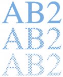
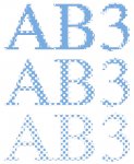
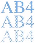
To understand better what I am explaining, just have a look at the linked pictures below:
- there is no scanning in this pictures, then no degradation due to the scanner,
- picture texts have been done by direct convertion from vector to pixels in Photoshop,
- and shown pictures come directly as a file from an Agfa Viper RIP, I simply made a colorization and added an outline to show the real shape: 
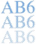
each picture is the real output of an imagesetter from a text in 8 pt size, printed at 2400 dpi with a 150 lpi screen and magnified 33,33 times:

• "AB0" is a vector text: no comment, it's the perfect shape of vectors...

• "AB1" and "AB2" are pixel 1-bit texts at 2400 and 1200 ppi:
- perfect shape, even with only 1200 dpi,
- and look at the edge of the screened shape: screen dots are cut to match exactly with the shape of the characters.
 

Attachments

  • AB0.jpg
    AB0.jpg
    72.1 KB · Views: 186
  • AB1.jpg
    AB1.jpg
    61.4 KB · Views: 181
  • AB2.jpg
    AB2.jpg
    66.5 KB · Views: 187
• "AB3", "AB4", "AB5", and "AB6" are pixel grayscale texts at 2400, 1200, 300 and ppi: crappy shape, due to:
- extra dots outside the characters,
- and most of the dots that are on the edge of the characters have a part ouside the shape,
 

Attachments

  • AB5.jpg
    AB5.jpg
    71.2 KB · Views: 176
  • AB3.jpg
    AB3.jpg
    68.6 KB · Views: 209
  • AB4.jpg
    AB4.jpg
    74.1 KB · Views: 208
  • AB6.jpg
    AB6.jpg
    91.9 KB · Views: 168
The difference between vectors and pixels is here:
- the RIP rasterization of vectors can "cut" the screen dots to match exactly with the exact shape of the object,
- the RIP rasterization of pixels pictures leaves screen dots outside the shape and CANNOT "cut" the screen dots on the edge, leaving part of them outside the shape...
... and these extra outside and partially outside the shape screen dots are both altering the shape of the object (character or else) and create the haze.


Second consequence, as the pixels of a contone picture are not printable, when the picture is printed you don't see the pixels, but you only see the screen dots...
... and the sharpness of the picture (and the haze of a pixel text in Photoshop) doesn't depend of the resolution: of course there is a relationship between the resolution of the picture and the screen ruling, and there is a ratio to be used...

... but if you are within the acceptable limits of this ratio, the sharpness of your printed picture depends ONLY of the screen ruling: just have a look to the linked picture, showing together 4 different resolutions for the text, and you will notice that the resolution doesn't change anything: the very high resolution 2400 ppi picture is as crappy than the normal 225 ppi picture (225 ppi is the normal resolution for 150 lpi screen)...
 

Attachments

  • AB3456.jpg
    AB3456.jpg
    102.7 KB · Views: 172
Last edited:
claude72,

Nice examples. I've often thought of making something like that to use as a sort of tutorial for designers who use Photoshop for everything. When you save as a PDF from Photoshop, you will see that the fonts are embedded, however the text is still not rendered in the same way as it would be if set in Indesign, Illustrator, etc. Instead of the text being directly rendered with a fill color, it is used as a clipping mask to reveal parts of an image. If you place black text over a regular image, Photoshop will create an image in a rectangular area that extends past the edges of the text, and all of the pixels will be black. It then uses text in a font as a clipping mask to cut out the image so that only the text is visible. This is interpreted differently than normal text by the trapping process, and I believe it will not be trapped by the Adobe trapping engine no matter the settings. Obviously this is still much better than having it completely rasterized.

You said that screen dots cannot be cut to follow the ideal path when the type is rasterized. I assume you mean that the screen dots cannot be cut within the domain of a pixel of the raster image, since they are cut on the edges of them.
 
If you have an unflattened version (where the text is still a text layer in Photoshop), you can save as Photoshop PDF from within Photoshop. This will keep the text as vector and it will be smooth sailing from there on.
Yes, it works... (you can also use EPS with "Keep vector text" option activated)... but I often experienced problems either with PDF or with EPS... fortunately, when one file doesn't work, generaly the second accept to do the job... if you are lucky you'll perhaps use the right one at the first attempt ;)

The sharpness of the text is not the only problem with text in Photoshop: with saving the text as vector, using PDF or EPS, OK you'll get crisp vector text, but you will go on dealing with other problems:

• first, most of the unaware users using text in Photoshop make RVB black text that will become CMYK text, and will stay in CMYK mode in the PDF or EPS file... then you will have risks of misregistration issues...

• second, if fortunately the text is black only or if you convert all the CMYK black text in black only, as Photoshop doesn't handle neither overprinting/knock-out nor trapping, all the black text will knock-out the back colors and picture-s without any trapping: getting a perfect registration on an offset press without trapping is often more difficult than to print a CMYK black!!!
To fix this issue, you'll have to set each text layer in Photoshop in the mode "Produit".
(sorry, I dont know the translation... see the linked screen shot...)
 

Attachments

  • fusion.jpg
    fusion.jpg
    60.7 KB · Views: 187
Last edited:
Nice examples.
Thanks.


When you save as a PDF from Photoshop
(...)
Instead of the text being directly rendered with a fill color, it is used as a clipping mask to reveal parts of an image.
Yes, I noticed that... :( :( :(

(one of the methods I use to print a vector text from my customers's Photoshop layouts is to "extract" the vector datas from an EPS or a PDF (the first one that accept to work correctly ;)) with illustrator and re-work it in Illustrator... and I have to first remove all the colored images giving the color to the text, then remove the clipping masks, to finally give the wanted color to the text, and make it overprint... long job, but perfect result, and no problem with offset printing!!!)


If you place black text over a regular image, Photoshop will create an image in a rectangular area that extends past the edges of the text, and all of the pixels will be black. It then uses text in a font as a clipping mask to cut out the image so that only the text is visible. This is interpreted differently than normal text by the trapping process, and I believe it will not be trapped by the Adobe trapping engine no matter the settings.
Yes... I have no information about the Adobe trapping engine, but I have the same feeling than you have...

... because I tried to use PitStop to modify the color of the text in a PDF from Photoshop (mainly to try to change CMYK black) and to make it overprint... but no way!!! when clicking on the text, PitStop shows that the text has no color... and nothing can be changed nor fixed...

... and I guess that this issue with PitStop comes from this particular structure of the text, with clipping masks cutting images, and that it also makes some fonctions of the RIP (like automatic trapping, automatic conversion of CMYK black and automatic black overprinting) being unefficient.


(and sometimes I experienced problems with the placement of the colored image behind the text, with for example the image beeing not high enough to reach the extremities of the ascent of the text... and the upper part of the text seems to be cut... or the accent are missing...)


You said that screen dots cannot be cut to follow the ideal path when the type is rasterized. I assume you mean that the screen dots cannot be cut within the domain of a pixel of the raster image, since they are cut on the edges of them.
I'm not sure to understand exactly your question... sorry, english is not my native language...

But, in fact, pixels can never be cut: each pixel is always a whole square area, even if they try to follow a circle: they will be placed along the curve, but one part of the pixel will always be outside the circle, and the result is always a kind of stair, jumping from a square to another square... and with a quality factor = 1, meaning that you use a 150 ppi picture for a 150 lpi screen, all these "not cut" pixels will be transformed in entire "not cut" screen dots and the size of the screen dot depends only:
- first of the screen ruling,
- and second of the density of the corresponding pixel...

... so if for example a pixel is exactly on the limit of the circle, meaning that half of the pixel is outside the circle and the other half is inside the circle, the corresponding screen dot can be also exactly on the limit of the circle, with one half part inside the circle, and the other half part outside the circle, altering the shape of the circle.

(with a quality factor = 2, meaning that you use a 300 ppi picture for a 150 lpi screen, each screen dot is made with 2x2 pixels... so if for example the 2 left pixels are outside the circle - and then white, and the 2 right pixels are inside the circle - and then black, the corresponding screen dot will be 50% gray, placed exactly on the limit of the circle, with its right half part inside the circle, and its left half part outside the circle, altering the shape of the circle.)


In a vector system, the screen is made "through" a clipping-mask, and the screen is "cut" exactly by the edge of the clipping-mask: so a circle is a clipping-mask, transparent inside and opaque ouside, and only the screen dots and the screen dots parts that are inside the mask are imaged, and the parts of the screen dots that are under the opaque mask are not imaged and suppressed: that's why in a vector system the screen dots are "cut" exactly to follow the shape...

(sorry, it's difficult for me to explain all that in english...)
 
Last edited:

PressWise

A 30-day Fix for Managed Chaos

As any print professional knows, printing can be managed chaos. Software that solves multiple problems and provides measurable and monetizable value has a direct impact on the bottom-line.

“We reduced order entry costs by about 40%.” Significant savings in a shop that turns about 500 jobs a month.


Learn how…….

   
Back
Top