ArtPrintZG
Member
Greetings,
I must preface this post by saying that I'm an absolute rookie when it comes to digital print and the like. The firm I currently work with only recently started to dabble with printing, and we're still trying to find our way. It doesn't help that we are in a very small country/market, where you can't really get professional help and advice on certain issues.
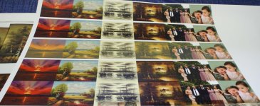
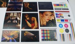
So we have bought a used machine a couple of years ago, but only recently started to actively work on it. Once we got it up and running, we ran into a problem with colors. Now, as I said, we're not really a professional printing place. We don't really need the print to be an exact match for the photo or whatever we are printing. But the initial prints we did came out to be very unsatisfactory. I'll attach a couple of photos as an example.
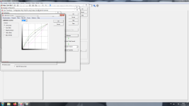
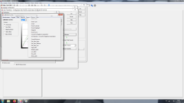
Generally, the prints come out over-saturated, dark and often dominated by one color (it's kind of hard to see it in the photos, because apparently the camera I took them does some color correcting, but it's much worse than in the photos). Now, from my limited knowledge, I understand that to achieve a good print, you need good color management and calibration. Also, there's a lot of talk about .icc profiles, which I don't really understand how they work. I tried loading some general usage .icc profiles in the RIP application we got with the machine, but none of them seem to do anything or have any effect on the print. The only thing that affected the prints was playing around with the curves and ink limit. But the ink limit generally just made the prints look pale(r) and I really don't get how the curves work.
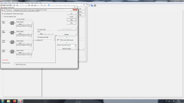
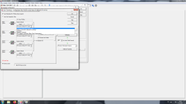
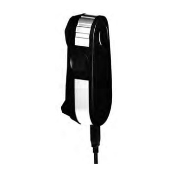
So are there any general pointers that people could give me? I know my best option would be to seek a professional, who could possible have one of those densitometer doohickeys, but where I live it's not really an option as I haven't found anyone who offers such services here. And as I said, I just need to get it to look "good enough", not really perfect or anything. So any advice is welcome. I'm also attaching a few screenshot of the color calibration options I have in my RIP application. Maybe it helps.


