Konica 6100 / Fiery issue with transparency

RVNG

Well-known member
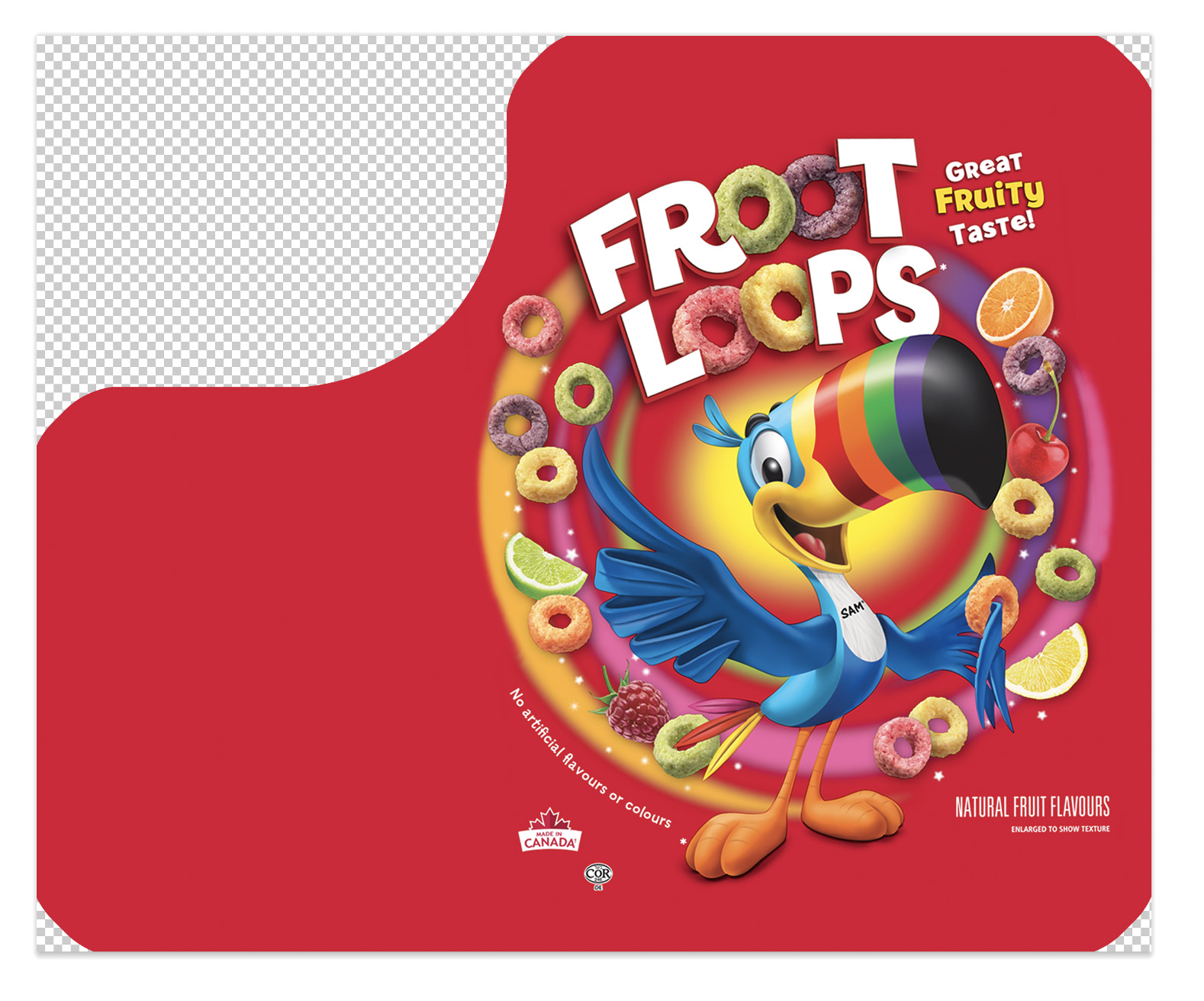
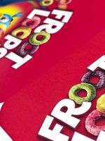
We ran into trouble with a job that had 2x contone images; sitting side by side; both RGB, both tagged with same ICC — when it runs through the Fiery, one image looks dull, the other is perfectly fine.
The only difference is the image on the right sits on a transparent layer in photoshop, and the Left image is flattened.
Question – is there a way to have the Fiery interpret each image the same despite its transparency? As I mentioned, the 2 images are identical in terms of colour space and profiling.
I realize that flattening the transparency is the fix, but why should this be?
The Fiery RIP handles transparency… but it handles the colour processing differently between transparent and non-transparent objects. Which doesn’t make sense to me.
A.jpg
B.jpg
 
A PDFX/4 workflow could probably prevent this.
You can go here to get test files and instructions on being compliant. You shouldn't have to flatten or anything once you get it working, and it will eliminate tons of future issues.
 
We use the PDFX/4 on our presets when saving/exporting from Adobe Illustrator/Indesign.
'Composite Overprint' - is that a setting on the Fiery?
 
Without the actual “final” PDF file along with the original images and InDesign or Illustrator file(s), it is virtually impossible to know what is going on.

That having been said, the moment you get transparency groups into the equation, all bets are off since it is possible that color space conversions are occurring prematurely during the rendering process.

If you are willing to share the assets, I might be able to determine what is really going on.

- Dov
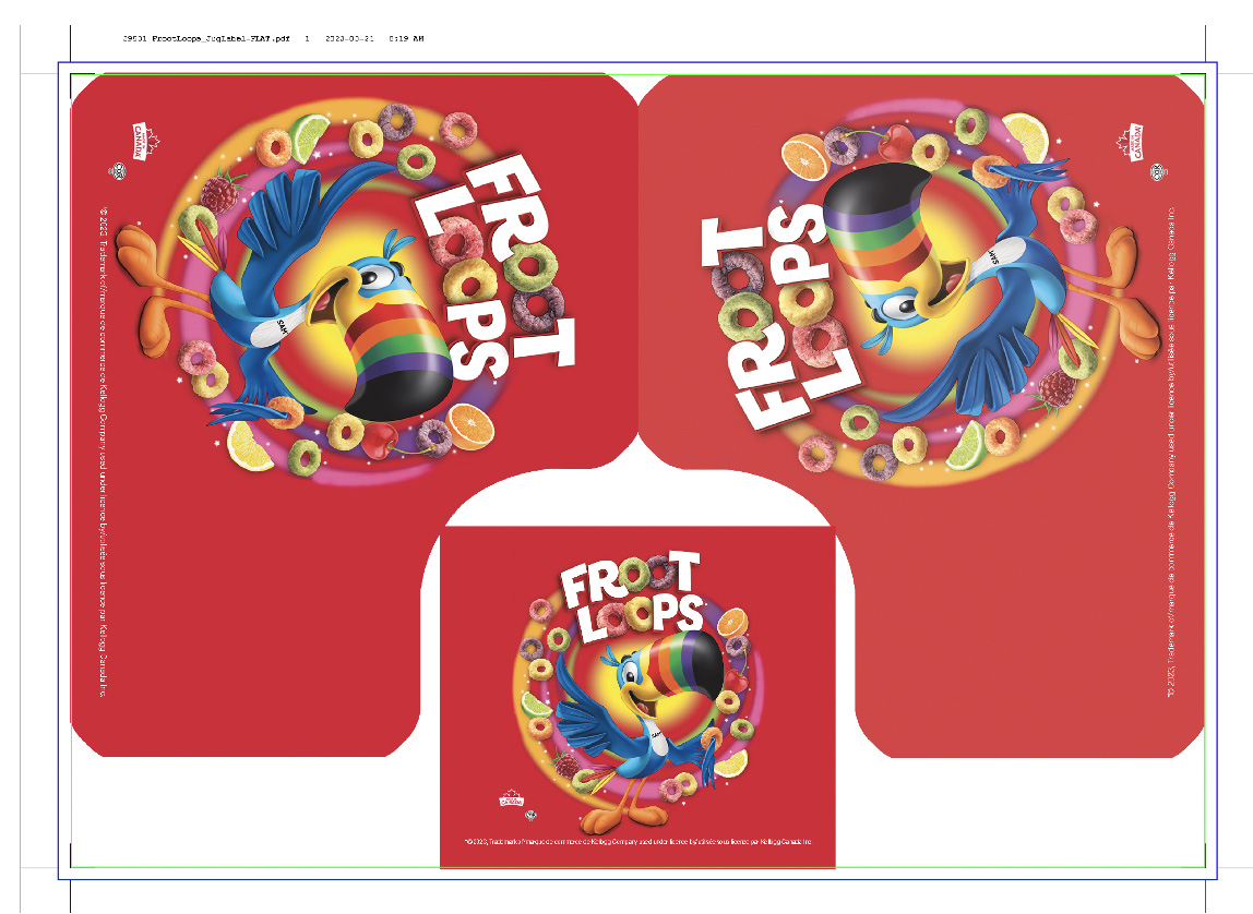
Thank you Dov. here is a link to the production PDF - 39531 Rev2_FrootLoops_JugLabel.pdf
Interesting to note: this art renders fine on our Kodak Nexpress and through our Heidelberg Prinect PDF workflow (Litho).
 
Nothing looks wrong to me examining the final PDF file and printing same. However, on a hunch, I made a patch to your final PDF file, removing the transparency group. It shouldn't make a difference, but try downloading the file at ZIP of Modified Test File and let me know whether this eliminates the problem for you.

- Dov
Thank you Dov! much appreciated.
Thank you! I will check our settings
Make sure your settings are correct.
I printed the file on my printer and it printed without issue.
View attachment 291904
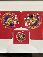
Thank you! I have run a test with the new settings... the colour is better, but I still see a difference between the two images. Photo attached - my camera is not picking up the difference very well but it is easier to see on the press sheet.
 

Attachments

  • fruitloop_test.jpg
    fruitloop_test.jpg
    53.6 KB · Views: 153
Without the actual “final” PDF file along with the original images and InDesign or Illustrator file(s), it is virtually impossible to know what is going on.

That having been said, the moment you get transparency groups into the equation, all bets are off since it is possible that color space conversions are occurring prematurely during the rendering process.

If you are willing to share the assets, I might be able to determine what is really going on.

- Dov
I did try the MOD file, thanks for sending along. Unfortunately same result. Here is a photo of the print.
 

Attachments

  • Unknown.jpeg
    Unknown.jpeg
    1.5 MB · Views: 183
try toggling "Adobe PDF Print Engine". I have two printers, one with and one without. I've noticed the one with prints transparencies and effects better.

I didn't look at the file, but... did the designer use the same colors throughout? I find files sometimes have the PMS spot in one area and process built in another. Even tho they use the "same" cmyk build, they'll render differently.
Toggling the "Adobe PDF Print Engine Preferred" box on our 7110 fixed a bunch of issues over the years.
 
try toggling "Adobe PDF Print Engine". I have two printers, one with and one without. I've noticed the one with prints transparencies and effects better.

I didn't look at the file, but... did the designer use the same colors throughout? I find files sometimes have the PMS spot in one area and process built in another. Even tho they use the "same" cmyk build, they'll render differently.
Yes, tried toggling the APPE on/off. Both areas of interest are contone images, both RGB, both tagged with the same ICC. The only difference is one is on a transparent layer in PSD, the other is not. If I flatten the one PSD the problem goes away.
I guess my point is, why should I have to do this if the Fiery uses an APPE? All our other workflows have APPE and they render it correctly.
 

PressWise

A 30-day Fix for Managed Chaos

As any print professional knows, printing can be managed chaos. Software that solves multiple problems and provides measurable and monetizable value has a direct impact on the bottom-line.

“We reduced order entry costs by about 40%.” Significant savings in a shop that turns about 500 jobs a month.


Learn how…….

   
Back
Top