Pantone Alternative for Illustrator & Photoshop

prwhite

Administrator
Staff member
SAUERESSIG e.GEN—provider of prepress services & tools—has announced an alternative to Pantone for Adobe Illustrator & Photoshop users with their c.CLOUD—cloud-based color database plugin.

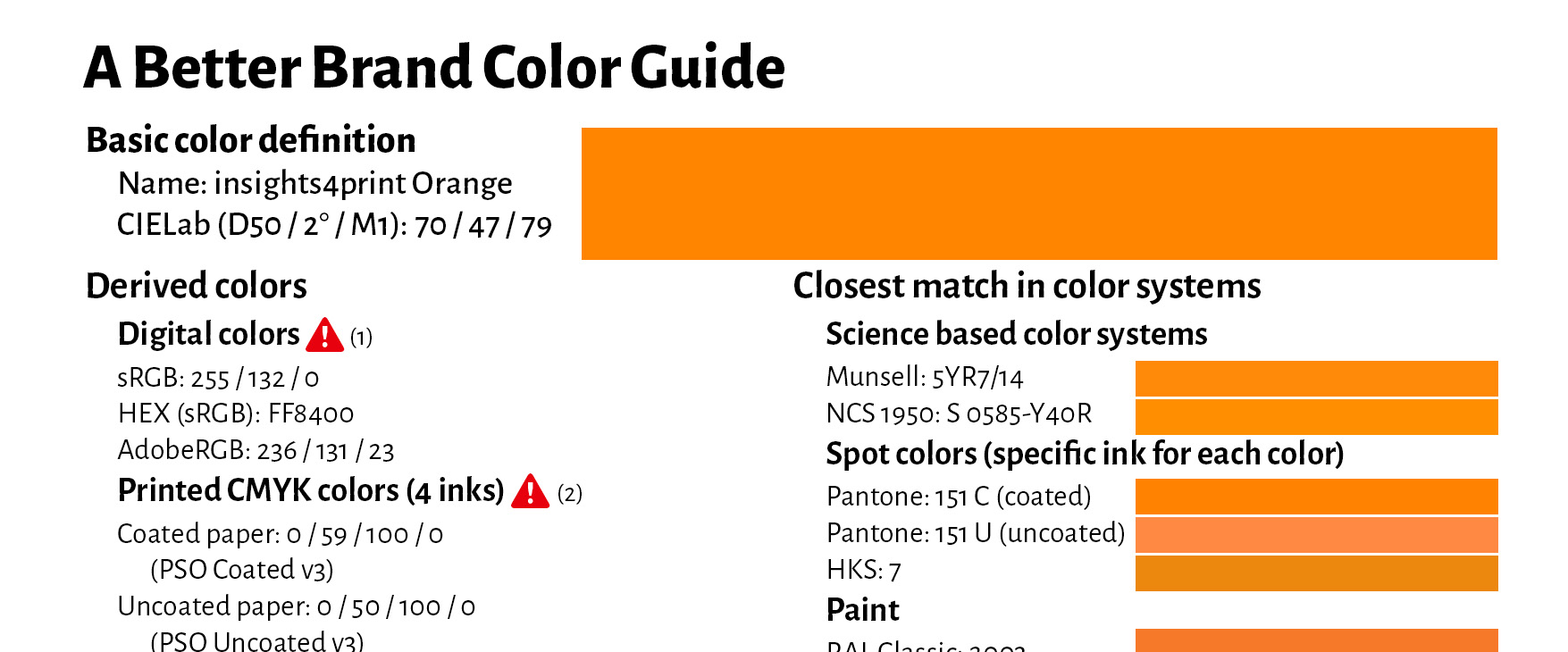
To connect c.CLOUD with Adobe products, a plugin for Illustrator & Photoshop is provided that retains Adobe’s user interface. Using c.CLOUD, Adobe users can deliver color libraries based on freely available spectral data like CIELAB HLC.

According to the company, color recipes, color information and printing parameters can be integrated into c.CLOUD’s color standard, and accessed anytime. The cloud-based color database facilitates data transfer across an entire supply chain for brand consistency.
Click here for more information.
 
Interesting information. But I wonder whether this isn't simply substituting a headache for an upset stomach.

Yet another so-called “standard” to worry about (Some standards are more standard than others!) and buy into. Just what we really need.

And of course, yet another subscription “cloud service” that effectively requires (1) that you be on-line to access information, (2) trust that this company will be around and not “retire” its products and services, and (3) all aspects of your workflow must subscribe to it.

Hmmmmmmmmmm.

- Dov
But, but CLOUD ! ! :LOL:
 
I would think that getting removed from Adobe software is going to cause Pantone to become much less relevant. I can't believe they aren't doing whatever they could to get Adobe to keep including them. Apparently graphic arts color is just a small part of their business, but I would still think this would be devastating to them.
 
I would think that getting removed from Adobe software is going to cause Pantone to become much less relevant. I can't believe they aren't doing whatever they could to get Adobe to keep including them. Apparently graphic arts color is just a small part of their business, but I would still think this would be devastating to them.
I thought it was Pantone that was pulling out of Adobe, not the other way around? In any case, regardless of the amount of business the graphic arts industry provides for Pantone, I think that from the industry’s standpoint (including ink); Pantone is the color standard. There is nothing else. And I don’t think anyone is more aware of that fact than Pantone itself. So, at least for now, that gives them an awful lot of clout within the industry to pretty much do whatever they want. Which I think is what they’re demonstrating, right now.
 
I would think that getting removed from Adobe software is going to cause Pantone to become much less relevant. I can't believe they aren't doing whatever they could to get Adobe to keep including them. Apparently graphic arts color is just a small part of their business, but I would still think this would be devastating to them.
You would be correct if Pantone was a scrappy start-up. But the fact is that Pantone is a subsidiary of X-Rite which in turn is a subsidiary of Danaher, an international conglomerate (which also includes Esko FWIW). Often, in such situations, the emphasis is on quarterly profits as opposed to long term vision as well a tying the ultimate customer (i.e., the designers and their corporate employers) to Pantone as direct customers, not “filtered” via Adobe's own “Adobe Color” infrastructure.

In terms of relevance, for graphic arts and color within large corporations, Pantone colors may be a starting point, but ultimately, many create their own brand colors and definitions. The “loss” of bundled, direct Pantone access within Adobe applications won't hurt them. Those who will be hurt will be smaller organizations and their workflows involving smaller print service providers when it comes to use of spot colors and/or high fidelity colors (use of additional colorants in typically a digital press to expand gamut).

Ultimately, if the positions stay as currently projected, I expect that designers and brand managers will continue to use Pantone definitions although the “definitions” (i.e., the Pantone color name and the LAB alternate color space specification) will simply be passed around independently from the full palettes). We'll obviously see what transpires.

- Dov
 
I thought it was Pantone that was pulling out of Adobe, not the other way around? In any case, regardless of the amount of business the graphic arts industry provides for Pantone, I think that from the industry’s standpoint (including ink); Pantone is the color standard. There is nothing else. And I don’t think anyone is more aware of that fact than Pantone itself. So, at least for now, that gives them an awful lot of clout within the industry to pretty much do whatever they want. Which I think is what they’re demonstrating, right now.
We are a tiny little print shop, but our largest clients are very large billion dollar corporations and we get a sliver of their work. What I have seen over the past decades in our little area is the move from everything being pantone, to exactly what Dov said. The ad agencies for these companies have switched over to using LAB specs for their brand colors back around 6 or 7 years ago. So from our perspective, it seems Pantone will fade more as time goes on, though they seem to have their fingers in more pies than I realized.
 
  • Like
Reactions: SMS
How would it impact "designers" who don't care/know about spot colors or cmyk they just use the Pantone named colors in their apps to specify colors?
 
How would it impact "designers" who don't care/know about spot colors or cmyk they just use the Pantone named colors in their apps to specify colors?
Such “designers” are a significant part of the problem, especially if they don't differentiate between real spot colors that have Pantone names versus CMYK or RGB composite colors with Pantone names. Amazing the problems you get when real spot colors get involved with overprint and transparency and/or when a print service provider gets a job with dozens of spot colors defined and accessed therein. :(

- Dov
 
I would think that these so called corporate designers are an even bigger problem because (apparently) they’re just making up spot colors that don’t even exist, on the fly, using L*a*b specs. I don’t know but maybe it’s fine for web pages, or digital printing machines, but it would be very difficult to match on an offset press to anything resembling a pre-printed swatch - because there aren’t any. Just trust your G7 certification, and everything’s good to go?

And for a true printed solid (without using the CMYK printing process), I would think that it’s not possible to create that color at all, since you first have to have an actual formula for mixing the Pantone base colors.
 
  • Like
Reactions: SMS
Such “designers” are a significant part of the problem, especially if they don't differentiate between real spot colors that have Pantone names versus CMYK or RGB composite colors with Pantone names. Amazing the problems you get when real spot colors get involved with overprint and transparency and/or when a print service provider gets a job with dozens of spot colors defined and accessed therein. :(

- Dov
We see more of these every day, and coupled with CSRs who say "the customer doesn't need to see a proof, just print it" this creates all sorts of problems as you say. Of course, whenever a job goes tits up (as we say here in Australia) fingers are immediately pointed at Prepress, with the ever present refrain of "it looked OK on my screen"
 
with CSRs who say "the customer doesn't need to see a proof, just print it"
i always ask CSRs/sales to send me an email saying that because you're right, they blame prepress, so I require an email now and then just reference it when the client rejects.
 
Interesting discussion - and still relevant I suspect. I can only recommend that you guys check out the Spot Matching System. It contains a total of 2.600+ colours, split into 3 versions, - Standard, ECO and MAX. All our SMS colours have in common that they can be selected on your (calibrated, sRGB capable) display and then easily converted to the CMYK colour spaces you want to use. SMS colours are even available - or can be converted to the new Fogra 58 RGB colourspace for digital textile printing. And the LAB values you see on your screen are always the LAB values you should aim for when you print the colours (or dye or paint - or whatever you need to do).
The Spot Matching System is created for consistent colour cross media, - one colour for all media v.s. one colour pr. media.
No subscription is required. You just have to buy the colour palette you want - at EUR 60 each. More info at www.spotmatchingsystem.com/news. Contact [email protected] for more information.
 

PressWise

A 30-day Fix for Managed Chaos

As any print professional knows, printing can be managed chaos. Software that solves multiple problems and provides measurable and monetizable value has a direct impact on the bottom-line.

“We reduced order entry costs by about 40%.” Significant savings in a shop that turns about 500 jobs a month.


Learn how…….

   
Back
Top