Problems with PDF files

make sure the it is saved to PDF version 1.5 or lower. If it is 1.6 or higher, Quark can't import it.


I noticed that some times we can not import PDF files in the pages after we modulate the original files like cropping or image processing to make color correction .

I resaved the files again with alower acrobat version it solved the problem particially but i still have that monky on my back......
 
I never put PDFs in Quark
I also didn't put PDF in Quark... but I sometimes put PDF in XPress... XPress is the software you work with, Quark is the manufacturer whom you give your money...

Anyway... XPress (as previously said) is not very good in importing PDF... the 5 and 6 releases are limited to PDF 1.3 only, and the 7 is limited to 1.5 maxi... (no info for the 8)
And I often experienced problems with importing in XPress PDF exported from InDesign or other Adobe softwares...
... XPress works better (or less bad) with distilled PDF.

As previously said, prefer an EPS file or switch to InDesign.


I always rasterize ads from agencies in Photoshop and then resave as TIF or EPS for placing in Quark - I just have always done this as I know a TIF is a complete flattened file and there will be no font issues which you can still get with EPS.
1-
That's the last chance solution to image a problematic PDF, but that's also the worst solution, giving unsharp text, unsharp lines as a contone picture can only do...

Of course you have no more problem with fonts and postscript level and so on, but you make butcher job and crap printing...


*********

2-
You make a (common) confusion between "rasterize" and "pixellize": opening a vector-based file - like a PDF - in a picture software like Photoshop DOESN'T rasterize the file, but pixellize the file, making a picture at a given resolution and in a given color mode : grayscales or CMYK.

At this step, you should know the big (and very important) difference between line-art mode and grayscales/CMYK mode (also called "contone" - for continuous tone - modes):

• line-art pictures contain only black and white pixels, that can be printed directly by laser or ink-jet printers and by offset presses: it easy to understand: for a black pixel, the printer or the offset press puts a "drop" of black ink on the paper, and for a white pixel the paper is left blank.

• contone grayscales pictures contain also black and white pixels plus gray pixels: in a common 8-bits grayscales picture, there are 254 different shades of gray... but the ink-jet/laser printers and the offset presses still work with ONE black ink and are able to print ONLY black or white pixels...
... and they are absolutely unable to print directly a single gray pixel, so they are completely unable to print 254 different shades of gray...
Here is the problem... and it has no solution...

... but a workaround exists: it's the screen. A screen is an area of little black dots in a white surface: seen at a reasonnable distance, the little black dots cannot be distinguished and our eyes see only a mix of black and white, making a gray:
- bigger are the black dots, more little is the white area remaining, and darker is the gray,
- thinner are the black dots, bigger is the white area remaining, and lighter is the gray.

Both vector pictures and bitmap pictures use a screen to print shades of gray... but they don't deal identically with the screen dots:
- vector can cut the screen dots to make them follow exactly the border of a line or a curve, so texts and other lines can keep a perfect shape, making a crisp printing
- bitmap pictures cannot cut the dots exactly on the borders, so texts and other lines are made with complete screen dots giving a rough line that seems unsharp when printed... that' why pixellized text is unsharp.

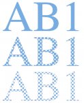
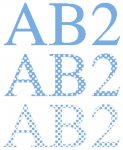
Sorry, it's quite difficult to explain, and more because english is not my native language (sorry for the mistakes)... so, here are two drawings that show clearly and exactly the real look of text in vector mode (AB0) and in pixel mode (AB5)... the difference is obvious!!!

(both pictures are made with a Viper RIP, by outputting the 1-bit rasterized picture as a file instead of sending it in the imagesetter: so it is EXACTLY what is normally on a film...
Text is Times 8 pts, the screen ruling is 150 lpi, the résolution of the 1-bit raster is 2400 dpi and the résolution of the grayscale picture "AB5" is 300ppi.
The magnification resulting of displaying a 2400 dpi picture on a 72 dpi screen is 33,33, times.
I added a thin red line on the "AB5" text to materialize the real shape of the glyphes.)
 

Attachments

  • AB0.jpg
    AB0.jpg
    72.1 KB · Views: 152
  • AB5.jpg
    AB5.jpg
    71.2 KB · Views: 157
Last edited:
A rasterization is completely different of a pixellization:

• you cannot rasterized a file with Photoshop... to rasterize a file, you need a RIP (RASTER image processor)!
(but converting a picture from grayscales to line-art with the "Halftone screen" option is a kind of rasterization)

• depending of the contents of the file, pixellization outputs CMYK ou grayscale or line-art pictures...
... but whathever the contents of the file, rasterization outputs only line-art (or 1-bit) pictures at the résolution of the output device: only black and white dots, made to image a black and white film, to copy a black or white plate and to be printed with one black ink on white paper,

• pixellization transforms the contents of the file in pixels CMYK or gray or black/white, depending only of the mode choosen by the user but without any difference during the pixellization between bitmap pictures or vector elements...
...rasterization transforms each kind of elements in a different manner:
- contone pixels in screen dots,
- line-art pixels in printer dots,
- vector black 100% element in printer dots
- vector gray elements in screen dots trough a clipping path (that makes the outlines sharp and crisp)...
... and finally built the screen dots with the printer/imagesetter dots and mix all that dots together in the same 1-bit raster picture

• pixellisation of a CMYK file in CMYK mode makes a CMYK pictures...
... rasterization of a CMYK file makes also the separation and output four 1-bit raster pictures: one for the cyan, one for the magenta, one for the yellow and one for the black.

• pixellization of a vector-text in contone mode makes unsharp printed text (AB5)...
... rasterization of a vector-text makes a crisp perfect text (AB0)

• pixellization of a contone vector file outputs unprintable contone pixels...
... rasterization of a contone vector file outputs a screen with screen dots and with a screen ruling...
... so, if the process DOESN'T ask for a screen ruling, then it is a pixellization, NOT A RASTERIZATION: opening a PDF file in Photoshop ask only for a resolution, not for a screen ruling, so it's only a pixellization.

Rasterization and pixellisation are really different!!!


... but pixellization of a vector-text in line-art mode makes also a crisp perfect text: "AB1" and "AB2" are both made from an EPS vector-text pixellized in Photoshop at 2400 (AB1) or 1200 ppi (AB2)... in this particular case, and only in this particular case, rasterization and pixellization make the same job and output the same pictures, with the same quality.

(1200 ppi is just a little bit less fine, but the resolution of human eyes is only about 420 ppi... and using a 1200 dpi resolution to image documents containing only text is a common pactice in print-shops)

PPI = pixels per inch: this unit is for pictures resolution
DPI = dots per inch: this unit is for printers/imagesetters resolution
LPI = lines per inch: this unit is for screens
 

Attachments

  • AB1.jpg
    AB1.jpg
    61.4 KB · Views: 158
  • AB2.jpg
    AB2.jpg
    66.5 KB · Views: 152
Last edited:
cmpe said:
I used to rasterise them in 1200 dpi and make huge files.
Lol! of course it makes huge files! because you make a pixellization in CMYK mode, not a rasterization... (a rasterization at 1200 dpi of a CMYK PDF would have give you 4 pictures each 32 times lighter than your CMYK 1200 ppi picture!!!)

... and it's common mistake to believe that an higher resolution will always do a better printed result...

For all pictures, it's partilly right: both line-art or contone pictures have a minimum resolution, and an optimal resolution:
- if the picture resolution is under this minimum resolution, the quality drops, of course...
- but it no use to have a resolution above the optimal résolution, it only grows unusefully the size of the file!

1- line-art pictures have black or white pixels that can be really printed, and our eyes can really see the printed pixels...
... but the human eyes have a 420 ppi mean resolution, so they can see a difference of quality in the range 0-400 ppi, but over 400/450 ppi the eyes make no difference whatever the used resolution is... so the common resolution needed for line-art offset printing is between 600 and 1200 ppi, the normal good quality optimal state of art printing resolution is 1200 ppi.
It's no use to have an higher than 1200 ppi résolution for line-art pictures, it only makes bigger files...


2- for contone pictures, as they need a screen, the resolution is linked to the screen :
• the minimum resolution is at least equal to the screen ruling of the screen used to print...
• and the optimal resolution is a relationship with the screen ruling:
- resolution = screen ruling X2 at 133 lpi and below 133,
- resolution = screen ruling X1,5 above 133 lpi.

... because, as I explained 2 posts before, the pixels cannot be printed directly, so they are never printed, they are always transformed in screen dots, and what you see on the paper are only the screen dots, whatever* the resolution is (while it is at least equal to the screen ruling of the screen)...

... so it is absolutely no use to pixellize a CMYK picture at more than twice the screen ruling, so it is more unuseful to pixellize at 1200 ppi... even with a 1200 ppi or 2400 ppi or 125,879,645,458 ppi contone picture, you will see only the 150 or 175 lpi screen dots on the paper.

The following drawing is a comparison between 4 different resolutions grayscales pictures (2400, 1200, 300, 225 ppi) printed with 150 lpi screen (the normal resolution for this screen ruling is 225 ppi, the standard used resolution is 300 ppi): as you can see, it's the same crap, with no real difference, whatever the resolution.


(I'm not sure of the use of the word "whatever"... sorry again...)
 

Attachments

  • AB3456.jpg
    AB3456.jpg
    102.7 KB · Views: 164
Last edited:
And for those who want to compare all the different text pictures...

vectoriel = vector based text
"au trait" = line-art
niveaux de gris = grayscales

The PDF viewed at 100% gives 8 X magnification.
 

Attachments

  • Grayoutx8.pdf
    79.4 KB · Views: 177

PressWise

A 30-day Fix for Managed Chaos

As any print professional knows, printing can be managed chaos. Software that solves multiple problems and provides measurable and monetizable value has a direct impact on the bottom-line.

“We reduced order entry costs by about 40%.” Significant savings in a shop that turns about 500 jobs a month.


Learn how…….

   
Back
Top