
You are using an out of date browser. It may not display this or other websites correctly.
You should upgrade or use an alternative browser.
You should upgrade or use an alternative browser.
Screen angles
- Thread starter aqazi81
- Start date

aqazi81
Well-known member
Thank you gordo for quick reply...
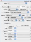
Below are the angles that were used. Are these correct.
With new angles there is no screen moire and the results are much better than earlier angles but there is some difference in final print result.
Old Angles
C 75 M45 Y90 K15
New Angles
C 15 M45 Y90 k 75
Below are the angles that were used. Are these correct.
With new angles there is no screen moire and the results are much better than earlier angles but there is some difference in final print result.
Old Angles
C 75 M45 Y90 K15
New Angles
C 15 M45 Y90 k 75
gordo
Well-known member
Thank you gordo for quick reply...
Below are the angles that were used. Are these correct.
With new angles there is no screen moire and the results are much better than earlier angles but there is some difference in final print result.
Old Angles
C 75 M45 Y90 K15
New Angles
C 15 M45 Y90 k 75
They're fine. With the new angles you're just swapping the M and K angles from the standard C15, Y90, M75, K45.
The standard is standard because Y is the least visible color so it's placed at the most (human) visible angle (90/0 degrees) it's also typically run at about 108% of the lpi of the other screen lpis to reduce moiré with the screen that's offset 15° from the Y (typically C but also sometimes M).
K is typically at 45° because it's the least human visible angle so that helps hide it considering it's the darkest color. Also, 45° helps reduce the sawtoothing effect of the screen at low lpi on the edge of B&W images. M and C are offset from K by 30° to create the least visible moiré pattern - rosettes.
What difference are you seeing compared to your old?
maac
Well-known member
No Title
Back in 2008 or so we also had moire problems from time to time on the Heidelberg 74 and did not know why. We found out from just one of our customers. We tried everything from changing the ink rotation lay down to screen angle swap and the lpi from 175 to 200. For the most part it did not help it would just hide the problem or become less noticeable. So when we brought the Heidelberg sm-52 anicolor we were told to run with a new screen family designed for that press. So one day that same customers had a new job on press on the Heidelberg 74 and the same problem with the moire not at all good. We change out the screen family from (PCC Nominal Euclidean 175lpi) to the (CQS Plus 7.5 Euclidean 175lpi) and know more moires we were not sure why but it does work for us.
Some years later I came across an article on here on the digital camera color gamut. I think it was just that. we still used the CQS Plus 7.5.
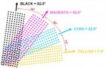
Cyan 82.5
Magenta 52.5
Yellow 7.5
Black 22.5
Spot 22.5
Back in 2008 or so we also had moire problems from time to time on the Heidelberg 74 and did not know why. We found out from just one of our customers. We tried everything from changing the ink rotation lay down to screen angle swap and the lpi from 175 to 200. For the most part it did not help it would just hide the problem or become less noticeable. So when we brought the Heidelberg sm-52 anicolor we were told to run with a new screen family designed for that press. So one day that same customers had a new job on press on the Heidelberg 74 and the same problem with the moire not at all good. We change out the screen family from (PCC Nominal Euclidean 175lpi) to the (CQS Plus 7.5 Euclidean 175lpi) and know more moires we were not sure why but it does work for us.
Some years later I came across an article on here on the digital camera color gamut. I think it was just that. we still used the CQS Plus 7.5.
Cyan 82.5
Magenta 52.5
Yellow 7.5
Black 22.5
Spot 22.5
Attachments
Last edited:
gordo
Well-known member
Back in 2008 or so we also had moire problems from time to time on the Heidelberg 74 and did not know why. We found out from just one of our customers. We tried everything from changing the ink rotation lay down to screen angle swap and the lpi from 175 to 200. For the most part it did not help it would just hide the problem or become less noticeable. So when we brought the Heidelberg sm-52 anicolor we were told to run with a new screen family designed for that press. So one day that same customers had a new job on press on the Heidelberg 74 and the same problem with the moire not at all good. We change out the screen family from (PCC Nominal Euclidean 175lpi) to the (CQS Plus 7.5 Euclidean 175lpi) and know more moires we were not sure why but it does work for us.
Some years later I came across an article on here on the digital camera color gamut. I think it was just that. we still used the CQS Plus 7.5.
Cyan 82.5
Magenta 52.5
Yellow 7.5
Black 22.5
Spot 22.5
I think that your use of CQSPlus7.5 is irrelevant. (It is typically used for printing on tubes.)
Your dot shape is "Euclidean" (round/square/inverted round)
7.5° screen angle offsets are used to avoid single channel moiré. This can happen when an extra one or two pixels appear and repeat on the individual halftone dots causing a moiré pattern within that single color. That is probably what solved your moiré problem.
Running K at 22.5 is OK but can cause "sawtoothing" and/or "ribboning" when printing B&W imagery because of how the screen angle hits the edges of a thin line or photo edge.
Running the spot at an arbitrary 22.5° may work but, if it's screened and overprinting a process color it could cause problems. If it overprints K then you'll lose gamut and may experience moiré with slight misregistration (you're doing dot on dot overprinting K). Normally the angle of a spot color is selected based on the "missing color" approach. For example, a spot Green would use the M angle because Green would never print with M. Orange spot would use the C angle because O would never print with C and so on. That also keeps the spot color 30° away from the other colors and therefore minimizes the visibility of any moiré.
If you're not sure about what "sawtoothing" or "ribboning" is, read this post (scroll down to the relevant bits)
Last edited:
maac
Well-known member
That is a lot to think about, and you are spot on I should have seen that (black and spot angles). I will change out the black to (82.5) and the spot to (37.5) the setup will be.
Cyan 22.5
Magenta 52.5
Yellow 7.5
Black 82.5
Spot 37.5
We are locked in to the (CQS Plus 7.5.) screen family because of the Heidelberg sm-52 anicolor small quantities. The Heidelberg Speedmaster -74 for large quantities. We need to run the same type of work off both of them and the color needs to match.
We also have the 2 color Komori and 2 color Ryobi were we run screen family (PCC Nominal) Round dot
Cyan 15
Magenta 75
Yellow 90/0
Black 45
Spot 75
Thanks for your help gordo
Michael
Last edited:
gordo
Well-known member
I had forgotten to add the link to the ribboning and sawtoothing so I'll describe it here 'cause it's worth knowing about:
Sawtoothing:
In the below graphic, the halftone screen angle is the same (45º) but the angle of the gray box has been changed in 10º increments.

Note how the smoothness of the edges of the box changes as its angle relative to the halftone screen angle changes. The ragged appearance of edge of the last box is referred to as "sawtoothing."
In certain circumstances, depending on the size of the graphic and the frequency of the halftone, the selected screen angle can distort the accurate rendering of images.
In the below graphic, the halftone screen angle is the same (45º) but the angle of the gray lines have been changed.

Note how the screen has affected the rendering of the gray lines at different angles. The artifact at 1, 2, 3, and 4 is referred to as "ribboning" and is fairly common in the printing of automobile images.
In the below graphic, the halftone screen angles have been changed to the standard 4/C process angles (K 45º, C 15º, M 75º, Y 0º) but the angle of the three gray lines have been kept the same (0º).

In this case ribboning has appeared in the Cyan and Magenta angles while the Black and Yellow angles have caused the appearance of different dotted line effects.
All these issues are usually more prominent with lower lpi screens and less visible with high lpi screens and smaller graphics rather than larger ones and are not revealed in inkjet proofs. Of course FM screening eliminates the problems completely.
Sawtoothing:
In the below graphic, the halftone screen angle is the same (45º) but the angle of the gray box has been changed in 10º increments.
Note how the smoothness of the edges of the box changes as its angle relative to the halftone screen angle changes. The ragged appearance of edge of the last box is referred to as "sawtoothing."
In certain circumstances, depending on the size of the graphic and the frequency of the halftone, the selected screen angle can distort the accurate rendering of images.
In the below graphic, the halftone screen angle is the same (45º) but the angle of the gray lines have been changed.
Note how the screen has affected the rendering of the gray lines at different angles. The artifact at 1, 2, 3, and 4 is referred to as "ribboning" and is fairly common in the printing of automobile images.
In the below graphic, the halftone screen angles have been changed to the standard 4/C process angles (K 45º, C 15º, M 75º, Y 0º) but the angle of the three gray lines have been kept the same (0º).
In this case ribboning has appeared in the Cyan and Magenta angles while the Black and Yellow angles have caused the appearance of different dotted line effects.
All these issues are usually more prominent with lower lpi screens and less visible with high lpi screens and smaller graphics rather than larger ones and are not revealed in inkjet proofs. Of course FM screening eliminates the problems completely.
gordo
Well-known member
@Gordo:
I thought that solving the screening issues you mention above and no moire were the original and best selling points for stochastic screening when it first came out back in the late 80s/early 90s.
Although I still believe a 300lpi or higher conventional line screen is capable of finer detail.
Those indeed were some (but not all) of the selling points when stochastic was introduced for printing (BTW digital stochastic was actually introduced for green/black, amber/black computer displays that needed to reproduce tones but didn't have the resolution to do halftones)
I would disagree with you about 300 lpi or higher conventional screens being capable of finer detail since, to simulate tones, image pixels in an AM screen are clustered to form halftone dots which are larger structures than the pixel structures used with an FM screen to simulate tones. That clustering to form a halftone dot in an AM screen effectively sacrifices detail to represent tones. You don't have that loss of detail with an FM screen. Also, with an AM screen you still have a (high frequency) moiré structure called a "rosette". Rosettes, because they are "periodic", effectively reduce the lpi in that periodic structure by 50%. So an AM screen, from a detail rendering point of view, has two frequencies - the periodicity of the individual dots (e.g. 300 lpi) and the periodicity of the rosettes (at 150 lpi). FM screening, of course, doesn't have that issue.
IMHO, I really don't see the point in using a 19th century AM halftone screen in today's digital world - especially considering that today's contract proofing typically does not simulate, the sometimes disastrous, effect of an AM screen on printed imagery.
Interestingly, on a sidebar, printers seem to be fixated, or attached to, lpi as some sort of "Holy Grail". I once helped a printer win a "They Said it Couldn't be Done" Benny award in 2002 by doing the technical work so that he could print a poster at, if memory serves, 1695 lpi. It was silly, but he was very proud. What happens when you really crank up lpi with an AM screen is that you get what looks, under a loupe, like a crappy FM screen. But what can I say? The customer is always right. LOL
gordo
Well-known member
One problem I see with FM screening is because it appears randomly, sometimes it appears in non image areas where it doesn't belong and creates a very light color where there should actually be none. This can be seen in reversed out images, and especially seems to appear around edges that should be extremely sharp and appear to be clean, but when examined under a loupe, are not crisp at all.
That has nothing to do with the FM screening. It has to do with its implementation. FM screening may appear random -but it's not - no matter the vendor.
Because conventional AM screening does not appear randomly, the edges of images are always clean and crisp. A screened image may appear uneven because of where the screen angle ends, but the dot is either there (partially or wholly) or it isn't, and does not show up in areas that it shouldn't be in.
Sorry, but that may have been your experience but it makes no sense and I've never seen it in a proper FM installation. Your FM supplier may have done you a disservice.
Personally I would say that overall, I prefer FM screening because of it's obvious advantages with no moire, and (what appears to be) it's ability to screen areas with no rough edges.]/quote]
Yes
But I also see some of it's flaws and think that AM screening has a few advantages as well, especially in the higher lpi range. That's where I think it really shines as far as detail is concerned but unfortunately, it seems that most printers aren't really set up for it and are unwilling or unable to reproduce it. IMO.
Well, if "most printers aren't really set up for it and are unwilling or unable to reproduce it" is not a problem of the FM screening technology - it is a problem of the printshop management. Those who have adopted FM screening do very well indeed with it - both lithographically and economically. I've explained the technical reasons why FM is superior to high lpi AM - what you offer in contrast is opinion without any apparent technical basis. Screening is a technical matter not a matter of opinion. Also, there is no "FM" screening per se, each vendor has their own implementation and some are...crap, while others are brilliant (pun intended).
On a sidebar, I helped set up my local daily newspaper to print with FM screening (Auraia DM 2) using secondhand ECRM violet CtP and they've saved some 25% in ink usage cost ($$$savings) and reduced their advertiser charge backs to virtually zero (when I first met them the stack of chargebacks was nearly a foot thick). Plus they now print near-photographic fidelity with no moirés. They love it and so do their advertisers and sales people.
Last edited:
Similar threads
- Replies
- 0
- Views
- 2K
- Replies
- 3
- Views
- 903


