Standard Dot Gain from CTP

bhm8hwcm

Well-known member
Can someone please provide some insight into what are some standard dot gain standards when running CTP. I have a DI press and when printing raw data from the rip we print with lots of gain (way more than normal CTP plates). At the rip we include a curve that basically removes all dot gain so in fact making our plates linear. We then add back a curve with the desired amount of gain.

I am running a Xitron rip and initially my rip was setup to simulate SWOP using the SWOP dot gain curve in the rip. I assume this is old SWOP as the gains are quite high.

I understand that when many people put in CTP, out of the box things print pretty good and so I wanted to simulate these standards. I have done extensive searching for info but I have not found a lot. My plan down the road is to possibly go for gracol but in my reading it appears as though you want to start with a press printing to decent standars before you make your adjustments for gray balance. My question is what is this standard?

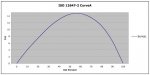
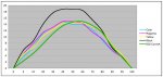
What is standard dot gain for all 4 colours for :

5%, 25% 50%, 75%, etc.

Based on some reading, does the following appear to be true?
At 50% black gains about 4-5% more than cyan and magenta.
At 50% yellow gains about 2% less than cyan and magenta.

Does cyan gain more than magenta, or magenta more than cyan?

I seem to have problems in highlights and midtones (printing too light) and so I also think the shape of the curve may be important as well in this area.

Any thoughts? Any curves to share?
 
First - forget dot gain.
What's important is final tonality - not what is on the the plate to achieve it.
The old GRACoL (6) provided these values - using a 175lpi AM screen, round dot at the following densities (measured dry) on a gloss #1 or #2 sheet:
K: 1.70 - 22% - what this means is 50% in the file = 72% in presswork
C: 1.40 - 20% - what this means is 50% in the file = 70% in presswork
M: 1.50 - 20% - what this means is 50% in the file = 70% in presswork
Y: 1.05 - 18% - what this means is 50% in the file = 18% in presswork

There is likely no need to first linearize the plate - it just adds a complication. You might start with an uncalibrated plate and build curves that achieve the final required tonality.

best, gordo
 
We have always adjusted exposure to hold he smallest dot that you want. After that adjust your curve to get what you want. As a general rule of thumb when you get different batch numbers of plates that may require an exposure change this method almost always puts your curve right where you want it.
We have used this method for ctp since 1997.
 
My plan down the road is to possibly go for gracol but in my reading it appears as though you want to start with a press printing to decent standars before you make your adjustments for gray balance. My question is what is this standard?

Applying G7 (Gracol) does not require that your press already be printing toward standards, but rather that it be in good working order and mechanically/chemically sound.

The old Gracol 6 numbers are just that...old. Or rather, outdated, though one might often find them to achieve similar results compared to updated specifications. ISO 12647-2 defines the current international standard in terms of solid ink color and tonality (via TVI/dotgain). G7 allows a means to achieve ISO 12647-2 compliant print but with a more unambiguous definition of tonality.
 
I have to somewhat disagree with meddington.

It does no harm, and can do a great deal of good, to start to gain process control of prepress/pressroom by targeting the "old" standards and specifications - still used by the vast majority of the prepress/print world. Once a solid foundation of understanding in prepress and pressroom has been established, then GRACoL 7 can be implemented as required. Perhaps sooner, perhaps later.

thx, gordo
 
Call me old school if you like but I think some of today's "stnadards" are a bit of over kill. After all it is still ink on paper. We have been running linear for 4 years doing all 5 color work and we have never had a problem.
 
jose

jose

I have been reading your article on Dot gain and the responses posted on your site amazes me i keep asking myself the following, why are these people not contacting the press suppliers to get the true facts and advice.
Some of the responses would not be accepted by a lot of print buyers ,sticking to ISO or Fogra standards can keep you away from a lot of trouble.

Press manufactures do extensive tests on different types of papers and inks and they have the best answers.

Being in the print industry for 30 years it amazes me how people go about looking for solutions when the very people that are supplying you the product should be the ones with the answers.

Lastely, if the suppliers are not prepared to advise then you know you have purchased from the incorrect supplier.

Thanks

best regards
 
It does no harm, and can do a great deal of good, to start to gain process control of prepress/pressroom by targeting the "old" standards and specifications - still used by the vast majority of the prepress/print world.

Not to argue your point, but the old standards/specifications are generally lacking in terms of fully defining tonality, relying on only midtone TVI and print contrast, and offer little insight into highlight tonality, which was part of the original question posted. This could be particularly deficient when using non-standard screening.
 
Not to argue your point, but the old standards/specifications are generally lacking in terms of fully defining tonality, relying on only midtone TVI and print contrast, and offer little insight into highlight tonality, which was part of the original question posted. This could be particularly deficient when using non-standard screening.

Agreed. Could you post a graph that shows what the current dot gain curves look like?

best, gordo
 
Not legal to copy the ISO standard I'm afraid, but here's an approximate Excel plot of ISO's curve A. There are other proposed curves that could be said are more representative raw CTP, but nothing official there yet.
 

Attachments

  • TVI.jpg
    TVI.jpg
    46.3 KB · Views: 252
Thanks. I was thinking more along the lines of a press running to, e.g. GRACoL 7, showing the curves for each of the 4 process colors. Maybe from your experience rather than an official curve set.

BTW, It's interesting that the curve you show has the peak over around the 60% rather than the 40% that I usually see with dot gain graphs (e.g. the one in the 2007 Idealliance guidelines & specifications book)

thx, gordo
 
Ah, Gotcha. I will post one later (away from desk now).

You're correct that typical TVI curves are often "leaning" the other way or more symmetrical than ISO curve A. Keep in mind that the TVI curve in the G7 guide is calculated from weighting colorimetric values rather than spectral/densitometric TVI data. Also note that G7 tonality is slightly heavier in the quarter tones (2-3%)...a bit more closely aligned with raw CTP...a reason some have pushed for a new curve definition.
 
Here's a TVI graph from a live run..CMYK curves, and an apporx ISO curve A (in green).
 

Attachments

  • 4cTVI2.jpg
    4cTVI2.jpg
    61.5 KB · Views: 236

PressWise

A 30-day Fix for Managed Chaos

As any print professional knows, printing can be managed chaos. Software that solves multiple problems and provides measurable and monetizable value has a direct impact on the bottom-line.

“We reduced order entry costs by about 40%.” Significant savings in a shop that turns about 500 jobs a month.


Learn how…….

   
Back
Top