Strange dot

To claude72,

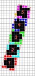
Probably most people are not aware about how the gray level limitation problem was solved. Fuji in particular has made very effective marketing use of that lack of information.

Regarding the dpi/lpi cell size issue. I can illustrate the problem better than I can explain the solution as math is not my strength.
An imagesetter/CtP can only image complete pixels to form the halftone dot. Below is a graphic - on the left, superimposed on the recorder grid, are 5 halftone cells (1,2,3,4,5) with 25 pixels in each cell and with the cells at 90 degrees (the yellow angle). On the right the same cells are angled at 15 degrees (the cyan angle). Note that the cells no longer have 25 whole pixels available in each cell, nor does each cell contain the same number of pixels. (1=14, 2=15, 3=14, 4=15, 5=15). So we've gone from 25 pixels per cell to an average of 14.6 pixels per cell even though both dpi and lpi have remained the same.
Geometry-1.jpg
 
Thanks for all the info. Herewith some answers:

"Are you able to see the rasterized dot structure on screen prior to output? does it match what you see on plate?"

Yes I can and Yes I does.

"To me it looks a bit like very odd scanline slip, I am guessing that the fast scan line direction is bottom to top. The fact that it works Ok on internal tests, could indicate issues between the RIP interface and the interface on the device, possibly noise on the cable, or pixel timing clock issue. Such issues are useually very noticable, but I have seen very slight issues like this before."

I don't think it is noise on the cable as it is fine with other lines screens and we get the same results using the worklow/rip to a different platesetters (have tried 3 different platesetters)

"@ Laura : I presume you've already ruled out the Lithocam, by using a Peak microscope to see the result on plate, isn't it ? "

Yes, we used a Peak microscope as well as a different type of platereader - not sure what. Ironically (or not) the platesetter vendor did not trust my equipment and brought his own and the result is the same.

"I would ask the RIP supplier to check the RIP configuration again hardware platform included, then reinstall everything from scratch and retest."

They have just upgraded the PC Hardware and upgraded the system to the latest version. This problem is not customer specific as we have seen this now at more than one customer.

If it is not correct to use 200lpi at 2400dpi then what should we be using to get optimal results. Going to 175lpi is not an option. The frustrating part is that the vendor is not coming back to us with a solution so it is all quess work at this stage. They are not even admitting that there is something wrong with the dot! So there is not much that we can do.
 
You appear to be using a Eucliden dot (round/square/round) Perhaps try a different dot shape at 200 lpi - round (round dots just get larger through the tone scale IMHO the best dot shape for CtP) or elliptical (rounded diamond shape).

best, gordon p

my print blog here: Quality In Print
 
They are not even admitting that there is something wrong with the dot! So there is not much that we can do.
Personnaly, I don't think that something is wrong with the dot...

... in my mind, it's simply because the screen ruling is a little bit to high for the resolution...

But if a lower screen ruling is not possible, you should either raise the résolution of the imagesetter (3000 ou 3600 dpi) or accept this dot shape if you want to keep composite (euclidian) dots... or try to change the dot shape, as gordo suggests!


gordo said:
An imagesetter/CtP can only image complete pixels to form the halftone dot. Below is a graphic - on the left, superimposed on the recorder grid, are 5 halftone cells (1,2,3,4,5) with 25 pixels in each cell and with the cells at 90 degrees (the yellow angle). On the right the same cells are angled at 15 degrees (the cyan angle). Note that the cells no longer have 25 whole pixels available in each cell, nor does each cell contain the same number of pixels. (1=14, 2=15, 3=14, 4=15, 5=15). So we've gone from 25 pixels per cell to an average of 14.6 pixels per cell even though both dpi and lpi have remained the same.
OK,ok... you're right, imagesetter/CtP can only image complete pixels to form the halftone dot...

... but the system cannot leave untouched pixels (neither white, nor black)!!! in your drawing, if only the 15 or 14 imagesetter dots fully included into the cells are turned black to built an 100% density screen, meaning that all the other dots that are on the separation lines remain untouched (and then remain white), you'll never be able to have a real 100% black screen!!!

In fact, the system uses all the dots, including the dots that are on the separation lines between 2 (or 3) cells, "linking" each of these dots to the cell that includes the most part of the dot: for example, in the line of 6 dots which is between cell #1 and cell #2 :
- the 3 first dots on the left belong to the cell #1,
- the 3 following dots belong to cell #2...

... and on the left side of the cell #1, you can get 3 more dots, 3 on the right side and 2 on the bottom side, plus the 3 of the upper side, and the 14 fully in the cell = 3+3+2+3+14 = 25!!! For each cell, on each side of each cell, there are 2 or 3 or more dots linkable to this cell...

... and if you re-count the number of dots in each cell on your modified graphic I add to this post, adding the dots partially in the cell but with their most part in the cell, to the 15 or 14 dots fully included in the cell, you get:
- #1 : 14 dots + 11 red dots,
- #2 : 15 dots + 10 cyan dots,
- #3 : 14 dots + 11 green dots,
- #4 : 15 dots + 10 blue dots,
- #5 : 15 dots + 9 magenta dots + the orange dot
(I'm not sure of the possible position of the orange dot...),

= 25 dots for each screen cell: in each situation the system "cope" as it is possible to use all the available dots, and it always gets its 25 dots per cell!!!
 

Attachments

  • Geometry-2.jpg
    Geometry-2.jpg
    91.8 KB · Views: 165
Last edited:
It's like an old school math (sorry) problem: calculate the number of appletrees that a farmer can put in his rectangular field: normally, the way to solve the problem is to calculate the numbers of ENTIRE trees that goes in each of the 2 main sides of the field, and multiplicate the 2 resulting numbers...

In an ideal situation, when the field is a perfect rectangle (or square) and the dimensions of the field match exactly the size of the trees, and the trees are put exactly parallel, then you get 2 numbers (row and column) without any digits behind the dot, meaning no tree will be "cut" by the fence or go past the fence over the road...
... and in that particular case, a simple calculation made with dividing the surface of the field by the surface of a square tree will be as exact...

... but when the field is very, very big, and allows millions of trees, dividing the surface of the field by the surface of a square tree will give an almost exact result, even if the field is not a rectangle or a square : in the reality, some trees will have their longuest branchs over the road (or over the neighbour field), but it's not important regarding to the enormous size of the field which mades the size of the trees become insignificant.

With a screen, its the same: if you consider only 5 cells at 15°, you get many incomplete cells around your 5 cells... but a letterUS page imaged with an 150 lpi screen at 750 dpi (to keep the 5 time lpi/dpi ratio of your example) contains :

(8.5 x 150) x (11 x 150) = 2,103,750 cells
and
8.5 x 750) x (11 x 750) = 52,593,750 dots

... and 52,593,750 / 2,103,750 = 25 dots in each cell.
 
Am I correct in getting to the following conclusions then:

1. That the dot is unusual, but that it won’t necessarily create a bad print.

2. That the resolution is not high enough for the line ruling that is being used, so the suggestion is either to go 175lpi/2400dpi or 200lpi/3000dpi

3. To change the dot shape and rather use a round dot as apparently that is better for CTP.
 
Am I correct in getting to the following conclusions then:
1. That the dot is unusual, but that it won’t necessarily create a bad print.
2. That the resolution is not high enough for the line ruling that is being used, so the suggestion is either to go 175lpi/2400dpi or 200lpi/3000dpi
3. To change the dot shape and rather use a round dot as apparently that is better for CTP.

1 - Yes. (consistency is more important than accuracy)
2 - No, you can do 175 or 200 lpi at 2400 dpi - no need to go to a higher dpi to get all your gray levels (unless you have a very old RIP - pre 1995 or a Screen RIP that does not support extra gray levels without going to a higher dpi - your user manual will confirm either way)
3 - Yes. It can't hurt to try a round dot - it might also give a more pleasing looking dot under a microscope. For the cost of a plate it might be worth seeing of the round dot suffers a similar issue of "hairiness"

best, gordon p

my print blog here: Quality In Print
 
Am I correct in getting to the following conclusions then:

1. That the dot is unusual, but that it won’t necessarily create a bad print.
– It can create problems at least in theory if job quality requirements are very high. You could have smooth pastels, skintones or high contrast image elements and vector graphics possible affected by this anomaly. Another thing is the dot can fool an X-Y spectro or densitometer on press and the preset ink curve will not match those readings perfectly.

2. That the resolution is not high enough for the line ruling that is being used, so the suggestion is either to go 175lpi/2400dpi or 200lpi/3000dpi
3. To change the dot shape and rather use a round dot as apparently that is better for CTP.
– Yes I would try different combinations in the RIP to get rid of the strange pattern. Interesting to see if various rulings/dotshape combinations solve the problem completely or just alleviates it. So it's not a simple go-no-go with that particular RIP software, I wouldn't reject this RIP only based on the strange dot aspect. If I am to evaluate such a program I would look at numerous other things. If this RIP is part from a workflow solution... things will get even more complicated.
 
2 - No, you can do 175 or 200 lpi at 2400 dpi - no need to go to a higher dpi to get all your gray levels
But trying an higher resolution is one possible solution!


gordoyou're right (and I was first wrong), with the super-cells an higher resolution will not change the abilities of the RIP to get all the gray levels...

... but Laura's problem is not a problem with the number of available gray levels...

... the issue is the shape of the dots: using an higher resolution will change the way the RIP calculates the dots and will then change a little bit the shape of the dots.
 
To continue the saga. The vendor of the platesetter/workflow has now come back and said that there is nothing wrong with the dot and it will not result in lower quality print. I have requested specifications from FOGRA on what is acceptable and what not, but if anybody else have some more specifications that I can through at the workflow vendor I would greatly appreciate it.
 
You might try contacting Larry Goldberg at Beta Industries:

larry (@) betascreen (dot) com
Phone: (800) 272-7336 (201) 939-2400

He showed me a similar halftone dot image (a.k.a. "hairy dot") at GraphExpo in 2001 (I believe). He may have found out what the cause was in that case. If you send him your photo he might recognize it.

best, gordo
my print blog here: Quality In Print
 
Gordo:

Do you think this could be an intentional tweaking of the normal Euclidean growth by the screen engineer to accomplish a softening or shifting of the 50% tone jump? Sort of like the alternately clipped corners in Agfa's ABS I think you've mentioned here or on your site.

You would expect tricks like that to be implemented consistently in similar screens, but I know one of the ABS sets has the white dots around the 70% tint alternating between circles and squares (can't understand why), while most of the ABS tiles do not.
 
Gordo: Do you think this could be an intentional tweaking of the normal Euclidean growth by the screen engineer to accomplish a softening or shifting of the 50% tone jump? Sort of like the alternately clipped corners in Agfa's ABS I think you've mentioned here or on your site.

LauraMinter hasn't said what their workflow is. The dots do have the corner notches at 50% associated with :ABS but I haven't seen these kinds of artifacts with Agfa's screening. Adding pixels the way those dots are formed won't help shift the 50% tone jump. They may be the result of some sort of noise added to minimize single channel moiré though. I'm still assuming that their RIP does not allow their operators to alter how dots are formed (e.g. old Scitex RIP) 'cause that could lead to strange looking dots.
Not enough info to figure out the problem.
I still think she should switch to round dot - Euclidean be dammed! :)

best, gordon p
my print blog here: Quality In Print current topic: GCR for ink savings
 
The reason why I am not saying who the vendor is, is that I am an independant consultant. I do not want to get anybody/vendor's back up as they are already upset with me for finding this problem. There are not that many platesetter/Workflow vendors out there and it is one of the bigger ones, so I think you can narrow it down rather nicely.

I will send the information to Larry. Thanks for that info. Maybe he has some more ideas on what it could be and what I should try.

I will have a meeting with my customer on Tuesday and suggest that we go the round dot route and see if they agree. I will keep you up to date with my progress.
 
The dots do have the corner notches at 50% associated with :ABS but I haven't seen these kinds of artifacts with Agfa's screening. Adding pixels the way those dots are formed won't help shift the 50% tone jump. They may be the result of some sort of noise added to minimize single channel moiré though.

We use ABS, and I've never seen dots quite like that, but it seems like it would have a similar (though probably less desireable) effect. The reason I suspect that it might soften the tone jump is that while the coverage is just about exactly 50%, the dots do not quite touch each other. I've seen some of Agfa's patents, and some of them seem like they are attempting to patent common sense. Maybe Agfa specifically patented the concept of notching out corners the 50% dot, and this RIP company wanted to do something similar without putting them at risk of lawsuit threats. I'm not able to comprehend how this sort of trick affects moire, since the basic geometry is the same with or without it. Can you elaborate on this, Gordo?

Laura:

So does this actually look bad when the ink hits the paper, or is it something you only notice when you're looking for it?
 
[SNIP] I'm not able to comprehend how this sort of trick affects moire, since the basic geometry is the same with or without it. Can you elaborate on this, Gordo?

It doesn't affect just any moiré - just single channel moiré.
Most prepress people encounter single channel moiré when they scan, or resample, or rescreen already halftone screened images. But it can also occur when a raster image is screened for the first time.

The standard photomechanical screen angles (0, 15, 75, and 45 degrees) do not work best with digital screens. Digital screens already have a fixed grid at 90 degrees within which the haftone dots need to be imaged at their various angles. The result is that the halftone dots, for example in just the black channel (or plate), are not exactly the same. And so, occasionally, certain combinations of dot shape, screen frequency, and resolution can cause small aberrations of dot construction to repeat themselves at regular intervals. The repetition of these minute aberrations in the dots may show up as an undesirable pattern within one screen - "single color moiré." The addition of “noise” introduces intentional irregularities into the screen that “break up” this undesirable pattern. The addition of noise can be done by offsetting the screens at uneven angles (e.g. the 7.5 degree offsets of Scitex screening), or by the addition of "P" noise in prepress if the screening engine has that option, or the addition of noise in the original screening algorithm (e.g. Fuji CoRes).

best, gordon p
my print blog here: Quality In Print - current topic: GCR ink savings
 
Just an update on this. We tried using a 200lpi round dot with this customer. The irregular dot structure dissapeared but the print was extremely flat. Even with dot compensation curves etc. We can not continue using the 200li round/square dot as it definately creates print problems. It appears as if it is mottling on the press. I have now had it at more than one customer who uses the same dot structure and line screen. We have now taken them down to 190lpi which seems to be a standard screen set for this supplier and now the dot is not irregular anymore. We are though having a situation where the print looks a bit flat. It seems to have somehting to do with the midtone areas. Any more suggestions?
 

PressWise

A 30-day Fix for Managed Chaos

As any print professional knows, printing can be managed chaos. Software that solves multiple problems and provides measurable and monetizable value has a direct impact on the bottom-line.

“We reduced order entry costs by about 40%.” Significant savings in a shop that turns about 500 jobs a month.


Learn how…….

   
Back
Top