Xerox Versant 280 - Match CMYK to previously printed sheets

sidneykidney

Well-known member
Just a heads up — I’m not very experienced with getting the most out of my EFI ES-2000 spectrophotometer, so I’m wondering if there’s a better way to approach this.
I print 10 different package cartons on my Xerox Versant 280. Each SRA3 sheet contains 2–3 solid (flat) colours that repeat across the sheet. I keep a master sheet for colour matching when I need to do a reprint.
Even after calibrating, I still find myself manually adjusting the output profile curves in Fiery Command WorkStation to get a closer match.
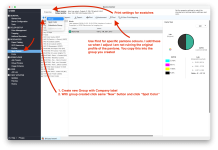
Is there a tool — similar to the Pantone ColourCue — that can measure the CMYK values on my printed sheet so I can adjust and match my CMYK curves more quickly and accurately than relying on visual judgment or can I use my EFI ES-2000 spectrophotometer?
 
Unless you start with a known target/calibration on the initial prints, it's impossible to know what the true hardware CMYK values are on your master. I would avoid doing curves to color correct, since this affects ALL of your colors.

if the source color is a Spot color, edit that spot color in Spot Pro. REmember, this will affect any and all jobs that use that spot color.

If the source object is RGB/CMYK instead of spot, create a custom Spot Color in Spot Pro. (I think there is even a "replace color" option, I haven't used it years?? I'll have to re-research)
1770391037516.png
1770391246470.png


Tweak the Spot Color until it matches, then you will need to edit your source PDF with something like Pitstop Pro and replace the solid color with the newly created custom Spot Color.
 
OK... I'm not going to guarantee this will work and it might have undesirable changes to the same color in gradiants, you would need to test this... Changes to one specific color would be better than an across the board tweak to the colors of other objects in your document.

Create "Substitute Group" give it a name, then Create "Substitution": You will need the exact source RGB or CMYK of your object, enter a new CMYK replacement color, then #3 under Variations you can tweak the actual output of your replacement color.
1770391697343.png


In your print job on the Fiery you need to turn on Substitute Colors
1770391811410.png
 
if the source color is a Spot color, edit that spot color in Spot Pro. REmember, this will affect any and all jobs that use that spot color.

View attachment 294713

Just as an FYI, the Pantone Libraries in that window are read from top to bottom by the machine so you can create a "Group" in that window for a specific client etc and copy & paste/duplicate the relevant pantones into that group and alter them.
Whenever your working on that client you can just grab the group and move it to the top and it will read those first, once done move it back below the regular Pantone Libraries and it's back to normal.
that is AWESOME! I never knew
 
Just as an FYI, the Pantone Libraries in that window are read from top to bottom by the machine so you can create a "Group" in that window for a specific client etc and copy & paste/duplicate the relevant pantones into that group and alter them.
Whenever your working on that client you can just grab the group and move it to the top and it will read those first, once done move it back below the regular Pantone Libraries and it's back to normal.
Why not just select the Spot Group under "Use spot group:" instead of Default?
 
Why not just select the Spot Group under "Use spot group:" instead of Default?
It's years since I actually used that, didn't know they had that in the properties, I'll have a look when back in the office

How does that work if you only put some Pantone's in the group? Do you have to add every pantone that's in the file?
 
Last edited:
It's years since I actually used that, didn't know they had that in the properties, I'll have a look when back in the office

How does that work if you only put some Pantone's in the group? Do you have to add every pantone that's in the file?
My experience is the select Spot Group is put at the top of the list just like if you would have have moved it in Spot Pro. The real advantage is that you can save a preset for that specific customer.
 
Thank for your all this information.
Attached are examples of the artwork. I've been using Command workstation for some time but never had any training except when it was initially installed and everything was done at 100 miles an hour, so nothing was taken in!!!
I like the idea of using substitute colours which I think I will experiment with.
Like I said originally, I have master sheets for each colour but even if I had to use substitute colours, the CMYK breakdown will give me a near enough starting point but I'd still need to tweak the colours a bit. The reason I asked if there's a way of taking the readings with an instrument is so it gets me to my final destination quicker than visually.
 

Attachments

  • Pic1.jpg
    Pic1.jpg
    55.5 KB · Views: 95
To be able to make specific color adjustment like your asking for, these should be spot colors so that any changes only affect that specific color and not any of the others. If not spot colors, the other option is to use ImageViewer and select each color to replace. Make sure you have Composite overprint selected when ripping the file if you want to do the ImageViewer replace color option.
 
Personally if the colours are Pantones or spot colours I would make a new library for the client so whenever the job comes it uses a specific profile. This would mean the file has to use the specific spot colour or Pantone colour. Use a starting CMYK makeup, I generally just use what I see in Indesign and do the rest on the press.

Same area EdwardB was in. Go to Device Central > Spot Colours.

In there the first thing to do is select "Properties" This will be at the top. In here is you basic print setup, you need this for when printing colour swatches for matching. With that done you make a new "Color Group"
I think of these as playlists in iTunes. I have ones setup for different clients that I need specific colours to constantly match.

You create this new Color group and you can either search for the Pantone you need or just create a new spot from scratch and enter


Screenshot 2026-02-10 at 8.38.53 AM.png


Screenshot 2026-02-10 at 8.40.05 AM.png


Screenshot 2026-02-10 at 8.40.21 AM.png


I found this the easier way to do colour matching. Regarding the spot colour groups, the Fiery software starts looking through colours from the top of the list and works its way down. In the past I have had adjusted Reflex Blue for a specific company, so to not have it used when not needed I would need to move the libraries around. So if 2 groups have Reflex Blue, I move the one I want to the top of the list.
 

Attachments

  • Screenshot 2026-02-10 at 8.38.53 AM.png
    Screenshot 2026-02-10 at 8.38.53 AM.png
    1.2 MB · Views: 111
EdwardB & Wonderings. Thank you so so much for all your efforts!!!!!!!
You've both made it sound so easy and I'm sure a training course wouldn't have made it as idiot proof as you've both done.

Regarding Pantone to CMYK on My Xerox Versant 280, there's so many variations in CMYK breakdowns in every software I use but I've found that the closest starting point for me is my Pantone Color Bridge Swatch Book. There have been numerous times when I've input the breakdown from the swatch and I don't have to tweak it afterwards.
Why are you using Pantone to CMYK in your design software which defeats the whole purpose of using Spot Colors and having the ability to set the output to press color values via Spot On color libraries.
 
Why are you using Pantone to CMYK in your design software which defeats the whole purpose of using Spot Colors and having the ability to set the output to press color values via Spot On color libraries.
What I meant was, default CMYK Values within Spot On.
For example: Pantone 548 C
Spot On default = 100C, 0M, 26Y, 80.5K
Pantone Color Bridge = 100C, 21M, 28Y, 76K
As a starting point for Spot On, I will use the Pantone Color Bridge CMYK breakdown and go from there because the Spot On default is always very far off from what I'm trying to achieve.
 
interesting... my Fiery Spot Pro lists 548C as 90.6, 11.4, 24.7, 78.0

more interestingly the Delta E... of 4.77! Basically it'll never match the Pantone Coated book.
1771441159055.png
 
Do you guys realize the CMYK values listed in Spot On are the values that are sent to the printer/specific papers. They really have nothing to do with the colors listed in any spot color book. Yes the libraries have the lab values which the printer paper output profile uses to determine the values sent to the printer. Check different printer paper output profiles and you will find Spot On will have different CMYK values for different papers and different profile creation settings.

This is why you should visually choose (from a book) a named spot color you want. What adjustments you want or need to make to match that color as close as possible should be done in Spot On affecting only the color output to the printer values.
 
   
Back
Top