Brand colors in CMYK - Spot Matching System (SMS)

SMS

Active member
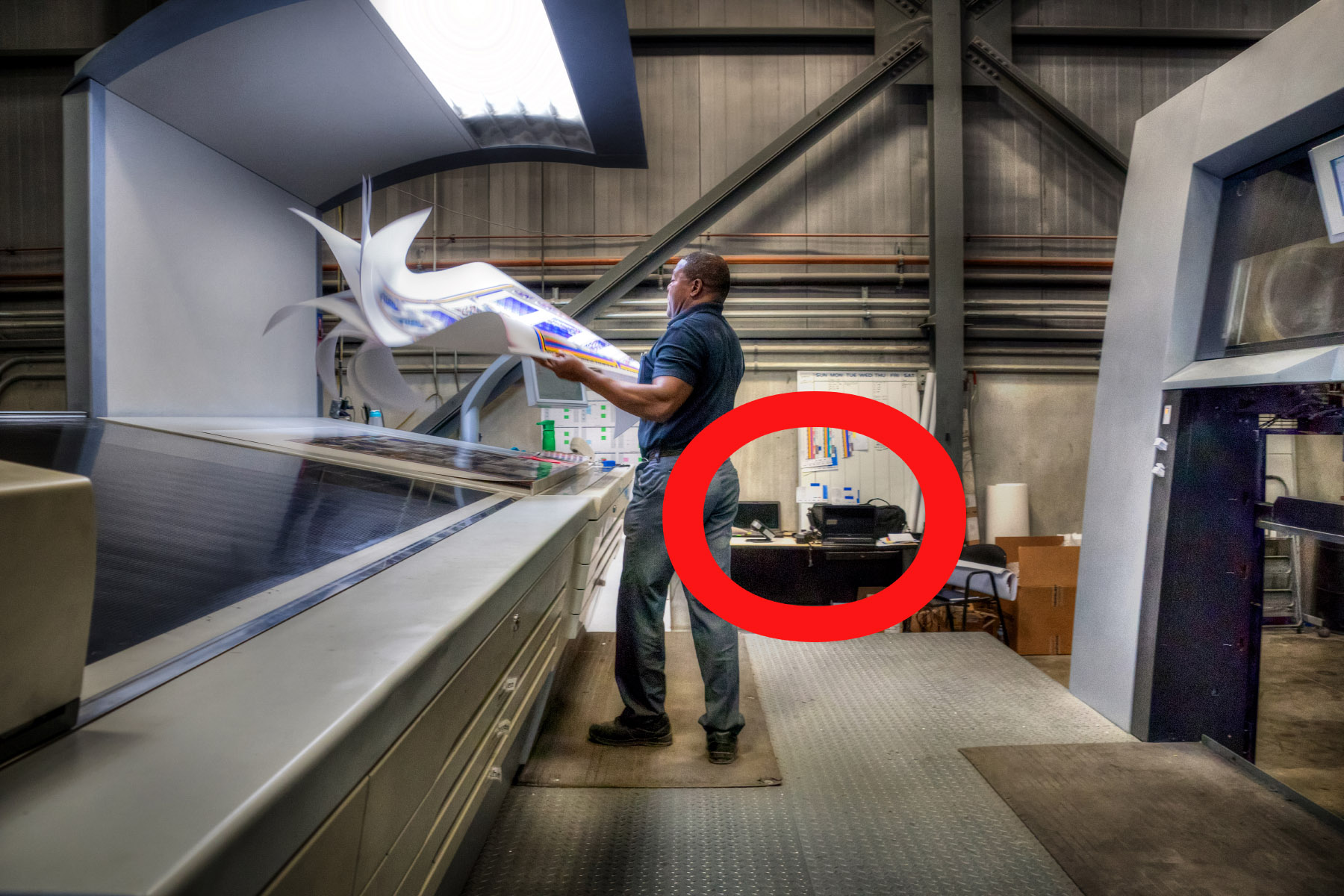
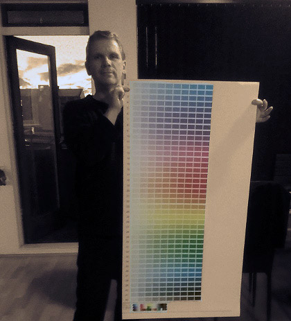
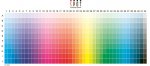
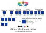
Spot-Nordic, an Icelandic company based in Reykjavik has just launched a new color matching system, consisting of 420 ISO certified colors, adapted for CMYK printing on coated and uncoated paper.
We are looking for printers in all categories that are, what we refer to as, SMS READY, - i.e. are able to receive CMYK PDF files set up for output and printing according to ISO 12647-2-2013 - or are ready to receive such PDF files and to convert them to their own colorspace.

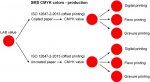
For preparation and layout for a job to be printed on coated substrate/paper, the designer will be using the Fogra Coated V3 icc profile and for a job to be printed on uncoated paper, the designer will be using the Fogra Uncoated V3 icc profile.

To be SMS READY, you need to be able to hit our ISO certified SMS brand colors in CMYK according to your own ISO certified SMS poster or color guide or (in the case of custom SMS colors), according to a customer supplied custom ISO certified SMS proof/ticket. PSO certified printers and G7 Master Facilities should be able to manage this task. The DE2000 we would consider acceptable in the case of our SMS colors is 2 or less from the target color.

Please refer to our website www.spotmatchingsystem.com and contact [email protected] if you believe your company is SMS READY. You may also want to consider subscribing to SMS in this case - see www.spotmatchingsystem.com/services. Posters and color guides can also be ordered from our website.

If your company happens to offer contract proofs (ISO 12647-7-2016), we are looking for remote proofing sites to print out SMS posters, color guides and custom SMS proofs for customers in your region.
 

Attachments

  • photo8246.jpg
    photo8246.jpg
    54.7 KB · Views: 520
  • photo8247.jpg
    photo8247.jpg
    55.3 KB · Views: 677
  • photo8248.jpg
    photo8248.jpg
    71.4 KB · Views: 756
You received a patent for this? LOL
Unless I'm missing something this is just a color atlas. Been around since the stone age: https://tinyurl.com/y9kbeuve
Basing it on ISO specifications doesn't make it unique. Measuring the CMYK color then using that info to blend a custom spot color ink is also not new.
BTW you use Flash on your website - it's antique software that's been/being abandoned by the industry. Even by its developer Adobe: https://www.wired.com/2011/11/adobe-kills-mobile-flash/

And yes, even cavemen used a color atlas. Full cave image and a close up of the bottom left.:

Click image for larger version  Name:	Caves 1.jpg Views:	2 Size:	207.2 KB ID:	281599
Click image for larger version  Name:	Caves.jpg Views:	1 Size:	244.9 KB ID:	281600
 
Last edited:
Thank you for your observation and cool pictures Gordo.

I realize there is a lot of text on the SMS website.

You are missing the 2 main points, - unless there is another CMYK color atlas out there with each color mapped to look identical when printed on coated and uncoated paper. The second main point is the proposed approach to selecting brand colors - so for instance instead of picking Orange 021 C as your brand color only to find out later that it looks like crap when printed in CMYK (approx. 2/3 of all printing), it makes more sense to first pick out your CMYK variations and then picking your spot colors.

The features of the SMS system are probably more interesting for brand designers, that tend to struggle when it comes to assigning CMYK to their brand manuals, since all printers have to do is to print according to ISO 12647 to hit the colors. Easy as pie.

Sorry about the Flash. I am not a web designer but will take your point into consideration in the future.
 
I understand where you are coming from SMS, I have always used the Pantone Color Bridge Coated and Uncoated fan guides for finding the “lowest common denominator” colour match between spot and CMYK values on different stock.

It is a good brand designer that understands that if one wishes to have the minimum amount of colour variation, the colours should be chosen for the best match in both spot and process and in different papers.


Stephen Marsh
 
  • Like
Reactions: SMS
Thank you for your comment Mr. Marsh.

The Pantone Color Bridge is an excellent tool to see the closest match to an original Pantone color when converted to CMYK. The catch is that no Pantone color looks like it's CMYK cousin, - some are pretty close while others are nowhere near. The best way to see this is exactly to browse through the Pantone Color Bridge.

In addition Pantone C and Pantone U colors are the same recipe and they share the same name/number. But they are not the same colors.

It is in my opinion not acceptable for a professional graphic designer to propose and present only the coated version of a Pantone color for a brand color and not presenting it's uncoated version at the same time - so the customer can at least have a say, if this is an acceptable DE2000 difference or not. Of course the right way to do this (before SMS came along that is) would be to find the closest match to the C color in the U guide.

The last time I saw an attempt to do this - which was pretty good, was when I was a printer myself back in 1995 or so, when Visa International presented 2 sets of Pantone colors, - blue and orange, - one set for printing on coated paper, one for printing on uncoated paper. I still remember how damn impressed I was when I saw the standard. This was nota bene back in the day when we printed 2 color jobs with 2 Pantone colors.

But since around 2000, anything above 1 color is typically simply printed in CMYK - because it's cheaper than a 2 color job.

So, around this time SMS occured to me. Not only were original Pantone colors being converted to CMYK with typically pretty dull results, - there was also the issue that graphic designers didn't seem to be aware of uncoated paper - or perhaps they simply don't care?

The SMS approach could be referred to as reversed technology for graphic designers.

Instead of using the Color Bridge to see the closest likeness to your original Pantone color, you select your brand color from SMS CMYK colors (which are already ready for printing on both coated and uncoated paper). Once you have found a nice SMS color you like, take out your Pantone Formula Guide C and find the closest match for coated paper and then take out your Pantone Formula Guide U and find the closest match for uncoated paper. The Pantone color gamut is always big enough to match any CMYK color from the narrow CMYK gamut - and the Pantone Color Institute even offers to match colors that are not available in their standard colors to any sample, - for coated and uncoated paper, textile or plastic.

If none of our humble number of 420 colors are to your liking, we find the closest likeness to any color you have in mind, - preferably more "natural" colors, since I can work all night but I will not be able to match Reflex Blue in CMYK for you.

I believe this is the only way a designer CAN actually present a brand color that is in fact the SAME, - whether it is printed in CMYK, spot or dye. SMS first, the rest later.

What is also pretty cool about the SMS approach is that since SMS colors are CMYK by origin, they can be applied to a CMYK bitmap image. You can wear a jacket in your brand colors, take a picture of yourself and print it in CMYK - a picture of you in a jacket that is in your brand colors, - not a dull likeness - THE brand colors. Equally, if you are a clothing manufacturer, you can also mass manufacture the jacket in SMS colors, print flyers and pass them out and people who order the jacket will in fact be able to match the color of the jacket with their leaflet, when they get the jacket. If you are not sure how many jackets you should order, you can dye the jacket with any SMS color in Photoshop, print the flyers in CMYK and wait and see how many orders you get before you place your first order ;-)

Mr. Michael Abildgaard, a lektor at the Danish School for Media and Journalism has written a very interesting paper on the subject of brand identities, which to a great extent supports the basis for the SMS system and the SMS approach to visual brand identity - why it may help reduce those incredible color fluctuations we see today when brand colors are being printed worldwide. The abstract from his paper is accessible on our site with a link to the complete paper - www.spotmatchingsystem.com/links/michael.html.
 
[snip]
You are missing the 2 main points, - unless there is another CMYK color atlas out there with each color mapped to look identical when printed on coated and uncoated paper.

AFAIK there isn't a color atlas that shows individual colors appearing the same on coated and on uncoated paper. That would mean trying to match the coated to the uncoated since the uncoated has a smaller gamut than the coated and is effectively the “lowest common denominator”. I'm not sure that brand owners and their creatives would want to minimize their potential gamut.

The second main point is the proposed approach to selecting brand colors - so for instance instead of picking Orange 021 C as your brand color only to find out later that it looks like crap when printed in CMYK (approx. 2/3 of all printing), it makes more sense to first pick out your CMYK variations and then picking your spot colors. The features of the SMS system are probably more interesting for brand designers, that tend to struggle when it comes to assigning CMYK to their brand manuals, since all printers have to do is to print according to ISO 12647 to hit the colors. Easy as pie.

That's correct. And that's what most color atlases show. Unfortunately, what is the technically correct option tends not to be the one that creatives choose. This has been an issue for many decades and I doubt very much that it will change anytime soon. There was once a spot color system that used standard CMYK inks for the base colors as a way to solve the problem - however that system died. Good luck with it though.

Sorry about the Flash. I am not a web designer but will take your point into consideration in the future.

Since Flash has been dead for over 8 years, your web designer appears to be as knowledgeable about web design as print designers are about CMYK.
 
  • Like
Reactions: SMS
LOL. I will be sure to pass this onto my web designer. He was suspiciously cheap, come to think of it.

Well, we can only present the creatives with our way out of the woods and hope they will realize the benefits of stable color for professional brands v.s. picking vibrant colors that were actually only vibrant during their brand presentation, 2 years ago.

Then of course we have the brand owners themselves that pay the bills. Do you think they are content with their brand colors being all over the place most of the time?
 
Well, we can only present the creatives with our way out of the woods and hope they will realize the benefits of stable color for professional brands v.s. picking vibrant colors that were actually only vibrant during their brand presentation, 2 years ago.

Hope springs eternal.

Then of course we have the brand owners themselves that pay the bills. Do you think they are content with their brand colors being all over the place most of the time?

You would think the brand owners would want to do something about this issue. But my experience dealing with brand owners (one on one and at technical conferences) has shown me that they don't realize that they're only paying lip service to to this ideal. (Yes I've seen the color conformance devices Coke puts into printshops to monitor their brand colors). There is a great deal of published misinformation and misrepresentation floating around about printing technology and that tends to inhibit the adoption of best practices by buyers, specifiers, and creatives.
Heck, you (the buyer) hired a "creative" (also the specifier) that didn't know Flash has been dead for 8 years. Lesson learned?
Like I said, I wish you luck, but I doubt you'll have any success.

Oh, the spot color system that used CMYK as the base colors was “Focoltone”. It was intended to solve the issue that you’re dealing with. RIP.
 
Last edited:
Hope springs eternal.

Amen to that.

You would think the brand owners would want to do something about this issue. But my experience dealing with brand owners (one on one and at technical conferences) has shown me that they don't realize that they're only paying lip service to to this ideal. (Yes I've seen the color conformance devices Coke puts into printshops to monitor their brand colors).

Wow, I have not seen those Coke conformance devices. Do you have a picture? I have only seen the brand standard the poor printers are supposed to work by.

There is a great deal of published misinformation and misrepresentation floating around about printing technology and that tends to inhibit the adoption of best practices by buyers, specifiers, and creatives.

The main problem in my opinion is the wide gap between technical people in color management and creatives. Instead of standing between creatives and printers, the color management gurus are standing on the other side of the printers, trying to knock on their doors to create interest in standardization. In this scenario the creatives are not complaining about a thing when it comes to printing and quality which is why printers are often not really excited to get a grip on ISO standards.

So you have a DE2000 of 8 between a target color defined by a brand standard and the print?
"Well, the printer told me there was nothing to be done about this. This was printed in CMYK on uncoated paper"...

Heck, you (the buyer) hired a "creative" (also the specifier) that didn't know Flash has been dead for 8 years. Lesson learned?

So you were not able to see my beautiful diagrams?

Like I said, I wish you luck, but I doubt you'll have any success.

Thank you. I will quote you when I release my autobiography in a few years :)

Oh, the spot color system that used CMYK as the base colors was “Focoltone”. It was intended to solve the issue that you’re dealing with. RIP.

Focoltone was a really valid attempt to incorporate CMYK for graphic designers. At that time there was little standardization, ISO standards were set by a fixed density and they had to worry about factors like different CMYK inks between manufacturers, which made implementing it globally a real headache.

SMS colors are based on the universal standard for CMYK printing and can be achieved by all printers in all categories.

It presents an alternative approach to defining a robust brand identity for graphic designers as well as a new approach for designers in all categories to define colors that print correctly in CMYK (again, the by far most common print method in the world).

I believe this is as easy as it gets and I am confident designers will appreciate the simplicity of the SMS approach:

1) Pick out an SMS color from our system or any colors you want from any color system you like or measure any random color you want for your project with your i1Pro2

2) Send us the name of the color or M1 LAB value of your random color.

3) Receive the best SMS match in CMYK for coated and uncoated paper along with a certified hard proof for visual approval and further matching.

4) Pick your spot colors and dyes from any current standard you like - be it Pantone, HKS, RAL or whatever to complete your range or order them from Spot-Nordic.


At the end of this process you have one ISO standardized master color and any number of derived colors to match it, - on paper, textile, plastic or aluminum.

The sky is the limit.

But you are right Gordo. If the creatives refuse to use SMS, at least in selected cases where color consistency is more important than color vibrancy, we have a problem.

Best regards

Ingi
 
Wow, I have not seen those Coke conformance devices. Do you have a picture? I have only seen the brand standard the poor printers are supposed to work by.

In hindsight I probably should have taken a proper snap of the gizmo. :-(

You can see it circled in this snap:

Coke thing.jpg


The main problem in my opinion is the wide gap between technical people in color management and creatives. Instead of standing between creatives and printers, the color management gurus are standing on the other side of the printers, trying to knock on their doors to create interest in standardization. In this scenario the creatives are not complaining about a thing when it comes to printing and quality which is why printers are often not really excited to get a grip on ISO standards.

It's a rare creative that's interested in the technical aspects of printing. Maybe it's a different side of the brain that's used.

I think there's a difference between the Euro approach and the rest of the world. Printers are interested in industry standards, and have been. However they are usually driven by customer demand - not what's best practices.

So you were not able to see my beautiful diagrams?

I had to change browsers to one that allowed Flash just to view the page.

Flash.jpg


And on my tablet I just see a blank area where the flash graphics are supposed to be - no option to run flash for that page. Doesn't your designer check their work? Don't you check your own marketing? And what idiot would use obsolete Flash to display a static image? And you complain about print creatives not understanding tech. If it wasn't for this thread I wouldn't have bothered continuing to look at your website. I would certainly fire your "cheap" web designer immediately, and have some harsh discussions with whoever is responsible for your marketing.
Sorry, but I have to be blunt. First impressions are that you're running an amateur hour mickey mouse operation that hasn't got a clue what they're doing. As a result I would never trust you with brand color management nor would I recommend your services to a brand owner - even if the services were free.

Oh, the spot color system that used CMYK as the base colors was “Focoltone”. It was intended to solve the issue that you’re dealing with. RIP.

Focoltone was a really valid attempt to incorporate CMYK for graphic designers. At that time there was little standardization, ISO standards were set by a fixed density and they had to worry about factors like different CMYK inks between manufacturers, which made implementing it globally a real headache.

That's not quite correct. Focoltone was invented in Wales and launched in the UK in 1988. It had among other things the first process colour swatch book that had ever been created. Focoltone worked with inks from all over the world testing them and so on. All the colours could be mixed with any brand of process colour inks to ISO and British Standards. All of the research and development was done in co-operation with the Printing Industry Research Association in the UK

I believe this is as easy as it gets and I am confident designers will appreciate the simplicity of the SMS approach:
[/QUOTE]

Dealing with creatives is analogous to what the folks in this short (non-Flash) video (takes a moment to load) are dealing with: https://www.youtube.com/watch?v=CwO45La_NVo

Peace.
 
Last edited:
Well Gordo. Thank you again for your observations.

I don't think trying to heard creatives will get me anywhere. I would rather have them chase me.

It is too bad that you seem to have made up your mind about SMS, although I am pretty sure you haven't seen it for yourself or tested it.

I honestly find it sad that a respected veteran such as yourself would make a judgement call on a color matching system that has been in the market for one month, based only on Flash components on the website - as well as my ability to deliver what I am selling.

Perhaps things haven't changed that much since Focoltone presented their system back in 1988. It is still easier to stand still and repeat what you have learned.

I dare you to order a copy of my system and see it for yourself. Then pick any color you like, order the CMYK values and have them printed according to their respective ISO standard. If the colors don't match, you can call me and SMS whatever you like.

Understand that I'm trying to help you. What I say, I say without beating around the bush and is what I would say to your face and to your employees.

It is too bad that you seem to have made up your mind about SMS, although I am pretty sure you haven't seen it for yourself or tested it.

I haven't made up my mind about SMS as a technology. Keep in mind though that superior technology is unrelated to market success.

I honestly find it sad that a respected veteran such as yourself would make a judgement call on a color matching system that has been in the market for one month, based only on Flash components on the website - as well as my ability to deliver what I am selling.

The product, or technology, is just one component of the success of a product/solution.

Think of it this way...there's a new car on the market, best engine efficiency, least environmental impact, best cost/performance ratio, etc. Paradise on wheels. You check out the new car, but the doors don't fit properly, the engine hood/bonnet is crooked, the temperature controls are erratic. Do you think you can look past that? The product/solution is the whole package - not just one part. Having prospects switching browsers (for those that know how to do that) to view your website shows a lack of concern about customers, lack of internal quality controls, and lack of basic tech. It speaks volumes about your company and hence your offering. I only focus on the Flash aspect because it reflects your company. I was once told by a print buyer that she rated printers according to her first impressions of the company lobby and customer toilet - really - not the print "quality".

Your website is a fail and it's probably a big part of your marketing. It's failure is a reflection of your company as a whole and will manifest in other areas of your sales and marketing.

If your website is unchanged in the next two weeks then you will have confirmed the impression that your competence as a business is questionable.


I dare you to order a copy of my system and see it for yourself. Then pick any color you like, order the CMYK values and have them printed according to their respective ISO standard. If the colors don't match, you can call me and SMS whatever you like.

PM me and I'll give you my physical address. You can send me two press sheets - one on coated and the other on uncoated paper showing that they match.
Something like what you show on your website although, strangely, you don't make the comparison that shows your product's benefit.:

Atlas.jpg


Or you can send me a smaller sample that shows the color alignment between substrates.

I am happy to report on what I see/measure.

PS - why no color bars on the sheet? I guess this is proofer output?
 
Last edited:
  • Like
Reactions: SMS
Understand that I'm trying to help you. What I say, I say without beating around the bush and is what I would say to your face and to your employees.


I haven't made up my mind about SMS as a technology. Keep in mind though that superior technology is unrelated to market success.

That is good (that part about you not having made up your mind about SMS as a technology). The technology behind SMS is not mine so there is nothing alien about it. SMS colors are ISO certified CMYK variations, which means that we simply pick out LAB values from the common gamut of coated and uncoated paper and arrange them into a convenient system ready for designers to use, - and printers to print by. We then charge a modest service fee for each CMYK value pr. papertype, whether it is a part of our standard target or if it is a custom order (say if you order the closest SMS color to PMS 158 C - because you have been using that color for your company for years). Using SMS and presenting it as a brand color actually means that the rules are clear when it comes to printing that color and printers don't have to wonder about what is expected. If SMS xx-xx is mentioned in a job description that should automatically trigger alarm bells and questions and even requests for proofs if the printer doesn't have a copy of the SMS base colors, - or if it is a custom SMS color.
The same is not true when a fixed CMYK value is used in a logo - where in many cases it is probably not even mentioned that there is a brand color to be watched within that document. I wonder how many advertising agencies follow up on the customer's colors when the job is planned to be printed in CMYK. You mentioned Coca Cola that I assume are primarily printing their CMYK on coated paper and substrates. But what about the others that would also like their brand colors kept under check?


The system is convenient and anyone can use it without knowing anything about color management. But I personally find my SMS approach to defining brand colors just as interesting as the fact that each color can be reproduced side by side on coated and uncoated substrate, and I hope that creatives/designers will agree with me in time.

The product, or technology, is just one component of the success of a product/solution.

Think of it this way...there's a new car on the market, best engine efficiency, least environmental impact, best cost/performance ratio, etc. Paradise on wheels. You check out the new car, but the doors don't fit properly, the engine hood/bonnet is crooked, the temperature controls are erratic. Do you think you can look past that? The product/solution is the whole package - not just one part. Having prospects switching browsers (for those that know how to do that) to view your website shows a lack of concern about customers, lack of internal quality controls, and lack of basic tech. It speaks volumes about your company and hence your offering. I only focus on the Flash aspect because it reflects your company. I was once told by a print buyer that she rated printers according to her first impressions of the company lobby and customer toilet - really - not the print "quality".

I understand your point and I am sure that a lot of people agree with you.

Your website is a fail and it's probably a big part of your marketing. It's failure is a reflection of your company as a whole and will manifest in other areas of your sales and marketing.

If your website is unchanged in the next two weeks then you will have confirmed the impression that your competence as a business is questionable.

Fair enough. I have replaced the Flash components with static Jpgs but there is still too much text, I know. This is a disorder I have, rooted in my theory "Don't leave anything relevant to the subject out". I know it is not considered good marketing these days to use a lot of words, but I really hope professionals will at least appreciate most of the information, even if it takes some time to get through it. SMS is nota bene only aimed at professionals.

PM me and I'll give you my physical address. You can send me two press sheets - one on coated and the other on uncoated paper showing that they match.
Something like what you show on your website although, strangely, you don't make the comparison that shows your product's benefit.:

Atlas.jpg


Or you can send me a smaller sample that shows the color alignment between substrates.

Please place your order for the product you want to order here - www.spotmatchingsystem.com/services - see info at the bottom of the page.
Send it to [email protected].


I am happy to report on what I see/measure.

That sounds great Gordo. I know the outcome of your measurements between the substrates of course, since I have done them myself, but to ensure yourself and anyone else that these are in fact original CMYK colors, - not something else, I really hope you will take a few of my colors out for a spin and have them printed by an offset printer who can manage jobs that are made using the PSO Coated V3 and PSO Uncoated V3 icc output profiles.
Any PSO Certified printer should be able to handle this and Idealliance has assured me that any G7 Master Facility printer should be able to take these files and convert them CMYK-to-CMYK to the Gracol gamut - which is just about the same, - so there shouldn't be much difference in the final CMYK values of the colors you select. To make this interesting, don't tell the printer what you are doing, just ask them to put a little extra colorbar next to their standard colorbar and ask them to print to the ISO standards. Then send a copy of the final sheet with the colorbars to me - especially if they fail in hitting the SMS colors you select.


PS - why no color bars on the sheet? I guess this is proofer output?

The SMS system is only presented on certified proofs according to ISO 12647-7-2016 for the respective standard. It does not make sense to print it, since you can never get as close to the correct color on press, as you can on a proof with an inline measurement device.
 
Last edited:
On your website, it shows a picture of standard CMYK inks being printed (proofed), and appearing almost exactly the same on coated and uncoated stock. Are you using formulas for the uncoated versions to match the standard inks on coated?

You are right. This is an actual photograph of our coated and uncoated proofs of the 420 standard colors of SMS, certified according to ISO 12647-7-2016.

This is what makes SMS special (strange and unusual while you get used to it).
SMS colors are LAB based. A condition for being assigned an SMS number is that the color has to be achievable on both coated and uncoated paper.

To keep the system simple and accessible to all, you order any SMS color you want to print, state the paper type/substrate type you intend to print on and the ISO printing standard and we send you the correct CMYK value for the job. Of course you get a different CMYK value for coated and uncoated paper. You even get a different CMYK value if you need to go between ISO 12647-2-2013 and ISO 12647-2-2004/AMD 2007.

You just keep using your process inks (ISO 2846), printing condition according to ISO 12647-2-2013 (or if you have to, ISO 12647-2004/AMD 2007).

When you order your copy of the SMS system, it is strictly speaking enough for you to order either the coated or the uncoated version for matching SMS colors, whether you are printing on coated or uncoated paper. The SMS colors will look the same and yield just about the same LAB value if you rely on spectral measurements in your process.

Just measure any SMS color from your proof and feed it to your system or your instrument in that case.

However I never get tired of viewing the coated and uncoated version of the system side by side. It still feels a bit like going against the laws of nature.
So if you can afford it, order both the coated and uncoated version and use them like you would with normal color guides - the coated version when you are printing on coated stock and the uncoated one when you are printing on uncoated stock.
 
Formula = Build. You must be using a specific formula that you have come up with, to build the CMYK uncoated swatches to match the CMYK coated swatches.

There’s no other way that the base colors would look identical.

Ok, I see what you mean. As described on our website, www.spotmatchingsystem.com, the CMYK composition (halftone values) of the coated version of each SMS color, including the colors we refer to as SMS Cyan (SMS J-1), SMS Magenta (SMS J-13), SMS Yellow (SMS J-25) and SMS Black (SMS J-42) are NEVER the same.

Our colors are LAB based but delivered in CMYK for reproduction according to the ISO 12647-2-2013 standard / Gracol 2013.

As I mention in our technical section, the DE2000 difference between 0c0m0y100k C and 0c0m0y100k U is 12.47 - according to the ISO 12647-2-2013 standard itself - see www.spotmatchingsystem.com/technical.

If you think about C, M, Y and K as colors (like we do), would you consider a DE2000 of 12.47 acceptable?

If black is a part of a corporate logo and you (as a graphic designer) could select the shade of the black, would you do it or would you prefer to leave it to chance?
You can control the shade of your black for both coated and uncoated paper if you use SMS colors.
 

Attachments

  • photo8258.jpg
    photo8258.jpg
    47.2 KB · Views: 389

PressWise

A 30-day Fix for Managed Chaos

As any print professional knows, printing can be managed chaos. Software that solves multiple problems and provides measurable and monetizable value has a direct impact on the bottom-line.

“We reduced order entry costs by about 40%.” Significant savings in a shop that turns about 500 jobs a month.


Learn how…….

   
Back
Top