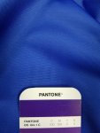
C100+M100 dark purple prints blue from online trade printer doing dye sub. job

printshoppe

New member
I recently had an issue with an online printer doing a dye sub table cover for me. I made the color C100+M100 expecting to get a dark purple, as is shown in the Pantone CMYK formula guide. When I received it, it was a cobalt blue color. Here is the response I received from the company:

One of our representatives has responded to your claim for job A613220-01/(171792) please see below.
Hello, After reviewing your claim ticket we will be unable to reprint this order. 100% Cyan and magenta is the composite for a blue print. We sincerely apologize for the inconvenience but since we do not offer color matching and the values are not correct for a purple print. Thank You


I called them to discuss and they 100% said I was wrong, and that this CMYK formula will print blue. I first politely asked them what reference book they were using to draw this conclusion. They told me they do not have any CMYK swatch books in their facility since they do not "color match or print Pantone colors", but that they do 5000 jobs per day, and nobody else has complained about the color of their prints. I tried to explain to them that a CMYK reference swatchbook has nothing to do with "Pantone" colors which I think they were confusing with spot colors. I became increasingly agitated by the prepress manager's lack of knowledge and insistence that C100 M100 prints blue. In all my 35 years in the industry, it is a known fact that this color may appear blue on the monitor, but when printed it comes out purple. Most of the time, my clients complain when their CMYK blue builds come out to purple. I tell them the rule of thumb that your magenta should be 30% less than the cyan to avoid a purple shift.

Either everything I have learned in the past 35 years is completely wrong and all my CMYK swatchbooks are incorrect, or this company is clueless and needs to get a basic education. THOUGHTS???
 
Understood. Thanks. We are talking Cobalt blue to deep purple - not looking for 100% match to my process guide, but in my experience the job should be somewhat in the ballpark!
 

Attachments

  • 20170509_153256.jpg
    20170509_153256.jpg
    1.8 MB · Views: 1,209
It was only a suggestion, since we have no idea which vendor you were using or what substrate . . . but I would be looking for a different vendor if I were in your shoes
 
Click image for larger version  Name:	100c100m.png Views:	2 Size:	12.5 KB ID:	265492


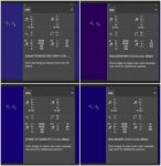
Here are 4 different CMYK profiles assigned to the same 100c100m source value.

One is for a common press condition, Coated paper. The L*a*b* numbers show that this is a blueish purple, however it could be argued as just being “purple” by most human observers.

One is for an inkjet printer, an Epson x800 series using a semi-matte stock. This is arguably purple, with an close redish magenta to blue ratio.

One is for an inkjet printer, an Epson x900 series using a semi-matte stock. This is the same paper as the previous, but a different inkset. This is arguably more blue than purple, with higher blue values than redish magenta.

One is for an inkjet printer, an Epson x900 series using a different satin stock. This is arguably more blue than purple, with higher blue values than redish magenta.


Stephen Marsh
 

Attachments

  • 100c100m.png.jpg
    100c100m.png.jpg
    12.5 KB · Views: 390
Last edited:
Stephen, I believe your demonstration only highlights what happens to untagged files when they go to different devices.

Why don't they just send them a tagged, as in ICC profiled, CMYK file and see what they do with it. Their RIP will have a much better idea of the colour that is supposed to be reproduced if it has some Lab values to go by instead of untagged, device dependent, CMYK values.

We might also point out that the CMYK values from the PANTONE guide are based on a very specific standardised printing condition details of which aren on page 2 under Tachnical Notes. It lists a total of 15 variables, some more important than others, that affect th visual appearance of the end result. Last, but definitely not least, is what they describe as "pressmanship".
 
The key phrase i the OP is "Dye sub", there are many variables associated with this process (These include substrates, sublimation paper selection, pressing time, temperature and pressure.) more so than offset or digital print, i suggest you visit the shop and get an understanding of their processes and maybe even discuss this with suppliers to the Dye sub industry who often have seen iit all before and can guide you and your printer to a solution without upsetting either party
 
If the inks were ideal, C would completely absorb red wavelengths and would not absorb any of the green and blue wavelengths (perfect CYAN). Similarly, perfect M would completely absorb green wavelengths, and would not absorb any of the red and blue wavelengths.
Mixing perfect C and M would therefore end up as violet-blue: White light (all R, G, and B wavelengths) comes in, C absorbs all R, M absorbs all G, and non of them (C and M) absorbs any B... so you're left with blue... violet-blue since visible spectrum starts with violet and proceeds to blue and so on.
I suppose your experience comes from offset where inks are pigment-based and quite far from perfect. Dyes are more "pure" than pigments, i.e. they exhibit less unwanted absorptions. Some dye-based ink-jets can produce black by using only CMY (without K).
I'm not a native English speaker so I suppose by purple you mean blue with more violet. In any case, I believe that this has to do with absorbance properties of different sets of inks.
 
Last edited:
The key phrase i the OP is "Dye sub", there are many variables associated with this process...

No, the key phrase the OP used is CMYK.

Regardless of what the OP thinks, or what he's used to in the industry, if you send CMYK values, and don't define a color space, then you have no right to quibble at all over what you get back.


(Edited to add: It's probably worth pointing out that of course there are variables in dye-sublimation, just as there are in any other printing process. But dye sub is every bit as profilable as any other process, and just as predictable once correctly done.)


Mike Adams
Correct Color
 
Last edited:
IMHO . .. the key phrase is the vendor saying "We sincerely apologize for the inconvenience but since we do not offer color matching and the values are not correct for a purple print." it's the we do not offer color matcing . . . this would seem to indicate to me that they do not profile anything . . . like I said earlier - I would be looking for another vendor with better answers . . . just my 2 cents
 
40 years ago I worked in an offset shop where we did occasional sublimation. It was another one of the "let's see if this will work" and "That's COOL!" processes that made us no money. The inks were all process and the color match was always "pleasing color". No options.

Garment screen printers pretty much took over the sublimation field after that. Short run garment printing is ideal for dye-sub in many cases.

Short run garment printing is a low-entry field in both capital investment and knowledge. I do not expect much from most short run garment (and textile) vendors: that they even have a PMS book is an accomplishment in my experience.

Sublistatic printing (sublimation) uses heat-vaporizable dyes and of course is a heat process... totally different from both offset and screen. My shoot-from-the-hip is if you get a close CMYK match to ANY color you'll be on the lucky side: it's shooting at a moving target.
 
My shoot-from-the-hip is if you get a close CMYK match to ANY color you'll be on the lucky side: it's shooting at a moving target.

It's a different target, with its own set of procedures and its own set of rules, but it is most definitely not a moving target. In inkjet at least, it's as quantifiable, calibratable, predictable and repeatable as any other inkjet process.

I've profiled ink jet dye sub machines of all types on all processes all over the world, everything from Chromaluxe to koozies, and I know that done correctly, it works.


Mike Adams
Correct Color
 

PressWise

A 30-day Fix for Managed Chaos

As any print professional knows, printing can be managed chaos. Software that solves multiple problems and provides measurable and monetizable value has a direct impact on the bottom-line.

“We reduced order entry costs by about 40%.” Significant savings in a shop that turns about 500 jobs a month.


Learn how…….

   
Back
Top