CMYK spot colors across different printing methods

Jerry

New member
We are looking to create artwork which will be used across a wide variety of printing methods and are seeking a CMYK spot color palette which will work for the 'worst' of cold set newsprint presses right through to digital, inkjet and litho.

It seems like the best thing we could do is to start with printed samples of newsprint (can someone suggest the best ones?) use those which print clearly as our master set for other printing methods?

Is there a better way to do this?
 
Cross-referencing CMYK builds for other print conidtions, Part 1

Cross-referencing CMYK builds for other print conidtions, Part 1

First off, you're referring to *simulation* of spot colors using CMYK, correct? (I thought so!) :)

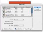
From a color management perspective this is a relatively simple thing to accomplish. It's going to require a few things though....you'll first need to determine what is going to be your "reference" color space (or printing condition if you will). This can then be used as a foundation for subsequent conversions or adjustments of these spot color CMYK builds for other printing processes. To start with, you'll need an ICC profile of this reference space. For the best chance of matching these builds from the get-go, let's say that reference space/profile is GRACoL Coated1 (nice wide color gamut of "normal" offset printing). I'll later get into why this might NOT be the best choice and what compromises you'll have to make....but this is a good reference to use to explain the basic concept.

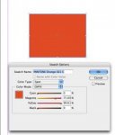
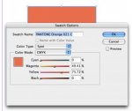
At this point, if you know the CMYK build using, say, the Pantone Process Simulation Guide as a starting point, you would simply ASSIGN your reference profile to this build in, say, Adobe Photoshop, and have it tell you what the L*a*b* value is for that build with that particular profile (you can use Phototshop's Color Picker for this or the into palette if it's set to L*a*b*). Keep in mind that there's no guarantee this will match what you see in the Pantone book as we have no *precise* idea of what ICC profile might define the printing condition used for the Pantone CMYK builds (more on that later).

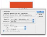
Once you know the L*a*b* value of the CMYK build relative to a reference color space/profile/printing condition, you can (in Photoshop) simply change your CMYK working space to your NEW printing condition profile, go into the Color Picker, type in the L*a*b* value and then look at the CMYK build it comes up with. These new values will likely be quite different than the first go-'round but this represents the CMYK build to match that color as close as possible with this new printing condition.

An alternate approach would be to create a blank L*a*b* document in Photoshop, fill it with the L*a*b* value you want and simply change change your CMYK working space at will and read out the CMYK equivalent from the Info palette (set first readout to Lab, the second to CMYK).

One other note, if you want THE most accurate rendering of that CMYK build, you should start by setting your default rendering intent in Color Settings to Absolute Colorimetric before doing any of this...this will ensure that the CMYK build that gets reported also takes into account the darkness and color tint of the printing stock, something that would be important for matching to newsprint....but be sure to set the rendering intent back to relative colorimetric (or perceptual) before you do any normal Photoshop work otherwise you'll be in for a big surprise!

That's the end of Part 1....on to Part 2 and Part 3

Regards,
Terry Wyse
 
Cross-referencing CMYK builds for other print conidtions, Part 2

Cross-referencing CMYK builds for other print conidtions, Part 2

In Part 1, I explained a simple way of taking the spot simuation build from the Pantone book, assigning the reference color space/profile and then deriving the L*a*b* value from that. I also alluded to the fact this is will NOT likely match the printed color swatch in the Pantone book.....and that's because we have no idea in a precise sort of way how that swatchbook was printed....and I mean how THAT swatchbook, the one you're holding in your hand, was actually printed.

There's a couple of ways around this dilemma...
1) If you're comfortable with the color swatches you have in your own book and want to use those as a reference, you could simply read them with a hand-held spectrophotometer such as an X-Rite EyeOne Pro. With the supplied software (EyeOne Share), it will not only give you the precise L*a*b* of THAT swatch, you can also create palettes of color swatches that can be exported and then imported into Photoshop, Illustrator, InDesign, etc. And I believe you can also get the CMYK build for that swatch in that software as well. Easy and precise!

2) There's one major caveat to the above, assuming you're taking measurements of CMYK builds....these will not likely match the ACTUAL spot color very closely, depending on if the spot color is "in-gamut" or "out-of-gamut" relative to the reference printing condition. For a bit better precision, it would be better to either read an actual spot color swatchbook (Pantone Coated for example) or simply call up that Pantone color in Photoshop from their built-in library(s) and take the L*a*b* from that and then move on to converting that to the proper CMYK build for your printing condition....but if that color is out of gamut for the reference printing condition (GRACoL Coated1?), the match won't be precise.

End of Part 2, on to Part 3 where I give you the BAD news! :)

Regards,Terry
 
Cross-referencing CMYK builds for other print conidtions, Part 3 (final)

Cross-referencing CMYK builds for other print conidtions, Part 3 (final)

Now for the bad news......

What you establish as your reference printing condition will entail certain compromises. In parts 2 and 3, I used GRACoL Coated1 as my reference because I figured this color space would have the best chance of accurately matching any of the CMYK builds I might specifiy since GRACoL Coated1 represents a fairly wide color gamut for CMYK offset printing (it represents commercial sheetfed offset on paper type #1).

The problem for YOU is that GRACoL Coated1 is way too big of a color gamut for newsprint. In other words, I might have a CMYK build that matches well with GRACoL Coated1 but that's almost a guarantee it can't be matched at all on newsprint, especially if the build in question is of a fairly saturated color.

At the same time, if I use GRACoL Coated1 as my reference/starting point for a REALLY wide gamut printing process such as inkjet printing (not PROOFING but PRINTING), I'm not likely using near the entire gamut of the inkjet process. In other words, I probably could've gotten a BETTER match if the inkjet process was my reference to begin with....but I started with a reference (GRACoL) was that "dumbed down" compared to inkjet printing.

So here's your challenge.....

You either start with a reference printing condition that's the "lowest common denominator" like newsprint, knowing full well that, while you'll likely achieve a very good match on other wider gamut printing processes to your newsprint reference, you could've gotten an even better match to the *original* color (L*a*b* value) had you not been constrained by the newsprint process....
....or you start with the widest color gamut process you'll likely encounter (inkjet or sheetfed offset), tune your colors for the best possible match on that process and then accept the compromises you'll have to make as you "dumb it down" for the other printing processes you encounter such as newsprint.

That's your mission should you choose to accept it!

By the way, I didn't get into ALL of the hardware/software solutions or alternate approaches that could be used....but trust me, they will all face the same dilemma/compromises like I described above. These other methods would just choose different paths to run into that same brick wall sooner or later!

End of Part 3....over and out.

Regards,
Terry
 
Knocked out!

Knocked out!

Terry,
Really knocked out by your generosity and attention to detail in responding to me. I have the general drift but after another couple of readings, I'm sure all of those suggested will make perfect sense. Thanks for all of your help. Jerry
 
The Adobe applications currently default to specifying PANTONE mixes by the CMYK recipes, but you can set the apps to make use of the published Lab values. Build your document in the largest color space that you'll be working in. When your finished, you can convert the document to the other color spaces. The CMYK builds will be redefined.

Or, change the document color space, pull the color from the swatch book again, and then set to CMYK again. The tint build will be recalculated.

Even easier to color manage the PDFs.
 

Attachments

  • Ink Manager.jpg
    Ink Manager.jpg
    19 KB · Views: 160
  • SWOP5.jpg
    SWOP5.jpg
    8.9 KB · Views: 159
  • Convert to Profile.jpg
    Convert to Profile.jpg
    16.8 KB · Views: 157
  • SNAP2007.jpg
    SNAP2007.jpg
    12.9 KB · Views: 160
your might use FOCOLTONE

your might use FOCOLTONE

FOCOLTONE are made by CMYK base. So, despite of you metode of printing you will get exact color match.

Try google to find out!

"The Focoltone Color Swatch Book shows 763 colors that you can print either spot or process from the CMYK process colors. The colors are presented in a fan-like swatch book for easy reference and selection of Focoltone colors."


We are looking to create artwork which will be used across a wide variety of printing methods and are seeking a CMYK spot color palette which will work for the 'worst' of cold set newsprint presses right through to digital, inkjet and litho.

It seems like the best thing we could do is to start with printed samples of newsprint (can someone suggest the best ones?) use those which print clearly as our master set for other printing methods?

Is there a better way to do this?
 
Well done Terry!

Well done Terry!

I am going to throw my two cents in for fun. I have had to do this very project. It is a pain.
I found, after much pain, that SNAP has some contitions and elements which may help you here. First, for the SNAP profiles they recommend just about the best Newsprint paper possible. This is the key. This paper is "whiter and smoother" than normal wood chip paper. Then SNAP does like a gray balance.
Yes, you will make selections to a web press but they will be very good. If a person has a project, Advertising Campaign, which will print over many various printing methods this will be extreemly useful. Yes you could do better on better equipment but, the theory here is that the ad looks the same no matter where it is printed. So remember the resolution on the newsprint 150Line should be matched as close as possible on the better machines, if the articles are to be compared. The colors will, from a good viewing distance, under good viewing lighting, look identical. Remember, tweeking of the colors may be necessary but you really do need to match to the LEAST controlable medium.
 
FOCOLTONE are made by CMYK base. So, despite of you metode of printing you will get exact color match.

Not sure I understand this statement....you're saying that because FOCOLTONE is based on fixed CMYK recipes/values that this ensures they will match across multiple methods of printing? Either I'm misunderstanding you or this statement can't possibly be true. Please clarify if you could.

Regards,
Terry
 
On Focoltone, I understand the claim is that you can mix the inks in the bucket or on paper. Now given variables as trapping values TVI and even primaries different appearance on different substrates. I must say with Terry the claim seems to be based on theory and not real life.

Remember Inks are 80% non-pigment in their recipes, and if printing order affects colours, as well as the FM raster dotts not overlapping causes FOGRA to come out with new ICC profiles for that process... well Wiki is not really a source to get your top priority info.

The idea is to use the CMYK primaries as mix components.
 

PressWise

A 30-day Fix for Managed Chaos

As any print professional knows, printing can be managed chaos. Software that solves multiple problems and provides measurable and monetizable value has a direct impact on the bottom-line.

“We reduced order entry costs by about 40%.” Significant savings in a shop that turns about 500 jobs a month.


Learn how…….

   
Back
Top