Pantone: + or not?

Is there some reason why they aren't supplying L*a*b* or spectral CGATS files for these colors?
Hello. No special reason really.

Designers typically do not work with LAB or concern themselves with what CGATS files are. They however need to know which ICC profile to use when setting up their CMYK files - that would include SMS colours.

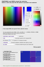
If you are interested in checking out the LAB values of SMS colours you can of course check them out yourself if you open the sRGB labelled patches in Photoshop and hover over the colour(s) of interest. Those are the LAB values or extremely close to the LAB values you should be able to hit in CMYK printing, analog or digital.
The SMS colour palette concept is an attempt to get Graphic Designers away from using amazing, media relative colours that most Printers can't actually produce, - but instead to get into a new mindset and up and running using a decent number (2.607 colours) of common colours that any Printer should be able to reproduce and at the same time getting Designers aquanted with proper ICC colour management and how to use it correctly to manage their brand colours (or have them managed by Spot-Nordic) for all media (Print, Web and TV), - and at the same time to help create a reason for Printers to at least be able to print to ISO 12647 standards when requested - with an accuracy of DE2000 of 2 or less preferably, - 3 at the very most to be able to say that the target colour is at least visually very similar to the printed outcome.
SMS colours request this of Printers and since they are solid colours printed in CMYK there is no way for Printers to get around this or "winging it" by selling the job with "pleasing colour" and a charming Printer giving a speech about what is possible and what is not.
Any customer can check the LAB value of his or her SMS brand colour with a simple i1Pro2 spectro.
 
I really appreciate the explanation of the motivations/designs behind SMS colors. Also, the idea that you started
selecting the colors of your system based on the likelihood of success in print reproduction seems brilliant
and wise. I hope you wouldn't mind a different perspective on color management as to why LAB values
would be better than the approach you explained.

Assuming most of SMS' targeted designers are using either the Adobe or Affinity design applications,
LAB values conveyed in ASE files are the best way to assure those designers have a path to excellent
print reproduction for their creations. For printers using RIP software, CGATS files and/or ICC named
color profiles consisting of LAB values are the best way to assure proper print performance. Some RIPs
(like Ergosoft) support importing ASE files with LAB values.

LAB color is device independent, and assures a standard for output. With respect, I think it is a bit of a backward
approach to convert an SRGB color space profile/RGB number into a LAB number that should have been
the basis of specification in the first place. Pantone as of a few years ago finally began to publicly disclose and specify their decks in
LAB. Another example of this approach is that EFI Fiery RIP distributes ICC named color profiles using LAB values
to specify Pantone colors in its RIP.

The reason I mentioned spectral values as another aspect of how SMS colors should be specified
is that anyone who might want to have paints and/or inks created would find that very useful.

I think you can better achieve your goal of a color collection that is more effectively print reproducible
using device independent LAB as the basis of specification.
Hey again, thank you for your comments, which are absolutely (pun intended) appreciated.

The Spot Matching System is a LAB based colour palette and it is always possible for users to get the LAB value of their colour(s). I have gotten quite a lot of comments concerning the spectral value part and that is in consideration. However since SMS colours are fixed to certain colour gamuts (sRGB, Rec. 709, Fogra and GRACoL CMYK gamuts, all of which are built and based on certain illumination and viewing angles, they are not intended to be judged with non-standard/custom lighting or viewing angles. At the same time it is always easy to take an SMS colour and use the LAB value of the colour to produce, - say a paint or a spot colour where you just need to define the target illumination and viewing angle for a visual match. I believe this should be possible using most modern colour mixing software where you have the spectral data of each colorant in the database.

The reason why it is not enough just to issue the LAB values of the SMS colours (besides from the fact that SMS is a business) and leave it at that is the fact that most designers and regretfully many Printers as well are not at all interested nor properly versed in colour management and constantly pressed for time and since it is now common practice that designers and other print customers are typically instructed to work in RGB mode and "just" deliver their PDF's in RGB (Adobe RGB usually) to their printer for late binding, who will convert the job to the destination CMYK output, usually using either relative colorimetric rendering intent or sometimes Perceptual when they convert from RGB to CMYK (depending on the printer), that will mean that the final CMYK composition of any SMS colours that might be used within the document (in RGB format) will be subject to chance. That is why SMS colours for print are at the moment delivered in CMYK format when it is clear what icc profile is appropriate - based on information from the printer responsible for printing the job.
I am sure you are aware of the current state of the art when it comes to brand colours - and how incredibly large colour fluctuations can be in reproduction of brand colours - even from one printer to the next, not speaking of colour fluctuations from one substrate type to another (from coated paper to uncoated paper) and especially from one media to another - say from print to Television or web. This is even the sad truth in the case of major companies like Coca Cola that should have a budget to at least standardize it's own brand colours cross media.

When our grandchildren look back on this time, they will most likely refer to the brand colour management of our times as the wild, wild west, where everyone is just focused on making any brand colour "pop" or look "pleasing to the eye", never taking into account that multi national companies and their brand colours travel around the globe for everyone to see - including colour fluctuations of up to a DE2000 of 15 in some cases.

At this moment in time I honestly think that it is best to do this one step at the time - by first making sure that the brand colours designers work with are reproducible in standardized CMYK printing to ISO standards. Step 2 is to check to what standards their printer(s) can in fact print - again to which ISO standards (Fogra or GRACoL/G7) and once that is clear, to make sure that they select papertypes that are appropriate and in accordance with the print standards available by their printers. Last step is then to manually provide the designer with their chosen SMS colours in CMYK format suited for using when they are setting up a job using the CMYK icc profile embedded with the SMS CMYK colours when they are delivered to the customer - same icc profile that the customer/designer should then use when setting up his or her job. The designer can then work in RGB format or CMYK format with images and graphics and text, only depending on what he/she or their printer prefers, but the CMYK SMS colours used within the document should remain unchanged - output as they are and only the RGB part of the document should be converted to CMYK by the printer. If the printer in this equation prefers to have the document delivered in CMYK format, the designer should simply convert his document to CMYK before sending it - again leaving CMYK data within the document unchanged.

I agree, this is not as smooth as I would have preferred it to be but it works - and it helps designers understanding how icc colour management works.

Of course it is possible to deliver SMS colours in .ASE format - but only in their final CMYK format - only when the customer has decided on substrate and print standard / icc output profile. There are also advantages to this slightly cumbersome approach - for instance it is possible for SMS customers to order SMS colours that are suited for printing on Fogra 51 substrate but set up for printing according to Fogra 39 - which is actually quite common since most coated papertypes these days contains quite a lot of optical brighteners and are thus appropriate for printing according to Fogra 51, while a lot of printers are bluntly refusing to switch to the new Fogra 51 and Fogra 52 / ISO 12647-2-2013 because "their customers are happy with the current Fogra 39 and Fogra 47 prints" (and so the prints are always cooler than the proofs) + the constant reprint issue where printers are afraid to change anything or have a discussion with their old customers about making any changes + the theory that ISO 12647-2-2013 is a conspiracy by X-Rite and other manufacturers to sell more measuring devices...
Actually, I think the SMS approach doesn't help designers and printers understand how icc color management works- I think the SMS approach caters to their mental
models of color and printing, with the intent of getting a better color matching outcome despite their inadequate understanding.

Even so, I respectfully disagree with your characterization of an aspect of the designer's workflow. When designers work with the Adobe or Affinity applications,
they typically know at least enough to specify a spot color by name which turns into a lookup in a swatch table. That swatch table then provides either LAB or CMYK
or RGB depending on the creator of the swatch table. In the case of Pantone, only recently have they started providing LAB numbers for their fan deck swatch tables.
How this will work in the age of Pantone Connect is unknown to me. The point is- when files are provided to a printer, and assuming the named color is mapped into
a LAB-based specification- this is what the file presents to the printer's environment. I've never heard of anyone quibbling profoundly about a LAB/D50 assumption
for specifying spot colors for printing. I therefore wonder why you are concerned about multiple illuminants, at least in regard to print. For web and TV, it was always
my impression that this was a vast wasteland of unmanageable anarchy when it comes to color. My thoughts are really focused on print since there is at least some
hope of it being amenable to proper color management.
 
  • Like
Reactions: SMS
Actually, I think the SMS approach doesn't help designers and printers understand how icc color management works- I think the SMS approach caters to their mental
models of color and printing, with the intent of getting a better color matching outcome despite their inadequate understanding.

Even so, I respectfully disagree with your characterization of an aspect of the designer's workflow. When designers work with the Adobe or Affinity applications,
they typically know at least enough to specify a spot color by name which turns into a lookup in a swatch table. That swatch table then provides either LAB or CMYK
or RGB depending on the creator of the swatch table. In the case of Pantone, only recently have they started providing LAB numbers for their fan deck swatch tables.
How this will work in the age of Pantone Connect is unknown to me. The point is- when files are provided to a printer, and assuming the named color is mapped into
a LAB-based specification- this is what the file presents to the printer's environment. I've never heard of anyone quibbling profoundly about a LAB/D50 assumption
for specifying spot colors for printing. I therefore wonder why you are concerned about multiple illuminants, at least in regard to print. For web and TV, it was always
my impression that this was a vast wasteland of unmanageable anarchy when it comes to color. My thoughts are really focused on print since there is at least some
hope of it being amenable to proper color management.
In some cases of curious designer they want to know WHY, which gives me an opportunity to explain the basics of icc colour management. But you are right that even if they are not at all interested in how but only the what, Graphic Designers and Printers are able to use the Spot Matching System colours blindly just by following simple instructions, - something that I myself can completely relate to. I have said it many times in my life: I don't care how this works. I just need it to work so I can do my job and get the right result.

The swatch tables that have until now been built into Adobe apps are fine to use if you are going to use for instance Pantone C colours for a logo. It gets much more tricky and takes a lot more precicion and knowledge by the Designer if you are creating a complete brand identity - the website, the business cards, the letterheads and envelopes and the outdoor signage and the TV graphics. Here it is simply not appropriate to just define the brand colours using Pantone C colours (and still Designers do this - and then just hope for the best when the brand is let out into the world). For me, after watching this for decades and seeing the same colour chaos being presented by even top Design Agencies (Pantone C and then a fixed CMYK value for each brand colour along with a HEX value) bundled with all the lofty talk about "Brand consistency" and Omnichannel this and Multichannel that, my conclusion is that if Designers want to put an end to the chaos (which I am not so sure about), the best way to do that is to use named SMS colours for brands and then just leave it to Spot-Nordic to deliver just the right colour combination appropriate for any occasion, using the LAB value of each colour as the base.

If you use SMS colours to create a completely new brand identity, you simply use the sRGB colours to finish it off. Show it to your customer online and when you need to start printing your letterheads and your posters or whatever, the Designer simply has to order the SMS variants appropriate for the job at hand and replace the sRGB colours with the CMYK colours when he or she has decided on which paper to use (nature and white point) and knows to which print standards his Printer prints (Fogra or GRACoL/G7 or even custom standards). Only then the final CMYK value can be realized - only suited for this job - or this type of job, using this paper and this printer. Switch to another printer that prints to another standard and then the CMYK values of the brand colours will need to be replaced.

In my humble opinion, the first thing a Designer who dares to speak out about Brand Consistency should be concerned about is Brand Colour Consistency, - how to keep his damn brand colours correct from one media to the other. Colour is the first thing we pick up when we look at - well just about anything and in my opinion Designers should be more concerned about keeping their key colours correct in their campaigns than the font type or even what is written. If you can nail down your brand colours cross media and keep them visually consistent over time, customers may eventually start knowing your company by your colours alone. That is at least the goal of the Spot Matching System, - what we should be attempting to do if perfection is the goal. And now finally we have to tools to actually aim for it.

The reason I mentioned spectral curves is an ongoing discussion I have been having with people in the textile industry, where they are often tasked with developing colours for clothes that don't change too radically (via metamerie) when going from one illumanant to another - say from D65 to typical store lighting, - since the last thing those manufacturers want is for a dark bluish jacket that you try on and buy to turn dark brown when you walk out or (worse) go on that date the following weekend. The reason I am having this discussion is that textile is the next frontier for the Spot Matching System and it is already possible to print SMS colours digitally on cotton or Polyester (which is damn cool since those clothes can be presented in their sRGB format in the online store of the shop or manufacturer and when the clothes are delivered to the customer the colours should almost always be very close to identical visually in normal daylight.

Online colours are not more unmanagable than print colours. In fact they are easier to manage since there is just one icc profile that is the global standard - sRGB. The only thing any user with even his or her smartphone or tablet or laptop or monitor has to do is to keep it calibrated and for those responsible for brand colours (Designers) to use only colours that fit within the colour gamut of sRGB (say SMS colours) - and when they are designing artwork for the web of course they have to use the sRGB profile - not Adobe RGB or ECI RGB. Yes, there will be some minor colour differences from one monitor to the next but I can assure you that the average visual difference there (especially if you just check with younger people that tend to renew their equipment quite rapidly) is much smaller than the actual DE2000 difference from one ISO certified printer to the next in offset printing.

All we can do is to use LAB as our target and then do what we can everytime to hit it.
 

Attachments

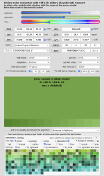
  • cielab.xyz_assortment.png
    cielab.xyz_assortment.png
    187.7 KB · Views: 229
  • cielab.xyz_colorconv.png
    cielab.xyz_colorconv.png
    133 KB · Views: 234
Is there some reason why they aren't supplying L*a*b* or spectral CGATS files for these colors?
Just logged in and saw this comment. SMS users can easily see the target LAB values of their SMS colours simply by opening them in Photoshop and hovering them with the EyeDropper. The LAB values you see in the sRGB version of our SMS colour palettes (P20, P20e or P20x) are the same LAB values you should measure with your 0/45 spectrophotometer. In other words, they are the same colours, whether you use them for digital displays or for print - on coated or uncoated paper.
 

PressWise

A 30-day Fix for Managed Chaos

As any print professional knows, printing can be managed chaos. Software that solves multiple problems and provides measurable and monetizable value has a direct impact on the bottom-line.

“We reduced order entry costs by about 40%.” Significant savings in a shop that turns about 500 jobs a month.


Learn how…….

   
Back
Top