In addition: Pantone says "the latest Pantone Formula Guide also features five new eco-friendly Pantone base mixing inks compatible with coating in print production processes" ... for this reason some bases have changed
Dear all, I think there's a little bit more than just than that ... I would like to share with you a couple of articles that I find they are worth to read.... I guess these are the original sources:
There are errors in the current PANTONE swatches. In the PANTONE Solid Coated as well as in the Solid Uncoated fan there are colours with wrong colour formulas.
PMS colors are alive and well. Some original base colors like reflex and warm red do not stand up to the curing lights in the coating system.
Coatable shades of these are now available but the pigments arent the same so when you are mixing say PMS 281 old school would be 94.10% reflex and 5.90% black.
Now we use .04 transparent white .1321 rubine .1711 coatable violet .5819 process blue and .073 black. Simple.
Just you go ahead and tell all the designers out there they can't use spot colors anymore because "Most spot colors are out of gamut"
DOH.
Yes - we print SPOT colors as process and RELY on the 'pantone' system to create those colors as reliably and as closely as possible.
Unless you were just trolling in which case - nevermind.
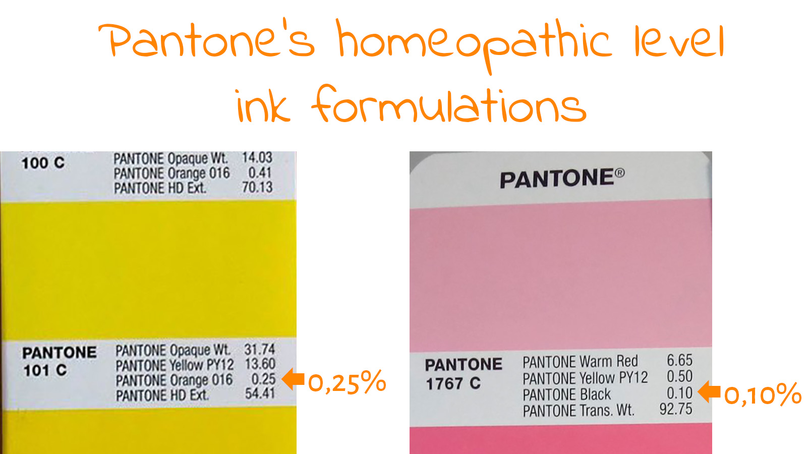
Pantone explains the homeopathic levels of ink in their new formulations (my emphasis):
"Regarding the criticism about “homeopathic” amounts of base inks, she [Pantone product manager Joyce Stempkowski] explained: “In order to achieve the specified spectral values with the new basic colors, Pantone at certain points had to use more components in very small quantities. However, in practice that should not be an issue, since printers will have their own recipes if they want to achieve small tolerances for a given standard.”
Pantone has added 224 mixed colours and five base ink colours to the Pantone Matching System – with some of the new formulations causing angst among printing industry pros.
"Pantone said the launch of the new colours had followed the integration of 294 Pantone Matching System Colors that were added in 2019 for closer alignment with Pantone’s Fashion, Home + Interiors System."
I guess we've been spoiled to have a color matching system (ie business) just for us, eh? The party is over.
LOL