J3_PrintWarrior
Well-known member
I have an interesting situation here.
A client has supplied me with a PDF that was created from Quark 8.12 along with the native document and links. Most of these photos are quite muddy within the mid-tone/highlight values. This is true with both the PDF and the Quark 8.12 document that was supplied. The native Photoshop files show to be a better quality when opened in Photoshop.
I can place the same exact link into a Indesign CS4 document and have it show something that is more true to what the client is expecting to print. It also shows truer to what I am seeing when I open the link in Photoshop.
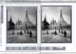
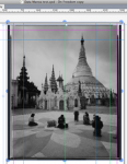
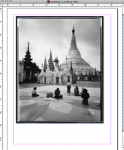
I've included a couple of attachments showing what I am seeing. You can see quite a difference between Quark and Indesign. I know Quarks preview doesn't compare to Indesign. But, this is a drastic difference. Again, the same link was placed in both documents at the same size.
When I export to PDF from either document it shows true or close to the same as I am viewing within each document. It's tends to show a "What you see is what you get." from both indesign and Quark.
My question is.....What is Quark-or is Quark doing something to the link to produce a subpar mid-tone/highlight quality? Ok it may not be correct to point the finger at Quark. It is Adobe Indesign and Adobe Photoshop. But, is it possible there's something with the link that Quark doesn't see that Indesign does(the link has no profile attached)? Why such a drastic difference between both these programs?
Any info will be helpful. Thanks in advance
A client has supplied me with a PDF that was created from Quark 8.12 along with the native document and links. Most of these photos are quite muddy within the mid-tone/highlight values. This is true with both the PDF and the Quark 8.12 document that was supplied. The native Photoshop files show to be a better quality when opened in Photoshop.
I can place the same exact link into a Indesign CS4 document and have it show something that is more true to what the client is expecting to print. It also shows truer to what I am seeing when I open the link in Photoshop.
I've included a couple of attachments showing what I am seeing. You can see quite a difference between Quark and Indesign. I know Quarks preview doesn't compare to Indesign. But, this is a drastic difference. Again, the same link was placed in both documents at the same size.
When I export to PDF from either document it shows true or close to the same as I am viewing within each document. It's tends to show a "What you see is what you get." from both indesign and Quark.
My question is.....What is Quark-or is Quark doing something to the link to produce a subpar mid-tone/highlight quality? Ok it may not be correct to point the finger at Quark. It is Adobe Indesign and Adobe Photoshop. But, is it possible there's something with the link that Quark doesn't see that Indesign does(the link has no profile attached)? Why such a drastic difference between both these programs?
Any info will be helpful. Thanks in advance