kate.in.cmyk
Member
I am stumped.
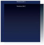
We have a customer that we run a gradient of PMS 296 C to 281 C on just about everything we print for them.
The 296 C appears on screen very muted.
There's no production issue, but as we end up sending PDF proofs to the customer, I have no answer for them on the appearance on screen other than "trust us, we're running the same as we have been"
I feel a little silly asking, but is there a way to get this gradient to preview a little better?
We've had this issue on other customer-supplied files. Once we process, our final proof specifies the same spot, but appears differently when toggling between the original and proof (on the same screen).
Occasionally, customers get finicky about it.
Thank you!


