

Hi all - I've been reading this forum for a long time and occasionally comment, but this is my first question. Please hang in there with me, I had a hard time writing it up as short as possible and still including vital info.
Two questions:
1. What is the proper way to convert spot colors into CMYK? As a general rule I do not warn customers when I am doing it unless there is a drastic change. I prefer to convert in Illustrator using SWOP because I feel Illustrator handles color the best.
2. Why would the same swatch look different in one file vs. a newly created file. It converts to a different CMYK breakdown as well. I copied and pasted the swatch out of the old file into the new file.
Details:
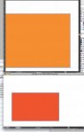
I received an inDesign file for print. It was set up in CMYK with PMS 021. I converted everything to CMYK and created an output file in Illustrator (.ai) to make films out of, my normal work flow. All colors look good and output the way they are supposed to. Get it on press and all the colors are printing like they should until I grab the packaging printed by a vendor and the oranges are off. The vendor apparently converted 021 as well but through InDesign and their result was a light orange (C=0, M=50, Y=100, K=0) where mine was a dark orange (C=0, M=80, Y=100, K=0). To give you a better idea of how different the colors are, mine is closer to PMS 7579 (page C 23) and theirs is close to PMS 2012 (page S2 C). Checking some color discussions online I feel that the correct conversion is mine. Checking their files though it seems the customer wants the lighter orange (C=0, M=50, Y=100, K=0) since that is all over their website. I checked their logo in a few different files, and everywhere it shows up as a light orange even though the swatch is called 021. I attached a screen shot of PMS 021 in a blank Illustrator document compared to how their logo looks in their file. As you can see they are drastically different. I would say they just created a new swatch and called it 021, but when I copied their logo into a new document the 021 showed up in the correct darker/vibrant color. The original file was an Illustrator 3 .eps, which is my only guess as to why the colors change between files. There do not appear to be any unusual Transparency settings on their end.
This disturbs me, because the customer supplied files to us and they printed two very different ways. I strongly believe my version is technically correct but looking over all their work on the website it's clear they want it to print a light orange, which is not PMS 021. How am I supposed to guess at what they want if they are supplying art this way and everyone else happens to print it different than I do?
BACKGROUND: I've been in Prepress for about 14 years. This is the only job I've had in this field and everything I know is self-taught. I am the only one in my department. I work at a screenprint shop with some offset, but we print on plastic rather than paper so our presses and inks are completely different than in other shops. We have no color bars, registration marks to double check the color. I have the CS6 suite but no other post prep software like PitStop. I set everything up manually in my software, I do all trapping by hand and all films are created by me through InDesign. I check all output percentages and compare to the original file to make sure nothing has been changed in the conversion before creating films.
Two questions:
1. What is the proper way to convert spot colors into CMYK? As a general rule I do not warn customers when I am doing it unless there is a drastic change. I prefer to convert in Illustrator using SWOP because I feel Illustrator handles color the best.
2. Why would the same swatch look different in one file vs. a newly created file. It converts to a different CMYK breakdown as well. I copied and pasted the swatch out of the old file into the new file.
Details:
I received an inDesign file for print. It was set up in CMYK with PMS 021. I converted everything to CMYK and created an output file in Illustrator (.ai) to make films out of, my normal work flow. All colors look good and output the way they are supposed to. Get it on press and all the colors are printing like they should until I grab the packaging printed by a vendor and the oranges are off. The vendor apparently converted 021 as well but through InDesign and their result was a light orange (C=0, M=50, Y=100, K=0) where mine was a dark orange (C=0, M=80, Y=100, K=0). To give you a better idea of how different the colors are, mine is closer to PMS 7579 (page C 23) and theirs is close to PMS 2012 (page S2 C). Checking some color discussions online I feel that the correct conversion is mine. Checking their files though it seems the customer wants the lighter orange (C=0, M=50, Y=100, K=0) since that is all over their website. I checked their logo in a few different files, and everywhere it shows up as a light orange even though the swatch is called 021. I attached a screen shot of PMS 021 in a blank Illustrator document compared to how their logo looks in their file. As you can see they are drastically different. I would say they just created a new swatch and called it 021, but when I copied their logo into a new document the 021 showed up in the correct darker/vibrant color. The original file was an Illustrator 3 .eps, which is my only guess as to why the colors change between files. There do not appear to be any unusual Transparency settings on their end.
This disturbs me, because the customer supplied files to us and they printed two very different ways. I strongly believe my version is technically correct but looking over all their work on the website it's clear they want it to print a light orange, which is not PMS 021. How am I supposed to guess at what they want if they are supplying art this way and everyone else happens to print it different than I do?
BACKGROUND: I've been in Prepress for about 14 years. This is the only job I've had in this field and everything I know is self-taught. I am the only one in my department. I work at a screenprint shop with some offset, but we print on plastic rather than paper so our presses and inks are completely different than in other shops. We have no color bars, registration marks to double check the color. I have the CS6 suite but no other post prep software like PitStop. I set everything up manually in my software, I do all trapping by hand and all films are created by me through InDesign. I check all output percentages and compare to the original file to make sure nothing has been changed in the conversion before creating films.
")
")


