Waterslide decals

Slammer

Well-known member
Hi, just started to restore an old gramophone and have gotten to the part where I need to recreate a one hundred year old logo from a company that no longer exists.
So I am getting the artwork done and have figured out that at the time they used water slide decals, just like the ones we had as kids on our Airfix models.
A bit of the google later and you can get on Amazon waterslide papers for inkjet and laser printers. That´s ok, I can live with that but my question is how did they print and reproduce these things a hundred years ago?
At first I thought Silk screen, but taking a closer look at an existing decal I cant find any apparent screening, so how DID they do it?
Anybody got an idea?
 
Might have been engraved.
That works for custom colors and individual layers of solid ink.
And it fits the time frame.
:)
 
Might have been engraved.
That works for custom colors and individual layers of solid ink.
And it fits the time frame.
:)
Could be it, as in Intaglio printing. That would work, I hadn´t thought about that, it would make the logos very much fine art by the standards of the time, even today´s standard.
 
More likely letterpress using lead type and hand cut linoleum blocks
We used to do some surprisingly beautiful work on our old Miehle Two Rev and Dawson, Payne & Elliot Stop Cylinder
 
Still, it may have been Silkscreen printed.
Any of several techniques could have been used that could hide mesh involvement.
 
Still, it may have been Silkscreen printed.
Any of several techniques could have been used that could hide mesh involvement.
I am going to take my trusty microscope and take a closer look at the “his masters voice” logo on my hmv109.
Get to the bottom of this mystery one way or another.
 
BTW, ink film thickness will generally be higher in silkscreen printing.
I can´t see any evidence of silkscreening on these decals and it looks as if the artwork is finer than silk screens can produce today, let along a hundred-odd years ago.
It is getting very interesting.
 
Makes sense, if it's really fine artwork than it probably wasn't silkscreend a hundred years ago.
However, modern silkscreening can achieve qualities that were unheard of not very long ago.
Text height of 0.8 mm and line width finer than 0.12 mm are regularly printed on PCBs.
I also saw some amazing print samples from fine screened FM films.
I am now thinking it could be a combination of Gravur and Flexo. But what I see under the microscope is confusing…
Paging Dr. Gordo… Dr. Gordo please respond.
 
So here is a little riddle for you Typographics people.
HMV has used a few fonts over its 101 year history. I have found one font that is of interest, one is "Cochin" or it is at least close enough. As in picture one. However I can´t find the font shown in the other picture and it´s driving me crazy because I am normally quite good at fontfinding.
Can anybody figure out what font this is?
 

Attachments

  • L-37150-1453585033-6826.jpg
    L-37150-1453585033-6826.jpg
    99.2 KB · Views: 123
  • HMV Logo small-2.jpg
    HMV Logo small-2.jpg
    32.9 KB · Views: 128
So here is a little riddle for you Typographics people.
HMV has used a few fonts over its 101 year history. I have found one font that is of interest, one is "Cochin" or it is at least close enough. As in picture one. However I can´t find the font shown in the other picture and it´s driving me crazy because I am normally quite good at fontfinding.
Can anybody figure out what font this is?
Looks like hand drawn - too many different letter forms.
I had a local sign painter who regularly mixed 'fonts' that he 'embellished' on signs.
He really only used the font as a guide.
Then the customer would ask us to please use the same font for something else which is how I learned he just made things up.
Interesting times . . .
The more I dig into this topic, the more I come across typefaces that are not recognized by any of the "fontfinder" type programs, or any of my Sherlock Holmes-esque powers of deduction. So I bag dibs on the term: "Extinct font!" Some of these logos are over a hundred years old by now from companies long gone and I find it fascinating.
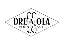
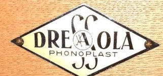
Recently for the restoration of a Dressola gramophone I recreated the logo from a 72ppi picture found on e-bay, it´s not an exact replica but I find it close enough to use.
What do you think?

I also think that I have found the original print method used at the time, I believe it to be the so-called "Chromolithography" procedure. Basically 4C stone printing using a Senefeld type press.
In Munich, close to where I live there is a Lithograph in the city center and I plan to swing by and take a look in the near future.
 

Attachments

  • DRESSOLA.jpg
    DRESSOLA.jpg
    157.7 KB · Views: 105
  • dressola.jpeg
    dressola.jpeg
    94.3 KB · Views: 109
Last edited:

PressWise

A 30-day Fix for Managed Chaos

As any print professional knows, printing can be managed chaos. Software that solves multiple problems and provides measurable and monetizable value has a direct impact on the bottom-line.

“We reduced order entry costs by about 40%.” Significant savings in a shop that turns about 500 jobs a month.


Learn how…….

   
Back
Top