• Best Wishes to all for a Wonderful, Joyous & Beautiful Holiday Season, and a Joyful New Year!

Why is the target not linear?

Simon Ivarsson

Well-known member
Can someone explain in simple words why 50% should print as 68%
I understand that back in the days dot gain was unavoidable due to the manual process.
I'm just guessing now, but the only way it was possible to compensate for dot gain was with the ink and printing press it self.
What I don't understand is why we today still aims for a target that is not linear.
With digital prepress and CTP its not impossible to print linear anymore.

in the manual for eskos IntelliCurve they explain it like this..

"The reason for this is that the human eye expects to see some dot gain, because people are used to look at a certain amount of dot gain, which has historically grown. People have learnt to get used to a standard offset dot gain (50% prints as 68.5%), a print result with dot gain that has always been considered as OK.”

And that just makes me more confused..
Because during press check I compare the original photo with the printed result. And they should defiantly match.
I surtenly don't want the mid tones to be 20 darker.
 
Because during press check I compare the original photo with the printed result. And they should defiantly match.
I surtenly don't want the mid tones to be 20 darker.

Simon, please define “compare the original photo with the printed result”. The photo reproduced on a CMYK proof that has been through a profile conversion that delivers approx. 12-18% lighter midtones are proofed with a simulation that has approx. the same value…so the proofed image is pretty much the same tonality as the original anyway?


Stephen Marsh
 
Ok, Ill try to define.
Shooting with film it would be the photocopy, shooting digital the RGB image.

Back when scanning reflective prints or transparencies – the goal was to approximate the original in the digitised version, as much as possible. When it came to ouput, there was a similar goal – except that output related alterations were often made such as dMin/Max considerations, local contrast etc.

When the conversion from RGB to CMYK is made the TVI is factored in, as long as the output has similar TVI then the image is back to where it started – looking like the original. The TVI could be zero or fifteen percent etc. This is independent of whether the print process in linear or not.

Change in the graphic arts can be glacial, when the mantra is “if it is not broken, don’t fix it”.

Let’s look at this a different way – what do you propose would be the gains if we printed to a linear target and prepared our files for such a condition so that such TVI was correctly factored in. How would the end result be different from a non linear workflow?


Stephen Marsh
 
Can someone explain in simple words why 50% should print as 68%
I understand that back in the days dot gain was unavoidable due to the manual process.
I'm just guessing now, but the only way it was possible to compensate for dot gain was with the ink and printing press it self.
What I don't understand is why we today still aims for a target that is not linear.
With digital prepress and CTP its not impossible to print linear anymore.

in the manual for eskos IntelliCurve they explain it like this..

"The reason for this is that the human eye expects to see some dot gain, because people are used to look at a certain amount of dot gain, which has historically grown. People have learnt to get used to a standard offset dot gain (50% prints as 68.5%), a print result with dot gain that has always been considered as OK.”

And that just makes me more confused..
Because during press check I compare the original photo with the printed result. And they should defiantly match.
I surtenly don't want the mid tones to be 20 darker.

The midtones won't be 20% darker. And the human eye doesn't expect to see some dot gain since very few viewers are even aware of dot gain.

Whatever dot gain the process has from 0% to whatever, will be compensated for in the conversion from image acquisition to final presswork - visually. I.e. If what I see on my display or what I see on the physical proof correctly reflects how the press will render the file's tones then I will adjust the image accordingly until its appearance aligns with my intent.

So, if you configure your press to print linear (i.e. the requested tones in my digital file are rendered as the same tones in the presswork) then I would still end up visually adjusting the digital tones in my file until its appearance aligns with my intent. I think you'd end up at the same place.

N.B. A small but important distinction: Dot Gain is not[/] a target. Dot gain is a process control metric. The actual target is tone reproduction. The lack of clarification of this difference by the industry standards groups (and by Esko in your quote) is one of the causes of a great deal of confusion and problems in this industry.
 
The dot value you measure on a press sheet is a combination of Mechanical dot gain (or possibly sharpening) and Optical dot gain. When we measure a 50% patch in a digital file it represents an area of 50% white and 50% colour which is observed on a monitor by transmitted' light. However when transfered to a sheet via a platemaking process and the blanket there is likely to be a mechanical variation, which can cause it to increase or reduce in size. Now we have to consider how this will optically appear to a viewer when printed on paper and observer under refelected light. When we measure this 50% patch on the sheet, what we're measuring is the reflected light, so if we say that our 50% patch is reading 68% this the amount of light absorbed by the patch on the sheet, with the balance 32% reflected into our eye. The extra 18% absorbed by the printed patch is mainly the result of the light absorbed by the paper surface and indeed the ink. If we had not calibrated the 50% to allow for these factors the printed patch while physicaly measuring 50% approx. would appear much too dark. This aslo explains why Coated papers show lower dot gain.
 
When we measure a 50% patch in a digital file it represents an area of 50% white and 50% colour which is observed on a monitor by transmitted' light.

I don't believe that viewing it on a monitor by "transmitted" (actually emissive) light is relevant. It is the requested tone value in the file vs the densitometer measured tone value of that requested tone value in the presswork that is the issue.

When we measure this 50% patch on the sheet, what we're measuring is the reflected light, so if we say that our 50% patch is reading 68% this the amount of light absorbed by the patch on the sheet, with the balance 32% reflected into our eye. The extra 18% absorbed by the printed patch is mainly the result of the light absorbed by the paper surface and indeed the ink.

I don't believe this is quite correct. Dot gain is a halftone value measured by comparing the reflectance of light from a solid patch of ink, a patch of non-inked area, and requested tone value. The comparison is made using a formula (there are several flavors) to derive the apparent tone value which is then reported as a tone value or as dot gain (tone value increase).

If we had not calibrated the 50% to allow for these factors the printed patch while physicaly measuring 50% approx. would appear much too dark.

The printed 50% patch won't physically measure 50% but appear too dark. The 50% patch will measure whatever the dot gain has caused the patch's tone value to become. The perception as to whether a tone value is too dark, or not, is the result of a mismatch between proofing (hard or soft), tone specification, and measured result. I.e. If my file request is for a 50% tone because it appears tonally correct to me on my monitor or hard proof, or is a specification based on a standard print condition, but get a darker tone in the presswork (because those devices didn't reflect the final tone reproduction of the presswork), then, in that case, the tone appears too dark.

This aslo explains why Coated papers show lower dot gain.

Coated papers have lower initial dot gain because of the surface characteristics of the substrate and the solid ink densities achievable relative to how and how the instrument derives its measurement.
 
Here's the simple answer (I hope) - In the beginning . . .film was produced linear, plates were exposed - a 50% dot became 54% on the plate (in a good shop - "others" it became 60% or more .. .). When printed at correct density, on a press set up correctly (rollers,blankets, pressures, etc.) the 50% measured 68-70% on the printed sheet. 3M's MatchPrint was developed around this measurable value. Photoshop's default settings were near these values also. The Pantone Tint book (Solids to CMYK) simulated these values as well (back then).
Now, you could print with 0% gain - the plate value would be around 42% in the 50% - your proofs would have to be the same 50%=50% colormetric data, but you'd have to print your own Pantone Tint book. . . You see - - - if you print with 0% gain, proof with 0% gain - you print exactly the same as the guy that prints with 30% gain and proofs with 30% gain!!
Actually I think Hallmark Cards prints with 0% gain (linear). Hope this helps, call me if I can be any help.
Dan
 
Thanks Gordo!
I understand why there is dot gain and why that was unavoidable back in the film days.
What I don't understand are why we still configure the printing process with that factor in mind.

Stephen, there probably won't be any gains if we printed linear.
But there seams to be a lot of confusion about target values.
And I have a hard time to explain to my colleagues why 50 isn't 50...
Decades ago when I built my first DGC curve I made it linear..
And yeah, the print looked horrible and I couldn't understand why.
My colleague just told me, 50 should be 68, thats the target. uhh?!?!

So, back to the original question. Why don't we print linear.
and the answer is that printing process are configured to match the dot gain we used to have before CTP... Correct?

"we have always done like this, so why change"
 
Thanks Gordo!
I understand why there is dot gain and why that was unavoidable back in the film days.
What I don't understand are why we still configure the printing process with that factor in mind.
[SNIP]
And I have a hard time to explain to my colleagues why 50 isn't 50...
Decades ago when I built my first DGC curve I made it linear..
And yeah, the print looked horrible and I couldn't understand why.
My colleague just told me, 50 should be 68, thats the target. uhh?!?!

So, back to the original question. Why don't we print linear.
and the answer is that printing process are configured to match the dot gain we used to have before CTP... Correct?

"we have always done like this, so why change"

I think the answer (here comes Mr Speculation) is that humans do not see linearly. Instead we see logarithmically and the tone reproduction resulting from dot gain aligns with that - which is why your linear presswork looked horrible.

Here's an example...

Here are two gradients:
Gradients.jpg


Which gradient has the appearance of an even distribution of tones? The top one or the bottom one?


No peeking!


I think most people would say that the top gradient has the appearance of an even distribution of tones. Yes?


Now, here are the same two gradients but now they have been "Posterized" into 21 steps to clarify the distribution of tone values. Stepwedged.jpg


The top gradient had a logarithmic distribution of tones - i.e. how we see relative tone values - so it has the appearance of an even distribution of tones in the unposterized version.
The bottom gradient had a linear distribution of tones i.e. 5% increments. But, as a gradient it appeared to have a lot of midtones relative to the shadow an highlight tones. Hence, as a gradient, it looked flat, lacking in contrast, and horrible relative to the logarithmic gradient.

So, I don't think the real answer is that printing process are configured to match the dot gain we used to have before CTP - although there's truth to that. I think that the real reason is that, intuitively, the presswork that has the dot gain looks "right" because it better aligns the presswork to how we see than linear output.

Sidebar - the tone patches look scalloped - lighter on one side and darker on the other. These are "Mach Bands" (same Mach speed guy). This is your eye/brain's way of enhancing an image's apparent details in order to make up for our optical system's lack of resolution. It's not an optical illusion. It's a mechanism that's just exaggerated by this type of imagery.
 
Last edited:
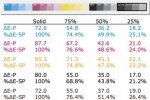
Maybe I can help.
If you do a Delta E2000 between 100% patch of color and paper.
And another Delta E 2000 between 50% and paper, the result is not proporcional.

∆E-P = Color Difference
sample compared to paper

Screen Shot 2015-07-16 at 8.25.42 AM.png.jpg
 
The simplest answer is that printing "linear" looks like crap. I tried it years ago when I first started working with CTP. Test it for yourself.

Like Gordo said, what you're looking for is a tonal, or densitometric, response. A 50% dot on paper does not absorb enough light to appear to be halfway between a solid and paper white.
 
Last edited:
A portion of the 18% gain is a measuring artifact. The film negative measured by transmitted light, or the file by the TIFF viewer, calculates an exact ratio of dark image areas to light non-image areas. The boundary areas are unambiguous and not subject to significant variations under normal conditions. Dot area calculations as described by Gordo and others, and implemented by every reflection densitometer manufacturer are subject to optical dot gain.

Often danced around, tediously compensated for, and poorly understood, the effect has been illustrated by Gordo, me, and others over the years.
The densitometer illuminates an area of white paper;
- much light is reflected from the surface
- some light is lost to transmission through the paper
- some light is absorbed inside the paper
- some light is scattered inside the paper, re-emerging some small distance from where it entered the paper

...illuminates an area of solid ink;
- much light is absorbed at the surface of the ink
- very little light is lost to transmission through the paper
- very little light is absorbed inside the paper
- very little light re-emerges from scattering within the paper because it comes up underneath the ink

...illuminates an area of AM dots;
- most everything is the same in the white areas and the ink areas, EXCEPT;
- light striking white paper NEAR THE EDGE of a dot is disproportionally lost due to scattering within the paper and re-emergence underneath the ink film

This is variously described as a "shadow effect" and other romantic notions.
If image analysis* rather than diffuse transmission is used to measure halftone dots on film, there is excellent agreement between the methods. There is no optical dot gain in transmission measurements.

If image analysis rather than diffuse reflectance is used to measure halftone dots of ink on paper, a LARGE portion of the 18% goes away. It is largely a measuring artifact called optical dot gain. Dot boundaries, thresholding, and angels-on-head-of-pin arguments can be used to adjust the exact result.

Stochastic screening with fine elements aggravates (exaggerates?) the effect because there is more "dot edge" than with AM screening for the same dot percentage.

*Image analysis tools such as the Beta UltraDottie and Betaflex, CCDot, icPlate, and others are useful quality control tools for monitoring dot-generating processes such as CTP platemaking in offset and particularly flexo, but too much trouble to bother with in the pressroom except for student thesis projects. Inkjet proofing for a visual and colorimetric match renders it moot.

Larry Goldberg
Beta Industries
 
Can someone explain in simple words why 50% should print as 68%
I understand that back in the days dot gain was unavoidable due to the manual process.
I'm just guessing now, but the only way it was possible to compensate for dot gain was with the ink and printing press it self.
What I don't understand is why we today still aims for a target that is not linear.
With digital prepress and CTP its not impossible to print linear anymore.

Just a simple comment on this.

Any printing process tends to be an attempt to place an controlled amount of pigment in a controlled location on a substrate.

Unfortunately, in real world analog processes, like film exposure, plate exposure, offset, flexo, gravure, toner, inkjet, etc., the final accuracy of placing the right amount of pigment in exactly the right location is not perfect. Therefore, the initial targets need to be compensated so the final result is what was desired. That is basically it with respect to trying to reproduce tonal values.

But reproducing tonal values does not ensure the reproduction of colours, which is a different issue.
 
Last edited by a moderator:
How we can simulate this acceptable dot gain in our screen like eizo
 
And the human eye doesn't expect to see some dot gain since very few viewers are even aware of dot gain.

-- Gordo

Thank you.

I've read that quote many time before and always had the same reaction.

And I could be off base here, but my assumption for this has always been that the reason for using non-linear curves is that almost all stock litho profiles are built expecting them, so they have to be there.

In large format, where typically the tone curves --calibration/linearization -- are built along with every profile, my experience has been that there's really a good bit of latitude available regarding what kind of curves you make, and also that most of the RIP manufacturers have their own curve settings that they build into their stock linearization routines; that all of them are slightly different, but that they will all render final prints that are visually basically identical with similar machine/media/ink combinations, provided the final ICC profile is created in the same way on both.

That would explain to me as well why attempting to print with linear curves wouldn't work when printing litho if you were running some industry standard profile.

But it would lead me to believe that if you did linear curves, and then profiled based on them, the result should be basically indistinguishable from a similar profile with differing tone curves but the same white point, primary chroma values, primary densities, and total ink density.


Mike Adams
Correct Color
 

PressWise

A 30-day Fix for Managed Chaos

As any print professional knows, printing can be managed chaos. Software that solves multiple problems and provides measurable and monetizable value has a direct impact on the bottom-line.

“We reduced order entry costs by about 40%.” Significant savings in a shop that turns about 500 jobs a month.


Learn how…….

   
Back
Top