10 Pre-Press Tips For Perfect Print Publishing

Not sure what Gordo uses...

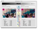
I used a free application from TGLC, PerfX Image Ink - screenshot attached.


Stephen Marsh
 

Attachments

  • tglc-perfx-image-ink.jpg
    tglc-perfx-image-ink.jpg
    174.3 KB · Views: 191
Some additional info about those images...
CMY ink reduction is 18.67%
Black ink increase is 9.34%

best, gordo

Strange how all threads about colormanagement nowadays ends up with everyone talking about ink-save products :) (sorry @threadstarter)

Thanks Gordo for adding additional data to my sample. The results vary alot depending of what in- and output profiles you set up and what artwork you process. But the #1 reason that we are using this kind of software is not to save ink-costs but to reach the quality and consistency in print that we are aiming for. Because of the use of more black we get faster start-ups and more stable grey balance and less smearing of course.

It would be interesting if someone who got an other ink-save sulution can do the same test with the same image! GMG, CGS, Alwan, etc?
 
The reason one getts into InkSave is because it the InkSave products are automating CMYK CMYK conversions. I do not find it strange. Had RGB workflows been adapted by the prepress comunity the InkSave products would have been to some extent redundant. What I find more surprising is that people are ready to accept InkSave work flows but not RGB workflow. It is a shame because the advantage of the RGB workflow is so much more than TIC/TAC control (and with a good separation profile even out of gamut colours can be handled somewhat inteligently)
 
I just gave the article a quick read. Does anyone else take issue to the place PSD recommendation? I'm a strong believe in only placing layered PSDs when you absolutely have to (i.e. you need the transparent background). I have all of my designers save flattened TIFs of their layered PSDs, and that is what they place in their final page layouts.

I was just a panelist at a file preparation seminar and I stressed to the audience why you shouldn't place layered PSD files just because you can. Perfect example, a recent jacket file I worked on had a layered PSD that was 760mb, compared to the 106mb flattened version. Why bother placing that beast into the file.

One of the top reasons I have for working in CMYK is being able to use the black channel to create masks. Often times I need to merge artwork with new backgrounds etc., and using a dupe of that black channel is always a great starting point for creating a realistic looking edge. (At least for the type of artwork I am working with).
 
Greg,

What happens if you need to make changes to one of the images that is flattened? Do you ask the customer for the PSD file? Do they supply it with the flattened file? If they provided both the layered and the flattened file, you are now looking at 866MB. Even if the designer doesn't give you the layered files, the designer is dealing with more and larger files than if they were to just use the layered file. It also takes the designer more time to save out a flattened file after each time they make changes to the layered file. You might say it isn't your problem, true in a way, time is money no matter who you are. The faster the designer can produce usable files, the cheaper their price, the more work they get and in turn you get. In this day and age we need to work as a team with the designer, there are bigger issues than layered files to deal with.

If you didn't have to create masks, would you still use CMYK?
 
For the sake of this argument, I am the customer. I work for a publisher, not a printer. True the designer uses more time when saving a flattened version, but they are saving more time when printing in-house materials etc. using a 100mb file versus a 700mb. Basically, we are never asking our printer to make changes, we handle all of the color correction and such, during the proofing stages. If, and this only happens rarely, one of my printers needs a layered file, I will supply it to them.

Also, how many times have you gone into a PSD file that had, say, 40 layers and only 26 were used, and none of them are clearly labeled. I know my printers don't want to run the risk of accidentally turning one of those layers on or off.

I would prefer to work in CMYK for everything. As mentioned in a previous post, I like to have more control over the conversions, and actually see each conversion, as opposed to an automated workflow. Granted I am just referring to jacket and cover imagery, along with short extent interior images. Most of our artwork is sent to the Far East for separations anyway, so we are getting CMYK to begin with.

Here's an example of a project in which I had to work in CMYK. The illustrator was supplying digital art (created in Painter, and fine-tuned in P'Shop), so what was supplied to me was an RGB Photshop.PSD. The art had large gray areas, color areas, and black outlines (some outlines were on top of color artwork, other outlines were on white). I was concerned about how to print this art so I did the following: Created a Layer Group for: 1) the gray elements 2) the color elements 3) the black line. Converted to CMYK (without flattening) and did the following: In order to keep the gray consistent I applied a monochrome Channel Mixer adjustment layer so that the grays would only output on the black plate. I filled the black line with 100K to avoid registration issues (the lines had separated to all 4 inks) and set it to Multiply so it would overprint the underlying colors. I don't know how I would have handled that if I stayed in RGB. Anyone have an RGB solution?
 
Last edited:
Gregg, When you have line art as images, yes there is an argument for going CMYK. As I would with technical illustrations in a Safe CMYK flow. This does also mean that you have to think carefully about ANY colour management. The RGB workflow as I see it is to seperate the photographic images that need colur managed from the safe CMYK. (In your case I would really think that Photoshop could do with more tools for TIC/TAC, since you are working photoshop in an area that has been quite static in development, with the exception of support for device link)
But the average business information officer who has been handed Indesign to produce a catalogue or to create information material, will benefit greatly by using an RGB workflow, since a CMYK workflow assumes an understanding of separations.
 
SWOP or GRACoL CMYK as a lowest common denominator doesn't cut it. If you choose that, then your web site and TV commercials look like crap. Staying in RGB has a lot of advantages when you take media other than print into account. I'm not saying you should slight print as a media and stay with RGB, I'm saying you can't slight any media type. At least with our clients, they want the best quality each media can provide, not choose the crappiest color space and make all the others match.

The very first web project my company got was because we knew how to take CMYK print files and " color correct " them so they looked good on the web. NTSC video had a terrible color space, and we also got a lot of work because we knew how to take CYMK images and get the most out of them for TV. Going the other direction, we processed NTSC video in a way so that when displayed on a computer monitor from QuickTime or WMV files, the color didn't look like dirty dishwater.

With a greater number of digital printers that have a CMYK gamut larger than SWOP or GRACoL, why handicap them with a constrained color space ?

There is another thing about the reference web page, it all assumes the use of Adobe software top to bottom. PDF ingest at the RIP stage allows content creators to use whatever software tools fit the job the best. For example, one project I worked on used command-line scripts on Linux to make customized PDF files on the fly from web site input. How do those " Top Ten Tips " fit into that workflow ?

One last note, Acrobat.com may be handy, but if you've signed a NDA that covers the content in your design / layout, you have some serious legal risk putting your files somewhere that isn't password protected. I consider that unprofessional.

Chasd.
 
SWOP or GRACoL CMYK as a lowest common denominator doesn't cut it...

A good argument, thank you, and great reason for RGB. Which brings us to an underlying consideration: which is more important, matching across media, or getting the most from each media used?

I'm a printer for life, so of course I'm looking at it from that perspective. For example, some of our work is fine art reproduction, most of which is produced using conventional offset tuned to G7, and undergoes considerable color correction to "get it just right." When that client wants to sell prints on a website, it is far more important that the potential buyer see an example of the product that is close to the actual product. If the actual product wasn't an art reproduction, say instead it was a plastic red toy fire truck, then accessing the wider gamut would be the obvious choice. In the end, the argument brings up important points that users should consider, which is a good thing.

As one coming from the world of printing, if I may speak for others, I think many of us still quiver when RGB images come in the door because of the terrible experiences we had, oh, say ten years ago. Things did not work so well back then, and RIPs in those days would produce some horrific results when fed RGB.

The color management modules in modern workflows and application software are far improved in this better future in which we have arrived. I am far less worried when ApogeeX sends up an RGB notification. With the proper profiles in the workflow, the result is comparable to Photoshop. It was not even close once upon a time.

And I do have some clients that specifically hand over RGB because they want me to do the CMYK conversion rather than their photographer or designer. Specialization has value, even in this future. But I still couldn't bring myself to issue a broad statement to all my clients, that I want them submitting RGB. Not yet.

What bothered me about the article is imagining how some users take advice and run with it. This thread would make a good article that -- I hope -- would encourage users to listen to advice, but also consider how it applies to their specific situation. It reminds of years ago, the old wive's tale, "Never use a TIFF in XPress, only an EPS, because it comes out low res." It's not that it came out low res, it was jagged on the edges because XPress was doing what the user asked: clipping it (badly) because the user "left" the picture box set to none (default), instead of setting it to white. For years that was misinterpreted as "low res." (although, low res could happen as well, when the PPD was a 300 dpi ouput device...)

At any rate, a determination of a right or wrong way to do it may still be up in the air. On one hand, getting CMYK is what printers are used to, and most would prefer. But I can see the RGB-proponent's side of the argument, and there is a twist that bolsters it. One issue we primarily litho prep folks face daily: many CMYK images have the SWOP Web profile assigned (default), and have been converted to CMYK using that profile. Barf, at least to those of us not prepping for web presses, rather higher quality offset. In these cases, an RGB image would be better, provided it has the proper profile set, considering we now have workflows with quality color management modules embedded, or in the case of manual conversion, in the hands of a skilled operator using a preferred destination profile in Photoshop.

In a short time, perhaps it will become true, that we no longer care so much whether images are RGB or CMYK, or fuss over it as much, as workflow and application software improves even more. I hope that is the case.
 
Last edited:
a lot to digest

a lot to digest

I am grateful I came in on the tail end of this discussion. You guys have all opened my eyes to many issues we took for granted.
 

PressWise

A 30-day Fix for Managed Chaos

As any print professional knows, printing can be managed chaos. Software that solves multiple problems and provides measurable and monetizable value has a direct impact on the bottom-line.

“We reduced order entry costs by about 40%.” Significant savings in a shop that turns about 500 jobs a month.


Learn how…….

   
Back
Top