Am I the only one that has customers viewing proofs and print without 5k lighting and saying we are always red? This seems to be getting worse as stocks have increased the amount of optical brighteners. I have always thought education is the answer, but it only goes so far. We are a G7 shop with Gracol as our standard. I am considering adjusting away from balanced gray. Am I wrong? Any ideas?
You are using an out of date browser. It may not display this or other websites correctly.
You should upgrade or use an alternative browser.
You should upgrade or use an alternative browser.
Customers without 5k lighting
- Thread starter RickS
- Start date
namelessentity
Well-known member
I don't really have an answer, but I have always questioned why we're supposed to color balance to a light that essentially only exists in a print shop or a gallery. Most everything I print is going to be seen under cheap office lighting or in someone's home.
gordo
Well-known member
I don't really have an answer, but I have always questioned why we're supposed to color balance to a light that essentially only exists in a print shop or a gallery. Most everything I print is going to be seen under cheap office lighting or in someone's home.
The purpose of standardized lighting (and environment) is to factor out the viewing conditions so that there is a reasonable expectation that everyone in the process is viewing the material the same way. The only variable then being the viewer's individual color perception.
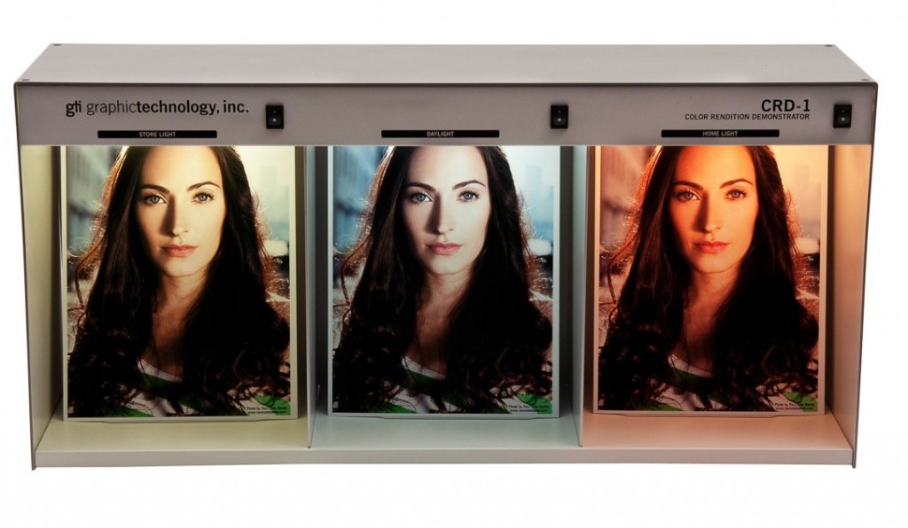
@ RickS - Grey balance of process inks is one requirement for setting up a press - but it is not a requirement for the final presswork - especially if the grey balance is measured in the color bar. The "red" your customers are seeing is likely caused by viewing under incandescent or warm fluorescent lights which will bias Magenta and cause colors which have a Magenta component to shift redder. The affect of optical brightners will vary depending on the UV component of the lighting, the ink coverage, and the difference of OB content in the proofing material vs the press sheet. In a well managed shop there is often a color booth which includes the basic different types of lights (5000K, office fluorescent, incandescent) so that the presswork can be viewed under the different lighting conditions in a controlled manner, and provide a basis for any needed customer discussions.
gordo, We have sales people that will want to view press sheets in all lighting conditions (5k, office, outdoors) before OK'ing a internal press check. Usually they will adjust magenta down from standard densities and gray balance to account for office lighting and not match the proof. This is increasing press OK's and causing scheduling challenges. I am wounding if pulling magenta down in our proof and also adjust press curves accordingly could be a viable solution. If this works, we may have to give up our G7 certification.
arossetti
Well-known member
I don't really have an answer, but I have always questioned why we're supposed to color balance to a light that essentially only exists in a print shop or a gallery. Most everything I print is going to be seen under cheap office lighting or in someone's home.
It isn't just color temperature but also the spectral response of each light source which varies greatly from bulb sku to bulb sku.
Tell your client to approve the proofs outside.
gordo
Well-known member
gordo, We have sales people that will want to view press sheets in all lighting conditions (5k, office, outdoors) before OK'ing a internal press check. Usually they will adjust magenta down from standard densities and gray balance to account for office lighting and not match the proof. This is increasing press OK's and causing scheduling challenges. I am wounding if pulling magenta down in our proof and also adjust press curves accordingly could be a viable solution. If this works, we may have to give up our G7 certification.
Well you're in a pickle.
Assuming that your proof and presswork align under 5K lighting you could bias your proof and presswork by upping the Y and C which effectively lowers the M (I generally prefer increasing ink density rather than lowering it). I can't see an issue with that - unless the presswork is intended to align with some other shop's work that isn't biasing their process equally. It's still a crapshoot though because there's so much lighting variability in the field.
You could also make use of a gizmo like this:

Some shops, if they don't have the multi-light viewing booth will have a room away from the press where sales or customers could evaluate proof/color. It would have a 5K viewing booth as well as typical office lighting so that evaluation can be made between those two.
If the target lighting is known - e.g. house brand packaging labels then the shop doing that work will often include the same lighting in their viewing area that's in the target environment.
Most proofing papers are intended to be a metameric match to the presswork under 5K - although that's also a bit of a crapshoot.
Personally, if this is an issue with all your presswork then I'd bias the press/proof.
If it's an issue with only one or two clients then I'd develop a proofer profile and print condition to satisfy their needs and use your standard for the rest of your work
In either case, I'd do some kind of education for sales/clients in order to set expectations correctly.
Cornishpastythighs
Well-known member
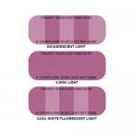
We started using these cheap strips attached to our colour standards that we sent the customer. We had to educate them first of course. We did not have to educate all the customers just the ones we felt would be the most difficult to satisfy. They now can make the decision to install 5K lights if they wish.
Attachments
From an ink makers standpoint, we match single color spot in any light we want to. Unless the print customer sends in copy, a color swatch, all commitments are back burnered. Even if a customer sends a chip, they still have to specify what light source for an expected exacting match. METAMERISM is the phenomenon or reality if you understand it that exists, so sometimes you have to deal with it. Not too often from my standpoint. But for G7 and process build printing, the ball game changes somewhat entirely, because of the added factors of color build and curves. One last thing, is my ink transfer doctor still alive, Erik? Have not ran across his wisdom or contributions lately. Thanks
D
D
Hello
I usually to see the color proof under the sun at 12 pm
it's the best standartd light
Agree?
That depends on whether you're on the equator, one of the Poles or somewhere in between.
Of course , too the weather is cloudy
Good for grey balance
arossetti
Well-known member
That depends on whether you're on the equator, one of the Poles or somewhere in between.
Obviously your client should fly to Rochester for optimal viewing conditions.
Macmann
Well-known member
We had a client who would only view the proofs in the parking lot with his car trunk lid open. He liked the way the trunk light illuminated the proof-even though it was a sunny afternoon. He requested a - 1% yellow move. Swear to God. If all goods and services were held to the scrutiny we give print, commerce would stop as we know it.
arossetti
Well-known member
We had a client who would only view the proofs in the parking lot with his car trunk lid open. He liked the way the trunk light illuminated the proof-even though it was a sunny afternoon. He requested a - 1% yellow move. Swear to God. If all goods and services were held to the scrutiny we give print, commerce would stop as we know it.
I hope the interior of his trunk was a neutral gray.
gordo
Well-known member
Serious question, why did we decide on D50/D65 as the industry standard instead of F4 or some form of warm fluorescent lighting model?
Because those color temperatures simulate daylight the closest in the northern latitudes.
Similar threads
- Replies
- 0
- Views
- 1199
- Replies
- 1
- Views
- 2996
PressWise
|
A 30-day Fix for Managed Chaos
As any print professional knows, printing can be managed chaos. Software that solves multiple problems and provides measurable and monetizable value has a direct impact on the bottom-line. “We reduced order entry costs by about 40%.” Significant savings in a shop that turns about 500 jobs a month. Learn how……. |


