• Best Wishes to all for a Wonderful, Joyous & Beautiful Holiday Season, and a Joyful New Year!

EFI/Versant 2100 Screening...

kdw75

Well-known member
I have tried the 200 dot screen, which looks good, but isn't perfectly smooth on large solids, and I have used the 150 dot, which has a nice dot pattern, which hides the toner inconsistencies, but is a little coarser than I would like. I would love to use the 175, but it seems to have an odd pattern, something similar to a Moire, show up in screens. Has anyone else noticed this?
 
I have a moire problem that is in the supplied photoshop file (please see attached). it was pulled off press yesterday at one of our sister company's and now put on my plate to fix. What's the go to fix? Not sure if I am able to do FM screening (old system).

1) Do FM screening to one of the colors 2) Do 200 line screen to one of the colors 3) Add noise in photoshop 4) Fake an illness and go home.

View attachment Moire.pdf
 
Well . . . thats a tough one cuz your dealing with screens/netting in the photograph . . . FM to them all might help but any am screening technology is going to have problems . .. . so the easy answer is 4 (stomach flu?)

Gordo . . any ideas?
 
Should have mentioned the photoshop files are re-screened (scanned from a printed page). The boss wants me to add noise in photoshop. The other option is to send it out for FM screening and hope we get a better result. Can't be worse than it is now. We have an Indigo so i'm going to try that first.
 
if they were scanned from a printed piece and you have that printed piece some scanner have moire removal option (works sometimes) or you can angle it on the scanner bed and try again . . . or you can mask the areas that are moireing and do a gaussian blur on them to fix the moire i just did a quick check on that and 1-3 pixels seemed to work well . . .
 
Would making one of the offending colors at 200 line screen be worth a shot? Attached is what got pulled off press yesterday.
 

Attachments

  • IMG_0528.JPG
    IMG_0528.JPG
    66.8 KB · Views: 358
Just looked at what you posted for whats coming off of your press . . . thats some bad moire it might help to play with different line screens, but from what I see from your original pdf and that image . . . you have some color issues also . . . . . without being on site can't help you more than that . . .you might call xerox service and see if they can help
 
Using FM won't help since there's moiré in the original (which might get added to).
Try this technique to remove the moiré from the original scan (rescan at higher than needed dpi e.g. 600 dpi): http://graphicssoft.about.com/cs/photoshop/ht/apsremovemoire.htm
If that doesn't help then speak with your client, explain that the moiré is in the original so all you're doing is reproducing it. Talk to your client about rebuilding the netting in the image. Given the simplicity of the areas of netting in the image this would be a fairly straightforward PShop job. Don't try to recreate the net itself - just the grey tones of the net. The halftone screening at 150 lpi would not resolve the netting anyway.
 
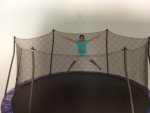
We ran the file through a GCR profile. The netting in the trampoline is where the moire was so sucking out the C-M-Y got it done.
 
They is someone of an unrelated question, but since you are using a Xerox Versant 2100 as I am, the Fiery rip being used is the EX-P 2100. It offers 10 bit rather than 8 bit resolution where you can see the difference on gradations. But here's the kicker, colors tend to come out darker. The tech explained that was because it is 10 bit. It doesn't make sense that when the color is calibrated it is actually not calibrated. That's my take on it. Have any input on this?
 
They is someone of an unrelated question, but since you are using a Xerox Versant 2100 as I am, the Fiery rip being used is the EX-P 2100. It offers 10 bit rather than 8 bit resolution where you can see the difference on gradations. But here's the kicker, colors tend to come out darker. The tech explained that was because it is 10 bit. It doesn't make sense that when the color is calibrated it is actually not calibrated. That's my take on it. Have any input on this?

I don't think that has anything to do with 10bit rendering, but you can back the density down by editing the targets in the calibration or editing the 100% down of each color in the profile. I prefer to edit it down in the profiles because it gives me more option when having different profiles for different jobs or printing conditions.
 

PressWise

A 30-day Fix for Managed Chaos

As any print professional knows, printing can be managed chaos. Software that solves multiple problems and provides measurable and monetizable value has a direct impact on the bottom-line.

“We reduced order entry costs by about 40%.” Significant savings in a shop that turns about 500 jobs a month.


Learn how…….

   
Back
Top