InDesign and Illustrator Spot Color Conversions Don't Match

Jon Wood

Member
It feels like I'm missing something obvious but I can't seem to find the "easy button". Here's the deal...

When converting spot colors to CMYK, InDesign and Illustrator are coming up with different CMYK recipes. This was first brought to my attention by an operator working in CC 2014 but looking into the issue, I discovered the same behavior in all versions later than CS5.5.

Both applications are using the default Pantone+ Solid Coated swatch library.
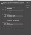
Both applications have the same color settings (Emulate Adobe InDesign 2.0 CMS Off).

EXAMPLE:

In Illustrator, the swatch for PANTONE Red 032 C has a default color mode of "Book Color" with a LAB value of 55/72/43. Changing the color mode to CMYK gives a CMYK recipe of 4.51/92.03/65.43/0.53.

In InDesign, the swatch for PANTONE Red 032 C has a default color mode of "PANTONE+ Solid Coated" with no values shown. Changing the mode to CMYK gives a CMYK recipe of 0/86.14/75/0. If I change the color mode to "Lab", the values pretty much match the Lab values in Illustrator (55.294/72/43) but the CMYK recipe is significantly different.

I hope I'm not rehashing something that's already been discussed–I've found quite a few conversations about the Pantone+ library but nothing about this specifically.

Thanks.
 
I saw you said the settings were the same but have you verified that you are working under the same color work spaces (GRACoL), etc.?
 
In the Edit > Color Settings... pulldown menu, both Illustrator and InDesign are set to "Emulate Adobe InDesign 2.0 CMS Off" as shown in the attached screen shot.
 

Attachments

  • Screen Shot 2015-01-14 at 11.39.01 AM.jpg
    Screen Shot 2015-01-14 at 11.39.01 AM.jpg
    11 KB · Views: 347
What that screenshot shows is "Emulate Adobe® Illustrator 6.0". Why are you using this setting? It probably has everything to do with your problem. See the attached for the "most sensible" default settings for someone designing with Printing intention in the US. These settings were provided by IDEAlliance a few years ago.
 

Attachments

  • SS-IllustratorCC2014.jpg
    SS-IllustratorCC2014.jpg
    14.9 KB · Views: 370
  • SS-InDesignCC2014.jpg
    SS-InDesignCC2014.jpg
    9.6 KB · Views: 384
Sorry. It helps when I actually read what I write. This is what I should have said.

In the Edit > Color Settings... pulldown menu:

InDesign is set to "Emulate Adobe InDesign 2.0 CMS Off".
Illustrator is set to "Emulate Adobe Illustrator 6.0".

In case it isn't already obvious, I know very little about color management. Is there somewhere else I should be looking for the "color work spaces"?

I've tried a couple other presets in the Color Settings window, such as North American General Purpose 2 and still got different results between Illustrator and InDesign, although not as different as with color management turned off.
 
Check your private messages. I provided a link to download the color configuration files for Creative Suite including instructions.
 
If you choose your Color Settings in Bridge that will ensure ALL your the settings are synchronised in ALL Adobe applications. You will know if this is in effect if the 'pie' chart in the top-left corner of the Color Settings dialogue is complete (synchronised) or has top-left quadrant slightly removed (unsynchronised). Chevalier's is synchronised.
 
When converting spot colors to CMYK, InDesign and Illustrator are coming up with different CMYK recipes.

That is correct - and completely out of our control.

The spot color swatches come from the manufacturer (Pantone, in this case) with either CMYK _OR_ Lab alternate values for use on devices w/o the actual ink (eg screens). Pantone strongly recommends that vendors (such as Adobe) uses the Lab values - which is what InDesign does. And if you are asking for CMYK, then ID is doing a Lab->CMYK conversion using whatever your color settings are.

Illustrator, however, doesn't do Lab - so we stick with CMYK. In that case, the CMYK values are coming directly from Pantone.

So if you have a problem with this - contact Pantone or even better - don't use Pantone colors if you don't really mean them!
 
It feels like I'm missing something obvious but I can't seem to find the "easy button". Here's the deal...

Who said anything about colour being easy?

As CMYK is device dependent, there is no magic “one size fits all” set of CMYK values that produce a “correct” CMYK version of a spot colour. Back when the colour library files used fixed CMYK values in the source, the CMYK conversion used these values. The colour recipe was consistent, just consistently wrong.

Adobe has moved to Lab based Pantone spot colour descriptions in later version of their software. A conversion is made from the Lab source to the document or working space CMYK profile if a conversion is made. Now the CMYK values may not be consistent, however they now produce the correct colour (as long as the spot colour is in gamut and the right profile is used to describe the final print condition).


Let’s explore four possible workflow options:

1) If your primary concern is output of spot colours as true spot colours, then use a colour library that is based off device independent Lab values, such as “PANTONE+ Solid Coated”. In this workflow, you will be handing off files with spot colours in them. This will at least provide a reasonably accurate preview in a PDF proof of the solid spot colour (but not automatically so for tints or overprints). What happens in hardcopy proofing is a topic for another discussion.

2) If your primary concern is output of spot colours as device dependent CMYK values which need to be as close as possible to the original spots (within the limits of the target process), then again – use a Lab based colour recipe and use an accurate profile of the intended printing condition to convert from the device independent Lab values to the device dependent CMYK values for the print process at hand. This does indeed introduce variables and complexity to users that don’t understand device dependent output – everybody in the authoring chain has to use the same profile and colour settings to get the same results. The key is that the results will be targeted for the desired print condition and should provide more accurate results. In this workflow, you will be handing off files that are only in CMYK with no spots.

3) A variation on the previous point, if your primary concern is output of spot colours as device dependent CMYK values which need to be as close as possible to the original spots (within the limits of the target process), then create your own “hard wired” target CMYK values in a custom .ASE swatch exchange library file, optimising the CMYK values beyond and above a simple automated ICC transform produced inside an authoring application such as Illustrator, InDesign or Photoshop. For example, rather than having a CMYK build that uses all four channels, you may prefer to create a version that ideally only uses the minimum amount of channels to get the job done, such as only two or three channels. For some other colours, one may prefer to use a higher GCR ratio or to perhaps only build the recipe out of black only. In this workflow, you will be handing off files that are only in CMYK with no spots.

4) If your primary concern is output of CMYK values and you don’t understand device dependent target conditions and you mistakenly believe that there is a “magic one size fits all universal CMYK recipe” and you don’t really care about the final colour being more accurate for a given target condition and simply wish for “synchronised” colour values in your authoring applications for creative consistency – then use a hard wired CMYK library such as “PANTONE+ Color Bridge Coated”. This *will* provide consistent hard wired values, similar to the old Pantone library files that used to used to use a one size fits all CMYK recipe definition that did not match any common target condition, such as used in say CS5 or prior applications. In this workflow, you will be handing off files that are only in CMYK with no spots.


Stephen Marsh
 
OOPS! That should have been top-right quadrant slightly removed.

It's also worth noting that, once you download the settings file from the link Chavlier has sent you, you have to load them into a folder where the applications can 'see' them. The IDEAlliance instructions provide one way of doing this: by locating the appropriate folder of the user but you can also do it from within any of the Adobe applications (except Bridge). It will take you straight to that folder.

One more thing... The IDEAlliance settings (like many others) use the Adobe RGB (1998) colour space for RGB images WITHOUT profiles. In other words, if you get an RGB image without a profile it will assume the intended appearance was based on Adobe RGB. This is a relatively wide gamut compared to most commercial printing processes (e.g. offset lithography, especially newsprint). If you convert to CMYK the result is often oversaturated colours and reddish skin tones due to the significant gamut clipping that occurs with the colorimetric rendering intents. You will get a more uniform conversion (and more acceptable appearance) using the Perceptual RI recommended by IDEAlliance but this will mean there is less colorimetric consistency between the two modes: RGB and CMYK. In other words, they won't necessarily look the same.

In my experience many publishers/printers have moved away from Adobe RGB where they want to use an RGB based workflow in order to achieve more consistency between RGB and CMYK output, especially when a lot of the content is intended for multiple platforms including electronic publications. The IDEAlliance Read Me file provides instructions on how to edit and save new Color Settings IF you do not want to use Adobe RGB.
 
I always leave Pantone's as spots, and let my RIP ( it has it's own Pantone lookup tables) convert to CMYK if needed. That way no matter where the file was generated from, it converts to process using the same values.
 
If you choose your Color Settings in Bridge that will ensure ALL your the settings are synchronised in ALL Adobe applications. You will know if this is in effect if the 'pie' chart in the top-left corner of the Color Settings dialogue is complete (synchronised) or has top-left quadrant slightly removed (unsynchronised). Chevalier's is synchronised.

The instructions and settings that I provided follow this procedure.

That is correct - and completely out of our control.

Illustrator, however, doesn't do Lab - so we stick with CMYK. In that case, the CMYK values are coming directly from Pantone.

LAB values for Pantone has been in Illustrator for multiple versions. You have the option to enable CMYK or LAB in the swatches palette settings. I always convert from LAB to CMYK manually as the CMYK values provided are not colorspace intelligent.

OOPS! That should have been top-right quadrant slightly removed.

It's also worth noting that, once you download the settings file from the link Chavlier has sent you, you have to load them into a folder where the applications can 'see' them. The IDEAlliance instructions provide one way of doing this: by locating the appropriate folder of the user but you can also do it from within any of the Adobe applications (except Bridge). It will take you straight to that folder.

One more thing... The IDEAlliance settings (like many others) use the Adobe RGB (1998) colour space for RGB images WITHOUT profiles. In other words, if you get an RGB image without a profile it will assume the intended appearance was based on Adobe RGB. This is a relatively wide gamut compared to most commercial printing processes (e.g. offset lithography, especially newsprint). If you convert to CMYK the result is often oversaturated colours and reddish skin tones due to the significant gamut clipping that occurs with the colorimetric rendering intents. You will get a more uniform conversion (and more acceptable appearance) using the Perceptual RI recommended by IDEAlliance but this will mean there is less colorimetric consistency between the two modes: RGB and CMYK. In other words, they won't necessarily look the same.

In my experience many publishers/printers have moved away from Adobe RGB where they want to use an RGB based workflow in order to achieve more consistency between RGB and CMYK output, especially when a lot of the content is intended for multiple platforms including electronic publications. The IDEAlliance Read Me file provides instructions on how to edit and save new Color Settings IF you do not want to use Adobe RGB.

Well said and well taken.
 
Thanks for all the responses. I apologize for not being as detailed as I should have been–I'm horribly inept at written communication (I'm only marginally functional when speaking). I didn't mean to spark a conversation about color management, or the best way to convert spot colors to process, I'm just trying to figure out why InDesign and Illustrator are giving me two different CMYK recipes for the same spot color, regardless of the color settings.

Update: I'm only seeing this behavior on some of our workstations even though they appear to have all the same settings.

Clarification: The reason I had the color settings in InDesign set to "Emulate Adobe InDesign 2.0 CMS Off", and in Illustrator set to "Emulate Adobe Illustrator 6.0", was an attempt to remove the applications' color management from the equation. I've tried a variety of color settings (matching between the applications of course) and still get different numbers.

I'm still looking into it but I'm having to do it "in my spare time". We used to have a local staff that would take care of this kind of stuff quickly and quietly but now it's all handled by our global Help Desk. If I eventually succumb, it'll be a lost cause. I'll post up when (if) I figure it out.
 
In quick tests here, I get the same conversion from InDy CC and Illy CC.

If I change the profile assigned to the Illustrator document before converting the spot color to CMYK then I get a different set of CMYK values. That would mean that Illustrator is not using pre-baked CMYK values. I can get InDesign to mirror the behavior, but it's a bit tricky. It looks like InDesign caches the conversion values. Assign a different profile and you, more or less, have to add the spot color again before converting.

If I save the Illustrator file as a PDF, I have Lab as the alternate color space for the spot color.

In the end, I think your color management settings are hurting you.
 
Last edited:
Thanks Rich. Unfortunately, I'm afraid that I misdirected and confused the conversation straight out of the gate (our shop uses a GRACol standard by the way). The issue is that it doesn't matter what color settings are specified in the applications; some of our workstations WILL do the same conversion between InDesign and Illustrator and some will not. I can even log into my workstation as another user and get the same conversion from both but under my login, using the same color settings, the conversions don't match. I'm still poking at it but it's looking like InDesign is the one that's throwing different numbers for some reason. This isn't my area of expertise (big surprise there) so I was hoping that it might just be a checkbox that I missed. I just need to figure out what's different and why. Should be simple, right? ;]
 
So, the problem appears to be fixed, although I don't fully understand how or why. After a couple different go-'rounds on the phone with Adobe's customer support and a number of screen sharing sessions, they eventually had me reboot in safe mode and run Disc Utility to repair disc permissions. All tests since have produced consistent spot to CMYK conversion between the CS/CC applications (HOORAY!).

On a side note...
In my initial attempts to troubleshoot the issue, I had tried removing the applications' color settings from the equation by setting Illustrator to "Emulate Adobe Illustrator 6.0" and InDesign to "Emulate Adobe InDesign CS2 CMS Off". With these settings, I do still get different Pantone spot to CMYK conversions between the two applications, but only in versions CS6 and later, which use the Pantone+ libraries. Doesn't really matter, since we don't use those settings but it still seems inherently wrong. Oh well.

Thanks again to everyone who took the time and effort to respond (and for not trashing me for how poorly my initial posts were constructed).
 

PressWise

A 30-day Fix for Managed Chaos

As any print professional knows, printing can be managed chaos. Software that solves multiple problems and provides measurable and monetizable value has a direct impact on the bottom-line.

“We reduced order entry costs by about 40%.” Significant savings in a shop that turns about 500 jobs a month.


Learn how…….

   
Back
Top