Need help printing pantone spot colors in China

TMPDave

Member
Hello,
We sell accessory products worldwide that are manufacturered in China in order to compete in the US and worldwide market. Unforunately that means that all of our packaging is also printed in China. Our packaging is 2-colors (black plus our brand color which is a PANTONE spot color). I have set up my pantone spot color with the correct color in adobe illustrator. The printer confirmed back the same pantone spot color that is in my artwork as what they are using. They also claim they are purchasing a pre-mixed spot color from a licensed pantone ink manufactuer. Pantone's licensing dept also verified the ink manufacturer they are using is licensed in commercial off-set printing inks and are in good standing. Yet the color on the packaging samples does not match the pantone chip that I tore out of the Pantone Solid chips book, or the pantone color formula guide. I have a new book, and tore off a new chip. Yet the packaging samples still do not match. The hue is a different color. Now, I'm not a printer, I'm a graphic designer, but it looks to me that it is mixed wrong (has too much of one of the colors in the formula, not enough of the other). The printer insists they are not mixing the ink themselves, but are purchasing the inks from a manufacturer. Does anyone have any experience with this? What else can make the pantone spot color be wrong? Is there any other possibility besides a bad ink mix?
 
Last edited:
We are using a White gloss paper with a laminate. We are printing in China, so they are not specific as far as the exact paper brand or product name. It's Probably not something that is available in the US anyway.

But.....You actually did supply an answer. Paper stock may alter the color. Good point, I will keep that in mind, as the paper isn't a bright white but kind of a warm white. Can anything else change the color?
 
Your Asian printer is doing the same thing most printers world-wide do. And it's the right thing according to Pantone.

Paper color may affect the hue of the spot color as will laminating and the type of lighting under which you are evaluating the color, as well as the amount of optical brightening agents in the paper you are using vs the paper your PMS swatches were printed on.

best, gordo
 
Last edited:
you might need to do some Spectral comparisons between what you are asking for and what the ink supplier is providing.Have them give you an ink drawdown on the stock to be used and then you can compare it against your chip. Could be stock causing the difference could be ink, you'll never know till you get some hard spectral data.
 
Your Asian printer is doing the same thing most printers world-wide do. And it's the right thing according to Pantone.

Paper color may affect the hue of the spot color as will laminating and the type of lighting under which you are evaluating the color, as well as the amount of optical brightening agents in the paper you are using vs the paper your PMS swatches were printed on.

best, gordo

Thanks Gordo! Excellent advice!! The white paper that the pantone chip is printed on is definetly a different white than my packaging sample, so that is def part of the problem. First, How would I get my paper to match pantone's paper? Does Pantone make paper recommendations for printing their inks correctly? Also, the difference in paper color is not as great as the difference in ink color. So I have a suspician while the paper and laminate plays a role, their might be something else playing a role as well making the color different. What else could it be?
 
you might need to do some Spectral comparisons between what you are asking for and what the ink supplier is providing.Have them give you an ink drawdown on the stock to be used and then you can compare it against your chip. Could be stock causing the difference could be ink, you'll never know till you get some hard spectral data.

Sorry, I'm not a printer, so I'm a bit unfamiliar.... What is an ink drawdown? What is a spectral comparison?
 
Another possible variable is the difference between your swatch book and the actual stock. Make sure you're not using a coated pantone book and printing on an uncoated stock or vice versa (an uncoated pantone book and printing on coated stock).
 
just for clarification....we are printing on white gloss paper with lamination and are specifiying a coated pantone with our printer.
 
DRAW DOWN:
A draw down is a sample of an ink color, usually on the
STOCK that the client wants to use as their finished product. A
draw down can be used to create a special ink color that doesn't exist; it can be used to show what an ink will look like on a certain STOCK. It also can be used to show what an ink plus a clear COATING will look like on a certain STOCK or simply what the ink and clear COATING will look like when printed together.
 
Extending on what Cornishpastythighs wrote.

A draw-down is where the ink supplier takes a small amount of the mixed PMS ink and prints it using a table top hand cranked press called a "Little Joe" (see attached pic click to enlarge).
If a special effect is being applied e.g. lamination or varnish, then half of that sample draw down will have the effect applied. That way you can see the original color as well as what impact the special effect will have on the color.

That is probably what you are looking at and comparing to your swatch book.

A spectral comparison is where a special instrument is used to measure the spectral (light wave length) response of the pigments used in the ink. Since your supplier is using certified Pantone inks, doing a spectral comparison would be the last thing to see where the problem may lay. The other reasons given so far are more likely the problem.

Can you take a photo or scan of the ink sample you have placed beside the swatch that it's supposed to match?

I mentioned "optical brightening agents" as a possible cause. These OBAs are used to make paper appear brighter white than they normally would. These agents fluoresce under UV light. UV light exists in normal daylight and fluorescent (office) lights. If the paper used by Pantone and the paper you are using have different amounts of OBAs then that will affect how the ink color appears under different lighting conditions. You can do a check by buying a cheap black light and viewing your samples in a dark room using this light. If one paper glows but the other doesn't then this may exacerbate the ink color difference.


best, gordo
 

Attachments

  • Little Joe sm.jpg
    Little Joe sm.jpg
    86.2 KB · Views: 292
Last edited:
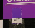
Thanks for all the explanations so far. I have added an image. Let me know what you think is the most likley culprint:

pantone 266 chip against packaging sample-small.jpg
 
Thanks for all the explanations so far. I have added an image. Let me know what you think is the most likley culprint:

View attachment 2673

Ouch! PMS 266 :p

PMS 266 is composed of two inks: Purple and Reflex Blue

Both those inks are highly reactive to lamination which you're doing (and varnish). i.e. these inks shift color over time - sometimes very quickly but sometimes over a period of months.

A full explanation can be found here:
The Print Guide: How to subdue the Reflex Blue Blues

Your Pnatone swatch book is not laminated so it does not show the effect.
Another wrench in the monkeyworks is that they may not have used Reflex Blue when they made up your PMS 266. They may have used a substitute which does not have quite the same hue or spectral properties. This substitution is common in the industry because Reflex Blue has very poor print properties. It's a major problem.

You're in a big pickle with 266. You're going to have to rethink the ink color you are using, and find an alternative color that will work.

BTW The photo you attached allowed me to calculate the relative difference between those two colors. This is expressed as a DeltaE number. "0" is a perfect match, 2-3 is typical tight quality color match, 3-5 is loose color match and more than 5 is unaccepable. Yours is a DeltaE of 11 - no where near a match.

best, gordo
 
Last edited:
Rethinking the color....that is pretty extreme. That being said, can you tell me which base colors are better than others in the bluish-purple family? How about Pantone Blue 072 or Violet? How can I calculate a DeltaE number??? If I can get mine in the 0-4 range I'm sure I will be more than happy!
 
Rethinking the color....that is pretty extreme. That being said, can you tell me which base colors are better than others in the bluish-purple family? How about Pantone Blue 072 or Violet? How can I calculate a DeltaE number??? If I can get mine in the 0-4 range I'm sure I will be more than happy!

Go to the link I gave you in my previous post, there are seven tips there for you.

You are going to have to work closely with your printer on this to find a workable compromise. Don't tell them how to solve the problem ( e.g. By suggesting a different formulation). Tell them what you are trying to achieve e.g. A color close to PMS 266 after lamination and let them figure out how to do it. They will need to do some experimenting with their ink vendor. There should be costs. Your biggest problem will be effective communications with your printer and your customer.
Again, there are some tips for that at the link I gave you.

Good luck, gordo
 
An alternative is not to give the printer a Pantone reference. Give them a physical sample to match or provide them with a LAB value you want the to match.
 
Hi - We are a printer in India and we always give a sample of the paper we plan to print on and ask the ink supplier to fine tune the ink for the specific paper. Depending on the paper shade/etc - the ink company varies the formulation so that the colors come out as close to the required swatch after printing. Since you want the colors to be spot on - you can ask the printer to then run this ink varnish and laminate to ensure it matches perfectly or needs further fine tuning.
Hope this helps.

That's wonderful but this is a case where the printed color changes over time. Can you predict what the color you print today will be like two months later?

Best gordo
 
Obviously not - this is only to negate the effect of paper on the ink. You will need to artificially age the sheet and then study the effect of aging on the printed sheet and make changes to the ink accordingly.
 
An alternative is not to give the printer a Pantone reference. Give them a physical sample to match or provide them with a LAB value you want the to match.

Dan is absolutely right. Specify the color not only by PMS number, but by L*a*b* values. Also, specify the tolerance you demand. Lamination, coating, and UV curing all impact color a great deal - especially in the red to blue (including purple) range. The ink may need to be completely reformulated to get the color you want. It takes a little work, but once the formulation has been achieved it's no more difficult to order than any other color.
 

PressWise

A 30-day Fix for Managed Chaos

As any print professional knows, printing can be managed chaos. Software that solves multiple problems and provides measurable and monetizable value has a direct impact on the bottom-line.

“We reduced order entry costs by about 40%.” Significant savings in a shop that turns about 500 jobs a month.


Learn how…….

   
Back
Top