Standard ink densities?

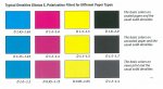
Wow, and our bosses wonder why we sometimes chase colour to match previously printed jobs or supplied samples! Everyone has there own set of "standard" densities. We also have our standards as well;
For coated stocks
C- 1.45
M- 1.35
Y- 0.90
K- 1.65

For uncoated
C- 1.25
M- 1.15
Y- 0.85
K- 1.45

Now having said this, we print with Hybrid inks were the cyan has more of a mag. hue to it, thus the lower values in magenta. We can run a stronger colour on uncoated stocks because no fear of set off.
Its good to see all of the different opinions though.:)
 
Gordo,

Clarifying, illuminating and bridging so many terms and relationships regarding ink densities and tone reproduction within the confines of just a single page post. Pretty darn concise, if you ask me!

I once worked with a guy who was able to explain in just a single sentence, what would require me several minutes to explain. That guy was great to work with.

Well done Gordo
Otherthoughts
 
Note that adjusting transfer curves will affect dot gain. Fo this reason many start by measuring the LAB values of 100% as a first step, to find the target density. Second "linearise" to acheive the desired TVI. Normally you will see that you will have the desired contrast then, but if not it is a matter of compromising the two. Changing the Density will mean redoing the TVI curve, as density will affect dot gain.

(and I agree that Gordo's post was clear :) )
 
Standard INK Densities

Standard INK Densities

The values you have mentioned are what we use for coated paper.
Does anyone have the values for uncoated paper??
We use
C-110
M-110
Y-95
K-130


Hi,

As per ISO 12647 - 3 for Uncoated (newsprint 40 - 52 g/m2)

C - 0.90
M - 0.90
Y - 0.90
Bk - 1.10
for all color deviation is + / - 0.10 (using a Black Backing)
for Measuring conditions pls have a look at below URL
* be aware its not free for non - members
Revision of ISO 12647-3
 
Hai larry,
Me too accept ur words with small suggestion.

" To be on the safe side, you may want to cross check whether the same density values can also be applied when you change any of your materials (ink, paper weight, etc.)."


Thing I wish to say is, you can check with different material like paper , fount, water, ipa etc but not with different Ink... Because density values vary with each brand ink (even process color too).
 
Typical Densities Chart

Typical Densities Chart

I just uploaded a Typical Densities Chart
 

Attachments

  • Typical Densities Chart.jpg
    Typical Densities Chart.jpg
    68.7 KB · Views: 1,316
  • Typical Densities Chart.pdf
    1,013.2 KB · Views: 397
I just uploaded a Typical Densities Chart

Note that the densities you posted are based on instruments set to Status "E" polarized
In N. America instruments are set to Status "T" unpolarized hence the values will be different (esp. the Yellow)
It's important to ensure that hand held and at-press automated instruments are set to the same Status. I've seen very many situations where hand helds are set to Status T while at-press instruments are set to Status E with resulting miscommunication and confusion. Or shops in N. America using instruments set to status T targeting Status E values (and vice versa) with much gnashing of teeth.

best, gordo

my print blog here: Quality In Print current topic: Naming image files
 
I've seen very many situations where hand helds are set to Status T while at-press instruments are set to Status E with resulting miscommunication and confusion. Or shops in N. America using instruments set to status T targeting Status E values (and vice versa) with much gnashing of teeth.

Or say, an Indigo whose internal densitometer is set to Status G
:p
 
Thanks for that info Gordo, you are the man! Now, can I easily obtain the same information for North America, Status "T" unploarized? I see a few different sets of numbers in this thread, but are these based on what people have 'found' to work in their environment, or industry standards?
 
Also, I am using an Eye1 Pro with UV Cut. I have not located this information about my device yet, but I am just starting to look now.
 
Now, can I easily obtain the same information for North America, Status "T" unploarized? I see a few different sets of numbers in this thread, but are these based on what people have 'found' to work in their environment, or industry standards?

The published N America solid ink density targets - for Grades 1 & 2 premium coated paper are:
Yellow 1.05 Dot gain (TVI) 18
Magenta 1.50 Dot gain (TVI) 20
Cyan 1.40 Dot gain (TVI) 20
Black 1.70 Dot gain (TVI) 22:
This is for 175 lpi - i.e. GRACoL 6/7- measured dry (not wet) values Status T - absolute, unpolarized.

You should be cautious with the numbers that people post as working for them since you do not know how their instruments are set up nor whether they've been calibrated or not.

GATF/PIA used to sell a high/low reference card to get around the issue of instrument variability. This was a card with C,M,Y,K patches printed at the high and low ranges of acceptable solid density. You were to read those values with your instrument and use whatever SID values it reported.

best, gordon

Gordo,

Not exactly sure about what they would mean when they say "acceptable". Would that be from plant to plant or within a run. I would think that if they mean within a run then seeing a variation is not so good.

I thought that a difference in density of 0.05 was not easy to see within a run. A difference in density of 0.05 is about an 8% difference in ink film thickness and that can lead to visible differences due to the difference in the dot gain as more ink squeezes our more than less ink. Have two screens that are printed with solids that vary in opposite directions and the resulting shift in colour is very noticeable.

What is actually required for consistent printing of screens is to be able to print the solids at much tighter tolerances that are not visably different.

For printing within a run, the notion of basing control on such a chart is just not capable.
 
Erik,

There are two issues.
First:
As you know, instruments do vary in the values they report. The Hi/Lo reference card was is/was a physical sample the SIDs at the maximum SID and Min SID. I.e. if the target was C the patches would range from a SID of 1.45 to 1.35 i.e. +/- 0.05 points from the 1.40 target SID.
The notion was that if, for example, your individual instrument reported that the SID values on the Hi/Lo card ranged from 1.30 to 1.20 then, with that instrument, when you measured a cyan SID of 1.25 on your press sheet's color bar then you knew that you were in actuality hitting the standard 1.40 SID target.

Second:
You might argue that +/- 0.05 SID as a tolerance is too wide. I don't know if that's true in practice because there are so many variables in human perception and so many variables in how image content shifts with SID variations.

best, gordon p


Gordon,

The idea of the card is good to relate a particular instrument's values with a more accurate reference. Lot's of practical value there.

I seem to remember at least one TAGA paper discuss the visual variation of combinations of screens when printed at the opposing limits of normal SID tolerances. If I can find the reference, I will post it. I have also seen it at press.

This problem is related to the idea of the capability of the process. My view is that the printing industry tends to do this backwards. They determine the tolerance limits more from how the process runs and not from the point of view on what the tolerances and standard deviation needs to be to obtain a visually consistent image.

When aiming for a visually consistent image, the tolerances need to be much tighter than the very wide +/-0.05 density points. The +/- 0.05 density points is about a total range of 16% variation in ink film thickness and that is not a tight target at all. A difference of 16% in ink film thickness has a great affect on dot gain. It is not about the visual appearance of the solids but what the lack of control on solids have on screens.
 
Dose any body know what is L 39 print standards
Hello, Fogra39L means ISO Coated v2 (ECI).
This is the Standard for Offset-Printing in Europe, Papertype 1+2.
The right ICC-Profiles for this are ISOcoated_v2_eci.icc for a maximum INK of 330%, and ISOcoated_v2_300_eci.icc for a max of 300%.
 
Last edited:
Hello, Fogra39L means ISO Coated v2 (ECI).
This is the Standard for Offset-Printing in Europe, Papertype 1+2.
The right ICC-Profiles for this are ISOcoated_v2_eci.icc for a maximum INK of 330%, and ISOcoated_v2_300_eci.icc for a max of 300%.

For clarification Fogra39 is a characterization data set based on ISO 12647-2, the printing standard, though Fogra39 has some intentional "deviations" from the standard for the blue and green overprints. ISO Coated v2 (ECI) is simply an ICC profile based on Fogra39 released by the ECI (and IMO, should be named ECI_Coated_v2, and drop the assumption that it is an "ISO" blessed profile).
sorry...pet peeve.
 
Hi Erik,

This problem is related to the idea of the capability of the process. My view is that the printing industry tends to do this backwards. They determine the tolerance limits more from how the process runs and not from the point of view on what the tolerances and standard deviation needs to be to obtain a visually consistent image.


When aiming for a visually consistent image, the tolerances need to be much tighter than the very wide +/-0.05 density points.

I think (and you'll likely agree) that current presses can have a hard time controlling the density tighter than +/- .05, and many would have difficulty with 0.05 actually. Not to take away from your point regarding visual based tolerances versus those based on devices capability. I'm not so sure that +/- 0.05 wasn't pulled out of the air without regard to visual based tolerances or device capability.

The +/- 0.05 density points is about a total range of 16% variation in ink film thickness and that is not a tight target at all. A difference of 16% in ink film thickness has a great affect on dot gain. It is not about the visual appearance of the solids but what the lack of control on solids have on screens.

I can’t relate the density value to a specific ink film variation as you have, but from measurement, a difference of +/- 0.05 on solids generally has a less significant effect on tints. For example, from actual measurements, a density shift of 0.06 resulted in a density difference of only 0.02 on the 50% midtone tint.

ex.
Cyan SID: 1.29, midtone density: 0.56, tvi: 19.0%
Cyan SID: 1.23, midtone density: 0.54, tvi: 18.3%

DeltaE76 between solids: 1.83
DeltaE76 between midtone tints: 0.94

This isn’t to say that SID differences can vary more than +/-0.05 without a visual impact, and in fact, I agree that having one channel at the high end and one at the low end can be detrimental. This might explain why ISO 12647-2 mandates a maximum mid-tone spread for TVI of 4 % or less between chromatic colors. Without this, the spread could be at the high or low end and cause more significant visual differences.
 
This isn’t to say that SID differences can vary more than +/-0.05 without a visual impact, and in fact, I agree that having one channel at the high end and one at the low end can be detrimental. This might explain why ISO 12647-2 mandates a maximum mid-tone spread for TVI of 4 % or less between chromatic colors. Without this, the spread could be at the high or low end and cause more significant visual differences.

This is very much related to my comments. If one has a specification that allows +/- 0.05 density pts for each channel, then two print samples that have #1 at Cyan +0.05 and Magenta - 0.05 and #2 at Cyan -0.05 and Magenta +0.05, the solids would be considered both in spec. but the printed screens of Cyan and Magenta with that range would have visual matching problems. It shifts the hue.

You would know better than I would how much a shift in dot gain will affect the hue of a CMY gray patch. I suspect that it is not a lot of dot gain change that will cause a problem.

In principle, I take a very simple view. If one can fundamentally reduce the amount of variation and it is practical and economical to do so, then it should be done. The big road block to action is probably that most people think this is impossible or very expensive, while I think it is very practical and can be done at relatively low cost.
 
This is very much related to my comments. If one has a specification that allows +/- 0.05 density pts for each channel, then two print samples that have #1 at Cyan +0.05 and Magenta - 0.05 and #2 at Cyan -0.05 and Magenta +0.05, the solids would be considered both in spec. but the printed screens of Cyan and Magenta with that range would have visual matching problems. It shifts the hue.

As I wrote before: Maybe, maybe not.
In this image I doubled the difference that meddington measured - the top is the original the bottom has + 2% Cyan and -2% Magenta:
RPerfume3.jpg


Are they different? Sure. Is it significant? I doubt it. No one is going to invest in fixing something that doesn't appear to be broken.
As I wrote before, I don't know if the +/- .05 SID tolerance is too wide or narrow in practice because there are so many variables in human perception and so many variables in how image content shifts with SID variations - with many dependencies (e.g. separation technique, screening, etc.). I suspect thyat the +/- .05 tolerance simply was the result of the opinions of a group of "greybeards"

I don't believe the subject has ever been properly researched (and I'm quite familiar with Brunner's work).

In any event, I look forward to the day when we finally start using the tools available to us and eliminate color bars and SID target patches altogether. While it had value in the old days, measuring a proxy target like a color bar when the actual live color target is right beside it seems quite foolish today given gthe technology we now have.

best, gordon p

my print blog here: Quality In Print current topic: naming image files
 

PressWise

A 30-day Fix for Managed Chaos

As any print professional knows, printing can be managed chaos. Software that solves multiple problems and provides measurable and monetizable value has a direct impact on the bottom-line.

“We reduced order entry costs by about 40%.” Significant savings in a shop that turns about 500 jobs a month.


Learn how…….

   
Back
Top