• Best Wishes to all for a Wonderful, Joyous & Beautiful Holiday Season, and a Joyful New Year!

How do I explain to a client that a CMYK value is not an actual color?

Here is a scan of another, 50-odd years old Ink Quiz, much like Gordos'.
In this quiz 3 inks were printed on 9 different paper stocks, die-cut in successively larger triangular holes, stacked and stapled together to form a small booklet.
Many times this helped me illustrate with minimal verbal explanations...

That is a beautiful thing!! I'm kind of jealous!

arossetti~
That is exactly what i'm saying. in regards to what started the discussion, he was asking how he can best designate a color to be stable across all platforms, print methods and paper types. and while yes, specifying a LaB value will give you a measurement target that will do just that, it may also put you in a spot where you are telling your customer to "Do this and everything will be ok" when in reality, it could cause more headaches than it solves. There's also the added complication on the printer's end where they now have to figure out what curves, adjustments and shifts are needed to achieve that LaB value for each project. Which while in theory should be all in the profiling, I know from experience that once in practice, it doesn't matter what curve you throw at it, you will need to alter the CMYK breakdown of an orange differently than a purple when switching stock types.

my example: I have a customer that wanted their brand colors to match across the board, after a few different swatch tests mixed in with different runs, we settled on the following different breakdowns, and you could put the coated/uncoated, CMYK/PMS, digital all side by side and get a match. We specifically helped them to pick a PMS shade of orange and purple that had the least amount of color shift from coated to uncoated printing.
This is what we used:
PMS 159 / Coated/Digital CMYK: C-0, M-60, Y-80, K-10 / Uncoated CMYK: C-0, M-50, Y-70, K-8
PMS 273 / Coated/Difital CMYK: C-100, M-96, Y-0, K-8 / Uncoated CMYK: C-85, M-85, Y-0, K-0

If you tried to apply the same adjustment curve to both colors (assuming only using the Coated CMYK seps) to achieve the match on uncoated, you would be able to match one of the colors, but not the other. Just for reference this is in the US, so printing to GracoL profiles, and calibrated and maintained G7 standards on all equipment and presses.

The bottom line comes down to this, if you are dealing with a customer that can't grasp or accept the idea of WHY you need different CMYK breakdowns for different methods and materials, they are more than likely not going to be able to understand why that LaB value isn't going to make it "look like it does on their screen".
 
I have moved to an all digital grand format environment so my workflow is much different. Every substrate is profiled on each printer so for me I'd rather let my RIP convert LAB to CMYK instead of CMYK-LAB-CMYK or even CMYK-LAB-CMYK-LAB-CMYK in the case of your client sends you a file not designed in GRACoL. But all this to say one workflow doesn't satisfy every environment.
 
No Title

Since even under standard lighting conditions, different people see color differently, trying to match a specific/problematic/out of gamut color on a specific combination of press/inks/substrate easily becomes a matter of personal taste.
The person making the final decision on which specific combination is a "good enough" match may have doubts, and reject a lot of samples.
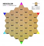
To overcome such situations we wrote a little postscript program that created color variations (in adjustable CMYK values) presenting subtly different color patches around a specific CMYK patch.
When a customer was presented with one sheet showing a set of variations to choose from, the final decision came much faster!
Here is a sample showing "Gold".
BTW, we named the program Hexcolor long before Hexadecimal values became important...
 

Attachments

  • photo6425.jpg
    photo6425.jpg
    822 KB · Views: 342
To overcome such situations we wrote a little postscript program that created color variations (in adjustable CMYK values) presenting subtly different color patches around a specific CMYK patch.
When a customer was presented with one sheet showing a set of variations to choose from, the final decision came much faster!
Here is a sample showing "Gold".
BTW, we named the program Hexcolor long before Hexadecimal values became important...

Really nice! Where can I get this program?
 
Magnus - or any member - if you are interested, please PM me and I shall send the program.
It's from 2001, creates EPS that we usually distill to PDF.
 
client
And while designing to LaB standards might help to standardize things to some level it has a BIG downfall. it's still not going to let you achieve a coated 021 orange in a 4-color breakdown on an uncoated sheet.

True enough, but it's not like there's an alternative that solves that problem.

Lots of people have weighed in here, but the answer to the client is simply that CMYK values are meaningless unless you know the particular CMYK to which you're referring.

The way I explain it in my teaching sessions is that saying "I'm working in CMYK" is something like saying, "I live at Jones Street." Well, Jones is a pretty long street. You're going to have to give me an address or I'm going to spend a long time looking for your house.

You need to know what CMYK, and then you have to navigate from there to the particular CMYK you're using. And at that point, I have a visual that's pretty effective at getting the point across.

But it is one of those things that once you get it seems pretty easy, but if someone doesn't get it, it can be hard for them to wrap their mind around and can be pretty glazed-look eye inducing pretty quickly.

(Edited to add:

Well, I wrote that and didn't notice there was a second page. Also went back and reread the original post, and I'd also add that basically, in talking to a client asking this question, I'd point out that if they're going to print their color on a bunch of different material, and they want it to exactly match on all their material, then for starters what they'd have to do is pick the material with the very smallest gamut, and limit themselves to colors that can be reproduced -- with CMYK inks -- on that material. Pantone 021 in the bridge book is a pretty good example.

Then I'd explain that when you're looking at printed ink, all you're really seeing is reflected light, and the glossier the material, the more light bounces straight to your eyes, etc.

Right now I'd agree, the best choice is L*a*b*. That's digitally what all Pantone colors are, a name and a L*a*b* value. The client doesn't have to limit to Pantone, but they can use the same process, and it achieves the best overall result.)


Mike Adams
Correct Color
 
Last edited:
Seeing is believing, designers are visual people trying to explain colour theory is like trying to explain a tesseract, the easiest way i found is in a meeting i grabbed a whiteboard marker and coloured in a piece on their newspaper and a sheet of 80 gsm paper from their photocopier, the visual difference explained instantly what i was trying to articulate verbally with limited success
 
Last edited:
If your client is local and if you have an old CMYK color key laying around, perhaps you could show them the color key?

pd
 
I'll put my customer hat on and throw more gas on the fire...

My CMYK values specify the colors I want on the produced piece when I slap my i1Pro2 on it. All your talk about LAB, CMYK, Pantone, substrates, refletive/refractive are fine, but those are your problems, I'm specifying final output.

Why don't you take all that fancy ICC color bar measuring G7 gray balancing technology and work it backwards so that it takes the output I want and color corrects back to what you have to do to the input file to get my output?


CMYK values are tonal values. They don't specify color.
 
I'll put my customer hat on and throw more gas on the fire...

My CMYK values specify the colors I want on the produced piece when I slap my i1Pro2 on it.

That is like giving someone directions without knowing where they are coming from. "Turn left at the light, pass the church, right at the next stop sign and it will be on your right." Can you tell me what will be on your right?
 
I'll put my customer hat on and throw more gas on the fire...

My CMYK values specify the colors I want on the produced piece when I slap my i1Pro2 on it. All your talk about LAB, CMYK, Pantone, substrates, refletive/refractive are fine, but those are your problems, I'm specifying final output.

And what I'd explain to you if you were a client and you said that to me -- very patiently -- is that you can't get a CMYK value from an i1Pro2. All it will give you is a L*a*b* value. To get to a CMYK number that L*a*b* value then has to be converted by someone, somehow, into some CMYK color space. And if that CMYK value is all you give me, unless you tell me what that CMYK color space is, then what you're doing is akin to telling a cab driver you live at 2100.

2100 what?

I know process bores you, and I know all you care about is result. But there is a process to get there, and if you want to get there, as a professional, you at least need to understand enough of that process to tell me where you want to go.


Mike Adams
Correct Color
 
Last edited:
So I have a customer who is interested in learning about LAB color. She is offsite and not in a position for me to do one on one training with but I'd like to point her to a website, video, training that could help explain it better to her. Anyone have a good resource that would go into basic color theory and cieLAB that can be digested in 30min or so?
 
So I have a customer who is interested in learning about LAB color. She is offsite and not in a position for me to do one on one training with but I'd like to point her to a website, video, training that could help explain it better to her. Anyone have a good resource that would go into basic color theory and cieLAB that can be digested in 30min or so?

A customer interested in learning? Unheard of! LOL

See if this fits the bill: http://the-print-guide.blogspot.ca/2010/04/tolerancing-color-in-presswork-cie-lab.html
 
So here's how I explain to customers...

"... so if you asked me where's the nearest Starbucks I could answer you 'about five'.." But that wouldn't really help you, would it? Five miles? Five minutes? Five what? You need a frame of reference, a map, to properly interpret that answer. Its the same thing with color. When you tell me your logo's rgb is 10,55,36, the only thing I can think of is in which color space is this? sRGB, like your phone or laptop? Adobe RGB like a better camera or monitor? ProPhoto RGB? Which one. Each may result in a slightly different color. ... " Then I show them the differences in gamut using ColorThink. Works like a charm every time.

Then pick a couple of stocks at random and ask them to order them by whiteness. Then ask them if its realistic to expect the same color on each if the machine doesn't know about the different white point on each stock.
 

PressWise

A 30-day Fix for Managed Chaos

As any print professional knows, printing can be managed chaos. Software that solves multiple problems and provides measurable and monetizable value has a direct impact on the bottom-line.

“We reduced order entry costs by about 40%.” Significant savings in a shop that turns about 500 jobs a month.


Learn how…….

   
Back
Top