Mark Flanders
Well-known member
Thank you.


Complete Color management in commercial printing is a holy grail, for now. (I know that's asking for trouble on this forum, but there is some truth to it from a practical standpoint.)
My practical advice? Get a one-off proof and and adjust your monitor to match it. Then adjust color and resend files if need be.
If you don't have the budget, send a deskjet proof that you like and ask them to do the best they can. Printers will bend over backwards to help you if you don't drive them crazy.
We do not honor embedded profiles on our Indigo 5000, its alot easier to have Colour Management at a device level instead of it being in your customers control. Which isn't always going to be right.
(Please forgive me if I slip too far into rant mode. All due respect all around.)
") I understand the practicalities as well, however as you've probably noticed, opinions among users and operators here and elsewhere very incredibly. Such is the fun of colour management... Also please don't interpret that I've a low opinion of a company because they are a new start-up (which, by the way, they are). I'm just proposing that it may explain some of the lack of confidence-inspiring answers I've received from this one particular shop.
I understand the practicalities as well, however as you've probably noticed, opinions among users and operators here and elsewhere very incredibly. Such is the fun of colour management... Also please don't interpret that I've a low opinion of a company because they are a new start-up (which, by the way, they are). I'm just proposing that it may explain some of the lack of confidence-inspiring answers I've received from this one particular shop.My practical advice? Get a one-off proof and and adjust your monitor to match it. Then adjust color and resend files if need be.
This is essentially printing profiling, and exactly what I'm asking the printer for. If only someone had already done this, and could simply provide me the colour profile, and all their other customers, to save us having to spend time money on it ourselves. Great idea! ")
The fellow didn't like the answers he got and suggested that they were clueless.
On ballparking color) You are probably right, and I admit it's crude, but the problem with getting a profile of the output device is that it doesn't do anything to calibrate the customers monitor.
May I ask why you want to print with a digital press? Is it a short run you're after?
) The reality is, as another poster mentioned, I'm dealing with very small volume (less than 10 probably), and thus low budget, which has me in the mass-market photobook producer arena. If I knew of other "more-capable" suppliers within this budget range in my area, I'd happily check them out, however I simply do not know where to find one. The color variation on a digital press is large, much more than offset litho - and that's a highly variable process, too.
If I knew of other "more-capable" suppliers within this budget range in my area, I'd happily check them out, however I simply do not know where to find one.
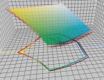
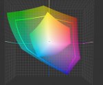
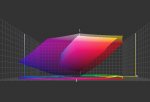
Many thanks for making the profiles comparisons for me. I know there's a huge loss going down to CMYK.
The comparison I'm looking for is comparing the US SWOP Web-Coated v2 they recommended with something like an Indigo 5000 profile (assuming it's reasonably decent), so I can compare how things might shift if I'm using SWOP v2, i.e., how far off might I be by using it.
At 180lpi, which is fine for the indigo you should be able to get 360dpi. Are you sure they don't mean 360dpi and not 240dpi?
- Color:
I often have a magenta cast on my first off Indigo proofs, and adjust accordingly. There are excellent custom color controls on the indigo if you have something to go by. However, if you're printing Black and White photos ... which are apparently not grayscale, but RGB, converted to CMYK, then you are actually printing quad-tones. (I'm showing my age here) Anytime you print a b/w photo in four color, even the smallest shift will create a color cast. (You know this from your neutral gray photography work, where there is a much more established and contained color control environment) Quad tones look great, in my opinion, but the effect is similar to a duotone, and good detail, but will have a rosette. If you want no color or rosette, then make the images grayscale.
Line Screen/DPI
This one makes me wonder if you might be right about the shops inexperience. 180 line? 240 DPI? That's a little odd.
My Indigo, which is older than the 5000, prints a 175 line screen, and has the option of 195 line and 230 line. I generally use 175. If your images have lots of busy detail, the 230 line screen might look fantastic. Be careful of images with large areas of light-medium and gradient tones...like an open sky sunsets. Electronic banding can occur and will show in the higher line screens.
So far as DPI, you are generally correct in the 2:1. Maybe they have some odd automation, but I would recommend sending files no less than 300 dpi, but not more than 600.
 I pointed that out and didn't get a response yet. Anyhow, they are going to re-run the proofs with higher dpi as soon as I provide them. I'm hoping that provides the noticeable reduction in "graininess" that I perceived in the 240-dpi set.
Also, if your text has screening, than you have 'rasterized" your text and the RIP is treating your text as grayscale/Color instead of line art. You really shouldn't set type in photoshop, but in a page layout program like InDesign or Quark, or conceivably in Illustrator. (MS Publisher if you must) Embed fonts, or convert to outlines, but don't rasterize them. (A font file is a mathematical description of the shapes of the letters, and is not dependent on resolution to look good. Rasterizing is essentially turning it into a picture file, which solves the missing font problem with a sledgehammer. Place your pictures, set you text, and export high quality PDF with fonts embedded...this is the basic approach. If you must set type in photoshop. see if you can save a TIFF with unrasterized layers.
It is my understanding that the default screening on the 5000 is approx 144 (sequin) and that the higher linescreens are not true lpi, but "simulations" or interpolations of the intended lpi (this has been indicated to me from HP techs).
Asbd altough the 2:1 ratio of dpi to lpi is good practice, 1.5:1 often is sufficient. In short, I don't think you'll see a significant improvement from 240dpi to 300dpi, particularly on the indigo. Also note that if the linescreen is changed on the indigo, there could be color differences from the same file at lower linescreens unless thr printer has compensated for this via curves or colormanagement.
Further on type crispness, anything other than solid, pure channel text can have edge artifacts from dot shape and screen angle. You could try the HP adaptive halftoning feature. This can add a "halo" of sorts around the edge of the text which can help minimize edge artifacts.
When you say "solid, pure channel", do you mean CMYK colour channel? I.e., pure black would be okay, but most any other shade/colour won't be because it's a mix of multiple colour dots instead of just the one? I think though that even for "black" this printer mentioned they use about a 70/30 mix with cyan.
Thanks,
KDJ