Muddy B&W Images

pacart

Well-known member
We have an issue with greyscale images always looking muddy when printed. They look fine on our monitors, but never look right when printed. We don't have any issues with color when we do 4-color.

We are running this on a 2 color offset press, sheetfed.

Any help would be appreciated.

Thanks
 
It is all about contrast.

Contrast created when converting colour/hue differences into grayscale luminosity/contrast differences in file conversion.

Then it is about the tonal range created when plating, including TVI/dot gain.

Then it is about the density and contrast that is being printed on press in combination with the substrate.

Do you have any sample images that went to press that are single gray colour, perhaps with the original in full colour?


Stephen Marsh
 
I guess I said it wrong - what I meant was that we don't have issues with our cmyk printing. Not that the same image is printed grayscale and cmyk.

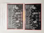
So that being said I've attached a photo. The top image is offset 2-color and the bottom image is digital. Both printed from the same file. And yes we do think the bottom one is too dark, but thats not an issue we have, or is it? Basically our pressman has to run the black way back in order to salvage the job. But when he runs cmyk jobs he can run all 4 colors within peramiters.

Also what i was trying to say is that when we print anything else in cmyk on the same press with the same brand of plates from the same image setter and the same prepress computer it looks fine.

So are there some kind of settings we can make in photoshop or Indesign or even in our RIP (Nexus) that will make the crappy greyscale images look better?

IMG_4464.JPG
 
I'd like to know more about this. I printed crappy grayscale images for years. "Out of the box" conversion of color to gray has never impressed me.
I simply open in PS, convert to gray, and make some (eyeball) adjustments. I love the history tool. Instant gratification.
 
That's the thing, I can make it look good all day long on my monitor, but the press never matches the grayscale images for some reason.
 
My personal weapon of choice in this situation is the levels window - it lets you set the highlight, shadow, and midtone dot . . . kinda like way back in the day when you would shoot halftones on the camera with a main, flash, and bump exposure so you could control the same dots . . . just my 2 cents . . . .:)
 
That's the thing, I can make it look good all day long on my monitor, but the press never matches the grayscale images for some reason.

First - 100% black on an offset press appears as about an 80% tone.

If your press operator cannot get to his maximum black solid ink density, and assuming that dot formation in the presswork is crisp/sharp then the likely problem is inappropriate dot gain compensation. That can happen in the original image creation, the RIP and plate imaging.

First check your color settings. Under "Working Spaces" the default should be "Gray: Dot Gain 20%"

If it's set at less than that then try setting it back to 20%.

If it's set at 20% then you have some options.
1- You can guess: set the value higher - maybe at 30%
2- You can build a proper dot gain compensation curve to be applied at the RIP for plate imaging.
(described here: The Print Guide: The principle of dot gain compensation plate curves )
 
I guess I said it wrong - what I meant was that we don't have issues with our cmyk printing. Not that the same image is printed grayscale and cmyk.

You did not say it wrong, I was seek further clarification by listing each major step in the process.

The first step is converting full colour to gray. This can be an art in itself and the first point where “mud” may be created.

Distinction between hue does not always equal distinction between gray levels. Take a look at the attached image. The upper is the RGB original, the bottom is an automated grayscale conversion. Tip: sometimes a terrible looking colour image creates a great grayscale, while a good looking colour image creates a poor grayscale.

After creating a good conversion to gray that takes hue differences into account and creates luminosity differences, the next step is setting tones in the gray image and so on. Where do you allocate contrast, where do you say I don’t care about detail – darken or lighten the tones etc.


So that being said I’ve attached a photo. The top image is offset 2-color and the bottom image is digital. Both printed from the same file. And yes we do think the bottom one is too dark, but thats not an issue we have, or is it? Basically our pressman has to run the black way back in order to salvage the job. But when he runs cmyk jobs he can run all 4 colors within peramiters.

Also what i was trying to say is that when we print anything else in cmyk on the same press with the same brand of plates from the same image setter and the same prepress computer it looks fine.

So are there some kind of settings we can make in photoshop or Indesign or even in our RIP (Nexus) that will make the crappy greyscale images look better?

View attachment 4498


Having a good K channel for shadows in important for both CMYK and mono/grayscale images on press.

Even though the bulk of the density is gained from the K plate, the CMY also add density which can be missing in black only tone work.


Stephen Marsh
 

Attachments

  • colour-to-gray.jpg
    colour-to-gray.jpg
    5.5 KB · Views: 146
As Gordo has suggested, I think dot gain is your main problem. Compensate for/predict this better and your pressman won’t have to knock the solids back to stop the tones being too dark.

To add to what Stephen has said about keeping contrast between hues, in Photoshop, I usually use a Curves adjustment layer, and more importantly, a Black & White one. This allows targeted adjustments to how particular hues are converted to greys. You can then pack the original colour image and the adjustment layers into a layer set, convert that to a smart object, then convert to greyscale without losing the colour and adjustment data.
 

PressWise

A 30-day Fix for Managed Chaos

As any print professional knows, printing can be managed chaos. Software that solves multiple problems and provides measurable and monetizable value has a direct impact on the bottom-line.

“We reduced order entry costs by about 40%.” Significant savings in a shop that turns about 500 jobs a month.


Learn how…….

   
Back
Top