• Best Wishes to all for a Wonderful, Joyous & Beautiful Holiday Season, and a Joyful New Year!

Pantone CMYK library

Dario

Well-known member
How are you supposed to print the Pantone CMYK library?
... using the 4 CMYK colours?
...or with a special ink?
What would be the point? Is it just a reference?
Lately I get a lot of jobs with these 'inks' in them, but I think the graphic designers don't know what they are doing, so even they can't tell us what they want us to do!
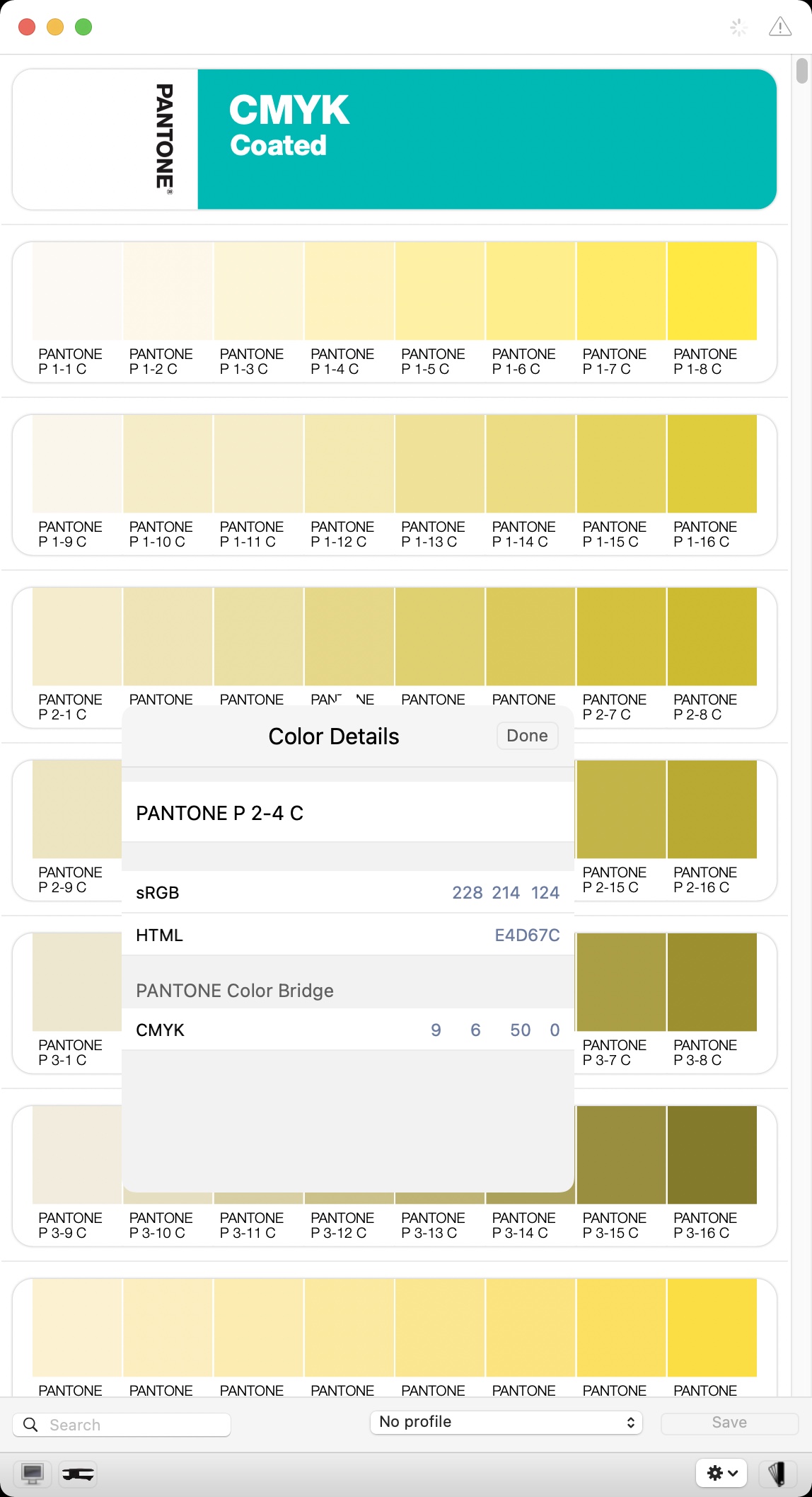
pantone cmyk lib.jpg
 
Last edited:
I would say you have to print with CMYK inks, but I guess you should have a job order or quotation with all the information, including the number of inks, right?

For sure you'll find more information about the PANTONE CMYK guides on the PANTONE’s website.
 
Aren't these just CMYK approximations of PANTONE colors? Assuming this way you can get close without paying extra to run 5, 6, or more colors on press. ¯\_(ツ)_/¯
 
Aren't these just CMYK approximations of PANTONE colors? Assuming this way you can get close without paying extra to run 5, 6, or more colors on press. ¯\_(ツ)_/¯

Pantone says: The new CMYK Guide also offers more of what designers have asked for in the past, namely additional in-between colors. These are colors between two existing Pantone Colors that help fill in the gaps and provide more unique offerings. These colors are all achievable with CMYK process printing so they are not as bright and saturated as the colors in the Pantone Formula Guide, but the number of choices is larger.

...some have a PMS equivalent, and some are unique to the CMYK guide...

source: https://www.pantone.com/articles/pr...dentification-and-better-printing-consistency
 
I would say you have to print with CMYK inks, but I guess you should have a job order or quotation with all the information, including the number of inks, right?

For sure you'll find more information about the PANTONE CMYK guides on the PANTONE’s website.
I think it's just Pantone's way of adding confusion to confusion 🤣🤣🤣
Thank you, señor!
 
These are meant to be printed in CMYK. When you add them to your swatch palette, in InDesign for example, they come in as Process colors (not spots).

In the screenshot you sent Pantone 1-7C is simply 81% yellow.
 
When you add them to your swatch palette, in InDesign for example, they come in as Process colors (not spots).
Thank you, that's a good clue-now these are hard things to test, since you have to pay.
 
With traditional printing (analog) you can print a "spot" color, also known as special, customer, corporate, logo, brand, Pantone, PMS, fountain, etc.
The cost is more because it needs its own ink, plate, unit, makeready, washup.
The advantage was more choice (metallics, fluorescents), accurate (closer match) and consistent color (within & between sheets). Spot colors are common in packaging, and recently they are trying to reduce washup cost by using a larger fixed pallet of CMYKOGV where O=Orange, G=Green, V=Violet. It has many names, such as Extended or Expanded Color Gamut (ECG). The old/obsolete Pantone Hexachrome system was an example.
With digital (dry laser toner), early print engines only had CMYK so any spot color had to be a "simulation" of a process build or callout. Due to the choice of toner pigments, the color gamut may have been smaller, so simulations may not have been as accurate. Digital liquid inkjet, having more colorants, has a very large color gamut, which is why it is used for contract color accurate prepress proofs (Epson, HP).
 
How are you supposed to print the Pantone CMYK library?
... using the 4 CMYK colours?
...or with a special ink?
What would be the point? Is it just a reference?
Lately I get a lot of jobs with these 'inks' in them, but I think the graphic designers don't know what they are doing, so even they can't tell us what they want us to do!

View attachment 292018
Pantone's CMYK system is a stand-alone system, which has nothing to do with the original Pantone Matching System. You print these colours in standard CMYK.
If you own these guides, you will see the halftones you are supposed to use for each colour. You should also be aware that these guides - and the CMYK variations of the Color Bridge guides are printed according to G7 standards - for Premium Coated and Premium Uncoated papers (Gracol) - and thus some CMYK values might not be an exact match to Fogra 51 and Fogra 52 respectively - although they should be close. You should be able to solve that by creating the Gracol CMYK colours in Photoshop and then simply converting them to the Fogra standard you need to print to - using the Absolute Colorimetric Intent.
 

PressWise

A 30-day Fix for Managed Chaos

As any print professional knows, printing can be managed chaos. Software that solves multiple problems and provides measurable and monetizable value has a direct impact on the bottom-line.

“We reduced order entry costs by about 40%.” Significant savings in a shop that turns about 500 jobs a month.


Learn how…….

   
Back
Top