[SNIP]my question though is in regards to linearization of plates. We have a plate linearization curve that we have applied to ensure that my 50 reads a 50 with the LithoCam. well, the good news is that it works. The 50 is indeed reading as such. My confusion is with what the 50 LOOKS like in a Euclidean pattern. What i have always read and learned and understood about the Euclidean pattern is that at the 50, you should have the perfect checkerboard pattern. What i am seeing does not agree with this. The pattern i see is definitely reading a 50, but it does not view as expected.
i contacted Kodak and Ihara and discussed this topic with them, and both seemed satisfied that my 50 is indeed a 50 and that the look shouldnt bother me, but it still does, because i am not understanding the reason why. we are using a1-Bit tiff workflow, outputting tiffs at 2540 from Prinergy, 175 LS, Euclidean dot shape to a Lotem Quantum 800 exposing at 2540.
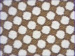
I took the screen capture and brought it into photoshop and verified that it is indeed measuring 50% coverage, and all of the other dot sizes are measuring properly on the plate. It is just that it isn't giving me that picture perfect checkerboard that is puzzling me.
I'm speculating here, but, despite what Kodak and Ihara says, I don't believe the image you posted is of a 50% dot. I think that it is more likely a 53%-55% dot.
Here's why.
Below is an image of a Euclidean AM dot direct from a Prinergy RIP:
It is a section from a gradient. You can clearly see that at a certain point a checkerboard is formed.
So how do you confirm that the checkerboard represents a 50% tone?
One way is to import the bitmap into PShop, convert it to greyscale and slowly apply the Gaussian blur filter until you cannot distinguish the halftone dots anymore. I've done that to the below image. The top half is blurred and the bottom half is the original bitmap:
If you then use the "Get Info" tool in PShop it will report that the checkerboard represents a 50% tone - which makes sense. However, a little to the left is a dot structure that looks very much like your microphoto. Measure that and PShop reports that it is actually about a 54% tone.
So I then took the image you provided and converted it to a bitmap and performed the same blurring. I also oriented the dots to the same screen angle:
Guess what? PShop reports that your original bitmap represents a 53% tone.
So, why the discrepancy? Well one reason might be in the way instruments calculate dot area from a microphotograph of a halftone on plate.
Most, if not all, use a thresholding algorithm to determine what is the non-printing plate and what is the printing dot. Put another way, the software decides that a pixel of X tone level and lighter is the plate while levels darker are ink carrying dots. Because the photo and/or dots have a slight softness to them, the result is a slight ambiguity as to where the transition occurs. Change the threshold and you change the size of the dot the instrument "sees" and hence the tone it represents. Below is your image on the left:
and beside it are the same dots but sliced by a different threshold value. As you can see, changing the threshold indeed changes the tone value reported by the instrument.
My suggestion to you is do a vignette of the black printer and see if you achieve a checkerboard at the 50% tone. If you have the appropriate software you might also look at the original bitmaps before they are imaged to plate. You could also create a synthetic 50% checkerboard in Illustrator or PShop, image that and measure with your instruments to see if they report a checkerboard as being a 50% tone.
BTW, since 175 lpi is not an even divisor of 2540 dpi you will never get a perfect checkerboard - but you will get very close with just a couple of extra or missing pixels.
BTW, how did you confirm the tone value using PShop?
Hope this helps. Best gordo