Spot colour problems

BigSi

Well-known member
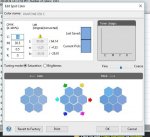
Hi there. I'm running "Fiery Command Workstation 5" my rip is an Ex-P 2100. For the life of me I cant get my Pantone spot colours to change when editing them threw command work station.
I'm doing all the obvious things. eg making sure the name is exactly the same in the file as in the list. For example PANTONE 659 C is exactly the same in the file as in the spot colour editor both are written as PANTONE 659 C.
I'm processing and holding the file. I have tried removing the Raster. It does not seem to make any difference if I create a new colour or edit an existing pantone colour. Maybe someone can flick me a link (I have tried youtube)
Your help is much appreciated. thanks Simon
 

Attachments

  • Spot col pro 2.JPG
    Spot col pro 2.JPG
    63.2 KB · Views: 493
  • Spot colour problem.JPG
    Spot colour problem.JPG
    168.1 KB · Views: 464
Are the calibration profiles selected the same, in the job parameters color tab on the job and are you editing the library for that calibration.
 
thanks, I'll have a look when I get in first thing. (this has been driving me crazy).
 
Do you have "spot color matching" turned on in advanced color settings for the job? Is it just one problematic file or any spot color from any file? I've seen a few PDFs where the colorant name had a space at the end.

I once had some strange caching problems that required me to delete the entry and recreate it to actually update the values. When I was diagnosing that, I changed the values back and forth from a contrasting color (like making Reflex Blue yellow) to the values I wanted to make certain they updated correctly.
 
No still not working. Maybe I'm doing something fundamental wrong!. Probably the case as it's not working for any pantone colours. Does any one know of anything put out by fiery? I have had it working in the past. thanks.
 
I have run into this issue and it could be a couple of things.

1. the colors in the file need to match one of the books you have - for example, Pantone 321 C from the plus series is not the same as Pantone 321 C from the V3 plus series. This matters.
2. If printing from indesign I have seen relief when sending as "composite leave unchanged"
 
So just want to go over a few things you may have already done:

!. In "Color Management" window the "Spot Color" box is ticked ("Spot color matching")
2. It doesn't matter if you have v.2 or v.3 library. What matters is the spot callout in the file is spelled EXACTLY like the respective Pantone in the library.
3. Check the job properties of the file in CWS to see what Output Profile it is using. Go back to Device Center>Resources>Spot colors and at the top most likely a drop down make sure the output profile matches the one being using in the job properties for the job.

These are all things that need to be established to effectively make this work as far as changing spot values. Also not sure if your sending through Acrobat or not but to eliminate human error (conversion happening that your not aware of) just drag and drop the file into the hold. This of course assuming #2 above has been addressed.

Good luck!

BTW I would be more than happy to check if the works on my end for you if you would like to attach it.
 
Last edited:
So just want to go over a few things you may have already done:

!. In "Color Management" window the "Spot Color" box is ticked ("Spot color matching")
2. It doesn't matter if you have v.2 or v.3 library. What matters is the spot callout in the file is spelled EXACTLY like the respective Pantone in the library.
3. Check the job properties of the file in CWS to see what Output Profile it is using. Go back to Device Center>Resources>Spot colors and at the top most likely a drop down make sure the output profile matches the one being using in the job properties for the job.

These are all things that need to be established to effectively make this work as far as changing spot values. Also not sure if your sending through Acrobat or not but to eliminate human error (conversion happening that your not aware of) just drag and drop the file into the hold. This of course assuming #2 above has been addressed.

Good luck!

BTW I would be more than happy to check if the works on my end for you if you would like to attach it.

It has been my experience that if you have multiple versions of any of the Pantone books in there, it absolutely does matter which version you are using and sending. Just my 2 cents.
 
So it may cause conflicts on some machines however I have never heard of it being an issue. However, again, that may not be the case for all machines. The thing is you can actually have multiple libraries v3 and 2nd edition coated for example and when it looks up the Pantone it actually will start with the library that is first in order from top down. In other words if v3 coated is on top of 2nd edition coated it will first search in the v3 library.

What is possible is giving this situation the operator can actually be trying to change the 2nd edition for whatever reason and yes that would not result in a change.

So I have notice that the difference being the recipes have been reworked from library to library so in that case yes it might matter in that case because the formula has changed (if at all).
 
Thanks Aaron

Will have a look at all this, I'm sure I'll get there in the end. ta Simon
 
Hey Simon,

I haven't used a Fiery in a while as we've moved to GX on both 2100 and Iridesse but from memory rather than making a generic across the board adjustment is makes it against the specific calibration and maybe stock that you select when running the adjustments.
If you set that to the same at the top of the spot colour adjustment screen (again from memory) and change the spot colour to something way off then set the same stock and calibration in the specific job will it work?

Hope you're enjoying the 2100 otherwise. Did you keep the V80 as backup?
 
Hi Josh.
Good to hear from you. Yes this all makes sense. I'll have another play around with the settings tomorrow. I'm sure I'll get there in the end. Yes the 2100 is a significant jump up from the V80. I feel I now have a proper production press.
The number one thing is being able to duplex 350gsm with confidence.
I wanted to keep the V80 (as a back up press) but could not afford to in the end. (It would have made a big difference to the lease payments on the 2100). Xerox have swapped the engine out of my old 700 to a 700i. Bugger all difference except that
it means they will keep it on contract for another year+. Just remind me again can you do metallic's on your Iridesse.? Short runs on my GTO do not always make sense when I factor in the plate cost.
ta Simon

That sounds like a worthwhile upgrade. I remember you were struggling to make a decision as on paper they seem quite similar.
I'm sure in another year the'll chuck a V80 in at no charge haha.

Yeah, we can do silver/gold under CMYK on the Iridesse. Creates some neat effects. In saying that, have you seen the silver/gold/black laminated sheets BJ Ball have started selling?
 
Hi Josh.

Yep print quality is the same between the two (V80 and 2100) Its just everything else that is miles better on the V2100.

Having said that I quite liked my V80 (heaps better than my 700)

Have you ever done any number crunching to see at what point it makes economic sense to buy a duplo/morgana
to finish b/cards/dl cards etc..? (rather than on a guillotine). Even with a good secondhand one at about 20k I don't think the numbers
would add up. Not with my volume, But your volume? My feeling is that it does not really make sense in little old NZ (volumes to small).
But I could be wrong :)

Yea I have seen those BJ ball sheets (all though I don't have an account with them any more).

ta Simon
 
As I recall, your edited color definition also has to reside in a group on the top level of the group list, since the color management does a look-up from top to bottom in the list of profile groups. So it uses the first definition that it comes across.
 

PressWise

A 30-day Fix for Managed Chaos

As any print professional knows, printing can be managed chaos. Software that solves multiple problems and provides measurable and monetizable value has a direct impact on the bottom-line.

“We reduced order entry costs by about 40%.” Significant savings in a shop that turns about 500 jobs a month.


Learn how…….

   
Back
Top