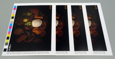
Total Area Coverage (TAC) Issue

Many ISO ,ICC profile like Fogra 39 , gave many TAC value 300%, 320%. As I know the most TAC will got more Color Gamut than the Less TAC, in the old day ,before Color Management Genration, I remember everyone do the color separation with 320-340% for Coated paper, this amount of Ink. Ink still can dry without the dry back problem. But now why they use less TAC in ISO Standard Profile? They will get less color Gamut, Why we don't want larger Color Gamut? Anyone have the answer? Why they go to 300% TAC? See now we are talking about the XCMYK which higher color Gamut.
 
Hi

If we are talking about 4 colors CMYK just in a theoretically sight your argument „higher TAC means higher gamut“ is not wrong. But it is not really true either, if you are talking about „color“...:

At once two things i remind you to think about:

It is possible to increase the gamut of „color“(!) with special inks, that you can print in a higher density as possible with standard pigmented inks, like Epples aniva for example because you get brighter and more saturated primaries with that ink.

Or you can choose a finer Resolution like FM to reduce light catching and „blacking“ (do you say so in english? The german word for what i mean is „Verschwärzlichung“) and winning brighter colours In that way. But think about this: The gamut increase by FM compared with AM only happens in secondary colours. The primaries printed in the same density results in the same Lab-Value. If you put a third color to a secondary mixture you start to loose „colour“, because you are beginning to black them...
Back to your argument/thougts:
Yes, with a 20% higher TAC you earn a measureable little bit blacker Black, but that is hardly to seen and not to call remarkable.
Or, just to say it clear: the TAC limit 300 (or above) in every usual profile is not a color anymore it is Black! So you will win maybe gamut, but not more „color“ with a higher TAC than 300.

The advantage to prevent a higher stock from „glueing“ or just to leave signs of the backside is much more important than the winning of a very little more darker Black, a „color“ which is not called a „color“ anymore, because it is just „black“ already.

That is why modern profiles are keeping the TAC below 300-320%.
(I think...)

Best

Ulrich
 
Last edited:
It is possible to increase the gamut of „color“(!) with special inks, that you can print in a higher density as possible with standard pigmented inks, like Epples aniva for example because you get brighter and more saturated primaries with that ink.

You can also increase gamut by increasing the solid ink density of standard offset inks.

Or you can choose a finer Resolution like FM to reduce light catching and „blacking“ (do you say so in english? The german word for what i mean is „Verschwärzlichung“) and winning brighter colours In that way. But think about this: The gamut increase by FM compared with AM only happens in secondary colours. The primaries printed in the same density results in the same Lab-Value. If you put a third color to a secondary mixture you start to loose „colour“, because you are beginning to black them...

Not quite right.
FM (and very high LPI/LPCM AM screening) effectively increases gamut in screened single color and screened two color builds. It does this by increasing the area of ink that will be filtered by light and thereby reducing the area of uninked paper. Light that is not filtered by ink has a greying (ergrauen) effect which reduces potential gamut. Put correctly: AM screens reduce the potential gamut by increasing the area of uninked paper compared to FM (and very high LPI/LPCM) screening.

Basically, standard AM screening does this:

AM moves.jpg


Not this:

Blacker.jpg


Or, just to say it clear: the TAC limit 300 (or above) in every usual profile is not a color anymore it is Black! So you will win maybe gamut, but not more „color“ with a higher TAC than 300.

You gain density by going to a higher TAC - I'm not sure you could refer to it as "gamut".

That is why modern profiles are keeping the TAC below 300-320%.
(I think...)

I think so as well. A printshop can run their own tests to determine what their Max TAC is if they find that standard TAC targets do not give the results they would like.
 
Last edited:
While on the topic...


Finding the ICC profiles that were released may be easier said than done, they used to be freely available...


Stephen Marsh
 
You can also increase gamut by increasing the solid ink density of standard offset inks.
Yeah, of course you can do that, if the layout is designed only with solids, but that is not worth a suggestion in most of all cases, because you will loose possible detailed drawing above 90% screened...


Not quite right.
FM (and very high LPI/LPCM AM screening) effectively increases gamut in screened single color...
Thanks Gordo, i did not grab deep enough in my mind to think about that, because I was focused to explain the blacking influence of a third color...

You gain density by going to a higher TAC - I'm not sure you could refer to it as "gamut"
I understand "gamut" as "scope"(?), let us have a look to the lowest L-values at a 3D-visualition of different TAC-Profiles in colorthink tomorrow, I am without the software at home now ;-)
 
Yeah, of course you can do that, if the layout is designed only with solids, but that is not worth a suggestion in most of all cases, because you will loose possible detailed drawing above 90% screened...

Not in my experience.

Thanks Gordo, i did not grab deep enough in my mind to think about that, because I was focused to explain the blacking influence of a third color...

Greying - not blackening. :)

I understand "gamut" as "scope"(?), let us have a look to the lowest L-values at a 3D-visualition of different TAC-Profiles in colorthink tomorrow, I am without the software at home now ;-)

This is what ColorThink shows me comparing Coated_Fogra39L_VIGC_260 to Coated_Fogra39L_VIGC_300

COMPARED.jpg


The 260 TAC shows an insignificantly larger gamut (color volume) than the 300 TAC - even in the black where it's both insignificant and irrelevant.
 
Wow, surprise, surprise, i did not expect that:

Also the ISOcoatedv2 (TAC330) and the ISOcoatedv2_300 (TAC300) are coming with exactly the same Gamut compared together:
402.279

The two VIGC´s (TAC 300 and TAC 260) with a slightly bigger one: 402.689

But all four are based on the same Characterisation Data set FOGRA39 what means same solids, White Point and Maximum Black (and same screen of course...)

TAC and Gamut FOGRA39.png


But there is to find a darker Maximum Black by the higher TAC´s if you look at the neutral rendering, as i expected
VIGC_300 L*out: 9,6
VIGC_260 L*out: 10,6
ISOcoatedv2 L*out: 9,5
ISOcoatedv2_300 L*out: 10,1

Lightness.png


might be the reason for the congruent gamuts is to find in the fact, that the separations are coming from one and exactly the same data set FOGRA39L which is made by a chart with color patches up to 400% and the measured XYZ-/Lab-values from all patches are determining the aims for a separation, but than i do not understand the (slightly) gamut increase in the VICG-Profiles compared with the ISOcoated ones...?

Ulrich
 
Last edited:
Yeah, of course you can do that, if the layout is designed only with solids, but that is not worth a suggestion in most of all cases, because you will loose possible detailed drawing above 90% screened...
Not in my experience.

I am sorry Gordo, maybe i misunderstood your invention, what i mean regarding problems with printing standard inks with higher density as "usually" is following:

If you start to determine a printing condition (offset) the best way is to find the optimum density for each color CMYK.

No matter that today all the documented Lab-values for the solids in the different profiles are setting the standard for evualating the "perfect" density for "that" ink, paper and machine...
The best density is of course (I know you know it...) not only how shiny, strong and brilliant e.g. magenta looks by increasing the density as high as possible.
I do not know/find the english term for (german) "relativer Druckkontrast" (look the topic here on page 19, may be there is an english version to find: https://www.hpv-ev.org/upload/fachwissen_farbe_qualitaet.pdf)
Not only for above 90% screened values it is important to keep them open, even for gradients and values below 90%...

If you are loosing possible contrast by printing with higher density as usually needed for a strong enough solid with a standard ink you are destroying a possible drawing with e.g. 97% mesuared on the sheet coming from 90% in the file, you are loosing "gamut" also, because then there happens a "compression" ...

So, i did not understand, what you mean as a possibility to work with higher density using "standard" inks to get an increased gamut in practise?

But, i beg your pardon again, i am also sure, you do not understand my thougts about that, because my bad english... ;-)

Best

Ulrich
 
Hello, Gordo/ Ulrich and fellow Lithographers/ Pre-Press


A PDF - Colour and Quality = Farbe + Qualitaet.

Regards, Alois
 

Attachments

  • Colour and Quality # 1082.pdf
    2.1 MB · Views: 593
Hello, Gordo/ Ulrich and fellow Lithographers/ Pre-Press
A PDF - Colour and Quality = Farbe + Qualitaet.

Regards, Alois

Thanks for that.

Here's the salient paragraph:

contrast.jpg


That applies in a film to plate workflow where linear film is the standard file transfer protocol.
In a CtP workflow one would apply a dot gain compensation curve to restore print contrast
 
Gordo,

you had been talking about experience in this thread, would you really recommend this as a method of printing standard colors with increased density in order to achieve a higher gamut than normal?


For my part, I would then always work with other methods (Anniva colors, FM ...), because I would have my doubts that, depending on the printed image, it would not create an unnecessary risk of discarding (traces of color on the back of the sheet or "glueing") if it is printed with significantly more density.


Not to mention that percentage ranges above 95% in the file (at the latest (!) from here on, everything mutate into a full-tone area ...) can not be “easily” reconstructed with a curve correction. Yes, in the midtones you can still win back the neccesary tone-value for a good drawing with a corresponding curve correction, but in the depths above 95% you can at least no longer speak of a "curve" and it seems really difficult for me to do it in a RIP ... !? 😉


I already said, that today, when setting up a printing condition, the primary focus is on the target color locations of the solids in order to determine the ideal (= "normal") density for printing with standard colors.

Surprisingly, the result is correct with the corresponding formula …

(Density Solid (DV) minus Density Tone-Value (D 75%) divided through Density Solid (DV) is Contrast in percent (KV), see also here: https: // de. wikipedia.org/wiki/Druckkontrast)

…checked in my experience with FOGRA39 very well, that means, you print with the “standard” density really the highest contrast / most tonal value differences.


You only have to ask yourself once how such a printing condition, the corresponding profile, comes about. The target color locations/the Lab-values for the solids do not fall from the sky. In my humble opinion, an evaluation of the best / highest print contrast is still a helpful method in the age of CTP to determine the target color locations of the solid colors. However, it is hardly needed anymore, because there are already enough characterization data for standard printing conditions and standard inks.


A direct connection with the film exposure era and this evaluation criterion therefore does not open up to me. I think, that this method was just more widespread in earlier times, because standard profiles (at that time still/already “best” FOGRA27 and 29) like the whole colormanagement were just gradually entering the industry - at the same time like CTP.

Best

Ulrich
 
Gordo,you had been talking about experience in this thread, would you really recommend this as a method of printing standard colors with increased density in order to achieve a higher gamut than normal?

Yes. I actually wrote a brochure at Creo on this subject (DMAXX) back around 1998. Creo used this process in its printed marketing materials to help printers understand some of the opportunities that a CtP workflow enabled them to do. There's a brief description on my blog here: Printing at DMaxx - maximizing the CMYK gamut
It was also used by many printshops as a way to differentiate their presswork without adding any cost other than doing a bit of testing.

For my part, I would then always work with other methods (Anniva colors, FM ...), because I would have my doubts that, depending on the printed image, it would not create an unnecessary risk of discarding (traces of color on the back of the sheet or "glueing") if it is printed with significantly more density.

If printing at higher than standard densities is all you do then I agree about using inks formulated for wider gamut. But that increases costs. (washups, ink inventory etc). And that is not the intent of this print option. It's just a tool that the printshop could use for certain customer projects. Testing will tell you at what density you can run before "setoff" (glueing) happens. The process is best suited for printers with an aqueous coater.

Not to mention that percentage ranges above 95% in the file (at the latest (!) from here on, everything mutate into a full-tone area ...) can not be “easily” reconstructed with a curve correction.

Curves are not usually of concern between 95%-99%. And they are not usually important compared with the rest of the tone scale.

A direct connection with the film exposure era and this evaluation criterion therefore does not open up to me. I think, that this method was just more widespread in earlier times, because standard profiles (at that time still/already “best” FOGRA27 and 29) like the whole color management were just gradually entering the industry - at the same time like CTP.

Honestly my focus has always been on print buyer requirements - not standards organization requirements.
Print buyers pay the bills. Standards organizations send you bills.

Being a quality printer your focus should be on satisfying your customer job needs. That means having the flexibility to offer different print conditions as appropriate. If the job requires that you adhere to an industry standard/specification then that's what you should deliver. If the job would benefit from not adhering to an industry standard/specification then you should be able to offer that.
An analogy I use is a clothing store.
Would you prefer to shop for a new shirt at a clothing store that only had green shirts because the store manager has decided that green shirts are the best?
Or would you prefer to shop for a new shirt at a clothing store that offered shirts in a variety of colors?
Do you think that the shop that offered shirts in a variety of colors would have a competitive edge? That the shop differentiated itself in the mind of the shopper?
 
Last edited:

PressWise

A 30-day Fix for Managed Chaos

As any print professional knows, printing can be managed chaos. Software that solves multiple problems and provides measurable and monetizable value has a direct impact on the bottom-line.

“We reduced order entry costs by about 40%.” Significant savings in a shop that turns about 500 jobs a month.


Learn how…….

   
Back
Top